Css3 常用布局方式 一行两列&高度固定&某列宽度自适应
方案有很多种,根据自己的喜好和实际场景选择方式
一、float +margin 方式 (推荐)
此方式,使用度高,扩展强,兼容性好。 使用到垂直方向居中,参考:CSS网页布局垂直居中整理
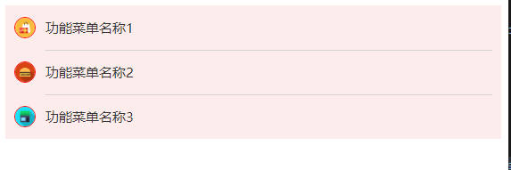
示例1:
css 代码
  /* 一行两列,高度固定,某一列宽度自适应*/

        .list {
            background: rgb(253, 236, 236);
        }

        .list .line {
            padding: 0px 10px;
            height: 50px;
            line-height: 50px;
            border: 0px solid blue;
        }

        .list .icon {
            width: 22px;
            height: 22px;
            border: 1px solid red;
            border-radius: 50%;
            float: left;
            position: relative;
            top: 50%;
            transform: translateY(-50%);
        }

        .list .icon img {
            width: 100%;
            height: 100%;
            display: block;
        }

        .list .content {
            margin-left: 35px;
            font-size: 15px;
            color: #333;
            border-bottom: 1px solid lightgray;
        }

        .list .last-content {
            border-bottom: 0;
        }
html代码:


    <div class="list">
        <div class="line">
            <div class="icon">
                <img src="http://www.jnqianle.cn/img/index/mall1.png" alt="">
            </div>
            <div class="content">
                功能菜单名称1
            </div>
        </div>
        <div class="line">
            <div class="icon">
                <img src="http://www.jnqianle.cn/img/index/order1.png" alt="">
            </div>
            <div class="content">
                功能菜单名称2
            </div>
        </div>
        <div class="line">
            <div class="icon">
                <img src="http://www.jnqianle.cn/img/index/mall2.png" alt="">
            </div>
            <div class="content last-content">
                功能菜单名称3
            </div>
        </div>
    </div>
显示效果:
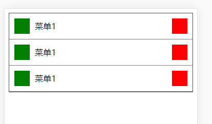
示例2:
css代码
      .list {
            border: 1px solid red;
        }

        .line {
            height: 50px;
            line-height: 50px;
            padding: 0px 10px;
            border-bottom: 1px solid gray;
        }

        .line .left {
            float: left;
            width: 30px;
            height: 30px;
            background: green;
            position: relative;
            top: 50%;
            transform: translateY(-50%);
        }

        .line .center {
            margin-left: 40px;
            margin-right: 40px;
        }

        .line .right {
            float: right;
            width: 30px;
            height: 30px;
            background: red;
            position: relative;
            top: 50%;
            transform: translateY(-50%);
        }
html,特别注意,center放在最下边
  <div class="list">
        <div class="line">
            <div class="left">
            </div>
            <div class="right">

            </div>
            <div class="center">
                菜单1
            </div>
        </div>

        <div class="line">
            <div class="left">

            </div>
            <div class="right">

            </div>
            <div class="center">
                菜单1
            </div>
        </div>
        <div class="line">
            <div class="left">

            </div>
            <div class="right">

            </div>
            <div class="center">
                菜单1
            </div>
        </div>

    </div>
显示效果:
二、待完善
更多: