方案一,淘宝百度方案,
核心过程:
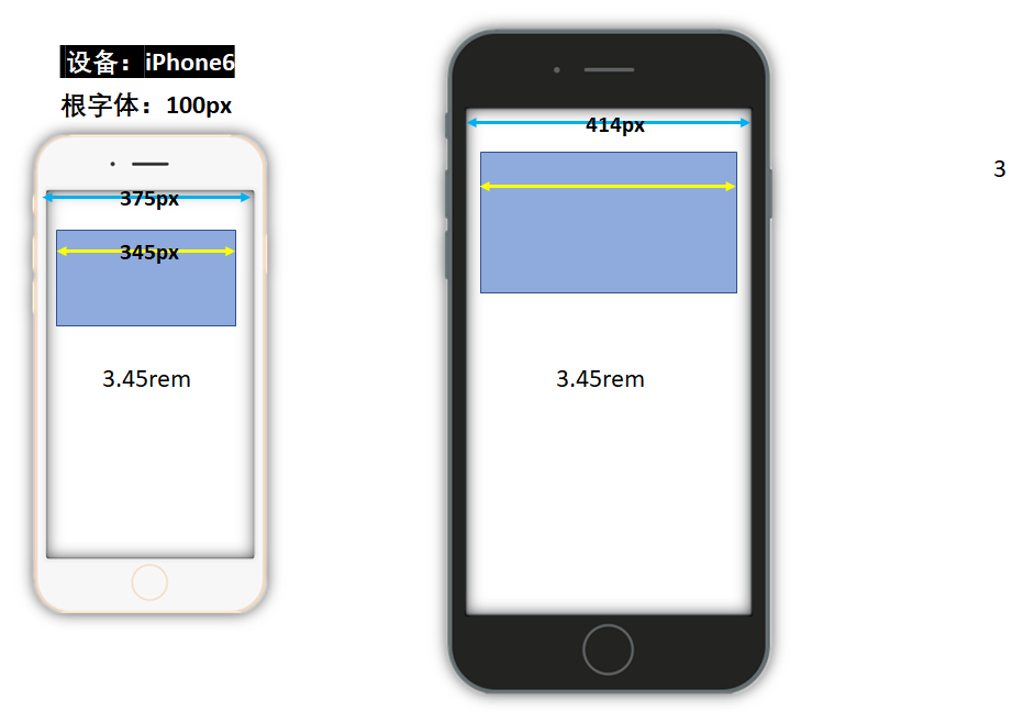
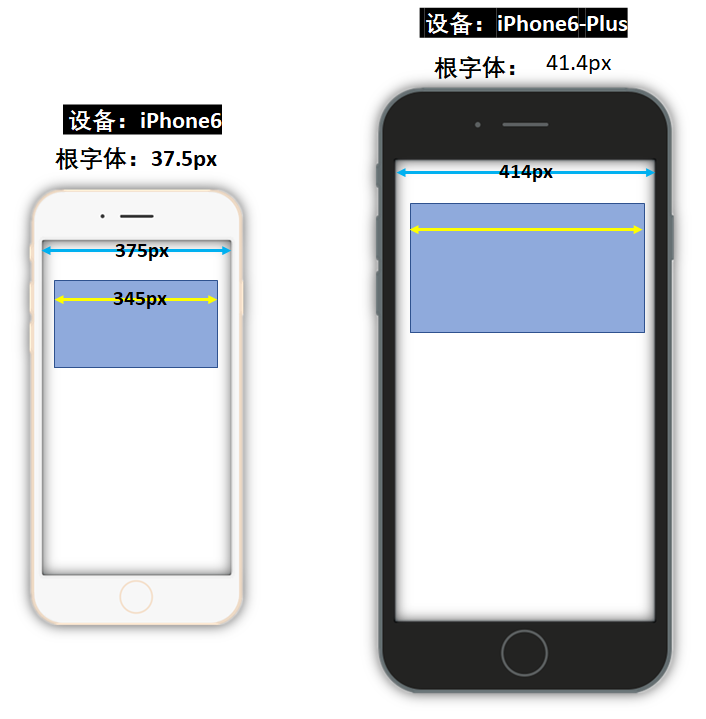
1.根字体 = ( 设备横向独立像素值 * 100 (苹果6固定)) / 设计稿宽度
2.编写样式时:
直接以rem为单位。
值为:设计值 / 根字体
设计稿宽度不变,苹果6的根字体固定100px,所以当rem不变, 物理像素变大,换设备,需要计算根字体。根字体变小
<!DOCTYPE html>
<html lang="en">
  <head>
    <meta charset="UTF-8" />
    <meta name="viewport" content="width=device-width, initial-scale=1.0" />
    <title>Document</title>
    <style>
      * {
        margin: 0;
        padding: 0;
      }
      html {
        font-size: 100px;
      }
      #demo {
         3.45rem;
        height: 1.5rem;
        margin: 0.15rem;
        background-color: pink;

        /*
            em: 是相对单位 相对父级的字体大小
            rem: 也是相对单位 相对跟元素素的字体大小

         */
      }
    </style>
  </head>
  <body>
    <script>
      // 为了适配不同的手机屏幕,需要动态的计算不同的手机,跟字体应该是多少
      // 公式: 当前设备的独立像素*100/设计稿的宽度 ==> 跟字体的大小
      // 下面这行代码拿到的是布局视口, 但是由于设置了理想视口,所以布局视口的宽度就是设备独立像素的宽度
      // console.log(document.documentElement.clientWidth)
      function adapter() {
     //获取当前物理设备像素
        const w = document.documentElement.clientWidth
        // 计算当前设备的跟字体应该是多少
        const rootFontSize = (w * 100) / 375
        // 给根元素赋值,记得要加px单位
        document.documentElement.style.fontSize = rootFontSize + 'px'
      }
      adapter()
      // 注意:切换设备,导致设备独立像素发生变化,因为设置了理想视口,所以布局视口也会变化,会触发window.onresize
      // window.onresize = function() {
      //   adapter()
      // }
      window.onresize = adapter
    </script>
    <div id="demo"></div>
  </body>
</html>
方案二,搜狐,唯品会方案
核心过程:
1. 根字体 = 设备横向独立像素值 / 10
2.编写样式时:
直接以rem为单位。
值为:设计值 / (设计稿宽度 / 10)
<!DOCTYPE html>
<html lang="en">
  <head>
    <meta charset="UTF-8" />
    <meta name="viewport" content="width=device-width, initial-scale=1.0" />
    <title>Document</title>
    <style>
      * {
        margin: 0;
        padding: 0;
      }
      html {
        font-size: 100px;
      }
      #demo {
         9.2rem;
        height: 4rem;
        margin: 0.4rem;
        background-color: pink;

        /*
            em: 是相对单位 相对父级的字体大小
            rem: 也是相对单位 相对跟元素素的字体大小

         */
      }
    </style>
  </head>
  <body>
    <script>
      // 方式二:
      // 1. 设置跟字体大小: 永远是设备独立像素/10
      // 2. 动态计算设计稿px对应的rem是多少
      function adapter() {
        const w = document.documentElement.clientWidth
        // 计算当前设备的跟字体应该是多少
        const rootFontSize = w / 10
        // 给根元素赋值,记得要加px单位
        document.documentElement.style.fontSize = rootFontSize + 'px'
      }
      adapter()

      window.onresize = adapter
    </script>
    <div id="demo"></div>
  </body>
</html>
第二种方法,非375设计图,是750设计图,和less一起搞
<!DOCTYPE html>
<html lang="en">
  <head>
    <meta charset="UTF-8" />
    <meta name="viewport" content="width=device-width, initial-scale=1.0" />
    <title>Document</title>
    <link rel="stylesheet" href="./index.css">
    <style>
      /* * {
        margin: 0;
        padding: 0;
      }
      html {
        font-size: 100px;
      }
      #demo {
         9.2rem;
        height: 4rem;
        margin: 0.4rem;
        background-color: pink; */

        /*
            em: 是相对单位 相对父级的字体大小
            rem: 也是相对单位 相对跟元素素的字体大小

         */
      /* } */
    </style>
  </head>
  <body>
    <script>
      // 方式二:
      // 1. 设置跟字体大小: 永远是设备独立像素/10
      // 2. 动态计算设计稿px对应的rem是多少
      function adapter() {
        const w = document.documentElement.clientWidth
        // 计算当前设备的跟字体应该是多少
        const rootFontSize = w / 10
        // 给根元素赋值,记得要加px单位
        document.documentElement.style.fontSize = rootFontSize + 'px'
      }
      adapter()

      window.onresize = adapter
    </script>
    <div id="demo"></div>
  </body>
</html>
less, 750的设计图
@font: 750/10rem;
* {
  margin: 0;
  padding: 0;
}

#demo {
   690 / @font;
  height: 300 / @font;
  margin: 30 / @font;
  background-color: pink;
}
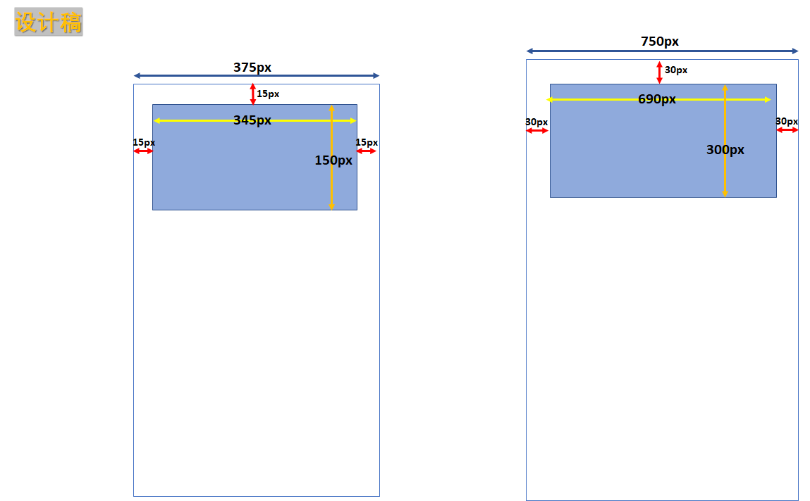
设计稿