尝试用React写几个通用组件 - 带搜索功能的下拉列表,开关切换按钮,弹出框
近期正在逐步摸索学习React的用法,尝试着写几个通用型的组件,整体项目还是根据webpack+react+css-medules构建,
项目代码 https://github.com/sunrun93/react-custom-components
启动项目:
git clone git@github.com:sunrun93/react-blog-app.git
npm i
npm start
启动项目后,如若发现本地css未生效,请在node_modules eact-scriptsconfigwebpack.config.dev.js和node_modules eact-scriptsconfigwebpack.config.prod.js找到对应的css-loader, 在其options中添加如下两项(modules,localIdentName):
 loader: require.resolve('css-loader'),
 options: {
        modules: true,
        localIdentName: '[name]__[local]__[hash:base64:5]'
}
主要组件包括:
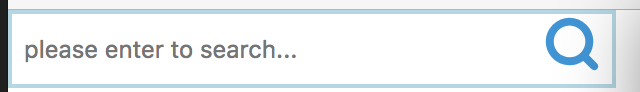
. Search-box:具有输入搜索功能的下拉列表,仅支持单项选中,并可根据用户输入匹配筛选选项,调用方式如下:

let options = [
      { id: '1', label: 'Option-A', value: 'Option-A' },
      { id: '2', label: 'Option-B', value: 'Option-B' },
      { id: '3', label: 'Option-C', value: 'Option-C' },
      { id: '4', label: 'Option-D', value: 'Option-D' }
    ];
<SearchBox options={options}/> //显示label
Toggle-btn:模仿ios系统中的开关按钮,基于checkbox实现一个toggle-btn的小插件。样式上,隐藏checkbox勾选框的样式,将troggle-btn的样式添加到checkbox的label上:

     <input type="checkbox" checked={this.state.isCheck} className={this.state.isCheck?styles.greenDotRight:styles.greenDotLeft}/>
     <label></label>
  input[type='checkbox'] {
          visibility:hidden;
          position:absolute;
      }

  .greenDotLeft+label{
      30px;
      height: 30px;
      border-radius: 15px;
      background-color:lightgray;
      display: inline-block;
      position: absolute;
      left: 0;
  }

  .greenDotRight+label{
       30px;
      height: 30px;
      border-radius: 15px;
      background-color: lawngreen;
      display: inline-block;
      position: absolute;
      right:0;
  }
调用方式如下:
<ToggleBtn isChecked={isChecked} onClick={toggleEvent}/> //onClick触发想要调用的方法,接受一个参数拿到当前的状态,isChecked可定义初始化的值
dialog-component 弹出框/对话框组件 - 弹出框或者对话框组件在web应用中非常的常见,因此尝试使用react构造一个对话框组件。
首先我们考虑一下两点:
- 弹出框显示时,通常情况会生成一个遮罩层,使用户无法触发页面上的其他操作。
- 弹出框的DOM节点在根节点生成,显示或关闭不能影响原本的页面结构。
因此,我们考虑通过两部分来构造这个组件,并通过ReactDOM提供的ReactDOM.unstable_renderSubtreeIntoContainer方法将其插入到DOM的根节点,结构如下(Layer层为遮罩层,Dialog为我们实际构造的组件):

<Layer>
    <Dialog>
        /* customer defined dialog content */
    </Dialog>
</Layer>
Layer层的具体实现如下,具体请查看
class Layer extends React.Component {
    constructor(props) {
        super(props);
    }
    componentDidMount() {
        this.renderLayer();
    }
    componentDidUpdate() {
        this.renderLayer();
    }
    componentWillUnmount() {
        this.removeLayer();
    }
    renderLayer() {
        if (!this.props.open) {
            this.removeLayer()
        } else {
            if (!this.layer) {
                this.layer = document.createElement("div");
                this.layer.className = styles.layer;
                document.body.appendChild(this.layer);//首先将Layer节点添加到DOM中
            }
            ReactDOM.unstable_renderSubtreeIntoContainer(this, this.props.children, this.layer);
            //然后通过unstable_renderSubtreeIntoContainer方法将其放到根结点下
        }
    }
    removeLayer() {
        if (!this.layer) {
            return;
        }
        ReactDOM.unmountComponentAtNode(this.layer);
        document.body.removeChild(this.layer);
        this.layer = null;
    }
    render() {
        return null;
    }
}