视觉效果

CSS代码:
.cover {
    padding: 36% 50%;
    background: linear-gradient(to right, white 50%, black calc(50% + 1px));
    position: relative;
    font-size: 200%;
}
.cover::before,
.cover::after {
    content: '';
    position: absolute;
    width: 36%; height: 50%;
    border-radius: 50%;
    left: 50%;
    transform: translateX(-50%);
}
.cover::before {
    top: 0;
    background: radial-gradient(circle, white 13%, black calc(13% + 1px));
}
.cover::after {
    bottom: 0;
    background: radial-gradient(circle, black 13%, white calc(13% + 1px));
}
.cover-h,
.cover-p {
    position: absolute;
    mix-blend-mode: difference;
    left: 0; right: 0;
    text-align: center;
    color: #fff;
    z-index: 1;
}
HTML代码:
<div class="cover">
    <h2 class="cover-h">CSS创意与视觉表现</h2>
</div>
布局
平行四边形布局
# shape-outside是不规则形状环绕布局的核心,支持的属性值分为如下四大类
1. none # 默认值
2. <shape-box> # 图形盒子
3. <basic-shape> # 基本图函数
4. <image> # 图像类
CSS Shapes教程
平行四边形布局解读
效果

代码
CSS代码:
.shape-left {
    float: left;
    width: 200px; height: 500px;
    shape-outside: polygon(0 0, 100% 0, 0% 100%);
}
.shape-right {
    float: right;
    width: 200px; height: 500px;
    shape-outside: polygon(100% 0, 100% 100%, 0 100%);
}
.content {
    display: block;
    padding: 1px;
    position: relative;
    z-index: 0;
}
.content::before {
    content: '';
    position: absolute;
    background-color: #fff;
    transform: skewX(-22deg);
    left: 50px; right: 50px; top: 0; bottom: 0;
    border: 1px solid #ddd;
    z-index: -1;
}
HTML代码
<div class="shape-left"></div>
<div class="shape-right"></div>
<content class="content">
   ...内容...
</content>
图形
透明方格
# 原理小方格错位叠加后效果
效果
代码
CSS代码:
.square {
    display: inline-block;
    padding: 300px;
    background-color: #fff;
    background-image: linear-gradient(45deg, #eee 25%, transparent 25%, transparent 75%, #eee 75%), linear-gradient(45deg, #eee 25%, transparent 25%, transparent 75%, #eee 75%);
    background-size: 16px 16px;
    background-position: 0 0, 8px 8px;
}
HTML代码:
<div class="square"></div>
镂空
图像剪裁
# 实现的关键就是使用巨大尺寸的outline模拟镂空
效果
代码
CSS代码:
.clip-img-x {
    display: inline-block;
    overflow: hidden;
    position: relative;
}
.clip-img {
    display: block;
}
.clip-shape {
    width: 150px; height: 150px;
    outline: 9999px solid rgba(0,0,0,.5);
    position: absolute;
    left: 0; right: 0; top: 0; bottom: 0;
    margin: auto;
    cursor: move;
}
HTML代码
<div class="clip-img-x">
    <div class="clip-shape"></div>
    <img src="./mm.jpg" class="clip-img">
</div>
新手引导
# 实现的关键就是使用巨大尺寸的box-shadow扩展模拟镂空。
# 也可以使用径向渐变实现,但没有box-shadow好理解好上手。
效果

代码
CSS代码:
.guide-x {
    text-align: center;
    padding: 100px 16px;
    background-color: #fff;
    position: relative;
    overflow: hidden;
}
.guide-overlay {
    position: absolute;
    left: 0; top: 0; right: 0; bottom: 0;
    background: linear-gradient(transparent, transparent);
}
.guide-overlay-shape {
    width: 100px; height: 60px;
    position: absolute;
    left: 0; top: 0; right: 0; bottom: 0;
    margin: auto;
    border-radius: 50%;
    box-shadow: 0 0 0 9999px rgba(0,0,0,.75);
}
HTML代码
<div class="guide-x">
    <div class="guide-overlay">
        <i class="guide-overlay-shape" data-content="发布按钮搬到这里了"></i>
    </div>
    <button class="button">发布</button>
</div>
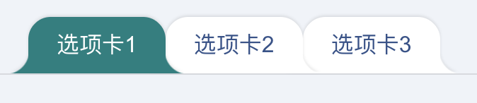
外圆角选项卡
效果
代码
CSS代码:
.tab-x {
    display: flex;
    flex-direction: row-reverse;
    justify-content: flex-end;
    padding-left: 20px;
    border-bottom: 1px solid rgba(0,0,0,.1);
}
.tab-a {
    --backgroundColor: #fff;
    background-color: var(--backgroundColor);
    line-height: 20px;
    padding: 10px 20px;
    border-radius: 16px 16px 0 0;
    filter: drop-shadow(0 -1px 1px rgba(0,0,0,.1));
    position: relative;
}
/* 创建外侧圆弧 */
.tab-a::before,
.tab-a::after {
    content: '';
    position: absolute;
    bottom: 0;
    width: 16px; height: 16px;
}
.tab-a::before {
    background: radial-gradient(circle at 0 0, transparent, transparent 16px, var(--backgroundColor) 17px);
    right: 100%;
}
.tab-a::after {
    background: radial-gradient(circle at 100% 0, transparent, transparent 16px, var(--backgroundColor) 17px);
    left: 100%;
}
.tab-a.active {
    --backgroundColor: teal;
    color: #fff;
    z-index: 1;
}
HTML代码
<div class="tab-x">
    <a href="javascript:" class="tab-a">选项卡3</a>
    <a href="javascript:" class="tab-a">选项卡2</a>
    <a href="javascript:" class="tab-a active">选项卡1</a>
</div>
这里外部的圆角使用径向渐变实现。我们也可以使用box-shadow实现类似的效果,如下:
代码如下:
CSS
.quar-radius {
    width: 96px; height: 96px;
    border-radius: 0 0 50% 0;
    clip-path: polygon(0 0, 100% 0, 100% 100%, 0 100%);
    box-shadow: 0 0 0 100px teal;
}
HTML
<div class="quar-radius"></div>
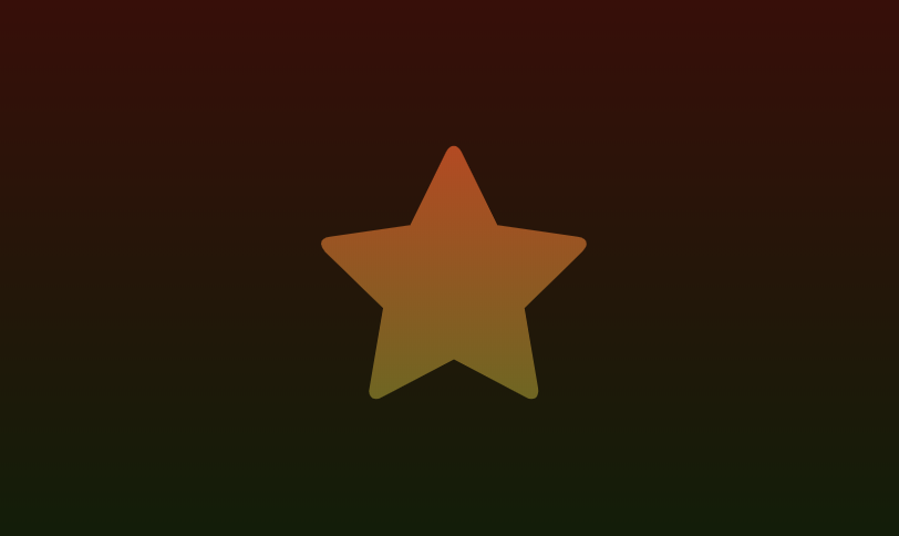
任意图形镂空
黑色黑色半透明遮罩,中间镂空的是不规则图形,例如五角星:
效果
代码
CSS代码:
.shape-hollow-x {
    width: 600px;
    max-width: 100%;
    height: 300px;
    background: linear-gradient(red, green);
    position: relative;
}
.shape-hollow {
    position: absolute;
    left: 0; right: 0; top: 0; bottom: 0;
    margin: auto;
    background-color: rgba(0,0,0,.75);
    /* 实际开发需要-webkit- */
    mask: no-repeat center;
    mask-image: linear-gradient(black, black), url(./star.svg);
    mask-size: cover, 120px 120px;
    mask-composite: exclude;
    mask-composite: source-out;
}
HTML代码
<div class="shape-hollow-x">
    <i class="shape-hollow"></i>
</div>
关于mask遮罩的详细介绍
拓展:新颖的过场动效
img.shape-hollow {
    /* 动画 */
    animation: starIn 2s infinite;
}
@keyframes starIn {
    from {
        -webkit-mask-size: 100%, 0 0;
        mask-size: 100%, 0 0;
    }
    to {
        -webkit-mask-size: 100%, 300% 300%;
        mask-size: 100%, 300% 300%;
    }
}
图像处理
# CSSgram中的图像处理 darken
# Github项目地址
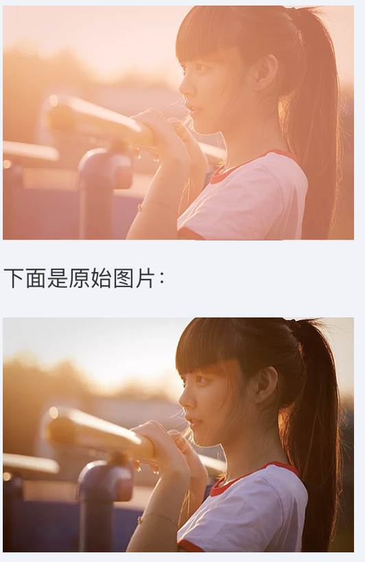
白天照片模拟黑夜
效果
代码
CSS代码:
.night {
    width: 256px; height: 256px;
    background: rgba(0,40,140,.6) url(./house-bed.jpg);
    background-size: 100%;
    background-blend-mode: darken;
    filter: brightness(80%) grayscale(20%) contrast(1.2);
}
HTML代码
<div class="night"></div>
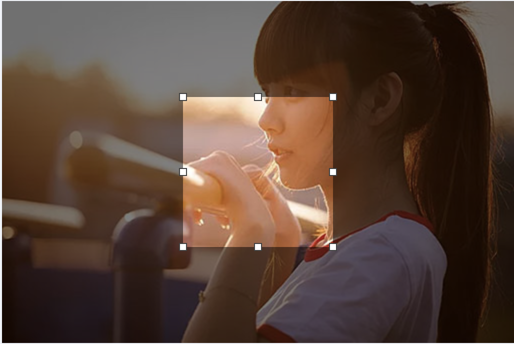
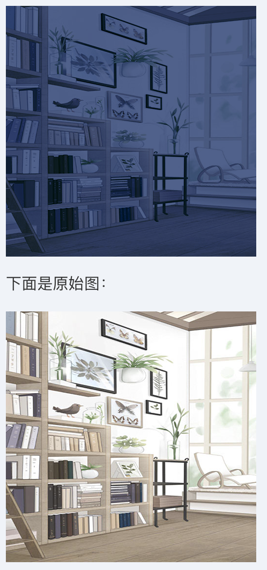
让照片更梦幻
效果
代码
CSS代码:
.girl {
    width: 256px; height: 171px;
    background: rgba(238,179,163, .8) url(./mm.jpg);
    background-size: 100%;
    background-blend-mode: soft-light;
    filter: contrast(1.1);
}
HTML代码
<div class="girl"></div>
更高级的图像处理
参考自
素描
CSS代码:
.sketch {
    width: 256px; height: 192px;
    background: url(./example.jpg) -2px -2px, url(./example.jpg);
    background-size: 258px 194px;
    background-blend-mode: difference;
    filter: brightness(3) invert(1) grayscale(1);
}
HTML代码
<div class="sketch"></div>
水彩
CSS代码:
.watercolor {
    width: 256px; height: 192px;
    position: relative;
    overflow: hidden;
}
.watercolor::before {
    content: '';
    display: block;
    height: inherit;
    background: url(./example.jpg) -2px -2px, url(./example.jpg);
    background-size: 100%;
    background-blend-mode: difference;
    filter: brightness(2) invert(1) grayscale(1);
}
.watercolor::after {
    content: '';
    position: absolute; left: 0; top: 0;
    height: inherit; width: inherit;
    background: url(./example.jpg) -1px -1px;
    background-size: 100%;
    mix-blend-mode: multiply;
    filter: brightness(1.3) blur(2px) contrast(2);
}
HTML代码
<div class="watercolor"></div>
彩铅
CSS代码:
.pencil {
    width: 256px; height: 192px;
    position: relative;
    overflow: hidden;
}
.pencil::before {
    content: '';
    display: block;
    height: inherit;
    background: url(./example.jpg) -1px -1px, url(./example.jpg);
    background-size: calc(100% + 1px);
    background-blend-mode: difference;
    filter: brightness(2) invert(1) grayscale(1);
}
.pencil::after {
    content: '';
    position: absolute; left: 0; top: 0;
    height: inherit; width: inherit;
    background: url(./example.jpg);
    background-size: 100%;
}
HTML代码
<div class="pencil"></div>
动画
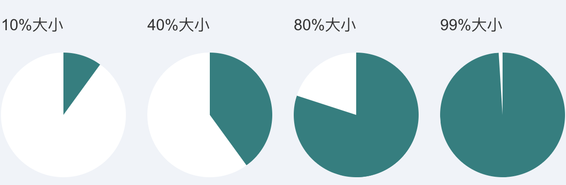
饼图
静态效果
代码
CSS代码:
.pie-simple {
    width: 128px; height: 128px;
    background-color: white;
    border-radius: 50%;
    overflow: hidden;
}
.pie-left,
.pie-right {
    width: 50%; height: 100%;
    float: left;
    position: relative;
    overflow: hidden;
}
.pie-left::before,
.pie-right::before,
.pie-right::after {
    content: '';
    position: absolute;
    width: 100%; height: 100%;
    background-color: teal;
}
.pie-left::before {
    left: 100%;
    transform-origin: left;
    transform: rotate(calc(3.6deg * (var(--percent) - 50)));
    opacity: calc(99999 * (var(--percent) - 50));
}
.pie-right::before {
    right: 100%;
    transform-origin: right;
    transform: rotate(calc(3.6deg * var(--percent)));
}
.pie-right::after {
    opacity: calc(99999 * (var(--percent) - 50));
}
HTML代码
<div class="pie-item">
    <p>10%大小</p>
    <div class="pie-simple" style="--percent: 10;">
        <div class="pie-left"></div>
        <div class="pie-right"></div>
    </div>
</div>
<div class="pie-item">
    <p>40%大小</p>
    <div class="pie-simple" style="--percent: 40;">
        <div class="pie-left"></div>
        <div class="pie-right"></div>
    </div>
</div>
<div class="pie-item">
    <p>80%大小</p>
    <div class="pie-simple" style="--percent: 80;">
        <div class="pie-left"></div>
        <div class="pie-right"></div>
    </div>
</div>
<div class="pie-item">
    <p>99%大小</p>
    <div class="pie-simple" style="--percent: 99;">
        <div class="pie-left"></div>
        <div class="pie-right"></div>
    </div>
</div>
动态效果(略)
代码
CSS代码(单循环):
.pie-spin {
    width: 128px; height: 128px;
    background-color: white;
    border-radius: 50%;
    overflow: hidden;
}
.pie-spin-left,
.pie-spin-right {
    width: 50%; height: 100%;
    float: left;
    position: relative;
    overflow: hidden;
}
.pie-spin-left::before,
.pie-spin-right::before,
.pie-spin-left::after,
.pie-spin-right::after {
    content: '';
    position: absolute;
    width: 100%; height: 100%;
    background-color: teal;
}
.pie-spin-left {
    opacity: 1;
    animation: second-half-show 1.6s steps(1, end) infinite;
}
.pie-spin-left::before {
    left: 100%;
    transform-origin: left;
    animation: spin 1.6s .8s infinite linear;
}
.pie-spin-right::before {
    right: 100%;
    transform-origin: right;
    animation: spin 1.6s infinite linear;
}
.pie-spin-right::after {
    animation: second-half-show 1.6s steps(1, end) infinite;
    opacity: 1;
}
.pie-spin-left::after {
    animation: second-half-hide 1.6s steps(1, end) infinite;
    opacity: 0;
}
@keyframes spin {
  0%   { transform: rotate(0); }
  100% { transform: rotate(360deg); }
}
@keyframes second-half-hide {
  0%        { opacity: 1; }
  50%, 100% { opacity: 0; }
}
@keyframes second-half-show {
  0%        { opacity: 0; }
  50%, 100% { opacity: 1; }
}
CSS代码(交替循环):
.pie-spin2 {
    width: 128px; height: 128px;
    background-color: white;
    border-radius: 50%;
    overflow: hidden;
}
.pie-spin2-left,
.pie-spin2-right {
    width: 50%; height: 100%;
    float: left;
    position: relative;
    overflow: hidden;
}
.pie-spin2-left::before,
.pie-spin2-right::before {
    content: '';
    position: absolute;
    width: 100%; height: 100%;
    background-color: teal;
}
.pie-spin2-left::before {
    left: 100%;
    transform-origin: left;
    animation: spinWait2 3.2s infinite linear;
}
.pie-spin2-right::before {
    right: 100%;
    transform-origin: right;
    animation: spinWait1 3.2s infinite linear;
}
@keyframes spinWait1 {
    0%        { transform: rotate(0deg); }
    25%, 50%  { transform: rotate(180deg); }
    75%, 100% { transform: rotate(360deg); }
}
@keyframes spinWait2 {
    0%, 25%  { transform: rotate(0deg); }
    50%, 75% { transform: rotate(180deg); }
    100%     { transform: rotate(360deg); }
}
HTML代码(单循环):
<div class="pie-spin">
    <div class="pie-spin-left"></div>
    <div class="pie-spin-right"></div>
</div>
HTML代码(交替循环):
<div class="pie-spin2">
    <div class="pie-spin2-left"></div>
    <div class="pie-spin2-right"></div>
</div>
打点
效果

最优实现
代码
CSS代码:
dot-a {
    display: inline-block;
    height: 1em; line-height: 1;
    text-align: left;
    vertical-align: -.25ex;
    overflow: hidden;
}
dot-a::before {
    display: block;
    content: '...A..A.';
    white-space: pre-wrap;
    animation: dot1 3s infinite step-start both;
}
@keyframes dot1 {
    33% { transform: translateY(-2em); }
    66% { transform: translateY(-1em); }
}
HTML代码:
正在加载中<dot-a>...</dot-a>
其他实现
1. content动画实现
优点:
易理解易上手;
颜色、字号天然自适应;
缺点:
IE不兼容,Safari不兼容;
CSS代码:
dot-b::before {
    content: '...';
    position: absolute;
    animation: dot2 3s infinite step-start both;
}
dot-b:after {
    content: '...';
    color: transparent;
}
@keyframes dot2 {
    33% { content: '.'; }
    66% { content: '..'; }
}
HTML代码
正在加载中<dot-b></dot-b>
2. ch尺寸控制
优点:
易理解易上手;
颜色、字号天然自适应;
缺点:
IE ch支持有瑕疵;
专门使用了等宽字体,样式不完美;
CSS代码:
dot-c {
    display: inline-block;
    width: 3ch;
    text-indent: -1ch;
    vertical-align: -.25ex;
    overflow: hidden;
    animation: dot3 3s infinite step-start both;
    font-family: Consolas, Monaco, monospace;
}
@keyframes dot3 {
    33% { text-indent: 0; }
    66% { text-indent: -2ch; }
}
HTML代码
正在加载中<dot-c>...</dot-b>
3. box-shadow模拟
# 亦可以使用radial-gradient模拟。
优点:
没有什么优点;
缺点:
尺寸、间距和形状固定,适用场景有限;
CSS代码:
dot-d::before {
    content: '';
    position: absolute;
    width: 2px; height: 2px;
    background-color: currentColor;
    box-shadow: 4px 0, 8px 0;
    animation: dot4 3s infinite step-start both;
    margin-top: 1em;
}
dot-d::after {
    content: '...';
    color: transparent;
}
@keyframes dot4 {
    33% { box-shadow: none; }
    66% { box-shadow: 4px 0; }
}
HTML代码:
正在加载中<dot-d></dot-d>
4. border和background模拟
优点:
脑洞不错;
缺点:
尺寸、间距和形状固定,适用场景有限;
CSS代码:
dot-e::before {
    content: '';
    position: absolute;
    width: 10px; height: 2px;
    padding: 0 2px;
    border-left: 2px solid; border-right: 2px solid;
    background-color: currentColor;
    background-clip: content-box;
    box-sizing: border-box;
    animation: dot5 3s infinite step-start both;
    margin-top: 1em;
}
dot-e::after {
    content: '...';
    color: transparent;
}
@keyframes dot5 {
    33% { border-right-color: transparent; background-color: transparent; }
    66% { border-right-color: transparent; }
}
HTML代码:
正在加载中<dot-e></dot-e>
流动
色彩的流动
# 看上去在流动:实际上没有任何位移。
CSS代码:
.flow-colorful {
    max-width: 600px;
    height: 150px;
    background: linear-gradient(to right, red, orange, yellow, green, cyan, blue, purple);
    animation: hue 6s linear infinite;
}
@keyframes hue {
    from {
        filter: hue-rotate(0deg);
    }
    to {
        filter: hue-rotate(360deg);
    }
}
HTML代码:
<div class="flow-colorful"></div>
文字动效
CSS代码:
.flow-slogon {
    font-size: 120px;
    -webkit-background-clip: text;
    -webkit-text-fill-color: transparent;
    background-image: linear-gradient(to right, red, yellow, lime, aqua, blue, fuchsia);
    animation: hue 6s linear infinite;
}
HTML代码:
<h2 class="flow-slogon">第五届CSS大会</h2>
移动的错觉
# 斜纹进度条:视觉上是前进,实际上是上下移动。
CSS代码:
.flow-twill {
    padding-right: 30%;
    height: calc(1.4142 * 20px);
    background: repeating-linear-gradient(45deg, teal, teal 10px, transparent 11px, transparent 19px, teal 20px);
    background-clip: content-box;
    animation: twill 1s linear infinite;
    position: relative;
}
.flow-twill::before {
    content: '';
    position: absolute;
    width: 100%; height: 100%;
    background: linear-gradient(rgba(0,0,0,.5), hsla(0,0%,100%,.5), rgba(0,0,0,.5));
}
@keyframes twill {
    from {
        background-position: 0 0;
    }
    to {
        background-position: 0 calc(-1 * 1.4142 * 40px);
    }
}
HTML代码:
<div class="flow-twill"></div>
移动与水波的错觉
# CSS模拟的波浪线
CSS代码:
.flow-wave {
    padding: 5px 0;
}
.flow-wave:hover,
.flow-wave:focus {
    background: radial-gradient(circle at 10px -7px, transparent 8px, currentColor 8px, currentColor 9px, transparent 9px) repeat-x,
        radial-gradient(circle at 10px 27px, transparent 8px, currentColor 8px, currentColor 9px, transparent 9px) repeat-x;
    background-size: 20px 20px;
    background-position: -10px calc(100% + 16px), 0 calc(100% - 4px);
    animation: waveFlow 1s infinite linear;
}
@keyframes waveFlow {
    from { background-position-x: -10px, 0; }
    to { background-position-x: -30px, -20px; }
}
HTML代码:
<a href="javascript:" class="flow-wave">hover我(移动端按下)</a>
行为
滚动指示器
# 我这里实现的方法去传统的CSS滚动指示器适用的场景要广泛的多,且使用更简单。
# 滚动页面,观察最顶端的条状进度。
# 滚动指示器建议在页面滚动高度超过一屏的时候使用。
原理
使用mix-blend-mode:darken改进实现。
CSS代码:
body {
    position: relative;
}
.indicator {
    position: absolute;
    top: 0; right: 0; left: 0; bottom: 0;
    background: linear-gradient(to right top, teal 50%, transparent 50%) no-repeat;
    background-size: 100% calc(100% - 100vh);
    z-index: 1;
    pointer-events: none;
    mix-blend-mode: darken;
}
.indicator::after {
    content: '';
    position: fixed;
    top: 5px; bottom: 0; right: 0; left: 0;
    background: #fff;
    z-index: 1;
}
HTML代码:
<!-- 在<body>标签内插入指示器元素 -->
<div class="indicator"></div>
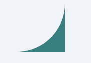
视差滚动
CSS代码:
.scroll {
    height: 600px;
    perspective: 1px;
    position: relative;
    background-color: #fff;
    -webkit-clip-path: polygon(0% 0%, 100% 0%, 100% 100%, 0% 100%);
    clip-path: polygon(0% 0%, 100% 0%, 100% 100%, 0% 100%);
    overflow-x: hidden;
}
.box {
    height: 1280px;
    transform-style: preserve-3d;
    transform: translateZ(-1px);
    position: relative;
}
.iphone {
    position: absolute; left: 50%;
    transform: translate3d(-50%, -120px, -1px) scale(2);
}

.smile, .flower, .music, .pdf {
    position: absolute; left: 50%; top: 50%;
    background: url(../../201503/mobile_1_layer2.png) no-repeat;
    transform: translate3d(-50%, -50%, 0);
}
.smile {
    width: 64px; height: 64px;
    margin: -400px 0 0 -400px;
}
.flower {
    width: 268px; height: 229px;
    background-position: 0 -56px;
    margin: -320px 0 0 400px;
}
.music {
    width: 114px; height: 114px;
    background-position: -10px -297px;
    margin: -40px 0 0 -300px;
}
.pdf {
    width: 130px; height: 120px;
    background-position: -10px -423px;
    margin: 140px 0 0 500px;
}
/*mobile*/
@media screen and (max- 640px) {
    .scroll {
        height: 400px;
    }
    .iphone {
        transform: translate3d(-50%, -40px, -1px) scale(2);
        max-width: 100%;
    }
    .smile {
        margin-left: -200px;
    }
    .flower {
        margin-left: 200px;
    }
    .pdf {
        margin-left: 260px;
    }
}
HTML代码:
<div class="scroll">
    <div class="box">
        <img src="./mobile_1_iphone.jpg" class="iphone">
        <i class="smile"></i>
        <i class="flower"></i>
        <i class="music"></i>
        <i class="pdf"></i>
    </div>
</div>
分栏拉伸
# 效果(PC only,Android亦可)
# 拖拽分隔线,可以改变左右两栏尺寸。
CSS代码:
.column {
    overflow: hidden;
}
.column-left {
    height: 400px;
    background-color: #fff;
    position: relative;
    float: left;
}
.column-right {
    height: 400px;
    padding: 16px;
    background-color: #eee;
    box-sizing: border-box;
    overflow: hidden;
}
.resize-save {
    position: absolute;
    top: 0; right: 5px; bottom: 0; left: 0;
    padding: 16px;
    overflow-x: hidden;
}
.resize-bar {
    width: 200px; height: inherit;
    resize: horizontal;
    cursor: ew-resize;
    opacity: 0;
    overflow: scroll;
}
/* 拖拽线 */
.resize-line {
    position: absolute;
    right: 0; top: 0; bottom: 0;
    border-right: 2px solid #eee;
    border-left: 1px solid #bbb;
    pointer-events: none;
}
.resize-bar:hover ~ .resize-line,
.resize-bar:active ~ .resize-line {
    border-left: 1px dashed skyblue;
}
.resize-bar::-webkit-scrollbar {
    width: 200px; height: inherit;
}

/* Firefox只有下面一小块区域可以拉伸 */
@supports (-moz-user-select: none) {
    .resize-bar:hover ~ .resize-line,
    .resize-bar:active ~ .resize-line {
        border-left: 1px solid #bbb;
    }
    .resize-bar:hover ~ .resize-line::after,
    .resize-bar:active ~ .resize-line::after {
        content: '';
        position: absolute;
        width: 16px; height: 16px;
        bottom: 0; right: -8px;
        background: url(./resize.svg);
        background-size: 100% 100%;
    }
}
HTML代码:
<div class="column">
    <div class="column-left">
        <div class="resize-bar"></div>
        <div class="resize-line"></div>
        <div class="resize-save">
            左侧的内容,左侧的内容,左侧的内容,左侧的内容
        </div>
    </div>
    <div class="column-right">
        右侧的内容,右侧的内容,右侧的内容,右侧的内容
    </div>
</div>