最近在FreeCodeCamp上重温网页前端,并且也学习了一些新东西,这个便是用bootstrap制作的一个简单的前端页面。
代码发布在codepen上,点击访问:BlogDemo
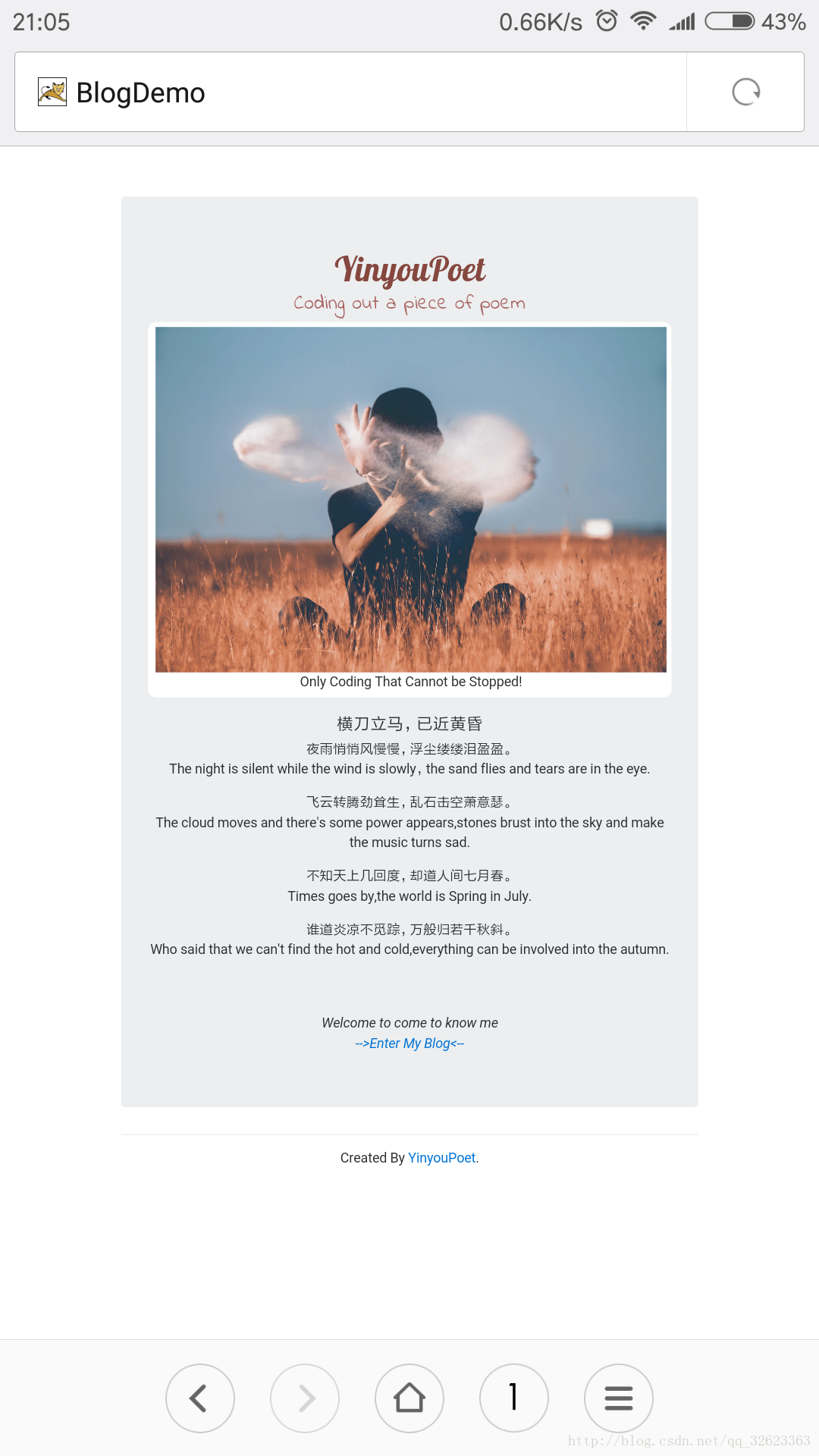
上个图,虽然比较简单,但是用了bootstrap框架后适配性还是不错的,手机上访问没问题。
下面对代码进行一些详细讲解啦~(≧▽≦)/~
因为没有动态页面所以没有用到js,css用的也不多,主要是用的bootstrap的一些类
先是html(里面的文字瞎诌的):
<link href="https://fonts.gdgdocs.org/css?family=Lobster" rel="stylesheet" type="text/css">
<link href="https://fonts.googleapis.com/css?family=Indie+Flower" rel="stylesheet">
<div class="container">
  <div class="jumbotron">
    <h1 class="text-center header">YinyouPoet</h1>
    <h4 class="text-center motto">Coding out a piece of poem</h4>
    <div class="col-xs-12 img-show">
      <img src="https://images.unsplash.com/photo-1498019559366-a1cbd07b5160?dpr=1&auto=format&fit=crop&w=1500&h=1014&q=80&cs=tinysrgb&crop=" class="carousel-inner img-responsive img-rounded" />
      <div class="caption text-center">
        Only Coding That Cannot be Stopped!
      </div>
    </div>

    <div class="col-xs-12 content text-center">
      <h5 class="text-center poem-title">横刀立马,已近黄昏</h5>
      <p>夜雨悄悄风慢慢,浮尘缕缕泪盈盈。<br/> The night is silent while the wind is slowly,the sand flies and tears are in the eye.</p>
      <p>
        飞云转腾劲耸生,乱石击空萧意瑟。</br>
        The cloud moves and there's some power appears,stones brust into the sky and make the music turns sad.
      </p>
      <p>
        不知天上几回度,却道人间七月春。</br>
        Times goes by,the world is Spring in July.
      </p>
      <p>谁道炎凉不觅踪,万般归若千秋斜。</br>
        Who said that we can't find the hot and cold,everything can be involved into the autumn.
      </p>
<br><br>
<footer><cite>Welcome to come to know me</cite></footer>
<footer><cite><a href="#" class="link">-->Enter My Blog<--</a></cite></footer>
    </div>


  </div>
<hr>
<footer class="text-center">
      <p>Created By <a href="#">YinyouPoet</a>.</p>
    </footer>
</div>
代码都挺好理解的,讲一些类的作用吧。
1、container和container-fluid不一样,bootstrap类的其他部分都需要放在具有这两者之一的div里面,但是有区别,container是固定宽度的,而container-fluid则是自适应整个屏幕,不过两者都具有自适应性,否则在手机上显示就不会那么正常了。
2、jumbotron:看见那块灰色的没,那就是jumbotron,网上说法呢这个是超大屏幕,听起来怪怪的,其实作用主要是:增加标题大小、增加外边距。参考的:Bootstrap
其他的没什么好解释的了,有不明白的可以给我留言,下面放的是css代码
body{
  margin-top:60px;
}
.header{
  font-family:Lobster;
  color:#86473f;
}
.img-show{
  background-color:#fff;
  padding:5px 5px 5px 8px;
  border:1px solid #fff;
  border-radius:10px;
}
.motto{
  color:#a96360;
  font-family:'Indie Flower', cursive;
}
.content{
  margin-top:20px;
}
.poem-title{
  font-family:隶书;
}
.link{

}
这些都是些简单样式也不用多解释了,对于bootstrap还没入门的可以先看看我的前一篇博客:bootstrap前端框架的简单基本使用
这个是我将来个人主页的欢迎页 ,后续页面尽情期待.·.·.·.·.