• CSS3鼠标移入移出图片生成随机动画


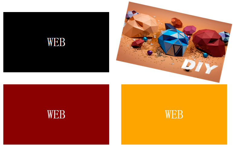
    今天分享使用html+css3+少量jquery实现鼠标移入移出图片生成随机动画,我们先看最终效果图(截图为静态效果,做出来可是动态的哟)


    左右旋转


    上下移动

    缩放

    由于时间关系我就不一步步解析各段代码所代表含义,我这里就给出一些思路及关键代码:

    1、首先使用ul li展现4张图片

    本示例中不仅使用了图片,在图片表面还放置了一段“WEB”字样文字,用于与图片实现隐藏或显示效果,故html中每张图片上方加入:

    <div class="mytext">WEB</div>

    2、CSS控制图片及文字透明度

    本示例中一组图片与文字同时放在一个li里面,高度与宽度设置与li一样大,并使用绝对定位固定它们的位置:

    #myimg ul li a div {
    position: absolute;
    top: 0;
    left: 0;
    width: 100%;
    height: 100%;
    text-align: center;
    font-size: 40px;
    }

    默认将隐藏图片,只显示文字,鼠标放入li时显示图片,这里使用opacity透明度属性控制:

    #myimg ul li a div.pic {
    opacity: 0;
    }
            
    #myimg ul li:hover a div.pic {
    opacity: 1;
    }

    3、CSS3自定义动画

    本示例中用css3定义了3种动画:

     @keyframes rot
                /*自定义 旋转动画*/
                
                {
                    0% 20% 40% 60% 80% 100% {
                        transform-origin: top center;
                    }
                    0% {
                        transform: rotate(0deg)
                    }
                    20% {
                        transform: rotate(-20deg)
                    }
                    40% {
                        transform: rotate(15deg)
                    }
                    60% {
                        transform: rotate(-10deg)
                    }
                    80% {
                        transform: rotate(5deg)
                    }
                    100% {
                        transform: rotate(0deg)
                    }
                }
                
                @keyframes top
                /*自定义 上下动画*/
                
                {
                    0% {
                        top: 0
                    }
                    20% {
                        top: 20px
                    }
                    40% {
                        top: -15px
                    }
                    60% {
                        top: 10px
                    }
                    80% {
                        top: -5px
                    }
                    100% {
                        top: 0px
                    }
                }
                
                @keyframes sca
                /*自定义 缩放动画*/
                
                {
                    0% {
                        transform: scale(1)
                    }
                    20% {
                        transform: scale(1.1)
                    }
                    40% {
                        transform: scale(0.9)
                    }
                    60% {
                        transform: scale(1.05)
                    }
                    80% {
                        transform: scale(0.95)
                    }
                    100% {
                        transform: scale(1)
                    }
                }

    使用css执行上述自定义动画:

    #myimg ul li.rot {
    animation: rot 1s;
    }
                
    #myimg ul li.top {
    animation: top 1s;
    }
                
    #myimg ul li.sca {
    animation: sca 1s;
    }

    4、Jquery生成随机动画

    当鼠标移入ul li时,使用jquery随机产生上述3种自定义动画,这里使用hover事件


    HTML代码如下:

    <div id="myimg">
                <ul>
                    <li>
                        <a href="#">
                            <div class="mytext">WEB</div>
                            <div class="pic"><img src="img/5.png"></div>
                        </a>
                    </li>
                    <li>
                        <a href="#">
                            <div class="mytext">WEB</div>
                            <div class="pic"><img src="img/5.png"></div>
                        </a>
                    </li>
                    <li>
                        <a href="#">
                            <div class="mytext">WEB</div>
                            <div class="pic"><img src="img/5.png"></div>
                        </a>
                    </li>
                    <li>
                        <a href="#">
                            <div class="mytext">WEB</div>
                            <div class="pic"><img src="img/5.png"></div>
                        </a>
                    </li>
                </ul>
    
            </div>

    CSS代码如下:

    <style type="text/css">
                * {
                    padding: 0;
                    margin: 0;
                }
                
                #myimg {
                    width: 800px;
                    margin: 20px auto;
                }
                
                #myimg ul li {
                    list-style-type: none;
                    position: relative;
                    float: left;
                    width: 350px;
                    height: 200px;
                    line-height: 200px;
                    margin: 20px;
                }
                
                #myimg ul li.rot {
                    animation: rot 1s;
                }
                
                #myimg ul li.top {
                    animation: top 1s;
                }
                
                #myimg ul li.sca {
                    animation: sca 1s;
                }
                
                #myimg ul li:hover a div.pic {
                    opacity: 1;
                }
                
                #myimg ul li a {
                    text-decoration: none;
                    color: white;
                }
                
                #myimg ul li a div {
                    position: absolute;
                    top: 0;
                    left: 0;
                    width: 100%;
                    height: 100%;
                    text-align: center;
                    font-size: 40px;
                }
                
                #myimg ul li a div.pic {
                    opacity: 0;
                }
                
                #myimg ul li:nth-child(1) a div.mytext {
                    background: black;
                }
                
                #myimg ul li:nth-child(2) a div.mytext {
                    background: blue;
                }
                
                #myimg ul li:nth-child(3) a div.mytext {
                    background: darkred;
                }
                
                #myimg ul li:nth-child(4) a div.mytext {
                    background: orange;
                }
                
                @keyframes rot
                /*自定义 旋转动画*/
                
                {
                    0% 20% 40% 60% 80% 100% {
                        transform-origin: top center;
                    }
                    0% {
                        transform: rotate(0deg)
                    }
                    20% {
                        transform: rotate(-20deg)
                    }
                    40% {
                        transform: rotate(15deg)
                    }
                    60% {
                        transform: rotate(-10deg)
                    }
                    80% {
                        transform: rotate(5deg)
                    }
                    100% {
                        transform: rotate(0deg)
                    }
                }
                
                @keyframes top
                /*自定义 上下动画*/
                
                {
                    0% {
                        top: 0
                    }
                    20% {
                        top: 20px
                    }
                    40% {
                        top: -15px
                    }
                    60% {
                        top: 10px
                    }
                    80% {
                        top: -5px
                    }
                    100% {
                        top: 0px
                    }
                }
                
                @keyframes sca
                /*自定义 缩放动画*/
                
                {
                    0% {
                        transform: scale(1)
                    }
                    20% {
                        transform: scale(1.1)
                    }
                    40% {
                        transform: scale(0.9)
                    }
                    60% {
                        transform: scale(1.05)
                    }
                    80% {
                        transform: scale(0.95)
                    }
                    100% {
                        transform: scale(1)
                    }
                }
            </style>

    Jquery代码如下:

    <script type="text/javascript">
                $(function() {
                    var anim = ['rot', 'top', 'sca'];
                    var a, b;
                    $("#myimg ul li").hover(function() {
                        //向下取0-2整数
                        a = anim[Math.floor(Math.random() * 3)];
                        while (b == a) {
                            a = anim[Math.floor(Math.random() * 3)];
                        }
                        $(this).addClass(a);
                        b = a;
                    }, function() {
                        $(this).removeClass(a);
                    })
                });
            </script>

    注意事项:需要引入jquery文件,可以自行选择jquery版本

    好了,今天分享就到这里,以后还有更多哟,请大家一起来交流下


  • 相关阅读:
    Codeforces D
    Codeforces 899E
    Codeforces 898F
    算法笔记--字符串hash
    算法笔记--归并排序
    Codeforces D
    Codeforces 101628A
    牛客练习赛7 E 珂朵莉的数列
    算法笔记--树的直径 && 树形dp && 虚树 && 树分治 && 树上差分 && 树链剖分
    Codeforces 895C
  • 原文地址:https://www.cnblogs.com/tangyifeng/p/5246323.html
Copyright © 2020-2023  润新知