官方文档 https://ant.design/components/collapse-cn/
目录
一、antd中的collapse
代码目录
1、组件结构图(♦♦♦重要)
2、源码节选:antd/components/collapse/collapse.tsx
3、源码节选:antd/components/collapse/CollapsePanel.tsx
二、RcCollapse
代码目录
1、组件内部属性结构及方法调用关系图(♦♦♦重要)
2、组件应用的设计模式(♦♦♦重要)
3、源码节选:rc-collapse/Collapse.jsx
4、源码节选:rc-collapse/panel.jsx
一、antd中的collapse
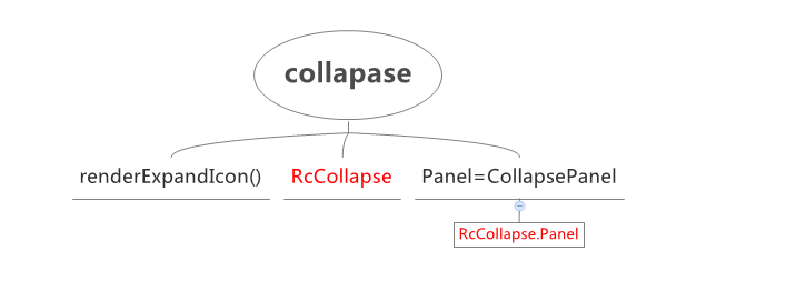
antd组件中有些使用了React 底层基础组件(查看具体列表点这里),collapse就是这种类型的组件
antd中collapse主要源码及组成结构如下,其中红色标注的Rc开头的组件是React底层基础组件
代码目录
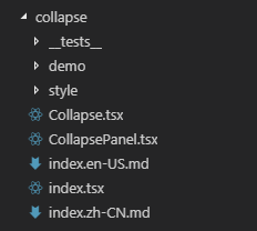
1、组件结构图:
2、antd/components/collapse/collapse.tsx
export default class Collapse extends React.Component<CollapseProps, any> {
  static Panel = CollapsePanel;

  static defaultProps = {
    prefixCls: 'ant-collapse',
    bordered: true,
    openAnimation: { ...animation, appear() { } },
  };

  renderExpandIcon = () => {
    return (
      <Icon type="right" className={`arrow`} />
    );
  }

  render() {
    const { prefixCls, className = '', bordered } = this.props;
    const collapseClassName = classNames({
      [`${prefixCls}-borderless`]: !bordered,
    }, className);
    return (
      <RcCollapse
        {...this.props}
        className={collapseClassName}
        expandIcon={this.renderExpandIcon}
      />
    );
  }
}
3、antd/components/collapse/CollapsePanel.tsx
export default class CollapsePanel extends React.Component<CollapsePanelProps, {}> {
  render() {
    const { prefixCls, className = '', showArrow = true } = this.props;
    const collapsePanelClassName = classNames({
      [`${prefixCls}-no-arrow`]: !showArrow,
    }, className);
    return <RcCollapse.Panel {...this.props} className={collapsePanelClassName} />;
  }
}
二、RcCollapse
由上述Collapse源码不难看出,折叠面板组件的实现逻辑主要在RcCollapse中,下面是核心代码、组件内部属性结构及方法调用关系图
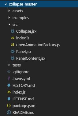
代码目录
1、组件内部属性结构及方法调用关系图

2、组件应用的设计模式
这个组件中主要使用里“聪明组件和傻瓜组件”模式、“组合组件”模式
a、聪明组件和傻瓜组件:
遵循职责分离原则,把获取和管理数据的逻辑放在父组件,作为聪明组件;把渲染界面的逻辑放在子组件,也就是傻瓜组件
聪明组件:Collapse,负责获取和管理数据
-
- getItems(),获取数据,将props中的数据传递给子组件CollapsePanel;
- onClickItem(),管理数据,计算active的值传递给子组件;
傻瓜组件:Panel,只负责渲染;
-
- 根据父组件传入的数据控制渲染逻辑,如active时的渲染效果
b、组合组件:
适用场景:Collapse组件中Collapse是一个容器,包含一个或多个CollapsePanel,可以有一个(手风琴)或多个Panel展开(active),展开的样式不同与未展开
一般实现:每个Panel中传入isActive状态和onclick方法,在Panel内部实现渲染逻辑
缺陷:每个Panel中要写多个props参数
每个Panel中处理onclick的相同逻辑,重复代码,增加Panel成本高
Collapse中控制active逻辑在每次新增Panel时也要修改
组合组件模式:借助React.Children.map或React.cloneElement使列表中多个子组件的公共处理移到父组件中统一处理
Collapse中的实现:Collapse渲染时调用this.getItems(),在this.getItems()中使用React.Children.map配置panel的onItemClick事件和activeKey等其他属性
Panel只在点击事件时调用父组件中定义的onItemClick,没有冗余代码,降低了增加Panel的成本
PS:组件设计模式详细内容可以自行查找相关资料,推荐掘金小册《React 实战:设计模式和最佳实践》,本文部分内容摘自该文
3、rc-collapse/Collapse.jsx
class Collapse extends Component {
  constructor(props) {
    super(props);
    ……this.state = {
      ……
    };
  }

  componentWillReceiveProps(nextProps) {
    ……
  }

  onClickItem(key) {
    ……
  }

  getItems() {
    const activeKey = this.state.activeKey;
    const { prefixCls, accordion, destroyInactivePanel, expandIcon } = this.props;
    const newChildren = [];

    Children.forEach(this.props.children, (child, index) => {
      if (!child) return;
      // If there is no key provide, use the panel order as default key
      const key = child.key || String(index);
      const { header, headerClass, disabled } = child.props;
      let isActive = false;
      if (accordion) {
        isActive = activeKey[0] === key;
      } else {
        isActive = activeKey.indexOf(key) > -1;
      }

      const props = {
        ……
        openAnimation: this.state.openAnimation,
        accordion,
        children: child.props.children,
        onItemClick: disabled ? null : () => this.onClickItem(key),
        expandIcon,
      };

      newChildren.push(React.cloneElement(child, props));
    });

    return newChildren;
  }

  setActiveKey(activeKey) {
    if (!('activeKey' in this.props)) {
      this.setState({ activeKey });
    }
    this.props.onChange(this.props.accordion ? activeKey[0] : activeKey);
  }

  render() {
    const { prefixCls, className, style, accordion } = this.props;
    const collapseClassName = classNames({
      [prefixCls]: true,
      [className]: !!className,
    });
    return (
      <div className={collapseClassName} style={style} role={accordion ? 'tablist' : null}>
        {this.getItems()}
      </div>
    );
  }
}
4、rc-collapse/panel.jsx
class CollapsePanel extends Component {
  handleItemClick = () => {
    if (this.props.onItemClick) {
      this.props.onItemClick();
    }
  }

  handleKeyPress = (e) => {
    if (e.key === 'Enter' || e.keyCode === 13 || e.which === 13) {
      this.handleItemClick();
    }
  }

  render() {
    const {
      ……
    } = this.props;
    const headerCls = classNames(`${prefixCls}-header`, {
      [headerClass]: headerClass,
    });
    const itemCls = classNames({
      [`${prefixCls}-item`]: true,
      [`${prefixCls}-item-active`]: isActive,
      [`${prefixCls}-item-disabled`]: disabled,
    }, className);

    let icon = null;
    if (showArrow && typeof expandIcon === 'function') {
      icon = React.createElement(expandIcon, { ...this.props });
    }
    return (
      <div className={itemCls} style={style} id={id}>
        <div
          className={headerCls}
          onClick={this.handleItemClick}
          role={accordion ? 'tab' : 'button'}
          tabIndex={disabled ? -1 : 0}
          aria-expanded={`${isActive}`}
          onKeyPress={this.handleKeyPress}
        >
          {showArrow && (icon || <i className="arrow" />)}
          {header}
        </div>
        <Animate
          showProp="isActive"
          exclusive
          component=""
          animation={this.props.openAnimation}
        >
          <PanelContent
            prefixCls={prefixCls}
            isActive={isActive}
            destroyInactivePanel={destroyInactivePanel}
            forceRender={forceRender}
            role={accordion ? 'tabpanel' : null}
          >
            {children}
          </PanelContent>
        </Animate>
      </div>
    );
  }
}