弹性盒子布局
弹性盒是一种简单而强大的布局方式,通过弹性盒可以指明空间的额分布方式、内容 的对齐方式和元素的视觉顺序,把不同的组件放置在页面中。内容可以轻易的横向或纵向排布,还可以沿着一个轴布局,或者折断成多行。
突出的特点:能让元素对不同的屏幕尺寸和不同的显示设备做好适应准备
弹性盒依赖父子关系。在元素上声明display:flex或display:inline-flex激活弹性布局,这个元素被称为弹性容器(flex container),负责在所占的空间内布置子元素,控制子元素的布局,其子直接元素称为弹性元素(flex item)
- demo
<div style="display: flex;">
    <div>
      Here is some content.
    </div>
    <div>
      More content than before, but no properties explicitly set.
    </div>
    <div>
      Lots and lots of content. Even more content than to the left, but no properties explicitly set.
    </div>
</div>
在弹性容器中,各元素可以在主轴上排序。主轴可以是横向的,也可以是纵向的,因此可以把元素布置为列或行。
可见格式化模型
盒模型
盒模型描述了元素如何显示,以及(在一定程度上)如何相互作用。页面中的所有元素被当成一个矩形盒子,这个盒子包括元素的content、padding、border和margin。
默认情况下,content即width*height。通过修改box-sizing属性可以改变计算盒子大小的方式。box-sizing的默认值为content-box.
若:box-sizing:border-box;,则盒子的宽高width,height=content+padding+border,此时,外边距不会算在width中。可将将盒子想象成一个包装箱,四壁是border,填充物是padding,中间的才是content,border和padding是为了美化和保护盒子。外边距决定箱子摆放的位置。
浮动
浮动元素会脱离普通文档流,也就是说:后面的盒子在布局上会忽略该浮动元素所占的空间,但是后面的元素中的内容,如文字等,会绕开浮动元素盒子。这就是所谓的环绕。e.g
只要环绕盒子(浮动)的高度分配合适就可以
<style>
    .float-left{
        float: left;
         600px;
        height: 200px;
        background-color: #ccc;
    }
    .content{
        font-family: Consolas;
        font-size: 5rem;
    }
</style>
<div class="float-left"></div>
<div class="content">
    a b c d ds d d d e e g  a s f d fg  fds f fds f sd
    a b c d ds d d d e e g  a s f d fg  fds f fds f sd
</div>
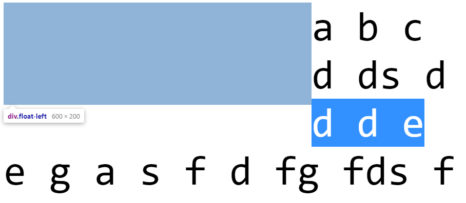
如果需要后面的行盒子不环绕在浮动盒子外面,需要给行盒子使用clear属性。clear:left,right,both,none用于指定盒子的哪一侧不要挨着浮动盒子。清除的元素上方会创造出足够的垂直
格式化上下文
当元素在页面水平或垂直方向排布时,他们之间如何相互影响,CSS有几套不同的规则,其中一个就是格式化上下文,如行内格式化上下文
- 块级格式化上下文:是个规则,块级格式化上下文的元素可以完成如下功能:
规定:页面必须自动包含突出的浮动元素(否则浮动元素的内容可能抛出滚动区域外);所有块级盒子的左边界默认与包含块的左边界对齐(如果文字顺序为从右向左,那么右对齐)
有些规则允许创建自己内部块级格式化上下文,需要具备下面的条件才能使块级格式化上下文包括:
- display为inline-block或table-cell之类的元素,可以为内容创建类似的块级上下文;
- float不是none的元素
- 绝对定位的元素
- overflow不是visible的元素,满足该条件,就会为该元素创建新的跨级格式化上下文。
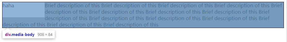
当一个元素具备了触发新块级格式化上下文的条件,并且挨着一个浮动元素时,他就会忽略 自己边界必须基础自己的包含块边界的规则。此时,这个元素会收缩到合适大小;不仅行盒子如此,所有盒子都如此。e.g
<style>
.media-block{
background-color: gray;
border: 1px solid black;
overflow: auto;
}
.media-fig{
float: left;
15%;
height: 50px;
background-color: #ccc;
}
.media-body{
overflow: auto;
}
</style>
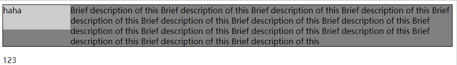
<div class="media-block">
<div class="media-fig">haha</div>
<div class="media-body">
Brief description of this Brief description of this Brief description of this
Brief description of this Brief description of this Brief description of this
Brief description of this Brief description of this Brief description of this
Brief description of this Brief description of this Brief description of this
Brief description of this Brief description of this Brief description of this
</div>
</div>
<p>123</p>

media-body的overflow属性满足要求(块级格式化上下文),此时,左边有个浮动元素,就不需要紧挨着包含块(media-block)元素了。
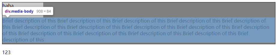
如果media-body的overflow不符合条件,就会变成环绕-- 紧挨着包含块边界、内容自动绕开浮动元素。
如果media-body设置display:inline-block时:
media-block自动包含突出的浮动元素,如果该元素不设置为块级格式化上下文,则:
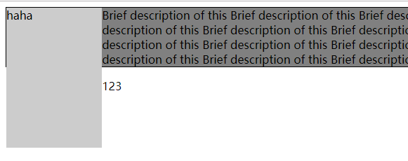
此外,当media-body满足块级格式化上下文后,可以不用设置宽度和浮动,因为他会自动调整去适应浮动元素旁边的剩余空间。这就实现了弹性布局的左侧固定宽度,右侧自适应剩余宽度
<div class="media-block">
    <div class="media-fig">haha</div>
    <div class="media-body">  宽度自适应
        <div style=" 100%; height: 200px; background-color: blue"></div>
        <p>
            Brief description of this Brief description of this Brief description of this
            Brief description of this Brief description of this Brief description of this
            Brief description of this Brief description of this Brief description of this
            Brief description of this Brief description of this Brief description of this
            Brief description of this Brief description of this Brief description of this
        </p>
    </div>
</div>

弹性盒子布局
弹性盒是一种简单而强大的布局方式,通过弹性盒可以指明空间的额分布方式、内容 的对齐方式和元素的视觉顺序,把不同的组件放置在页面中。内容可以轻易的横向或纵向排布,还可以沿着一个轴布局,或者折断成多行。
突出的特点:能让元素对不同的屏幕尺寸和不同的显示设备做好适应准备
弹性盒依赖父子关系。在元素上声明display:flex或display:inline-flex激活弹性布局,这个元素被称为弹性容器(flex container),负责在所占的空间内布置子元素,控制子元素的布局,其子直接元素称为弹性元素(flex item)
- demo
<div style="display: flex;">
    <div>
      Here is some content.
    </div>
    <div>
      More content than before, but no properties explicitly set.
    </div>
    <div>
      Lots and lots of content. Even more content than to the left, but no properties explicitly set.
    </div>
</div>
在弹性容器中,各元素可以在主轴上排序。主轴可以是横向的,也可以是纵向的,因此可以把元素布置为列或行。
盒模型
盒模型描述了元素如何显示,以及(在一定程度上)如何相互作用。页面中的所有元素被当成一个矩形盒子,这个盒子包括元素的content、padding、border和margin。
默认情况下,content即width*height。通过修改box-sizing属性可以改变计算盒子大小的方式。box-sizing的默认值为content-box.
若:box-sizing:border-box;,则盒子的宽高width,height=content+padding+border,此时,外边距不会算在width中。可将将盒子想象成一个包装箱,四壁是border,填充物是padding,中间的才是content,border和padding是为了美化和保护盒子。外边距决定箱子摆放的位置。
浮动
浮动元素会脱离普通文档流,也就是说:后面的盒子在布局上会忽略该浮动元素所占的空间,但是后面的元素中的内容,如文字等,会绕开浮动元素盒子。这就是所谓的环绕。e.g
只要环绕盒子(浮动)的高度分配合适就可以
<style>
    .float-left{
        float: left;
         600px;
        height: 200px;
        background-color: #ccc;
    }
    .content{
        font-family: Consolas;
        font-size: 5rem;
    }
</style>
<div class="float-left"></div>
<div class="content">
    a b c d ds d d d e e g  a s f d fg  fds f fds f sd
    a b c d ds d d d e e g  a s f d fg  fds f fds f sd
</div>
如果需要后面的行盒子不环绕在浮动盒子外面,需要给行盒子使用clear属性。clear:left,right,both,none用于指定盒子的哪一侧不要挨着浮动盒子。清除的元素上方会创造出足够的垂直
格式化上下文
当元素在页面水平或垂直方向排布时,他们之间如何相互影响,CSS有几套不同的规则,其中一个就是格式化上下文,如行内格式化上下文
- 块级格式化上下文:是个规则
规定:页面必须自动包含突出的浮动元素(否则浮动元素的内容可能抛出滚动区域外);所有块级盒子的左边界默认与包含块的左边界对齐(如果文字顺序为从右向左,那么右对齐)
有些规则允许创建自己内部块级格式化上下文,需要具备下面的条件才能使块级格式化上下文包括:
- display为inline-block或table-cell之类的元素,可以为内容创建类似的块级上下文;
- float不是none的元素
- 绝对定位的元素
- overflow不是visible的元素
当一个元素具备了触发新块级格式化上下文的条件,并且挨着一个浮动元素时,他就会忽略 自己边界必须基础自己的包含块边界的规则。此时,这个元素会收缩到合适大小;布局行盒子如此,所有盒子都如此。e.g
<style>
    .media-block{
        background-color: gray;
        border: 1px solid black;
        overflow: auto;
    }
    .media-fig{
        float: left;
         15%;
        height: 50px;
        background-color: #ccc;
    }
    .media-body{
        overflow: auto;
    }
</style>
<div class="media-block">
    <div class="media-fig">haha</div>
    <div class="media-body">
        Brief description of this Brief description of this Brief description of this
        Brief description of this Brief description of this Brief description of this
        Brief description of this Brief description of this Brief description of this
        Brief description of this Brief description of this Brief description of this
        Brief description of this Brief description of this Brief description of this
    </div>
</div>
<p>123</p>
media-body的overflow属性满足要求(块级格式化上下文),此时,左边有个浮动元素,就不需要紧挨着包含块(media-block)元素了。
如果media-body的overflow不符合条件,就会变成环绕-- 紧挨着包含块边界、内容自动绕开浮动元素。
弹性盒子布局
弹性盒是一种简单而强大的布局方式,通过弹性盒可以指明空间的额分布方式、内容 的对齐方式和元素的视觉顺序,把不同的组件放置在页面中。内容可以轻易的横向或纵向排布,还可以沿着一个轴布局,或者折断成多行。
突出的特点:能让元素对不同的屏幕尺寸和不同的显示设备做好适应准备
弹性盒依赖父子关系。在元素上声明display:flex或display:inline-flex激活弹性布局,这个元素被称为弹性容器(flex container),负责在所占的空间内布置子元素,控制子元素的布局,其子直接元素称为弹性元素(flex item)
- demo
<div style="display: flex;">
    <div>
      Here is some content.
    </div>
    <div>
      More content than before, but no properties explicitly set.
    </div>
    <div>
      Lots and lots of content. Even more content than to the left, but no properties explicitly set.
    </div>
</div>
在弹性容器中,各元素可以在主轴上排序。主轴可以是横向的,也可以是纵向的,因此可以把元素布置为列或行。