/*这是HTML*/
<!DOCTYPE html>
<html>

    <head>
        <meta charset="utf-8" />
        <title>main</title>
        <link rel="stylesheet" href="css/header.css" />
        <link rel="stylesheet" href="css/aside.css" />

    </head>

    <body>
        <div id="container">
            <div class="header" id="header">
                <div class="header_part1">
                    <div class="w3c_logo">w3schools.com</div>
                    <div class="dotcom">THE WORLD'S LARGEST WEB DEVELOPER SITE</div>
                </div>
                <div class="header_part2">
                    <ul class="nav_1">
                        <li>HTML</li>
                        <li>CSS</li>
                        <li>JAVASCRIPT</li>
                        <li>SQL</li>
                        <li>PHP</li>
                        <li>BOOTSTRAP</li>
                        <li>HOWTO</li>
                        <li>JQUERY</li>
                        <li>W3.CSS</li>
                        <li>PYTHON</li>
                        <li>MORE</li>
                    </ul>
                    <ul class="nav_2">
                        <li>REFEPENCES▼</li>
                        <li>EXAMPLES▼</li>
                    </ul>
                </div>
            </div>
            <div class="aside">
                <nav class="aside_nav">
                    <h3 class="left"><span class="left_h2">CSS</span> Responsive</h2>
                    <a target="_top" href="css_rwd_intro.asp">RWD Intro</a>
                    <a target="_top" href="css_rwd_viewport.asp">RWD Viewport</a>
                    <a target="_top" href="css_rwd_grid.asp">RWD Grid View</a>
                    <a target="_top" href="css_rwd_mediaqueries.asp">RWD Media Queries</a>
                    <a target="_top" href="css_rwd_images.asp">RWD Images</a>
                    <a target="_top" href="css_rwd_videos.asp">RWD Videos</a>
                    <a target="_top" href="css_rwd_frameworks.asp">RWD Frameworks</a>
                    <a target="_top" href="css_rwd_templates.asp">RWD Templates</a>
                    <br>
                    <h3 class="left"><span class="left_h2">CSS</span> Grid</h2>
                    <a target="_top" href="css_grid.asp">Grid Intro</a>
                    <a target="_top" href="css_grid_container.asp">Grid Container</a>
                    <a target="_top" href="css_grid_item.asp">Grid Item</a>
                    <br>
                    <h3 class="left"><span class="left_h2">CSS</span> Examples</h2>
                    <a target="_top" href="css_templates.asp">CSS Templates</a>
                    <a target="_top" href="css_examples.asp">CSS Examples</a>
                    <a target="_top" href="css_quiz.asp">CSS Quiz</a>
                    <a target="_top" href="css_exercises.asp">CSS Exercises</a>
                    <a target="_top" href="css_exam.asp">CSS Certificate</a>
                    <br>
                    <h3 class="left"><span class="left_h2">CSS</span> References</h2>
                    <a target="_top" href="/cssref/default.asp">CSS Reference</a>
                    <a target="_top" href="/cssref/css_selectors.asp">CSS Selectors</a>
                    <a target="_top" href="/cssref/css_functions.asp">CSS Functions</a>
                    <a target="_top" href="/cssref/css_ref_aural.asp">CSS Reference Aural</a>
                    <a target="_top" href="/cssref/css_websafe_fonts.asp">CSS Web Safe Fonts</a>
                    <a target="_top" href="/cssref/css_animatable.asp">CSS Animatable</a>
                    <a target="_top" href="/cssref/css_units.asp">CSS Units</a>
                    <a target="_top" href="/cssref/css_pxtoemconversion.asp">CSS PX-EM Converter</a>
                    <a target="_top" href="/cssref/css_colors.asp">CSS Colors</a>
                    <a target="_top" href="/cssref/css_colors_legal.asp">CSS Color Values</a>
                    <a target="_top" href="/cssref/css_default_values.asp">CSS Default Values</a>
                    <a target="_top" href="/cssref/css3_browsersupport.asp">CSS Browser Support</a>
                </nav>
            </div>
            <div class="adv">
              <a href="#header">
                  <img src="img/arc-every8minutes-webstatic-160x600-resize-3HqE6._V504641250_.jpg" />
              </a>
            </div>
            <div class="main_content">
<p style="text-indent: 2em; font-family: '微软雅黑';"> CSS 中的百分比的应用
阅读 643
收藏 30
2017-05-31
原文链接:blog.5udou.cn
前言
百分比的应用随处可见,但是就一直没有机会去好好总结一下,如今项目中遇到的坑都是当年留的泪,在月底之前终于把这个好久想总结的文章给写完了。

1、使用百分比的场合
在目前项目中,最常用百分比的莫过于width和height。其他可以用到百分比的样式包括:border-radius,background-position,font-size,line-height,vertical-align,bottom、left、right、top,transform: translate等。如果上面列举的所有属性你都能够轻松地说出它们的百分比含义,那么估计这篇文章就不大适合你了。

接下去我们使用JsFiddle上面的demo来逐个说说这些样式的百分比

2、罗列常用的百分比
2.1、width和height
这个最常用也是最简单的了,它们的百分比计算是基于包裹它的父元素的宽和高来计算,比如:


其盒子模型如图所示:


有一种特殊情况是,父元素没有明确的高度定义,并且子元素使用百分比并且不是绝对定位,那么这时候的百分比等同于auto。

于是我们有如下的demo:


可以看到父元素的高度是子元素撑起来的,然后子元素的高度不再按照百分比来计算,而是使用了auto值。

另外如果子元素是绝对定位的又会如何?再看下面的demo:


那么留给大家一个问题: 此时为什么cube的这个块元素的高度计算成了101.89?

2.2、margin和padding
这两个属性的百分比就比较有意思了,也是我们经常用错的两个。在CSS盒子模型规范明确提出了其百分比的含义:

The percentage is calculated with respect to the width of the generated box's containing block. Note that this is true for 'margin-top' and 'margin-bottom' as well. If the containing block's width depends on this element, then the resulting layout is undefined in CSS 2.1.

padding的解释也是类似。

上面的意思可以总结出三点:

百分比的计算是基于其包含块的宽度
百分比的计算规则适用于margin和padding的四个方向
如果包含块的宽度取决于该元素,那么百分比的使用结果是未定义的。
同样以上面的demo为例子,可以看到cube元素的margin计算得到:

6px 18px 6px 18px

padding同理计算得到0px 12px 0px 12px

这时定有童鞋会疑惑,为什么CSS规范的制定者会选择使用包含块的宽度来作为参考值,而不是高度?

其实在上面总结的三点中已经有所涉及的了,在我们平时的样式布局中,元素的高度取决于子元素的高度,如果子元素的margin或者padding的百分比又依赖于包含块的高度,那么二者互相依赖,就永远无法得到一个稳定的值,陷入了一种死循环,因此也许是基于这个考虑,CSS的规范中才会提到上面要点的第三点。以上纯属自己的猜测,仅供参考。

2.3、border-radius
根据MDN-border-radius的百分比介绍:

横轴上的百分比参考的是元素自身的宽度,纵轴上的百分比参考的是元素自身的高度,负值是无效的

border-radius的百分比参考值是自身的尺寸,于是你可以经常使用百分比来画出一个圆形来:


从上面的例子可以看出border-radius的作用顺序是从top-left开始顺时针依序到bottom-left,缩写规则和margin一样

  </p>
 <p style="text-indent: 2em;">


那么如何理解MDN的那一句话呢?

2.4、background-position
background-position这个属性允许你在它的包含块中随意移动背景图片(或者渐变),默认值是0 0,这个时候的图片是放在左上角的位置,如下demo:


如果使用百分比,那么百分比的计算应该是这样的,假设一个容器的长宽为300X200,图片是150X150,那么当设置background-position: 20% 100%,那么图片新的位置应该是(以左上角为例):

(0, 0) => ((400 - 150) * 20%, (200 - 150) * 100%)
也就是移动的结果是(父元素-背景图片)*百分比,这样的设计很符合我们平时排版的思路。

2.5、font-size
这个属性的百分比参考值是它的父元素的font-size,没有太多的信息,是比较纯粹的一个百分比。

2.6、line-height
line-height这个属性的百分比参考的是自身的font-size大小,更多line-height的信息可以参考line-height

2.7、vertical-align
vertical-align顾名思义是纵向对齐,其参考值是自身的line-height,这三个属性合起来有一个demo可以看看效果:


2.8、bottom、left、right、top
定位使用的四个方向值,如果使用百分比的话,参考的是元素包含块的尺寸,这个时候不同于margin或padding,left和right是参照包含块的宽度,bottom和top是参照包含块的高度,我们可以通过下面的demo来看看效果:


2.9、transform: translate
在水平或者垂直居中的应用场景中,我最常使用的便是这个平移变换了,轻轻松松的-50%就可以让块元素居中,那么这个百分之50%基于的是什么样的参考值呢?答案便是其自身元素的宽度或者高度,这里的宽度和高度是否包含了padding和border呢?我们使用下面的demo来说说:


所以通过这个实例,我们清楚其参考的应该是border-box的尺寸

Tips

请注意,当百分比值用于可继承属性时,只有结合参照值计算后的绝对值会被继承,而不是百分比值本身

        </p>
            </div>
            <div class="footer" style="border-top: 1px solid gainsboro;">

                 <p style="text-align: center; font-size: 15px; margin-top: 100px;">电话:13094587757</p>
                 <p style="text-align: center; font-size: 15px;">邮箱:2393790565@qq.com</p>
                 <address style="text-align: center; font-size: 15px;">地址:翻斗大街一号胡图图</address>
            </div>
        </div>
    </body>

</html>
/*CSS*/
* {
margin: 0px;
padding: 0px;
list-style: none;
text-decoration: none;
}
#container{
display: grid;
grid-template-areas:"header header header"
"aside main adv"
"aside footer footer";
grid-template-columns:1fr 6fr 1fr;
grid-template-rows:138px 1fr 205px;
grid-gap:20px;
min-height: 100vh; /*这个单位:相对于视口的高度。视口被均分为100单位的vh*/
}
#container>.header{
grid-area:header;
overflow: hidden;
}
#container>.aside{
grid-area:aside;
}
#container>.adv{
grid-area:adv;
}
#container>.main_content{
grid-area:main;
}
#container>.footer{
grid-area:footer;
}
.header>.header_part1{
display: flex;
flex-direction: row;
justify-content: space-between;
height: 88px;
}
.header>.header_part1>.w3c_logo{
color: #4CAF50;
font-family: arial;
font-size: 37px;
letter-spacing: 3px;
float: left;
padding-left:30px;
padding-top:25px;
overflow: hidden;
}
.header>.header_part1>.dotcom{
float: right;
padding-right:30px;
padding-top:45px;
overflow: hidden;
letter-spacing: 4px;
word-spacing: 8px;
}
.header>.header_part2{
display: flex;
flex-direction: row;
justify-content: space-between;
height: 44px;
color: white;
background-color: gray;
}
.header>.header_part2>.nav_1{
float: left;
}
.header>.header_part2>.nav_2{
float:right;
}
.header>.header_part2>ul>li{
float: left;
line-height: 44px;
padding: 0px 15px;
}
.header>.header_part2>ul>li:hover{
background: black;
}
.aside{
overflow-y: scroll;
overflow-x: visible;
position: sticky;
top: 44px;
height: 675px;
border: 1px solid gainsboro;
background: #f1f1f1 !important;
}
.aside_nav{
}
.aside_nav>h3{
text-align: center;
}
.aside_nav>a{
display: block;
padding: 3px;
text-align: center;
line-height: 1.5;
font-size: 15px;
color: #000000;
}
.aside_nav>a:hover{
background: #cdcdcd;
}
以上由三个文件组成: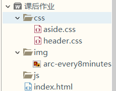
效果图:
布局: