咖啡店案例效果图
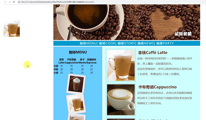
(一)页面的布局
1. 最上方的header:右下角是四个小图标,像图层一样附加在当前的header部分上。
2. 超链接构成的导航栏,鼠标悬浮的时候字体颜色发生变化。
3. 主体分为左右两栏:边栏 和右侧的主要内容。边栏有一个table ,table下方是图片(圆角阴影),还有倾斜的效果。右侧主体分为四个子区域,每个区域都有左侧的图片和右侧的文字构成,右侧的文字又有标题和正文内容。
4. footer部分。
5. 左侧有一个“广告”部分,fixed定位。
----------------------------
先创建一个站点文件夹,里面创建images, css文件夹。我们采用link来引用css样式。
HTML基本结构为
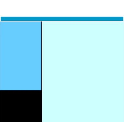
<div id="container">
    <div id="header"></div>
    <div id="nav"></div>
    <div id="main">
        <div id="aside"></div>
        <div id="content"></div>
    </div>
    <div id="footer"></div>
</div>
先简单定义上述几个元素的样式
*{
    margin: 0;
    padding: 0;
}
body {
    font-family:"微软雅黑";
    font-size:16px;
    color: #673929; /*深棕色*/
}
#container {
    margin:0 auto;  /*水平居中*/
    width:900px;
}
#header {
    height:220px;
}
#nav{
    height:30px;
    margin-bottom:5px;
    background:#09c;
    font: 18px/30px 微软雅黑;
    color: #fff;
    letter-spacing: 2px;
    text-align: center;
}
#main{
    background:#000; /*黑色*/
    height:2050px;/* 需要之后根据内容计算,内容有了这个高度就不需要写了*/
}
#aside {
    float:left;
    width:300px;
    background:#6cf;
    text-align: center;
    font-size: 14px;
    color: #000;
}
#content{
    float:right;
    width:595px;
    margin-bottom:5px;
    background:#cff;
}
#footer {
    height:60px;
    line-height: 60px;
    background:#6cf;
    clear:both; /*保证位置最底部*/
    text-align: center;
}
效果如下:上述header没有设置背景色,是白的。
(二)改进1
在原有的HTML结构增加header 的图片,nav的5个超链接
    <div id="header">
        <img src="images/banner.jpg" alt="" />
    </div>
    <div id="nav">
        <a href="#">menu</a>
        <a href="#">party</a>
        <a href="#">join us</a>
        <a href="#">more</a>
        <a href="#">help</a>
    </div>
在CSS也要增加超链接的一些样式, 放在原来的#nav后面。
a:link{
    color: #fff; /*白色*/
    text-decoration: none;
}
a:visited{
    color: #fff;
    text-decoration: none;
}
a:hover{
    color: yellow; /*鼠标悬停时变黄色*/
    text-decoration: none;
}
a:active{
    color: #fff;
    text-decoration: none;
}
上述的a 的四种状态都是不添加下划线的,可以简化代码
a{
    text-decoration: none;
}
a:link{
    color: #fff; /*白色*/
}
a:visited{
    color: #fff;
}
a:hover{
    color: yellow; /*鼠标悬停时变黄色*/
}
a:active{
    color: #fff;
}
但是万一别的地方的超链接想要有下划线,这种方法不可行。最好用嵌套 #nav a{ text-decoration:none;}
预览效果发现 nav的文字没有居中显示,在#nav样式中增加 line-height:30 px , 与 其height一致就行了。
(三)改进2
在content 下面有四行,每一行的左侧是图片,右侧是文字。文字部分又分为标题和内容。
在sublime 中可以输入 .subcont*4>img+ .subtext> h2+p 进行拓展。
        <div class="subcont">
            <img src="images/Latte.jpg" alt="">
            <div class="subtext">
                <h2>拿铁Caffè Latte</h2>
                <p>这是一种传统的经典饮料——浓缩咖啡调入热牛奶,其上覆盖一层轻盈的奶沫。
<br>品尝此款咖啡时,您可以选择特别加入某种口味(如香草,焦糖或杏仁口味)的糖浆。</p>
            </div>
        </div>
这样输入四次,把四行内容都添加上。
上述CSS的补充如下
.subcont{
    width: 570px;
    margin: 10px auto;
    clear: both;
}
.subcont img{
    margin: 5px;
    padding: 5px;
    float: left;
    border: 1px dashed #000; /*黑色虚线*/
}
.subcont .subtext{
    width: 60%;
    float: left;
    margin: 5px;
}
.subcont h2{
    margin: 5px;
}
.subcont p{
    font:16px/2em 微软雅黑;  /*2倍行 高*/
}
content的内容都有了,那么可以把CSS样式中#content{} 的height去掉了。进一步,也可以把main{}的height去掉。
(四)改进3
现在在header部分的右下角增加一个图片的列表,需用用到层定位。
在HTML的header部分增加一个icon-list , 添加四张图片。
<div id="icon-list">
         <img src="images/1.bmp">
         <img src="images/2.bmp">
         <img src="images/3.bmp">
         <img src="images/4.bmp">
</div>
预览效果发现四个小图片由于没有了位置,位置在header下方了,如何使用层定位改变?
(1)在CSS样式中,#header增加 position :relative;
(2)增加子元素#icon-list 的样式
#icon-list{
    position:absolute;/*子层定位*/
    top:170px; /*距离父元素上方170px*/
    right: 30px;
    width: 130px;
    height: 30px;
    font-size: 0px; /*去掉图片直接默认的空隙*/
}
#icon-list img{
    margin-left:5px;
}
接下来,在窗口的左侧添加一个图片作为“广告”
这个固定定位与main 无关,可以放在HTML的外面,结构中增加
<div id="l-fix">
      <img src="images/Latte.jpg">
</div>
设置这一部分的样式
#l-fix{
    position: fixed;
    top:100px;
    left:5px;
}
(五)改变4
1. 在aside中添加照片墙。
四张照片放在圆角边框里,还有阴影的效果。每个图片的倾斜程度不同。
在aside下面增加 imglist, 里面加入四个照片。每个照片放在div中,因为要设置圆角的边框等效果。四个照片有共同的样式 pol , 也有不同的样式,rotate-left,rotate-right.

CSS中增加样式
#imglist{
    width: 130px;
    margin: 0 auto;
}
.pol
{
    width:85px;
    padding: 10px;
    background-color: #eee;
    border:1px solid #BFBFBF;
    box-shadow:2px 2px 4px #aaa; /*盒子阴影*/
    border-radius: 5px; /*圆角边框*/
}

.rotate_left
{
    -ms-transform:rotate(7deg); /* IE 9 */
    -moz-transform:rotate(7deg); /* Firefox */
    -webkit-transform:rotate(7deg); /* Safari and Chrome */
    -o-transform:rotate(7deg); /* Opera */
    transform:rotate(7deg);  /*顺时针效果*/
}

.rotate_right
{
    -ms-transform:rotate(-8deg); /* IE 9 */
    -moz-transform:rotate(-8deg); /* Firefox */
    -webkit-transform:rotate(-8deg); /* Safari and Chrome */
    -o-transform:rotate(-8deg); /* Opera */
    transform:rotate(-8deg);
}
#imglist img{
    height: 95px;
    width: 85px;
    margin: 0 auto;
    font-size: 0;
}
#imglist img:hover{
    -webkit-transform: scale(1.2);
    -moz-transform: scale(1.2);
    -ms-transform: scale(1.2);
    -o-transform: scale(1.2);
    transform: scale(1.2);
}
还有table 的HTML为
<h2>MENU</h2>
        <table >
          <tr>
              <th ></th>
            <th >Latte</th>
            <th >Cappuccino</th>
            <th >Mocha</th>
            <th >Espresso</th>
          </tr>
          <tr>
            <th scope="row"  >LARGE</th>
            <td>35</td>
            <td>35</td>
            <td>35</td>
            <td>30</td>
          </tr>
          <tr>
            <th scope="row"  >MEDIUM</th>
            <td>30</td>
            <td>30</td>
            <td>30</td>
            <td >25</td>
          </tr>
          <tr>
            <th scope="row"  >SMALL</th>
            <td>25</td>
            <td>25</td>
            <td>25</td>
            <td>20</td>
          </tr>
        </table>
这里的table没有特别的CSS样式。
Scope属性同时定义了行的表头和列的表头:
col: 列表头
row: 行表头