这里是有助于我们复习用的想要了解详情可以查看菜鸟教程
1.选择器
p.center{text-align:center;}:所有p元素的class="center"元素
属性选择器:[title=runoob]:[属性=值];[title~=]:属性多选
first-child 伪类来选择元素的第一个子元素
:lang 伪类使你有能力为不同的语言定义特殊的规则
相邻选择器:
div p:后台选择器;
div>p:子代选择器;
div+p:相邻兄弟选择器;
div~p:普通相邻选择器;
伪类选择器:a:link
a.red
p:first-child
q:lang(no)
:first-line文本首行设置样式
:first-letter首字符
":before" 伪元素可以在元素的内容前面插入新内容
":after" 伪元素可以在元素的内容之后插入新内容。
list-style-type:none;这是无须列表的
display:inline block
更多的::checked;disabled;empty;:first-line:link:visited;hover;focus;:first-letter;first-line;:before;first-child;:lang(language)
box-shadow:可以设置div的阴影;
对链接的样式设置:
a:link - 正常,未访问过的链接;a:visited - 用户已访问过的链接;a:hover - 当用户鼠标放在链接上时;a:active - 链接被点击的那一刻
列表:
可以设置ul ol 样式通过list-style-type:例如
ul.b {list-style-type: square;} ol.c {list-style-type: upper-roman;}
2.背景色
backgroup-color;backgroup-image;backgroup-repeat;backgroup-attachment;backgroup-position
3.修饰文本
text-align;text-decoration 属性用来设置或删除文本的装饰;text-transform://文本转换;text-index://文本缩进
可用em来控制字体的大小:px/16=em 通常情况是16px;
所有浏览器默认字体大小100%;
4.表格设置:
border-collapse :折叠边框;border:设置边框的td{text-align= right};
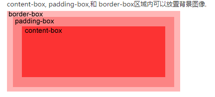
盒子模型:content->padding->border->margin->outline(轮廓)
5.设置边框:
border-style;border-width;border-bottom;border-left;border-right
6.设置轮廓:
outline-color;outline-style;outline-width
7.分组选择器:
h1,h2,p
{
color:green;
}
尺寸:height,line-height;max-height;max-height;min-height;width
8.响应式相册


<!DOCTYPE html>
<html>
<head>
<meta charset="utf-8">
<title>菜鸟教程(runoob.com)</title>
<style>
div.img {
    border: 1px solid #ccc;
}

div.img:hover {
    border: 1px solid #777;
}

div.img img {
    width: 100%;
    height: auto;
}

div.desc {
    padding: 15px;
    text-align: center;
}

* {
    box-sizing: border-box;
}

.responsive {
    padding: 0 6px;
    float: left;
    width: 24.99999%;
}

@media only screen and (max- 700px){
    .responsive {
        width: 49.99999%;
        margin: 6px 0;
    }
}

@media only screen and (max- 500px){
    .responsive {
        width: 100%;
    }
}

.clearfix:after {
    content: "";
    display: table;
    clear: both;
}
</style>
</head>
<body>

<h2 style="text-align:center">响应式图片相册</h2>

<div class="responsive">
  <div class="img">
    <a target="_blank" href="img_fjords.jpg">
      <img src="http://www.runoob.com/wp-content/uploads/2016/04/img_fjords.jpg" alt="Trolltunga Norway" width="300" height="200">
    </a>
    <div class="desc">Add a description of the image here</div>
  </div>
</div>


<div class="responsive">
  <div class="img">
    <a target="_blank" href="img_forest.jpg">
      <img src="http://www.runoob.com/wp-content/uploads/2016/04/img_forest.jpg" alt="Forest" width="600" height="400">
    </a>
    <div class="desc">Add a description of the image here</div>
  </div>
</div>

<div class="responsive">
  <div class="img">
    <a target="_blank" href="img_lights.jpg">
      <img src="http://www.runoob.com/wp-content/uploads/2016/04/img_lights.jpg" alt="Northern Lights" width="600" height="400">
    </a>
    <div class="desc">Add a description of the image here</div>
  </div>
</div>

<div class="responsive">
  <div class="img">
    <a target="_blank" href="img_mountains.jpg">
      <img src="http://www.runoob.com/wp-content/uploads/2016/04/img_mountains.jpg" alt="Mountains" width="600" height="400">
    </a>
    <div class="desc">Add a description of the image here</div>
  </div>
</div>

<div class="clearfix"></div>

<div style="padding:6px;">

  <h4>重置浏览器大小查看效果</h4>
</div>

</body>
</html>
9.图像设置:
opacity://设置透明度
filter:alpha(opacity=40); /* IE8 及其更早版本 */
10.@media 规则:不同的媒体可以设置不同的样式
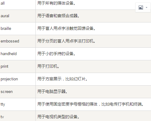
<style> @media screen { p.test {font-family:verdana,sans-serif;font-size:14px;} }
@media print { p.test {font-family:times,serif;font-size:10px;} }
@media screen,print { p.test {font-weight:bold;} }
</style>
-------------------------------------------------CSS3-----------------------------------------------------------------------------------------------------
1.CSS3边框:
border-radius://可设圆角了:border-radius=25px;
border-image://设图标
box-shadow://盒子的阴影
border-image: /*IE*/
-webkit-border-image: /* Safari 5 and older */
-o-border-image: /* Opera */
backgroup-image:可以放多个图片了然后通过backgroup-position来设置位置
例子: background-image: url(img_flwr.gif), url(paper.gif);
background-position: right bottom, left top;//设置多个背景后位置要从新弄下了
background-repeat: no-repeat, repeat;
background-size:
background-origin:content-box//指定了背景图像的位置信息
background-clip://背景剪裁保留制定的位置
2.渐变:
linear-gradient(dir,color1,color2...)
radial-gradient(center, shape size, start-color, ..., last-color)
3.文本效果
text-shadow;box-shadow;text-overflow;word-wrap;word-break;
<style>
@font-face:这个可以字体文件直接放在一个位置用的时候再加载就好了 { font-family: myFirstFont; src: url(sansation_light.woff); } div { font-family:myFirstFont; } </style>
4.CSS3 转换
有两个属性:transform:设置转换方式的;transform-origin:设置转换位置
transform:
-ms-transform:
-webkit-transform:
translate(x,y);//移动
translate3d(x,y,z);//3d移动
rotate(angle);//旋转的角度
rotate3d(x,y,z,angle)
scale(x,y);//元素增大增小
scale3d(x,y,z)
skew(x,y);//元素x,y倾斜
matrix(n,n,n,n,n,n)//对旋转,缩放,移动,倾斜的一次设置
transform-origin:设置转换对象的那个位置
5.CSS3 过渡
transition:设置过渡
CSS3 动画
@keyframes规则可以创建动画
使用方式:①创建一个@keyframes规则
@keyframes first
{
from{backgrounp:red;}
to{backgrounp:yellow}
}
②使用这个规则
animation:first 5s;
具体到细节:
animation-name;animation-durition;animation-time-funtion;animation-delay;
animation-iteration-count;animation-direction;animation-play-state;
4.CSS3 多列
对多个文字进行设计
| column-count | 4.0 -webkit- | 10.0 | 2.0 -moz- | 3.1 -webkit- | 15.0 -webkit- 11.1 |
| column-gap | 4.0 -webkit- | 10.0 | 2.0 -moz- | 3.1 -webkit- | 15.0 -webkit- 11.1 |
| column-rule | 4.0 -webkit- | 10.0 | 2.0 -moz- | 3.1 -webkit- | 15.0 -webkit- 11.1 |
| column-rule-color | 4.0 -webkit- | 10.0 | 2.0 -moz- | 3.1 -webkit- | 15.0 -webkit 11.1 |
| column-rule-style | 4.0 -webkit- | 10.0 | 2.0 -moz- | 3.1 -webkit- | 15.0 -webkit 11.1 |
| column-rule-width | 4.0 -webkit- | 10.0 | 2.0 -moz- | 3.1 -webkit- | 15.0 -webkit 11.1 |
| column-width |
outline-offset :外形设置
outline:2px solid red
cutline-offset:15px//与border 的距离
5.CSS 图片
圆角:border-radius
缩略图:用border这个属性就好了
定位图片中的文本位置:通过定位属性relation,absolit属性结合使用
图片滤镜:filter:grayscale(100%);还有很多种类
6.CSS 按钮
7.CSS 分页
8.CSS3 弹性盒子(Flex Box)
就跟微信小程序开发模式是一样的用的也是Flex Box
css3也有多媒体查询@media