使用echarts
npm install echarts --save || cnpm install echarts --save
定义wkCharts.vue
<template>
  <div :class="className"
       :style="{height:height,width}" />
</template>

<script>
import echarts from "echarts"

export default {
  props: {
    // class 为 当前图表的唯一标识
    className: {
      type: String,
      default: "chart"
    },
     {
      type: String,
      default: "100%"
    },
    height: {
      type: String,
      default: "350px"
    },
    // option 为图表数据 包括呈现的方式 数据
    optionData: {}
  },
  data() {
    return {
      chart: null,
      getData: {
        tooltip: {
          trigger: 'axis',
          axisPointer: {
            type: 'cross',
            crossStyle: {
              color: '#000'
            }
          }
        },
        grid: {
          left: '2%',
          right: '2%',
          bottom: '3%',
          top: '10%',
          containLabel: true
        },
        legend: {},
        xAxis: [
          {
            type: 'category',
            data: ['1月', '2月', '3月', '4月', '5月', '6月', '7月', '8月', '9月', '10月', '11月', '12月'],
            axisPointer: {
              type: 'shadow'
            }
          }
        ],
        yAxis: [
          {
            type: 'value',
            name: ' ',
            min: 0,
            axisLabel: {
                formatter: '{value} '
            }
          },
        ],
        series: []
      }
    }
  },
  // 监听数据变化 进行试试刷新
  watch: {
    optionData (n) {
      if (n) {
        this.$nextTick(() => {
          this.chart.setOption(this.optionData, true) //设置为true时不会合并数据,而是重新刷新数据
        })
      }
    }
  },
  mounted() {
    // 防止未加载完毕 报错
    this.$nextTick(() => {
      this.chart = echarts.init(this.$el, "macarons")
      this.chart.setOption(this.getData)
    });
  },
  // 关闭 及 删除图表
  beforeDestroy() {
    if (!this.chart) {
      return;
    }
    this.chart.dispose();
    this.chart = null;
  },
  methods: {
  }
};
</script>
页面内使用
<template>
  <div class="contentr">
    <wkCharts className="echary" :optionData="option" ref="echary"></wkCharts>
  </div>
</template>

<script>
import wkChart from '@/components/wkCharts'

export default {
  name: "dataEcharts",
  data() {
    return {
      option: {}
    }
  },
  components: {
    wkCharts
  },
  created () {
  },
  async mounted() {
let dataName = ['数量', '占比', '同比', '环比']
let option = JSON.parse(JSON.stringify(this.$refs.echary.getData))
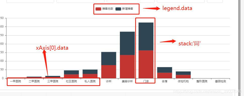
option.legend.data = dataName
option.grid.top = '15%'
option.xAxis[0].data = ['一甲医院', '二甲医院', '三甲医院', '社区医院', '私人医院', '诊所', '美容诊所', '门店', '名宿', '体检机构', '整形医院', '基因检测']
let series = []
dataName.map(res => {
if (res !== '数量') {
series.push({name: res, type: 'line', data: [2.0, 4.9, 7.0, 23.2, 25.6, 76.7, 135.6, 162.2, 32.6, 20.0]})
} else {
series.push({name: res, type: 'bar', data: [2.0, 4.9, 7.0, 23.2, 25.6, 76.7, 135.6, 162.2, 32.6, 20.0]})
}
})
option.series = series
this.option = JSON.parse(JSON.stringify(option))
   // 示例数据
   let optionData = {
      tooltip: {
        trigger: 'axis',
        axisPointer: {
          type: 'cross',
          crossStyle: {
              color: '#999'
          }
        }
      },
    // 工具栏
      toolbox: {
        feature: {
          // 显示表格数据
          dataView: {show: true, readOnly: false},
         // 切换为 k线图 或柱形图
          magicType: {show: true, type: ['line', 'bar']},
      // 刷新
          restore: {show: true},
          // 保存为本地图片
          saveAsImage: {show: true}
        }
      },
      // 说明 数据与 series 的name值对应 才会显示
      legend: {
        data: ['蒸发量', '降水量', '温度', '光照', '平均温度']
      },
      xAxis: [
       // 设置x轴底部显示的标题数据 及样式
        {
          type: 'category',
          data: ['1月', '2月', '3月', '4月', '5月', '6月', '7月', '8月', '9月', '10月'],
          axisPointer: {
              type: 'shadow'
          },
          axisLine: {
            lineStyle: {
              color: 'red'
            }
          }
        }
      ],
      yAxis: [
       // 显示样式设置  此处显示两个 y轴  看个人需求 是一个就写一个
        {
          type: 'value',
          name: '水量',
          min: 0,
          max: 250,
          interval: 50,
          axisLabel: {
              formatter: '{value} ml'
          },
          axisLine: {
            lineStyle: {
              color: 'red'
            }
          }
        },
        {
          type: 'value',
          name: '温度',
          min: 0,
          max: 25,
          interval: 5,
          axisLabel: {
              formatter: '{value} °C'
          },
          axisLine: {
            lineStyle: {
              color: 'blue'
            }
          }
        }
      ],
      series: [
          // bar 为柱形图 一个隔断 分为四个柱形  外加一个line K线图  数据全放在series
          {
            name: '蒸发量',
            type: 'bar',
            stack: '同', // 相同名称 数据出现在同一根柱形图上 呈现方式为上下呈现
            data: [2.0, 4.9, 7.0, 23.2, 25.6, 76.7, 135.6, 162.2, 32.6, 20.0],
            color: 'red',
            itemStyle: {
              normal: {
                                label: {
                                    show: false, //开启显示数据图上的数值
                                    position: 'top', //在上方显示
                                    textStyle: { //数值样式
                                        color: 'red',
                                        fontSize: 12
                                    }
                                }
                            }
            }
          },
          {
            name: '降雨量',
            type: 'bar',
            data: [2.6, 5.9, 9.0, 26.4, 28.7, 70.7, 175.6, 182.2, 48.7, 18.8],
            color: 'pink',
            itemStyle: {
              normal: {
                                label: {
                                    show: false, //开启显示数据图上的数值
                                    position: 'top', //在上方显示
                                    textStyle: { //数值样式
                                        color: 'pink',
                                        fontSize: 12
                                    }
                                }
                            }
            }
          },
          {
            name: '温度',
            type: 'bar',
            data: [2.6, 2.9, 1.0,26.4, 28.7, 70.7, 15.6, 12.2, 2.7, 38.8],
            color: 'blue',
            itemStyle: {
              normal: {
                                label: {
                                    show: false, //开启显示数据图上的数值
                                    position: 'top', //在上方显示
                                    textStyle: { //数值样式
                                        color: 'blue',
                                        fontSize: 12
                                    }
                                }
                            }
            }
          },
          {
            name: '光照',
            type: 'bar',
            data: [2.6, 5.9, 9.0, 26.4, 28.7, 20.7, 11.6, 112.2, 48.7, 18.8],
            itemStyle: {
              normal: {
                                label: {
                                    show: false, //开启显示数据图上的数值
                                    position: 'top', //在上方显示
                                    textStyle: { //数值样式
                                        color: 'black',
                                        fontSize: 12
                                    }
                                }
                            }
            }
          },
          {
            name: '平均温度',
            type: 'line',
            yAxisIndex: 0,
            data: [2.0, 2.2, 3.3, 4.5, 6.3, 10.2, 20.3, 23.4, 23.0, 16.5, 12.0, 10],
            color: 'rgb(64, 158, 255)',
            itemStyle: {
              normal: {
                                label: {
                                    show: false, //开启显示数据图上文字
                                    position: 'top', //在上方显示
                                    textStyle: { //数值样式
                                        color: 'rgb(64, 158, 255)',
                                        fontSize: 12
                                    }
                                }
                            }
            }
          }
      ]
    }
  },
  methods: {
  }
}
</script>

<style lang="scss" scoped>
</style>
简单做个记录 官方文档:https://echarts.apache.org/examples/zh/index.html