1.一排中有好几个div 让它一个一个依次淡淡的出现:
<script src="https://cdn.staticfile.org/jquery/1.10.2/jquery.min.js"></script>
<script>
$(document).ready(function(){
  $("button").click(function(){
    $("#div1").fadeIn();
    $("#div2").fadeIn("slow");
    $("#div3").fadeIn(3000);
  });
});
</script>

<body>

<p>以下实例演示了 fadeIn() 使用了不同参数的效果。</p>
<button>点击淡入 div 元素。</button>
<br><br>
<div id="div1" style="80px;height:80px;display:none;background-color:red;"></div><br>
<div id="div2" style="80px;height:80px;display:none;background-color:green;"></div><br>
<div id="div3" style="80px;height:80px;display:none;background-color:blue;"></div>

</body>
2.给图片加个动的效果:
一个div里面有个img图片
添加图片动的效果
样式:
<style type="text/css">
	.dong66 {
		overflow: hidden;
	}

	.dong66 img {
		cursor: pointer;
		transition: all 0.6s;
	}

	.dong66 img:hover {
		transform: scale(1.2);
	}
</style>

<div>
	<img src="1.png" />
</div>
3.鼠标移上去给div增加一个class名:
<script type="text/javascript">
    $('.elm').hover(
        function() {
            $(this).addClass('hover')
        },
        function() {
            $(this).removeClass('hover')
        }
    )
</script>
用js实现鼠标的移入移出效果:
<script type="text/javascript">
         // 鼠标移入移出事件
         $('li').hover(function() {
             // 鼠标移入时添加hover类
             $(this).addClass('hover')
         }, function() {
             // 鼠标移出时移出hover类
             $(this).removeClass('hover')
         });
</script>
jquery实现鼠标移动上和移走后的效果:
$("#aaa").mouseover(function(){
    $("#aaa").css("background-color","red");
})

$("#aaa").mouseleave(function(){
    $("#aaa").css("background-color","green");
})
4.只需要加上class名就可以实现动态效果:
http://www.mamicode.com/info-detail-1208639.html
5.animate.css 和 wow.min.js 一起配合使用
首先引用
<link rel="stylesheet" href="css/animate.css">
<script type="text/javascript" src="js/wow.min.js"></script>
<script type="text/javascript">
new WOW().init();
</script>
引入后按照 http://www.jq22.com/yanshi819 给的效果找到相应的class名添加上就能实现相应的效果。
<div class="fadeInLeft animated wow"></div>
<div class="b_s fadeInLeft animated wow" data-wow-delay="1.5s"> 其中 data-wow-delay="1.5s" 表示的延后多长时间后触发这个动画效果。
6.添加边框阴影:
div
{
  box-shadow: 10px 10px 5px #888888;
}
7.鼠标放上去 上面的浮层变长 动画效果
<style>
div
{
width:100px;
height:100px;
background:yellow;
transition:width 2s;
-moz-transition:width 2s; /* Firefox 4 */
-webkit-transition:width 2s; /* Safari and Chrome */
-o-transition:width 2s; /* Opera */
}

div:hover
{
width:300px;
}
</style>


<body>
8.鼠标放上去 :hover 属性 处理一张图片,放上去后比原来的图片多些东西。
.in_tu_right .r_tu1 a:hover{
  background:url(../images/sl422.jpg) no-repeat 0px 0;
}
9.给网站加高亮。
当导航栏目写死的时候每个栏目单独加判断。
高亮
<li class="fl time "><a href="{APP_PATH}" {if !$catid} id="nav_dj_dqy" {/if}>首页</a></li>


<li class="fl time"><a href="{$CATEGORYS[1][url]}" {if $catid==1} id="nav_dj_dqy" {/if}>关于我们</a></li>

<li class="fl time"><a href="{$CATEGORYS[9][url]}" {if $catid==9} id="nav_dj_dqy" {/if}>产品与方案</a></li>

<li class="fl time"><a href="{$CATEGORYS[5][url]}" {if $catid==5} id="nav_dj_dqy" {/if}>应用领域</a></li>

<li class="fl time"><a href="{$CATEGORYS[6][url]}" {if $catid==6} id="nav_dj_dqy" {/if}>解决方案</a></li>

<li class="fl time"><a href="{$CATEGORYS[15][url]}" {if $catid==15} id="nav_dj_dqy" {/if}>新闻中心</a></li>

<li class="fl time"><a href="{$CATEGORYS[8][url]}" {if $catid==8} id="nav_dj_dqy" {/if}>联系我们</a></li>
当给遍历导航栏目时需要加页面栏目的选中效果时:
{if ($parentid)}
{pc:content action="category" catid="$parentid" num="15" siteid="$siteid" order="listorder ASC"}
{loop $data $r}
  <a href="{$r[url]}" {if $catid==$r[catid] || $top_parentid==$r[catid]} id="nav_dj_dqy" {/if}>{$r[catname]}</a>
{/loop}
{/pc}
{else}
  <a href="{$CATEGORYS[$catid][url]}">{$CATEGORYS[$catid][catname]}</a>
{/if}
10 鼠标放上去有边框 或者只有下边框等 :hover属性。
11 鼠标放在div上 从上面滑下黑色浮层的效果:
<!DOCTYPE html>
<html>
    <head>
        <meta charset="UTF-8">
        <title></title>
        <style>
            .a_b{
                height: 500px;
                width: 500px;
                background-color: salmon;
                margin-top: 800px;
                margin-left: 500px;
            }
            .a_b:hover{
                cursor: pointer;
            }
            .a_b:hover .a_c{
                height: 500px;
            }
            .a_c{
                height: 0px;
                width: 500px;
                background-color: #000000;
                opacity: 0.5;
                transition:height 1s;
                -webkit-transition:height 1s; /* Safari */
            }
        </style>
    </head>
    <body>

        <div class="a_a"></div>

        <div class="a_b">
            <div class="a_c"></div>
        </div>

    </body>
</html>
12.当鼠标放在图片上时 图片一下子变大
样式:
/*图片变大效果开始*/
.a_d{
    overflow: hidden;
    border: 5px solid black;
    height: 400px;
    width: 400px;
}
.a_d img{
    transition: transform .2s;
    height: 400px;
    width: 400px;
}
.a_d img:hover{
    -ms-transform: scale(1.1); /* IE 9 */
    -webkit-transform: scale(1.1); /* Safari 3-8 */
    transform: scale(1.1);
}


/*图片变大效果结束*/
代码:
<div class="a_d">
    <img src="images/trainer3.png" />
</div>
13.鼠标放在div上 它里面的div四周出现阴影
样式:
/*鼠标放在div上  它里面的div四周出现阴影开始*/
.a_e{
    width: 300px;
    height: 500px;
    margin-left: 500px;
}
.a_f{
    width: 300px;
    height: 200px;
    margin-top: 50px;
}
.a_e:hover .a_f {
    box-shadow: 0px 0px 20px 0px rgba(221, 221, 221, 1);
}

/*鼠标放在div上  它里面的div四周出现阴影结束*/
代码:
<div class="a_e">
     <div class="a_f"></div>
</div>
14.当鼠标放在div上时边框方角变圆角
样式:
.a_g{
    width: 300px;
    height: 200px;
    background-color: #FFFFFF;
    border: 1px solid #BBBBBB;
    transition: 0.5s;
    -webkit-transition: 0.5s; /* Safari */
}
.a_g:hover{
    border-radius: 60px 0px;
}
代码:
<div class="a_g"></div>
15.首页上展示公司简介或者关于我们等纯展示,写死的东西时 有两三张重叠在一起的图片时 可以运用 animate.css 和 wow.min.js 一起用使照片动起来。
三张图片左边从左边出来,右边从右边出来,中间的从里面出来。
16.div本来就有浅色的边框,当鼠标放上去的时候浅色的边框变的深一点的颜色。
17.有小图标时,鼠标放上去时小图标的背景色由白色或浅色底变为深色底。
18. http://static.sucaihuo.com/modals/52/5200/demo/ 汇川样式的模板网站
19.鼠标放在div上后 div整体跟着移动很小的距离
样式:
/*鼠标放在div上后 div跟着移动很小的距离开始*/
.box{
    width: 1000px;
    height: 800px;
    margin: 0 auto;
    border: 5px solid black;
}
.thumbnail {
    width: 500px;
    height: 400px;
    border: 1px solid gainsboro;


    position: relative;
    overflow: hidden;
    -webkit-border-radius: 0;
    -moz-border-radius: 0;
    border: 1px solid rgba(221, 221, 221, 0.5);
    border-radius: 4px;
    -webkit-transition: border .2s ease-in-out, margin-top .4s ease-in-out;
    -o-transition: border .2s ease-in-out, margin-top .4s ease-in-out;
    transition: border .2s ease-in-out, margin-top .4s ease-in-out;
}
.thumbnail:hover {
    box-shadow: 9px 12px 14px rgba(0, 0, 0, 0.1);
    -moz-box-shadow: 9px 12px 14px rgba(0, 0, 0, 0.1);
    -webkit-box-shadow: 9px 12px 14px rgba(0, 0, 0, 0.1);
    -o-box-shadow: 9px 12px 14px rgba(0, 0, 0, 0.1);
    margin-top: -20px;
    transition: margin-top .4s ease-in-out
}


/*鼠标放在div上后 div跟着移动很小的距离结束*/
代码:
<div class="box">
     <div class="thumbnail"></div>
</div>
20.鼠标放在图片上后图片旋转并且变大1.2倍。
.d_d a img:hover{
      -ms-transform: scale(1.2) rotate(7deg);
      /* IE 9 */
      -webkit-transform: scale(1.2) rotate(7deg);
      /* Chrome, Safari, Opera */
      transform: scale(1.2) rotate(7deg);
}
21.用样式当鼠标放在图标和文字上时,hover 让文字向上移动一点距离,让隐藏的文字display block出现 让图标怎么怎么样。
22.当鼠标放在横排展示的一个个列表内容上时,每一个都增大1.1倍。
样式:
.blog-w3 {
    -webkit-transition: all 0.5s;
    -moz-transition: all 0.5s;
    -o-transition: all 0.5s;
    -ms-transition: all 0.5s;
    transition: all 0.5s;
}

.blog-w3:hover {
    transform: scale(1.1);
    -webkit-transform: scale(1.1);
    -ms-transform: scale(1.1);
}
23. 当鼠标放上去后 图片旋转360度
样式:
.a_h:hover{
    transform:rotate(360deg);
  -ms-transform:rotate(360deg);
  /* IE 9 */
  -moz-transform:rotate(360deg);
  /* Firefox */
  -webkit-transform:rotate(360deg);
  /* Safari and Chrome */
  -o-transform:rotate(360deg);
  /* Opera */
  transition:all 0.6s ease-in-out;
  -moz-transition:all 0.6s ease-in-out;
  -webkit-transition:all 0.6s ease-in-out;
  -o-transition:all 0.6s ease-in-out;
}
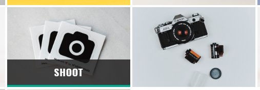
24 要做的效果如下图:
当鼠标放上去后从下面出现长方形的黑色浮层 浮层上显示标题。
样式:
.a_i{
    width: 300px;
    height: 200px;
    background-color: #00CBFE;
    position: relative;
}
.a_j{
    position: absolute;
    bottom: 0px;
    height: 0px;
    width: 300px;
    background-color: #000000;
    opacity: 0.5;
    transition:height 1s;
    -webkit-transition:height 1s; /* Safari */
}
.a_i:hover .a_j{
    height: 50px;

}
代码:
<div class="a_i">
     <div class="a_j"></div>
</div>
25.当鼠标放上去之后 图标自动旋转 包着的div让它变大倍数
26.展示图片产品图片列表时 当鼠标放在图片上时 出现遮罩层的同时让隐藏的图标或者文字出现。
27.好看的边框颜色 代码:
border:1px solid #59b7c2;
28.鼠标移动到产品列表的图片上时,文字移动 图标出现 另一个图标旋转。
29.首页新闻模块上 当鼠标放在新闻的简介或描述的长文字上时 描述的文字出现下划线。
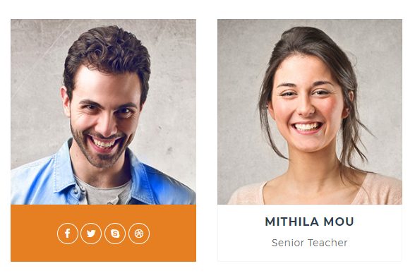
30. 当列表以div中上面是图片下面是文字的形式呈现的时候,动的效果可以为当鼠标放在最外面的div上时,从下面滑上来浮层盖住文字的效果 如下图:
31.当列表以div中上面是图片下面是文字的形式呈现的时候,动的效果可以为当鼠标放在最外面的div上时,下面装文字的小div向上滑动,滑到图片上面盖住一部分图片。效果如下图:
