首先需要说明,盒子模型是针对HTML元素的每一个标签的!因为HTML中每一个标签都符合盒子模型的特点!
块元素的特点:会随着浏览器的大小变化进行自适应!
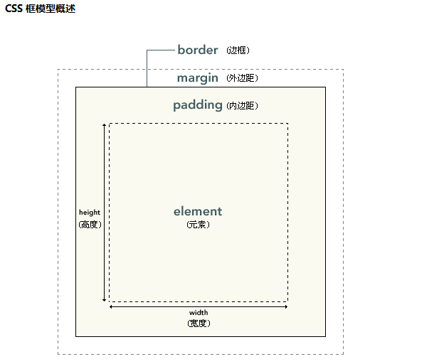
CSS 框模型 (Box Model) 规定了元素框处理元素内容、内边距、边框 和 外边距 的方式。如下所示:
需要注意:
盒子是由三部分组成的,即:盒子壁【border】+内边距【padding】+内容区【content=width+height】
而盒模型是由四部分组成的,即:外边距【margin】+盒子壁【border】+内边距【padding】+内容区【content=width+height】
从上面这幅图也可以看出,我们平时设置的height和width是盒模型中的内容区部分!padding内边距区是不允许放内容的,内容是放在内容区的!
如下所示:


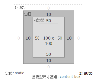
 1 <style type="text/css">
 2     div{
 3         width:100px;
 4         height:100px;
 5         border:10px solid red;
 6         padding:50px;
 7     }
 8 </style>
 9 </head>
10 <body>
11     <div>韭菜盒子韭菜盒子韭菜盒子</div>
12 </body>
可以在火狐浏览器打开F12键,仔细看看这段代码盒模型为:
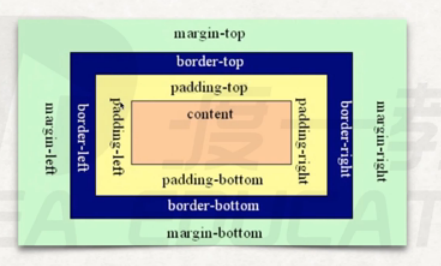
参考盒子模型:
如下代码为:
 1 <style type="text/css">
 2     .wrapper{
 3         width:100px;
 4         height:100px;
 5         border:10px solid red;
 6         background-color:green;
 7         padding:100px;
 8     }
 9     .content{
10         width:100px;
11         height:100px;
12         background-color:black;
13     }
14 </style>
15 </head>
16 <body>
17     <div class="wrapper">
18         <div class="content"></div>
19     </div>
20 </body>
展现出来的效果图为:

从效果图,可以知道两件事:
1.如果两个div嵌套,想把里面的div放入到外部div的中间,只需要将内部div填满外部div的内容区,然后将外部div的
四个方向的padding和border都设置为相等的值即可。
2.上图还可以得到一个结论:内边距呈现了元素的背景。
另外还需要注意代码部分,我们只给padding属性值一个值,就代表四个方向都是100px,当然我们也可以设置2个值,3个值,4个值,如下所示:
 1 <style type="text/css">
 2     .wrapper{
 3         width:100px;
 4         height:100px;
 5         border:10px solid red;
 6         background-color:green;
 7         padding:10px 20px 30px;
 8     }
 9     .content{
10         width:100px;
11         height:100px;
12         background-color:black;
13     }
14 </style>
15 </head>
16 <body>
17     <div class="wrapper">
18         <div class="content"></div>
19     </div>
20 </body>
效果如下所示:

如果说我不想设置4个方向的,就想设置一个方向的,行不行呢?可以!
如:
 1 <style type="text/css">
 2     .wrapper{
 3         width:100px;
 4         height:100px;
 5         border:10px solid red;
 6         background-color:green;
 7         padding:100px 0px 0px 0px;
 8     }
 9     .content{
10         width:100px;
11         height:100px;
12         background-color:black;
13     }
14 </style>
15 </head>
16 <body>
17     <div class="wrapper">
18         <div class="content"></div>
19     </div>
20 </body>
当然还可以再简单点,如下所示:
 1 <style type="text/css">
 2     .wrapper{
 3         width:100px;
 4         height:100px;
 5         border:10px solid red;
 6         background-color:green;
 7         padding-top: 100px;
 8     }
 9     .content{
10         width:100px;
11         height:100px;
12         background-color:black;
13     }
14 </style>
15 </head>
16 <body>
17     <div class="wrapper">
18         <div class="content"></div>
19     </div>
20 </body>
当然还可以为四个方向单独设置padding:padding-top、padding-right、padding-bottom、padding-left
margin:margin-top、margin-right、margin-bottom、margin-left
border-border-top-width、border-right-width、border-bottom-width、border-left-width
border-style:border-top-style、border-right-style、border-bottom-style、border-left-style
border-color:border-top-color、border-right-color、border-bottom-color、border-left-color
这里有一个问题?就是你看看下面这段代码盒子的真实宽度和高度请计算出来【realWidth 和 RealHeight】
<style type="text/css">
    div{
        width:100px;
        height:100px;
        background-color: red;
        border: 10px solid black;
        padding:10px 20px 30px;
        margin:10px 20px;
    }
</style>
</head>
<body>
    <div></div>
</body>
从上面的代码中,我们首先要知道:
①.盒子的真实宽度和真实高度是不算margin(外边距的),因为外边距连看都看不着,它是自身与其它盒子的距离!
②.realWidth = contentWidth+border*2+leftPadding+rightPadding=100+10*2+20*2=160
③.realHeight= contentHeight+border*2+topPadding+bottomPadding=100+10*2+10+30=160
④.区分盒模型的大小和盒子大小的计算方式,盒子大小是不算margin的,而盒模型是算margin的!
⑤.求可视区的宽和高实际上是指的求盒子的宽和高、因为margin是不可见的,所以这里说的也就是求盒子的宽和高!
现在我们就可以用盒子模型来做一个远视图的东西:
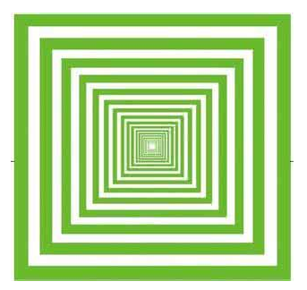
下边我们就用代码实现以下:实际上就是盒子嵌套盒子,然后确保内层盒子在外层盒子中间即可!那如何确保内层盒子在外层盒子中间呢?只需要让内层盒子占满外层盒子的内容区,然后给外层盒子加上等宽和等高的padding即可!如下所示:
 1 <style type="text/css">
 2     .content4{
 3         width:10px;
 4         height:10px;
 5         background-color:black;
 6     }
 7     .content3{
 8         width:10px;
 9         height:10px;
10         padding:10px;
11         background-color:green;
12     }
13     .content2{
14         width:30px;
15         height:30px;
16         padding:10px;
17         background-color:skyblue;
18     }
19     .content1{
20         width:50px;
21         height:50px;
22         padding:10px;
23         background-color:blue;
24     }
25 </style>
26 </head>
27 <body>
28     <div class="content1">
29         <div class="content2">
30             <div class="content3">
31                 <div class="content4"></div>
32             </div>
33         </div>
34     </div>
35 </body>
代码如上所示:效果图为:
当然效果还有点区别,我们只需要将颜色再调试一下就OK了,如下所示:
 1 <style type="text/css">
 2     .content4{
 3         width:10px;
 4         height:10px;
 5         background-color:#fff;
 6     }
 7     .content3{
 8         width:10px;
 9         height:10px;
10         padding:10px;
11         background-color:green;
12     }
13     .content2{
14         width:30px;
15         height:30px;
16         padding:10px;
17         background-color:#fff;
18     }
19     .content1{
20         width:50px;
21         height:50px;
22         padding:10px;
23         background-color:green;
24     }
25 </style>
26 </head>
27 <body>
28     <div class="content1">
29         <div class="content2">
30             <div class="content3">
31                 <div class="content4"></div>
32             </div>
33         </div>
34     </div>
35 </body>
这样效果就OK了,如下所示:

只不过在这个的基础上,多嵌套几层就能得到远视图的效果了!
不过这里我们要注意一个问题:就是当我们新创建一个一定高度和宽度的div之后,你会发现该div并不是直接紧邻着浏览器左上角的,而是如下所示:
代码及效果图如下:
下面我们再讲一下定位【层级模型】
定位我们用到的属性是postition,其值有:absolute、relative、fixed、z-index
注意:使用position属性时还必须使用另外的top、left、bottom、right属性,而且top和left属性只和position属性搭配使用!当然top和bottom只能同时出现一个,而left和right也只能同时出现一个!当然我们很少使用bottom,因为很多网页的底部不是立马可见的,需要拉动右边的边框往下拖,如:淘宝首页!
如下代码及效果所示:
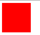
 1 <style type="text/css">
 2     div{
 3         position:absolute;
 4         left:100px;
 5         top:100px;
 6         width:100px;
 7         height:100px;
 8         background-color: red;
 9     }
10 </style>
11 </head>
12 <body>
13     <div></div>
14 </body>
这段代码在浏览器中的效果为:
 即距离浏览器的上边框和左边框都是100px!
我们再来看一下绝对定位【absolute】相对定位【relative】
绝对定位【absolute】:
特点:
①.盒子会脱离原来那一层进入到更高层【原来的会空出来,后面的盒子会补上】
②.绝对定位是相对于当前盒子最近的有定位【绝对定位或者相对定位】的父级进行定位,如果没有这样有定位的父级就相对于文档进行定位!
相对定位【relative】:
特点:
①保留原来位置进行定位【也就是说,原来的位置不会空出来】
②.相对于自己原来的位置【出生的位置】进行定位
那到底什么时候用absolute绝对定位,什么时候使用absolute相对定位呢?
一般根据开发经验:我们一般使用relative作为参照物,不进行定位,而使用absolute进行定位【定位必须是有参照物的】,为什么?
好处有两点:1.相对定位本身就是保留原理位置进行定位,这样对后面的元素就没有影响了【而absolute会脱离原来
那一层,会影响到后续元素位置】
2.如果我们给一个盒子设置一个相对定位,不设置top或者left属性,其实对这个盒子本身而言就没啥影响【它还
在原来位置,而且不影响后续元素】,所以相对定位当标杆是最好的,而absolute【绝对定位】可以任意调换
自己的参照物,更灵活一些!所以正常的配合是:relative当做机架【参照物】,而absolute当做定位的技术!
这样relative当做参照物就减少了对后续元素的破坏!
固定定位【fixed】:该定位也叫广告定位,很多广告无论你右侧的滚动条怎么滚动,左侧的都广告都不动,就是用这种技术实现的!
代码及效果演示:
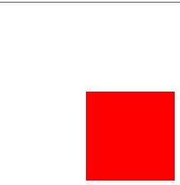
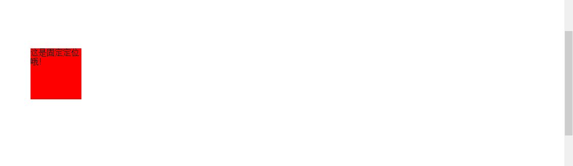
  1 <style type="text/css">
  2     div{
  3         width:100px;
  4         height:100px;
  5         background-color: red;
  6         position: fixed;
  7         left:300px;
  8         top:200px;
  9     }
 10 </style>
 11 </head>
 12 <body>
 13     <br>
 14     <br>
 15     <br>
 16     <br>
 17     <br>
 18     <br>
 19     <br>
 20     <br>
 21     <br>
 22     <br>
 23     <br>
 24     <br>
 25     <br>
 26     <br>
 27     <br>
 28     <br>
 29     <br>
 30     <br>
 31     <br>
 32     <br>
 33     <br>
 34     <br>
 35     <br>
 36     <br>
 37     <br>
 38     <br>
 39     <br>
 40     <br>
 41     <br>
 42     <br>
 43     <br>
 44     <br>
 45     <br>
 46     <br>
 47     <br>
 48     <br>
 49     <br>
 50     <br>
 51     <br>
 52     <br>
 53     <br>
 54     <br>
 55     <br>
 56     <br>
 57     <br>
 58     <br>
 59     <br>
 60     <br>
 61     <br>
 62     <br>
 63     <br>
 64     <br>
 65     <br>
 66     <br>
 67     <br>
 68     <br>
 69     <br>
 70     <br>
 71     <br>
 72     <br>
 73     <br>
 74     <br>
 75     <br>
 76     <br>
 77     <br>
 78     <br>
 79     <br>
 80     <br>
 81     <br>
 82     <br>
 83     <br>
 84     <br>
 85     <br>
 86     <br>
 87     <br>
 88     <br>
 89     <br>
 90     <br>
 91     <br>
 92     <br>
 93     <br>
 94     <br>
 95     <br>
 96     <br>
 97     <br>
 98     <br>
 99     <br>
100     <br>
101     <br>
102     <br>
103     <div class="wrapper">这是固定定位哦!</div>
104 </body>
上图无论,右侧的滚动条如何变化,这个小图形的位置都不会发生变化!也就是说无论是absolute还是relative实际上是相对于文档的定位,而fixed是相对于可视化窗口的定位,如下代码是相对于可视化窗口的居中定位!
 1 <style type="text/css">
 2     div{
 3         width:100px;
 4         height:100px;
 5         background-color: red;
 6         position: fixed;
 7         top:50%;
 8         left:50%;
 9         margin-left: -50px;
10         margin-top:-50px;
11     }
12 </style>
13 </head>
14 <body>
15     <br>
16     <br>
17     <br>
18     <br>
19     <br>
20     <br>
21     <br>
22     <br>
23     <br>
24     <br>
25     <br>
26     <br>
27     <br>
28     <br>
29     <br>
30     <br>
31     <br>
32     <br>
33     <br>
34     <br>
35     <br>
36     <br>
37     <br>
38     <br>
39     <br>
40     <br>
41     <br>
42     <br>
43     <br>
44     <br>
45     <br>
46     <br>
47     <br>
48     <br>
49     <br>
50     <br>
51     <br>
52     <br>
53     <br>
54     <br>
55     <br>
56     <br>
57
58     <br>
59     <br>
60     <br>
61     <br>
62     <br>
63     <br>
64     <br>
65     <br>
66     <br>
67     <br>
68     <br>
69     <br>
70     <div class="wrapper">这是固定定位哦!</div>
71 </body>
当然还可以来一个相对于文档的居中定位,只需要将定位的position:fixed该为position:absolute,如下所示:
 1 <style type="text/css">
 2     div{
 3         width:100px;
 4         height:100px;
 5         background-color: red;
 6         position: absolute;
 7         top:50%;
 8         left:50%;
 9         margin-left: -50px;
10         margin-top:-50px;
11     }
12 </style>
13 </head>
14 <body>
15     <br>
16     <br>
17     <br>
18     <br>
19     <br>
20     <br>
21     <br>
22     <br>
23     <br>
24     <br>
25     <br>
26     <br>
27     <br>
28     <br>
29     <br>
30     <br>
31     <br>
32     <br>
33     <br>
34     <br>
35     <br>
36     <br>
37     <br>
38     <br>
39     <br>
40     <br>
41     <br>
42     <br>
43     <br>
44     <br>
45     <br>
46     <br>
47     <br>
48     <br>
49     <br>
50     <br>
51     <br>
52     <br>
53     <br>
54     <br>
55     <br>
56     <br>
57
58     <br>
59     <br>
60     <br>
61     <br>
62     <br>
63     <br>
64     <br>
65     <br>
66     <br>
67     <br>
68     <br>
69     <br>
70     <div class="wrapper">这是固定定位哦!</div>
71 </body>
而且上面用到的top和left都是百分比!
注意:最后一个z-index也是只针对position有效,这个是决定层模型的第几层的,默认层是0,通过这个属性可以指定z轴的位置【第几层,设置1就是第2层】,实际上在层定位元素谁盖着谁的时候,z-index起了决定性的作用!当然该属性只在设置了position的元素上好使!
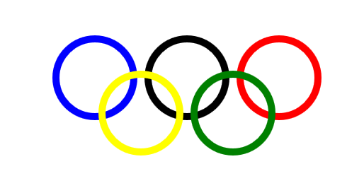
学到这里,大家可以试着写一个五环的功能,并且要求整个五环是居中的!如下所示:

所以,我们可以怎么写呢?五环是一个功能,要让五环居中,所以我们可以考虑写一个大div,这个大div低下有5个子div【每个子div代表一个环】,让五环居中也就是让这个大div居中即可!
 1 <style type="text/css">
 2     *{
 3         margin:0px;
 4         padding:0px;
 5     }
 6
 7     .plat{
 8         position:relative;
 9         top:50%;
10         left:50%;
11         margin-top:180px;
12         margin-left:-180px;
13         width:376px;
14         height:166px;
15     }
16     .circle1,
17     .circle2,
18     .circle3,
19     .circle4,
20     .circle5{
21         position: absolute;
22         width:100px;
23         height:100px;
24         border:10px solid black;
25         border-radius:50%;
26     }
27     .circle1{
28         border-color:blue;
29         left:0px;
30         top: 0px;
31     }
32     .circle2{
33         border-color: black;
34         left:130px;
35         top: 0px;
36     }
37     .circle3{
38         border-color: red;
39         left:260px;
40         top: 0px;
41     }
42     .circle4{
43         border-color: yellow;
44         left:65px;
45         top: 50px;
46         z-index: 1;
47     }
48     .circle5{
49         border-color: green;
50         left:195px;
51         top: 50px;
52         z-index: 1;
53     }
54
55 </style>
56 </head>
57 <body>
58     <div class="plat">
59         <div class="circle1"></div>
60         <div class="circle2"></div>
61         <div class="circle3"></div>
62         <div class="circle4"></div>
63         <div class="circle5"></div>
64     </div>
65 </body>
效果如下所示:

当然上面对于外层的div使用的是相对定位,下面对于外层的div我们使用绝对定位【相对于当前文档的】,如要要相对于可视化窗口就要改为fixed:
 1 <style type="text/css">
 2     *{
 3         margin:0px;
 4         padding:0px;
 5     }
 6
 7     .plat{
 8         position:absolute;
 9         top:50%;
10         left:50%;
11         margin-top:-83px;
12         margin-left:-188px;
13         width:376px;
14         height:166px;
15     }
16     .circle1,
17     .circle2,
18     .circle3,
19     .circle4,
20     .circle5{
21         position: absolute;
22         width:100px;
23         height:100px;
24         border:10px solid black;
25         border-radius:50%;
26     }
27     .circle1{
28         border-color:blue;
29         left:0px;
30         top: 0px;
31     }
32     .circle2{
33         border-color: black;
34         left:130px;
35         top: 0px;
36     }
37     .circle3{
38         border-color: red;
39         left:260px;
40         top: 0px;
41     }
42     .circle4{
43         border-color: yellow;
44         left:65px;
45         top: 50px;
46         z-index: 1;
47     }
48     .circle5{
49         border-color: green;
50         left:195px;
51         top: 50px;
52         z-index: 1;
53     }
54
55 </style>
56 </head>
57 <body>
58     <div class="plat">
59         <div class="circle1"></div>
60         <div class="circle2"></div>
61         <div class="circle3"></div>
62         <div class="circle4"></div>
63         <div class="circle5"></div>
64     </div>
65 </body>
效果如下所示:
下面我们再实现一个两栏布局,实际上两栏布局就两个关键点:
1.将下面的盒子让它上去【在上面的盒子上设置绝对定位】
2.让上去的这个盒子将另一个盒子的位置让出来【给上去的盒子设置margin-left或者margin-right】
代码及效果如下所示:
 1 <style type="text/css">
 2     *{
 3         margin:0px;
 4         padding:0px;
 5     }
 6     .left{
 7         position:absolute;
 8         right:0px;
 9         width:100px;
10         height:100px;
11         background-color:#fcc;
12         opacity:0.5;
13     }
14     .right{
15         margin-right:100px;
16         height:100px;
17         background-color:#123;
18     }
19
20 </style>
21 </head>
22 <body>
23     <div class="left"></div>
24     <div class="right"></div>
25 </body>

需要注意的是:上面在HTML的body标签内部,必须将class为left的div写在前面,上面的CSS代码才可以那么写!如果将class为right的div写在上面,则代码就会展现出不同的效果,代码和效果如下所示:
 1 <style type="text/css">
 2     *{
 3         margin:0px;
 4         padding:0px;
 5     }
 6     .left{
 7         position:absolute;
 8         right:0px;
 9         width:100px;
10         height:100px;
11         background-color:#fcc;
12         opacity:0.5;
13     }
14     .right{
15         margin-right:100px;
16         height:100px;
17         background-color:#123;
18     }
19
20 </style>
21 </head>
22 <body>
23     <div class="right"></div>
24     <div class="left"></div>
25 </body>

这是因为,如果right写在前面,即使设置该div后面的class为left的div为absolute,但是不要忘了,它出生的时候就是第二行,即使是脱离了原来那一层,它也不能越过下一层的div跑到第一行,这就是两栏布局!
然后我们讲一下两个CSS经典的Bug
代码和效果没问题的时候,如下所示:
 1 <style type="text/css">
 2     *{
 3         margin:0px;
 4         padding:0px;
 5     }
 6     .wrapper{
 7         margin-left:100px;
 8         margin-top:100px;
 9         width:100px;
10         height:100px;
11         background-color: black;
12     }
13     .content{
14         margin-left:50px;
15         width:50px;
16         height:50px;
17         background-color: green;
18     }
19 </style>
20 </head>
21 <body>
22     <div class="wrapper">
23         <div class="content"></div>
24     </div>
25 </body>

此时的效果如上所示,正常情况下如果我将内部div的margin-top设置为50px;那么按正说内部div应该会相对于外部div向下移动50px,但是事实上确是不移动的,看下面代码和效果:
 1 <style type="text/css">
 2     *{
 3         margin:0px;
 4         padding:0px;
 5     }
 6     .wrapper{
 7         margin-left:100px;
 8         margin-top:100px;
 9         width:100px;
10         height:100px;
11         background-color: black;
12     }
13     .content{
14         margin-left:50px;
15         margin-top:50px;
16         width:50px;
17         height:50px;
18         background-color: green;
19     }
20 </style>
21 </head>
22 <body>
23     <div class="wrapper">
24         <div class="content"></div>
25     </div>
26 </body>
会发现效果在子div中没设置margin-top:50px是一样的,这是为什么呢?
答案:垂直方向的margin,父子元素是粘合到一起的,它两个【父子嵌套元素】会取最大的那个值!这个现象导致的一个结果就是margin塌陷,意思就是说:这对于子元素来说,父元素相当于是塌陷的,因为设置了子元素的margin-top之后发现子元素相对于父元素还是不动,就好像没设置一样,所以叫margin塌陷,当然如果给子元素的margin-top设置的值是大于父元素的margin-top值的时候,字父元素都是会动的,都以这个最大值为准!
那么如何解决这个问题呢?实际上解决这个问题有个专业的手法叫BFC:Block Fomat Context【块级格式化上下文】 ,实际上CSS是将HTML中的每个标签都当做一个盒子对待的,进而针对这些盒子,CSS有一套模板式的东西来操作盒子【也就说对于各个不同的标签,CSS都有一模一样的操作模板样式来操作标签】,而这个BFC实际上就是相当于改变一下CSS模板中的某些样式,例如打个比方:原来设置width为100,height为100,HTML就认为是宽和高都是100,但是使用了BFC之后,可能我再设置了width为100,height为100,此时HTML就会认为你设置的width为50,height为50;其实BFC也没改变多少,如果CSS有一百条语法的话,BFC实际上连0.1%都没改变的了!它就改变了一丁点,但是就改变了这一丁点就把margin塌陷给解决了!就好像BFC就是解决margin塌陷而设计的一样!
那现在来看看如何来使用BFC?
1.如何触发BFC呢?
①.position:absolute:将该盒子设置为绝对定位之后,这个盒子自然就成了BFC元素!
②.display:inline-block;
③.float:left/right
④.overflow:hidden
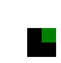
来我们先使用第四种解决方案overflow:hidden来解决一下:
当然overflow:hidden有自己的意义:自己本身的意义就是:溢出盒子的部分要隐藏展示!
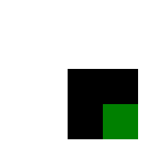
例如正常代码和效果如下所示:
 1 <style type="text/css">
 2     *{
 3         margin:0px;
 4         padding:0px;
 5     }
 6     .wrapper{
 7         margin-left:100px;
 8         margin-top:100px;
 9         width:100px;
10         height:100px;
11         background-color: black;
12
13     }
14     .content{
15         margin-left:70px;
16         width:50px;
17         height:50px;
18         background-color: green;
19     }
20 </style>
效果如下:
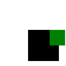
如果我们给外层DIV加了overflow:hidden之后,再看一下代码和效果:
 1 <style type="text/css">
 2     *{
 3         margin:0px;
 4         padding:0px;
 5     }
 6     .wrapper{
 7         margin-left:100px;
 8         margin-top:100px;
 9         width:100px;
10         height:100px;
11         background-color: black;
12         overflow: hidden;
13
14     }
15     .content{
16         margin-left:70px;
17         width:50px;
18         height:50px;
19         background-color: green;
20     }
21 </style>
22 </head>
23 <body>
24     <div class="wrapper">
25         <div class="content"></div>
26     </div>
27 </body>

这样溢出部分就隐藏了!
而且在父div上加上overflow:hidden属性之后,margin塌陷问题也可以得到解决了!如下代码和效果所示:
 1 <style type="text/css">
 2     *{
 3         margin:0px;
 4         padding:0px;
 5     }
 6     .wrapper{
 7         margin-left:100px;
 8         margin-top:100px;
 9         width:100px;
10         height:100px;
11         background-color: black;
12         overflow: hidden;
13
14     }
15     .content{
16         margin-left:50px;
17         margin-top:50px;
18         width:50px;
19         height:50px;
20         background-color: green;
21     }
22 </style>
23 </head>
24 <body>
25     <div class="wrapper">
26         <div class="content"></div>
27     </div>
28 </body>

所以上面我们使用BFC【设置overflow:hidden】改变了CSS对于父元素的默认渲染规则,解决了margin塌陷问题!
我们此时再将overflow:hidden注释掉,然后用display:inline-block来试一下,看看能不能解决:
 1 <style type="text/css">
 2     *{
 3         margin:0px;
 4         padding:0px;
 5     }
 6     .wrapper{
 7         margin-left:100px;
 8         margin-top:100px;
 9         width:100px;
10         height:100px;
11         background-color: black;
12         display: inline-block;;
13     }
14     .content{
15         margin-left:50px;
16         margin-top:50px;
17         width:50px;
18         height:50px;
19         background-color: green;
20     }
21 </style>
22 </head>
23 <body>
24     <div class="wrapper">
25         <div class="content"></div>
26     </div>
27 </body>
效果如下:
会发现这也是能解决问题的,当然我们也可以使用另外两种方式,这里我们再演示一种,最后一种你们自己去练习!
 1 <style type="text/css">
 2     *{
 3         margin:0px;
 4         padding:0px;
 5     }
 6     .wrapper{
 7         margin-left:100px;
 8         margin-top:100px;
 9         width:100px;
10         height:100px;
11         background-color: black;
12         position: absolute;
13     }
14     .content{
15         margin-left:50px;
16         margin-top:50px;
17         width:50px;
18         height:50px;
19         background-color: green;
20     }
21 </style>
22 </head>
23 <body>
24     <div class="wrapper">
25         <div class="content"></div>
26     </div>
27 </body>

那这么多方法都能解决这个问题,我们使用哪种方式解决呢?刚才我已经提示过大家了,实际上这个问题是没办法完美解决的,我们这里只不过是弥补一下!为啥呢?因为这些方法虽然都能解决margin塌陷,但是解决margin塌陷的同时又带来了新的问题,例如我加了overflow:hidden之后,如果说我们就想让内部的盒子溢出外部的盒子,这样加显然就不合适了,同理,如果我们将一个盒子摆放在那儿,希望后面的盒子都在它后面,我们如果使用position:absolute这样写也有点不合适,因为我这样一写后面的盒子就不会老老实实的待在原来自己呆的地方了,会往上移动!有的时候我们不想变成inline-block,就是想让它独占一行,这是不是也不行!所以这么多方式都能触发BFC,我们就需要根据需求,看看用了哪种解决方案即能解决margin塌陷,又不对需求造成影响的时候,我们就用哪一种方案!所以这几种方式只能叫弥补,不能叫解决!
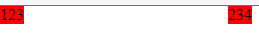
我们再来看另一个BUG,正常情况下,标签与标签之间的边界是不能共用的,例如我写下面两个:
代码和效果如下所示:
 1 <style type="text/css">
 2     *{
 3         margin:0px;
 4         padding:0px;
 5     }
 6     .box1{
 7         background-color: red;
 8         margin-right: 100px;
 9     }
10     .box2{
11         background-color: red;
12         margin-left: 100px;
13     }
14 </style>
15 </head>
16 <body>
17     <span class="box1">123</span>
18     <span class="box2">234</span>
19 </body>
如果此时我们让div上场,代码和效果如下所示:
 1 <style type="text/css">
 2     *{
 3         margin:0px;
 4         padding:0px;
 5     }
 6     .box1{
 7         background-color: red;
 8         margin-right: 100px;
 9     }
10     .box2{
11         background-color: red;
12         margin-left: 100px;
13     }
14     .demo1{
15         background-color: red;
16     }
17     .demo2{
18         background-color: green;
19     }
20 </style>
21 </head>
22 <body>
23     <span class="box1">123</span>
24     <span class="box2">234</span>
25     <div class="demo1">fda</div>
26     <div class="demo2">fda</div>
27 </body>

 可是如果我们此时跟两个兄弟元素div设置margin-top和margin-bottom你会发现,他们的边界是共用的,这就有问题了【按正说不共用才是正常的】!,代码和效果如下所示:
 1 <style type="text/css">
 2     *{
 3         margin:0px;
 4         padding:0px;
 5     }
 6     .box1{
 7         background-color: red;
 8         margin-right: 100px;
 9     }
10     .box2{
11         background-color: red;
12         margin-left: 100px;
13     }
14     .demo1{
15         background-color: red;
16         margin-bottom: 100px;
17     }
18     .demo2{
19         margin-top:100px;
20         background-color: green;
21     }
22 </style>
23 </head>
24 <body>
25     <span class="box1">123</span>
26     <span class="box2">234</span>
27     <div class="demo1">fda</div>
28     <div class="demo2">fda</div>
29 </body>

你会发现,本来我们设置了两个div的margin-top或者margin-bottom,本来他们的距离应该是200px的,但是现在仅仅只有100px,我们怎么解决这个问题呢?这里还是使用BFC,让他们处于BFC的环境中就OK,例如我可以在第二个div外面包裹一层Div,然后这个包裹Div什么也不做,仅仅是让内层DIv处于BFC环境即可,如下所示:
 1 <style type="text/css">
 2     *{
 3         margin:0px;
 4         padding:0px;
 5     }
 6     .box1{
 7         background-color: red;
 8         margin-right: 100px;
 9     }
10     .box2{
11         background-color: red;
12         margin-left: 100px;
13     }
14     .demo1{
15         background-color: red;
16         margin-bottom: 100px;
17     }
18     .demo2{
19         margin-top:100px;
20         background-color: green;
21     }
22     .wrapper{
23         overflow: hidden;
24     }
25 </style>
26 </head>
27 <body>
28     <span class="box1">123</span>
29     <span class="box2">234</span>
30     <div class="demo1">fda</div>
31     <div class="wrapper">
32         <div class="demo2">fda</div>
33     </div>
34 </body>

效果就OK了,当然我们也可以将刚才那两个div都放入到这个外层div中,代码如下所示,效果和上面是一样的:
 1 <style type="text/css">
 2     *{
 3         margin:0px;
 4         padding:0px;
 5     }
 6     .box1{
 7         background-color: red;
 8         margin-right: 100px;
 9     }
10     .box2{
11         background-color: red;
12         margin-left: 100px;
13     }
14     .demo1{
15         background-color: red;
16         margin-bottom: 100px;
17     }
18     .demo2{
19         margin-top:100px;
20         background-color: green;
21     }
22     .wrapper{
23         overflow: hidden;
24     }
25 </style>
26 </head>
27 <body>
28     <span class="box1">123</span>
29     <span class="box2">234</span>
30     <div class="wrapper">
31         <div class="demo1">fda</div>
32     </div>
33     <div class="wrapper">
34         <div class="demo2">fda</div>
35     </div>
36 </body>
这也是OK的,这样我们就有了两种解决margin合并问题的方式,当然都是用BFC解决的!
所以总结:BFC实际上解决了两个问题,一个是margin塌陷问题,另一个是margin合并问题,对于margin塌陷问题【子父元素之间的关系】,我们仅仅是给父元素增加了CSS代码,并没有修改HTML代码,而对于margin合并问题,解决了兄弟元素之间的问题,我们只需要在兄弟元素外层加一层HTML代码【盒子】,然后给外层HTML代码加上CSS样式,开启BFC即可!当然实际上对于第二种margin合并问题,我们是可以通过数学来弥补的,比如margin合并问题,本质就是希望两个标签空开点距离,上边200,下边100,实际上我们可以给上边或者下边的标签直接设置300不就解决了么!当然对于margin塌陷问题,必须用BFC解决了!所以在开发的时候,对于margin合并我们是不解决的,而是用数学方式弥补!