前言
开门见山,开篇明意。这篇博客主要讲解一下Android中ProgressBar控件以及间接继承它的两个子控件SeekBar、RatingBar的基本用法,因为其有继承关系,存在一些共有特性,所以在一篇博客中讲解。下面先简单描述一下这三个控件:
- ProgressBar是一个进度条控件,一般在需要做某个比较耗时的操作的时候,向用户展示执行进度,以免用户以为已经失去响应。
- SeekBar是一个拖动条控件,拖动条通过滑块表示数值,而用户可以在一定范围内拖动这个滑块而改变其数值。
- RatingBar是一个星级评分控件,向用户展示一个评分样式的控件,用户可以选择星级来为其评分。
ProgressBar
ProgressBar,进度条,是AndroidUI界面中一个非常实用的组件,通常用于向用户显示某个耗时操作完成的百分比。因此它需要动态的显示进度,从而避免长时间的执行某个耗时的操作,而让用户感觉程序失去了相应,从而提高界面的友好性。
从官方文档上看,为了适应不同的应用环境,Android内置了几种风格的进度条,可以通过Style属性设置ProgressBar的风格。支持如下属性,后面在示例中会一一展示:
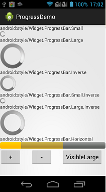
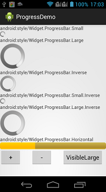
- @android:style/Widget.ProgressBar.Horizontal:水平进度条(可以显示刻度,常用)。
- @android:style/Widget.ProgressBar.Small:小进度条。
- @android:style/Widget.ProgressBar.Large:大进度条。
- @android:style/Widget.ProgressBar.Inverse:不断跳跃、旋转画面的进度条。
- @android:style/Widget.ProgressBar.Large.Inverse:不断跳跃、旋转动画的大进度条。
- @android:style/Widget.ProgressBar.Small.Inverse:不断跳跃、旋转动画的小进度条。
只有Widget.ProgressBar.Horizontal风格的进度条,才可以设置进度的递增,其他的风格展示为一个循环的动画,而设置Widget.ProgressBar.Horizontal风格的进度条,需要用到一些属性设置递增的进度,这些属性都有对应的setter、getter方法,这些属性如下:
- android:max:设置进度的最大值。
- android:progress:设置当前第一进度值。
- android:secondaryProgress:设置当前第二进度值。
- android:visibility:设置是否显示,默认显示。
对于Widget.ProgressBar.Horizontal风格的进度条而言,在代码中动态设置移动量,除了可以使用setProgress(int)方法外,Android还为我们提供了另外一个incrementProgressBy(int)方法,它与setProgress(int)的根本区别在于,setProgress(int)是直接设置当前进度值,而incrementProgressBy(int)是设置当前进度值的增量(正数为增,负数为减)。与setProgress(int)和incrementProgressBy(int)对应的还有setSecondaryProgress(int)和incrementSecondaryProgressBy(int)方法,用于设置第二进度值。
下面通过一个示例,来讲解一下上面的style设置样式的展示想过,以及动态控制进度条增减的实现。
布局代码:
 1 <?xml version="1.0" encoding="utf-8"?>
 2 <LinearLayout xmlns:android="http://schemas.android.com/apk/res/android"
 3     android:layout_width="match_parent"
 4     android:layout_height="match_parent"
 5     android:orientation="vertical" >
 6
 7     <TextView
 8         android:layout_width="wrap_content"
 9         android:layout_height="wrap_content"
10         android:text="android:style/Widget.ProgressBar.Small" />
11
12     <ProgressBar
13         style="@android:style/Widget.ProgressBar.Small"
14         android:layout_width="wrap_content"
15         android:layout_height="wrap_content" />
16
17     <TextView
18         android:layout_width="wrap_content"
19         android:layout_height="wrap_content"
20         android:text="android:style/Widget.ProgressBar.Large" />
21
22     <ProgressBar
23         android:id="@+id/pbLarge"
24         style="@android:style/Widget.ProgressBar.Large"
25         android:layout_width="wrap_content"
26         android:layout_height="wrap_content" />
27
28     <TextView
29         android:layout_width="wrap_content"
30         android:layout_height="wrap_content"
31         android:text="android:style/Widget.ProgressBar.Inverse" />
32
33     <ProgressBar
34         style="@android:style/Widget.ProgressBar.Inverse"
35         android:layout_width="wrap_content"
36         android:layout_height="wrap_content" />
37
38     <TextView
39         android:layout_width="wrap_content"
40         android:layout_height="wrap_content"
41         android:text="android:style/Widget.ProgressBar.Small.Inverse" />
42
43     <ProgressBar
44         style="@android:style/Widget.ProgressBar.Small.Inverse"
45         android:layout_width="wrap_content"
46         android:layout_height="wrap_content" />
47
48     <TextView
49         android:layout_width="wrap_content"
50         android:layout_height="wrap_content"
51         android:text="android:style/Widget.ProgressBar.Large.Inverse" />
52
53     <ProgressBar
54         style="@android:style/Widget.ProgressBar.Large.Inverse"
55         android:layout_width="wrap_content"
56         android:layout_height="wrap_content" />
57
58     <TextView
59         android:layout_width="wrap_content"
60         android:layout_height="wrap_content"
61         android:text="android:style/Widget.ProgressBar.Horizontal" />
62
63     <ProgressBar
64         android:id="@+id/pbHor"
65         style="@android:style/Widget.ProgressBar.Horizontal"
66         android:layout_width="match_parent"
67         android:layout_height="wrap_content"
68         android:max="100"
69         android:progress="20"
70         android:secondaryProgress="60" />
71
72     <LinearLayout
73         android:layout_width="match_parent"
74         android:layout_height="match_parent"
75         android:orientation="horizontal" >
76         <!-- 设置一个按钮控制水平进度的递增 -->
77         <Button
78             android:id="@+id/btnAdd"
79             android:layout_width="wrap_content"
80             android:layout_height="wrap_content"
81             android:text="  +  " />
82         <!-- 设置一个按钮控制水平进度的递减 -->
83         <Button
84             android:id="@+id/btnReduce"
85             android:layout_width="wrap_content"
86             android:layout_height="wrap_content"
87             android:layout_marginLeft="30dp"
88             android:text="  -  " />
89         <!-- 设置一个按钮控制Style为large的进度显示与隐藏 -->
90         <Button
91             android:id="@+id/btnVisible"
92             android:layout_width="wrap_content"
93             android:layout_height="wrap_content"
94             android:layout_marginLeft="30dp"
95             android:text="VisibleLarge" />
96     </LinearLayout>
97
98 </LinearLayout>
实现代码:
 1 package com.bgxt.progressbarseriesdemo;
 2
 3 import android.app.Activity;
 4 import android.os.Bundle;
 5 import android.view.View;
 6 import android.view.View.OnClickListener;
 7 import android.widget.Button;
 8 import android.widget.ProgressBar;
 9
10 public class ProgressBarActivity extends Activity {
11
12     private Button btnAdd, btnReduce, btnVisible;
13     private ProgressBar pbHor, pbLarge;
14
15     @Override
16     protected void onCreate(Bundle savedInstanceState) {
17         super.onCreate(savedInstanceState);
18         setContentView(R.layout.activity_progressbar);
19
20         btnAdd = (Button) findViewById(R.id.btnAdd);
21         btnReduce = (Button) findViewById(R.id.btnReduce);
22         btnVisible = (Button) findViewById(R.id.btnVisible);
23         pbHor = (ProgressBar) findViewById(R.id.pbHor);
24         pbLarge = (ProgressBar) findViewById(R.id.pbLarge);
25
26         btnAdd.setOnClickListener(mathClick);
27         btnReduce.setOnClickListener(mathClick);
28         btnVisible.setOnClickListener(new View.OnClickListener() {
29
30             @Override
31             public void onClick(View v) {
32                 // 判断Large进度条是否显示,显示则隐藏,隐藏则显示
33                 if (pbLarge.getVisibility() == View.VISIBLE) {
34                     pbLarge.setVisibility(View.GONE);
35                 } else {
36                     pbLarge.setVisibility(View.VISIBLE);
37                 }
38
39             }
40         });
41     }
42
43     private View.OnClickListener mathClick = new OnClickListener() {
44
45         @Override
46         public void onClick(View v) {
47             switch (v.getId()) {
48             case R.id.btnAdd:
49                 // 如果是增加按钮,因为进度条的最大值限制在100,第一刻度限制在90.
50                 // 在此限度内,以1.2倍递增
51                 // 使用setProgress()
52                 if (pbHor.getProgress() < 90) {
53                     pbHor.setProgress((int) (pbHor.getProgress() * 1.2));
54                 }
55                 if (pbHor.getSecondaryProgress() < 100) {
56                     pbHor.setSecondaryProgress((int) (pbHor
57                             .getSecondaryProgress() * 1.2));
58                 }
59                 break;
60             case R.id.btnReduce:
61                 // 如果是增加按钮,因为进度条的最大值限制在100,第一刻度限制在10.第二刻度限制在20
62                 // 在此限度内,以10点为基数进行递减。
63                 // 使用incrementXxxProgressBy(int)
64                 if (pbHor.getProgress() > 10) {
65                     pbHor.incrementProgressBy(-10);
66                 }
67                 if (pbHor.getSecondaryProgress() > 20) {
68                     pbHor.incrementSecondaryProgressBy(-10);
69                 }
70                 break;
71             }
72         }
73     };
74
75 }
展示效果:初始--递增--隐藏

SeekBar
SeekBar,拖动条控件 ,间接继承自ProgressBar,所以与进度条类似,但是进度条采用颜色填充来表名进度完成的程度,而拖动条则通过滑动的位置来标识数值。
SeekBar继承自ProgressBar,所以也继承了它的属性设置,上面介绍的一些属性在SeekBar中都可以用到。因为SeekBar涉及到一个滑块的概念,所以新增了属性android:thumb来通过设置一个Drawable对象,指定自定义滑块的外观,当然如果不设定也可以默认使用Android自带的风格。
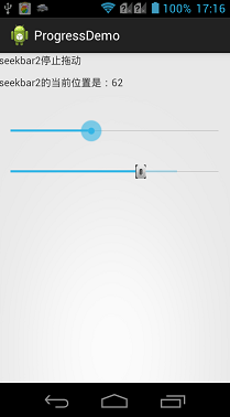
当用户按住滑块进行滑动的时候,会触发一个SeekBar.OnSeekBarChangeListener事件,这是一个接口,需要开发人员实现三个方法:
- onProgressChanged(SeekBar seekBar,int progress,boolean fromUser):滑块在移动的时候响应。seekBar为触发事件的SeekBar控件,progress为当前SeekBar的滑块数值,fromUser为是否用户拖动产生的响应。
- onStartTrackingTouch(SeekBar seekBar):滑块开始移动的时候响应。
- onStopTrackingTouch(SeekBar seekBar):滑块结束移动的时候相应。
下面通过一个示例来讲解一下SeekBar的基本用法。
 1 <?xml version="1.0" encoding="utf-8"?>
 2 <LinearLayout xmlns:android="http://schemas.android.com/apk/res/android"
 3     android:layout_width="match_parent"
 4     android:layout_height="match_parent"
 5     android:orientation="vertical" >
 6         <TextView
 7
 8         android:id="@+id/textview1"
 9         android:layout_width="match_parent"
10         android:layout_height="30dp" />
11
12     <TextView
13         android:id="@+id/textview2"
14         android:layout_width="match_parent"
15         android:layout_height="30dp" />
16
17     <SeekBar
18         android:layout_marginTop="30dp"
19         android:id="@+id/seekbar1"
20         android:layout_width="match_parent"
21         android:layout_height="wrap_content"
22         android:max="100"
23         android:progress="30" />
24     <!--设置一个拖动条,滑块为定义的bar图片-->
25     <SeekBar
26         android:layout_marginTop="30dp"
27         android:id="@+id/seekbar2"
28         android:layout_width="match_parent"
29         android:layout_height="wrap_content"
30         android:max="100"
31         android:progress="20"
32         android:thumb="@drawable/bar"
33         android:secondaryProgress="80" />
34
35 </LinearLayout>
实现代码:
 1 package com.bgxt.progressbarseriesdemo;
 2
 3 import android.app.Activity;
 4 import android.os.Bundle;
 5 import android.widget.SeekBar;
 6 import android.widget.TextView;
 7 import android.widget.SeekBar.OnSeekBarChangeListener;
 8
 9 public class SeekBarActivity extends Activity {
10     private TextView textview1, textview2;
11     private SeekBar seekbar1, seekbar2;
12     @Override
13     protected void onCreate(Bundle savedInstanceState) {
14         // TODO Auto-generated method stub
15         super.onCreate(savedInstanceState);
16         setContentView(R.layout.activity_seekbar);
17
18         textview1 = (TextView) findViewById(R.id.textview1);
19         textview2 = (TextView) findViewById(R.id.textview2);
20         seekbar1 = (SeekBar) findViewById(R.id.seekbar1);
21         seekbar2 = (SeekBar) findViewById(R.id.seekbar2);
22
23         seekbar1.setOnSeekBarChangeListener(seekBarChange);
24         seekbar2.setOnSeekBarChangeListener(seekBarChange);
25     }
26     private OnSeekBarChangeListener seekBarChange = new OnSeekBarChangeListener() {
27
28         @Override
29         public void onStopTrackingTouch(SeekBar seekBar) {
30             if (seekBar.getId() == R.id.seekbar1) {
31                 textview1.setText("seekbar1停止拖动");
32             } else {
33                 textview1.setText("seekbar2停止拖动");
34             }
35         }
36
37         @Override
38         public void onStartTrackingTouch(SeekBar seekBar) {
39             if (seekBar.getId() == R.id.seekbar1) {
40                 textview1.setText("seekbar1开始拖动");
41             } else {
42                 textview1.setText("seekbar2开始拖动");
43             }
44         }
45
46         @Override
47         public void onProgressChanged(SeekBar seekBar, int progress,
48                 boolean fromUser) {
49             if (seekBar.getId() == R.id.seekbar1) {
50                 textview2.setText("seekbar1的当前位置是:" + progress);
51             } else {
52                 textview2.setText("seekbar2的当前位置是:" + progress);
53             }
54
55         }
56     };
57 }
效果展示:
RatingBar
RatingBar,星级评分控件,RatingBar与SeekBar的用法非常相似,并且具有相同的父类AbsSeekBar,AbsSeekbar又继承自ProgressBar。而RatingBar与SeekBar最大的区别在于:RatingBar通过星形图标来表示进度。
RatingBar扩展了AbsSeekbar,所以新增了一些固有的属性,也屏蔽了一些无用的属性,如在RatingBar中就不存在第二进度的概念,新增的属性有如下几个:
- android:isIndicator:设置是否允许用户修改,true为不允许,默认为false,允许。
- android:numStars:设置评分控件一共展示多少个星星,默认5个。
- android:rating:设置初始默认星级数。
- android:stepSize:设置每次需要修改多少个星级。
对于RatingBar而言,当改变其星级选项的时候,会触发一个RatingBar.OnRatingBarChangeListener事件,这是一个接口,需要实现其中的onRatingChanged(RatingBar ratingBar,float rating,boolean fromUser)方法,其中ratingBar表示触发事件的控件,rating表示当前的星级,fromUser表示是否用户触发的修改事件。
在这里需要注意的一点就是,因为继承关系,RatingBar也有Progress属性,但是还有另外一个属性rating表示星级。这两个属性代表的意义是有区别的,区别在于Progress属性针对的是Max属性设置的值而言的,而rating是单纯的表示第几颗星。
下面通过一个示例来展示一下评分控件的基本使用。
布局代码:
 1 <?xml version="1.0" encoding="utf-8"?>
 2 <LinearLayout xmlns:android="http://schemas.android.com/apk/res/android"
 3     android:layout_width="match_parent"
 4     android:layout_height="match_parent"
 5     android:orientation="vertical" >
 6
 7     <TextView
 8         android:layout_width="match_parent"
 9         android:layout_height="wrap_content"
10         android:text="评分控件的使用"
11         android:textSize="20dp" />
12
13     <RatingBar
14         android:id="@+id/rbRating"
15         android:layout_width="wrap_content"
16         android:layout_height="wrap_content" />
17
18     <RatingBar
19         android:id="@+id/rbRating1"
20         android:layout_width="wrap_content"
21         android:layout_height="wrap_content"
22         android:isIndicator="false"
23         android:max="100"
24         android:numStars="4"
25         android:rating="2.5"
26         android:stepSize="0.5" />
27
28 </LinearLayout>
实现代码:
 1 package com.bgxt.progressbarseriesdemo;
 2
 3 import android.app.Activity;
 4 import android.os.Bundle;
 5 import android.widget.RatingBar;
 6 import android.widget.RatingBar.OnRatingBarChangeListener;
 7 import android.widget.Toast;
 8
 9 public class RatingBarActivity extends Activity implements OnRatingBarChangeListener {
10
11     private RatingBar rbRating,rbRating1;
12     @Override
13     protected void onCreate(Bundle savedInstanceState) {
14         super.onCreate(savedInstanceState);
15         setContentView(R.layout.activity_ratingbar);
16         rbRating=(RatingBar)findViewById(R.id.rbRating);
17         rbRating1=(RatingBar)findViewById(R.id.rbRating1);
18         //手动设置第一个RatingBar的属性值
19         rbRating.setMax(100);
20         rbRating.setProgress(20);
21         rbRating.setOnRatingBarChangeListener(this);
22         rbRating1.setOnRatingBarChangeListener(this);
23     }
24     @Override
25     public void onRatingChanged(RatingBar ratingBar, float rating,
26             boolean fromUser) {
27         //分别显示Progress属性和rating属性的不同
28         int progress=ratingBar.getProgress();
29         Toast.makeText(RatingBarActivity.this, "progress:"+progress+" rating :"+rating,Toast.LENGTH_SHORT).show();
30     }
31
32 }
展示效果:

总结
以上就详细说明了ProgressBar控件以及其两个子控件的用法,此处不包括控件样式的设置,对于控件的展示效果,以后再进行详解。
请支持原创,尊重原创,转载请注明出处。谢谢。