Table View Styles and Accessory Views
表格视图的风格以及辅助视图
Table views come in distinctive styles that are suitable for specific purposes. In addition, the UIKit framework provides standard styles for the cells used to draw the rows of table views. It also gives you standard accessory views (that is, controls) that you can include in cells.
表格视图有不同的风格以适应特定目标。此外,UIKit框架为绘制表格视图行的单元格提供了标准风格。它还提供了你可以包含进单元格的标准辅助视图(即控件)。
Table View Styles
一、表格视图风格
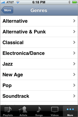
There are two major styles of table views: plain and grouped. The two styles are distinguished mainly by appearance.
表格视图有两种主要风格:简朴和分组风格。 两种风格主要通过外形区分。
Plain Table Views
1、简朴表格视图
A table view in the plain (or regular) style displays rows that stretch across the screen and have a creamy white background (see Figure 1-1). A plain table view can have one or more sections, sections can have one or more rows, and each section can have its own header or footer title. (A header or footer may also have a custom view, for instance one containing an image). When the user scrolls through a section with many rows, the header of the section floats to the top of the table view and the footer of the section floats to the bottom.
简朴(普通)风格的表格视图中的行横跨整个屏幕,并有一个白色背景(参见 图1-1)。简朴表格视图可以有一个或多个区。 每个区可以有一个或多个行,并且每个区可以有它自己的头标题或尾标题。 (头或尾还可能有一个自定义视图,比如其中可能包含一个图片)。当用户滚动带有很多行的区时,区头浮动在表格视图的顶部,区尾浮动在底部。
Figure 1-1 A table view in the plain style
图 1-1 一个简朴风格的表格视图
A variation of plain table views associates an index with sections for quick navigation; Figure 1-2 shows an example of this kind of table view, which is called an indexed list. The index runs down the right edge of the table view. Entries in the index correspond to section header titles. Touching an item in the index scrolls the table view to the associated section. For example, the section headings could be two-letter state abbreviations, and the rows for a section could be the cities in that state; touching at a certain spot in the index displays the cities for the selected state. The rows in indexed lists should not have disclosure indicators or detail disclosure buttons, because these interfere with the index.
表格视图的一个变种是关联区索引的表格视图,索引用于快速导航;图 1-2 显示了该类型表格视图的一个例子,它称为索引列表。索引位于表格视图右边,它向下延伸。 索引跟区头标题相关联。 比如,区标题(section headings)可以是两个字符组成的州缩写,区中的行可以是那个州里的城市;触摸一个索引将显示被选中州的所有城市。因为索引占用了这些界面,索引列表中的行应该没有扩展指示符或详情扩展按钮。
Figure 1-2 A table view configured as an indexed list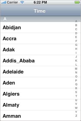
The simplest kind of table view is a selection list (see Figure 1-3). A selection list is a plain table view that presents a menu of options that users can select. It can limit the selection to one row or allow multiple selections. A selection list marks a selected row with a checkmark (see Figure 1-3).
最简单的表格视图是一个选择列表(参见图1-3)。选择列表是一个简朴表格视图,它显示了一系列用户可以选择的选项按钮。 它可以是单选也可以是多选。 选择列表用复选标记来标记被选中的一行(参见图1-3)。
Figure 1-3 A table view configured as a selection list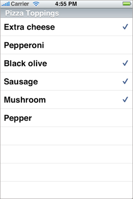
Grouped Table Views
2、分组表格视图
A grouped table view also displays a list of information, but it groups related rows in visually distinct sections. As shown in Figure 1-4, each section has rounded corners and by default appears against a bluish-gray background. Each section may have text or an image for its header or footer to provide some context or summary for the section. A grouped table works especially well for displaying the most detailed information in a data hierarchy. It allows you to separate details into conceptual groups and provide contextual information to help users understand it quickly.
分组表格视图也显示一个信息列表,但是它通过分组把相关行组织到可视的不同区里。正如图1-4所示,每个区都包含在一个圆角矩形内,并且默认情况下都有一个蓝灰色背景。每个区都可能有文本或一个图片作为它的头或尾来提供一些上下文或区的概要。分组表格在显示一个数据层次中的最详细信息时效果特别好。它让你把详细信息分成多个概念组并上下文信息来帮助用户快速理解它。
Figure 1-4 A table view in the grouped style
图 1-4 分组风格的表格视图
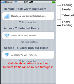
The headers and footers of sections in a grouped table view have relative locations and sizes as indicated in Figure 1-5.
分组表格视图里的区头和区尾有相对的位置和大小,如图1-5.
Figure 1-5 Header and footer of a section
On iPad devices, a grouped table view automatically gets wider margins when the table view itself is wide.
在iPad里,当表格视图变宽时,分组表格视图自动获得更宽的边距。
Standard Styles for Table View Cells
二、表格视图单元格的标准风格
In addition to defining two styles of table views, the UIKit framework defines four styles for the cells that a table view uses to draw its rows. You may create custom table view cells with different appearances if you want, but these four predefined cell styles are suitable for most purposes. The techniques for creating table view cells in a predefined style and for creating custom cells are described in “A Closer Look at Table View Cells.”
除了定义了两种风格的表格视图之外,UIKit框架还为表格视图用来绘制行的单元格定义了四种风格。 如果需要,你可以使用不同的外形创建自定义表格视图单元格,但是这四种预定义的单元格风格适合绝大多数目的。 以一种预定义风格创建表格视图单元格的技术以及创建自定义单元格等信息,请看“A Closer Look at Table View Cells.”
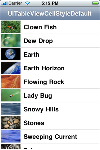
The default style for table view rows uses a simple cell style that has a single title and an optional image (Figure 1-6). This style is associated with the UITableViewCellStyleDefault constant.
表格视图行的默认风格是使用一种简单的单元格风格,它有一个标题以及一个可选的图片(图 1-6)。该风格跟UITableViewCellStyleDefault 常量相关联。
Figure 1-6 Default table row style
图1-6 默认表格行的风格
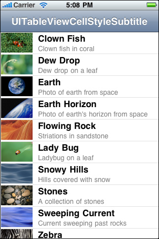
The cell style for the rows in Figure 1-7 left-aligns the main title and puts a gray subtitle under it. It also permits an image in the default image location. This style is associated with the UITableViewCellStyleSubtitle constant.
图1-7中的表格视图行的单元格风格是在主标题的下面添加了一个灰色子标题,并让两个标题向左边对齐。它还允许在默认图片的位置放置一张图片。 该风格跟 UITableViewCellStyleSubtitle 常量相关联。
Figure 1-7 Table row style with a subtitle under the title
图 1-7 标题下面带有一个子标题的表格行风格
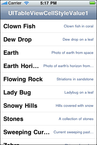
The cell style for the rows in Figure 1-8 left-aligns the main title. It puts the subtitle in blue text and right-aligns it on the right side of the row. Images are not permitted. This style is used in the Settings app, where the subtitle indicates the current setting for a preference. It is associated with the UITableViewCellStyleValue1 constant.
图 1-8 中的表格视图行的单元格风格是主标题左对齐。子标题以蓝色文本在行的右边靠右对齐。 不允许有图片。该风格被用于设置应用程序(Setting app), 子标题表明了偏好设置的当前设置。 它跟 UITableViewCellStyleValue1 常量相关联。
Figure 1-8 Table row style with a right-aligned subtitle
图 1-8 带有右对齐子标题的表行风格
The cell style for the rows in Figure 1-9 puts the main title in blue and right-aligns it at a point that’s indented from the left side of the row. The subtitle is left aligned at a short distance to the right of this point. This style does not allow images. It is used in the Contacts part of the Phone app and is associated with the UITableViewCellStyleValue2constant.
图1-9中表行的单元格风格是主标题以蓝色文本从行左边缩进那个点开始向右对齐,而子标题在距离缩进点右边不远处开始左对齐排列子标题。 该风格不允许有图片。 它被用于手机应用程序的联系人部分。它与UITableViewCellStyleValue2常量相关联。
Figure 1-9 Table row style in Contacts format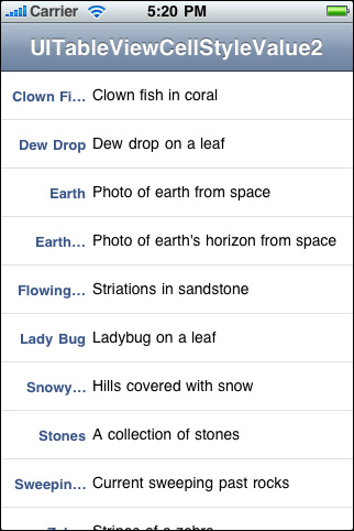
Accessory Views
三、辅助视图
There are three standard kinds of accessory views (shown with their accessory-type constants):
有三种标准辅助视图类型(同时显示了它们的辅助类型常量):
|
Standard accessory views |
Description |
|---|---|
|
|
Disclosure indicator— 扩展指示符---UITableViewCellAccessoryDisclosureIndicator。 当你选择一个单元格导出另一个放映数据模型层次中下一层的表格视图时使用该扩展指示符。 |
|
|
Detail disclosure button— 详情扩展按钮--- |
|
|
Checkmark— 复选标记--- |


Instead of the standard accessory views, you may specify a control (for example, a switch) or a custom view as the accessory view.
你可以指定一个控件(比如,一个开关)或一个自定义视图来替换标准辅助视图。