最近看到一遍关于渐变的文章,感觉很好,只是收藏感觉太可惜了,就转载了,好好学习!
CSS3 Gradient分为linear-gradient(线性渐变)和radial-gradient(径向渐变)。而我们今天主要是针对线性渐变来剖析其具体的用法。为了更好的应用CSS3 Gradient,我们需要先了解一下目前的几种现代浏览器的内核,主流内容主要有Mozilla(Gecko)(熟悉的有Firefox,Flock等浏览器)、WebKit(熟悉的有Safari、Chrome等浏览器)、Opera(presto)(Opera浏览器)、Trident(讨厌的IE浏览器)。本文照常忽略IE不管,我们主要看看在Mozilla、Webkit、Opera下的应用,当然在IE下也可以实现,他需要通过IE特有的滤镜来实现,在后面会列出滤镜的使用语法,但不会具体介绍如何实用,感兴趣的可以搜索相关技术文档。那我们了解了这些,现在就开始今天的主题吧。
CSS3的线性渐变
一、线性渐变在Mozilla下的应用
语法:
-moz-linear-gradient( [<point> || <angle>,]? <stop>, <stop> [, <stop>]* )
参数:其共有三个参数,第一个参数表示线性渐变的方向,top是从上到下、left是从左到右,如果定义成left top,那就是从左上角到右下角。第二个和第三个参数分别是起点颜色和终点颜色。你还可以在它们之间插入更多的参数,表示多种颜色的渐变。如图所示:

根据上面的介绍,我们先来看一个简单的例子:
HTML:
<div class="example example1"></div>
CSS:
.example {
    150px;
   height: 80px;
 }
(如无特殊说明,我们后面的示例都是应用这一段html和css 的基本代码)
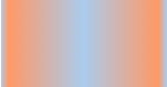
现在我们给这个div应用一个简单的渐变样式:
1 .example1 {
2    background: -moz-linear-gradient( top,#ccc,#000);
3 }
效果如下:

注:这个效果暂时只有在Mozilla内核的浏览器下才能正常显示。
二、线性渐变在Webkit下的应用
语法:
-webkit-linear-gradient( [<point> || <angle>,]? <stop>, <stop> [, <stop>]* )//最新发布书写语法
-webkit-gradient(<type>, <point> [, <radius>]?, <point> [, <radius>]? [, <stop>]*) //老式语法书写规则
参数:-webkit-gradient是webkit引擎对渐变的实现参数,一共有五个。第一个参数表示渐变类型(type),可以是linear(线性渐变)或者radial(径向渐变)。第二个参数和第三个参数,都是一对值,分别表示渐变起点和终点。这对值可以用坐标形式表示,也可以用关键值表示,比如 left top(左上角)和left bottom(左下角)。第四个和第五个参数,分别是两个color-stop函数。color-stop函数接受两个参数,第一个表示渐变的位置,0为起点,0.5为中点,1为结束点;第二个表示该点的颜色。如图所示:


我们先来看一个老式的写法示例:
background: -webkit-gradient(linear,center top,center bottom,from(#ccc), to(#000));
效果如下所示
接着我们在来看一下新式的写法:
-webkit-linear-gradient(top,#ccc,#000);
这个效果我就不在贴出来了,大家在浏览器中一看就明白了,他们是否一致的效果。仔细对比,在Mozilla和Webkit下两者的学法都基本上一致了,只是其前缀的区别,当然哪一天他们能统一成一样,对我们来说当然是更好了,那就不用去处理了。将大大节省我们的开发时间哟。
三、线性渐变在Opera下的应用
语法:
-o-linear-gradient([<point> || <angle>,]? <stop>, <stop> [, <stop>]); /* Opera 11.10+ */
参数:-o-linear-gradient有三个参数。第一个参数表示线性渐变的方向,top是从上到下、left是从左到右,如果定义成left top,那就是从左上角到右下角。第二个和第三个参数分别是起点颜色和终点颜色。你还可以在它们之间插入更多的参数,表示多种颜色的渐变。(注:Opera支持的版本有限,本例测试都是在Opera11.1版本下,后面不在提示),如图所示:

示例:
background: -o-linear-gradient(top,#ccc, #000);
效果如图所示
四、线性渐变在Trident (IE)下的应用
语法:
filter: progid:DXImageTransform.Microsoft.gradient(GradientType=0, startColorstr=#1471da, endColorstr=#1C85FB);/*IE<9>*/
-ms-filter: "progid:DXImageTransform.Microsoft.gradient (GradientType=0, startColorstr=#1471da, endColorstr=#1C85FB)";/*IE8+*/
IE依靠滤镜实现渐变。startColorstr表示起点的颜色,endColorstr表示终点颜色。GradientType表示渐变类型,0为缺省值,表示垂直渐变,1表示水平渐变。如图所示:

上面我们主要介绍了线性渐变在上述四大核心模块下的实现方法,接着我们主要针对线性渐变在MOZ、Webkit、Opera三大模块下实现各种不同线性渐变实例:
从上面的语法中我们可以很清楚的知道,要创建一个线性渐变,我们需要创建一个起点和一个渐变方向(或角度),定义一个起始色:
-moz-linear-gradient( [<point> || <angle>,]? <stop>, <stop> [, <stop>]* )
-webkit-linear-gradient( [<point> || <angle>,]? <stop>, <stop> [, <stop>]* )
-o-linear-gradient( [<point> || <angle>,]? <stop>, <stop> [, <stop>]* )
具体应用如下:
background:-moz-linear-gradient(left,#ace,#f96);/*Mozilla*/
background:-webkit-gradient(linear,0 50%,100% 50%,from(#ace),to(#f96));/*Old gradient for webkit*/
background:-webkit-linear-gradient(left,#ace,#f96);/*new gradient for Webkit*/
background:-o-linear-gradient(left,#ace,#f96); /*Opera11*/
效果如下:

起始点(Starting Point)的工作方式类似于background position。您可以设置水平和垂直位置为百分比,或以像素为单位,或在水平方向上可以使用left/center/right,在垂直方向上可以使用top/center/bottom。位置起始于左上角。如果你不指定水平或垂直位置,它将默认为center。其工作方式主要包含:Top → Bottom、Left → Right、bottom → top、right → left等,接着我们主要一种一种来看其实现的效果:
1、开始于center(水平方向)和top(垂直方向)也就是Top → Bottom:
/* Firefox 3.6+ */
background: -moz-linear-gradient(top, #ace, #f96);
/* Safari 4-5, Chrome 1-9 */
/* -webkit-gradient(,  [, ]?,  [, ]? [, ]*) */
background: -webkit-gradient(linear,top,from(#ace),to(#f96));
/* Safari 5.1+, Chrome 10+ */
background: -webkit-linear-gradient(top, #ace, #f96);
/* Opera 11.10+ */
background: -o-linear-gradient(top, #ace, #f96);
效果:

2、始于left(水平方向)和center(垂直方向)也是就Left → Right:
/* Firefox 3.6+ */
background: -moz-linear-gradient(left, #ace, #f96);
/* Safari 5.1+, Chrome 10+ */
background: -webkit-linear-gradient(left, #ace, #f96);
/* Opera 11.10+ */
background: -o-linear-gradient(left, #ace, #f96);
效果如下:

3、起始于left(水平方向)和top(垂直方向):
background: -moz-linear-gradient(left top, #ace, #f96);
background: -webkit-linear-gradient(left top, #ace, #f96);
background: -o-linear-gradient(left top, #ace, #f96);
效果如下:

4、Linear Gradient (with Even Stops):
/* Firefox 3.6+ */
background: -moz-linear-gradient(left, #ace, #f96, #ace, #f96, #ace);
/* Safari 4-5, Chrome 1-9 */
background: -webkit-gradient(linear, left top, right top, from(#ace), color-stop(0.25, #f96), color-stop(0.5, #ace), color-stop(0.75, #f96), to(#ace));
/* Safari 5.1+, Chrome 10+ */
background: -webkit-linear-gradient(left, #ace, #f96, #ace, #f96, #ace);
/* Opera 11.10+ */
background: -o-linear-gradient(left, #ace, #f96, #ace, #f96, #ace);
效果如下:

5、with Specified Arbitrary Stops:
 /* Firefox 3.6+ */
 background: -moz-linear-gradient(left, #ace, #f96 5%, #ace, #f96 95%, #ace);
 /* Safari 4-5, Chrome 1-9 */
 background: -webkit-gradient(linear, left top, right top, from(#ace), color-stop(0.05, #f96), color-stop(0.5, #ace), color-stop(0.95, #f96), to(#ace));
 /* Safari 5.1+, Chrome 10+ */
 background: -webkit-linear-gradient(left, #ace, #f96 5%, #ace, #f96 95%, #ace);
 /* Opera 11.10+ */
 background: -o-linear-gradient(left, #ace, #f96 5%, #ace, #f96 95%, #ace);
效果如下:
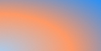
6、角度(Angle):
正如上面看到的示例,如果您不指定一个角度,它会根据起始位置自动定义。如果你想更多的控制渐变的方向,您不妨设置角度试试。例如,下面的两个渐变具有相同的起点left center,但是加上一个30度的角度。
没有角度的示例代码:
background: -moz-linear-gradient(left, #ace, #f96);
background: -webkit-linear-gradient(left,#ace,#f96);
background: -o-linear-gradient(left, #ace, #f96);
加上30度的角度代码:
background: -moz-linear-gradient(left 30deg, #ace, #f96);
background: -webkit-gradient(linear, 0 0, 100% 100%, from(#ace),to(#f96));
background: -o-linear-gradient(30deg, #ace, #f96);
效果图如下:


当指定的角度,请记住,它是一个由水平线与渐变线产生的的角度,逆时针方向。因此,使用0deg将产生一个左到右横向梯度,而90度将创建一个从底部到顶部的垂直渐变。我来看看你核心代码:
background: -moz-linear-gradient(<angle>, #ace, #f96);
background: -webkit-gradient(<type>,<angle>, from(#ace), to(#f96));
background: -webkit-linear-gradient(<angle>, #ace, #f96);
background: -o-linear-gradient(<angle>, #ace, #f96);
我们来看看各角度的区别
 1 .deg0 {
 2   background: -moz-linear-gradient(0deg, #ace, #f96);
 3   background: -webkit-gradient(linear,0 50%,100% 50%,from(#ace),to(#f96));
 4   background: -webkit-linear-gradient(0deg, #ace, #f96);
 5   background: -o-linear-gradient(0deg, #ace, #f96);
 6 }
 7
 8 .deg45 {
 9   background: -moz-linear-gradient(45deg, #ace, #f96);
10   background: -webkit-gradient(linear,0 100%,100% 0%,from(#ace),to(#f96));
11   background: -webkit-linear-gradient(45deg, #ace, #f96);
12   background: -o-linear-gradient(45deg, #ace, #f96);
13 }
14 .deg90 {
15   background: -moz-linear-gradient(90deg, #ace, #f96);
16   background: -webkit-gradient(linear,50% 100%,50% 0%,from(#ace),to(#f96));
17   background: -webkit-linear-gradient(90deg, #ace, #f96);
18   background: -o-linear-gradient(90deg, #ace, #f96);
19 }
20 .deg135 {
21   background: -moz-linear-gradient(135deg, #ace, #f96);
22   background: -webkit-gradient(linear,100% 100%,0 0,from(#ace),to(#f96));
23   background: -webkit-linear-gradient(135deg, #ace, #f96);
24   background: -o-linear-gradient(135deg, #ace, #f96);
25 }
26 .deg180 {
27   background: -moz-linear-gradient(180deg, #ace, #f96);
28   background: -webkit-gradient(linear,100% 50%,0 50%,from(#ace),to(#f96));
29   background: -webkit-linear-gradient(180deg, #ace, #f96);
30   background: -o-linear-gradient(180deg, #ace, #f96);
31 }
32 .deg225 {
33   background: -moz-linear-gradient(225deg, #ace, #f96);
34   background: -webkit-gradient(linear,100% 0%,0 100%,from(#ace),to(#f96));
35   background: -webkit-linear-gradient(225deg, #ace, #f96);
36   background: -o-linear-gradient(225deg, #ace, #f96);
37 }
38 .deg270 {
39   background: -moz-linear-gradient(270deg, #ace, #f96);
40   background: -webkit-gradient(linear,50% 0%,50% 100%,from(#ace),to(#f96));
41   background: -webkit-linear-gradient(270deg, #ace, #f96);
42   background: -o-linear-gradient(270deg, #ace, #f96);
43 }
44 .deg315 {
45   background: -moz-linear-gradient(315deg, #ace, #f96);
46   background: -webkit-gradient(linear,0% 0%,100% 100%,from(#ace),to(#f96));
47   background: -webkit-linear-gradient(315deg, #ace, #f96);
48   background: -o-linear-gradient(315deg, #ace, #f96);
49 }
50 .deg360 {
51   background: -moz-linear-gradient(360deg, #ace, #f96);
52   background: -webkit-gradient(linear,0 50%,100% 50%,from(#ace),to(#f96));
53   background: -webkit-linear-gradient(360deg, #ace, #f96);
54   background: -o-linear-gradient(360deg, #ace, #f96);
55 }
效果如下:

除了起始位置和角度,你应该指定起止颜色。起止颜色是沿着渐变线,将会在指定位置(以百分比或长度设定)含有指定颜色的点。色彩的起止数是无限的。如果您使用一个百分比位置,0%代表起点和100%是终点,但区域外的值可以被用来达到预期的效果。 这也是通过CSS3 Gradient制作渐变的一个关键所在,其直接影响了你的设计效果,像我们这里的示例都不是完美的效果,只是为了能给大家展示一个渐变的效果,大家就这样先用着吧。我们接着看一下不同的起址色的示例:
background: -moz-linear-gradient(top, #ace, #f96 80%, #f96);
background: -webkit-linear-gradient(top,#ace,#f96 80%,#f96);
background: -o-linear-gradient(top, #ace, #f96 80%, #f96);
效果如下:

如果没有指定位置,颜色会均匀分布。如下面的示例:
background: -moz-linear-gradient(left, red, #f96, yellow, green, #ace);
background: -webkit-linear-gradient(left,red,#f96,yellow,green,#ace);
background: -o-linear-gradient(left, red, #f96, yellow, green, #ace);
效果如下

7、渐变上应用透明─透明度(Transparency):
透明度还支持透明渐变。这对于制作一些特殊的效果是相当有用的,例如,当堆叠多个背景时。这里是两个背景的结合:一张图片,一个白色到透明的线性渐变。我们来看一个官网的示例吧:
background: -moz-linear-gradient(right, rgba(255,255,255,0), rgba(255,255,255,1)),url(http://demos.hacks.mozilla.org/openweb/resources/images/patterns/flowers-pattern.jpg);
background: -webkit-linear-gradient(right, rgba(255,255,255,0), rgba(255,255,255,1)),url(http://demos.hacks.mozilla.org/openweb/resources/images/patterns/flowers-pattern.jpg);
background: -o-linear-gradient(right, rgba(255,255,255,0), rgba(255,255,255,1)),url(http://demos.hacks.mozilla.org/openweb/resources/images/patterns/flowers-pattern.jpg);
接着看看效果吧

大家可以时入这里和原图做一下比较,是不是很神奇呀。如果想体会的话,快点动手跟我一起做吧。
上面我们主要介绍了CSS3中线性渐变,文章一开始说过CSS3渐变包含两个部分,其一就是我们说的线性渐变,其二就是我们接下来要说的径向渐变。
CSS3的径向渐变
CSS3的径向渐变和其线性渐变是很相似的。我们首先来看其语法:
 -moz-radial-gradient([<bg-position> || <angle>,]? [<shape> || <size>,]? <color-stop>, <color-stop>[, <color-stop>]*);
 -webkit-radial-gradient([<bg-position> || <angle>,]? [<shape> || <size>,]? <color-stop>, <color-stop>[, <color-stop>]*);
(需要特别说明一点的是,径向渐变到目前还不支持Opera的内核浏览器,所以我们径向渐变都是在firefox,safari,chrome底下进行测试完成的。)
除了您已经在线性渐变中看到的起始位置,方向,和颜色,径向梯度允许你指定渐变的形状(圆形或椭圆形)和大小(最近端,最近角,最远端,最远角,包含或覆盖 (closest-side, closest-corner, farthest-side, farthest-corner, contain or cover))。 颜色起止(Color stops):就像用线性渐变,你应该沿着渐变线定义渐变的起止颜色。下面为了更好的理解其具体的用法,我们主要通过不同的示例来对比CSS3径向渐变的具体用法
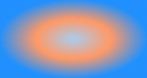
示例一:
 background: -moz-radial-gradient(#ace, #f96, #1E90FF);
 background: -webkit-radial-gradient(#ace, #f96, #1E90FF);
效果:

示例二:
 background: -moz-radial-gradient(#ace 5%, #f96 25%, #1E90FF 50%);
 background: -webkit-radial-gradient(#ace 5%, #f96 25%, #1E90FF 50%);
效果:

从以上俩个示例的代码中发现,他们起止色想同,但就是示例二定位了些数据,为什么会造成这么大的区别呢?其实在径向渐变中虽然具有相同的起止色,但是在没有设置位置时,其默认颜色为均匀间隔,这一点和我们前面的线性渐变是一样的,但是设置了渐变位置就会按照渐变位置去渐变,这就是我们示例一和示例的区别之处:虽然圆具有相同的起止颜色,但在示例一为默认的颜色间隔均匀的渐变,而示例二每种颜色都有特定的位置。
示例三
  background: -moz-radial-gradient(bottom left, circle, #ace, #f96, #1E90FF);
  background: -webkit-radial-gradient(bottom left, circle, #ace, #f96, #1E90FF);
效果

示例四
background: -moz-radial-gradient(bottom left, ellipse, #ace, #f96, #1E90FF);
background: -webkit-radial-gradient(bottom left, ellipse, #ace, #f96, #1E90FF);
效果
示例三和示例四我们从效果中就可以看出,其形状不一样,示例三程圆形而示例四程椭圆形状,也是就是说他们存在形状上的差异。然而我们在回到两个示例的代码中,显然在示例三中设置其形状为circle而在示例四中ellipse,换而言之在径向渐变中,我们是可以会渐变设置其形状的。
示例五
background: -moz-radial-gradient(ellipse closest-side, #ace, #f96 10%, #1E90FF 50%, #f96);
background: -webkit-radial-gradient(ellipse closest-side, #ace, #f96 10%, #1E90FF 50%, #f96);
效果:

示例六
background: -moz-radial-gradient(ellipse farthest-corner, #ace, #f96 10%, #1E90FF 50%, #f96);
background: -webkit-radial-gradient(ellipse farthest-corner, #ace, #f96 10%, #1E90FF 50%, #f96);
效果:

从示例五和示例六中的代码中我们可以清楚知道,在示例五中我人应用了closest-side而在示例六中我们应用了farthest-corner。这样我们可以知道在径向渐变中我们还可以为其设置大小(Size):size的不同选项(closest-side, closest-corner, farthest-side, farthest-corner, contain or cover)指向被用来定义圆或椭圆大小的点。 示例:椭圆的近边VS远角 下面的两个椭圆有不同的大小。示例五是由从起始点(center)到近边的距离设定的,而示例六是由从起始点到远角的的距离决定的。
示例七:
background: -moz-radial-gradient(circle closest-side, #ace, #f96 10%, #1E90FF 50%, #f96);
background: -webkit-radial-gradient(circle closest-side, #ace, #f96 10%, #1E90FF 50%, #f96);
效果:

示例八:
background: -moz-radial-gradient(circle farthest-side, #ace, #f96 10%, #1E90FF 50%, #f96);
background: -webkit-radial-gradient(circle farthest-side, #ace, #f96 10%, #1E90FF 50%, #f96);
效果:

示例七和示例八主要演示了圆的近边VS远边 ,示例七的圆的渐变大小由起始点(center)到近边的距离决定,而示例八的圆则有起始点到远边的距离决定。
示例九:
background: -moz-radial-gradient(#ace, #f96, #1E90FF);
background: -webkit-radial-gradient(#ace, #f96, #1E90FF);
效果:

示例十:
background: -moz-radial-gradient(contain, #ace, #f96, #1E90FF);
background: -webkit-radial-gradient(contain, #ace, #f96, #1E90FF);
效果:
示例九和示例十演示了包含圆 。在这里你可以看到示例九的默认圈,同一渐变版本,但是被包含的示例十的圆。
最后我们在来看两个实例一个是应用了中心定位和full sized,如下所示:
1  /* Firefox 3.6+ */
2  background: -moz-radial-gradient(circle, #ace, #f96);
3  /* Safari 4-5, Chrome 1-9 */
4  /* Can't specify a percentage size? Laaaaaame. */
5  background: -webkit-gradient(radial, center center, 0, center center, 460, from(#ace), to(#f96));
6  /* Safari 5.1+, Chrome 10+ */
7  background: -webkit-radial-gradient(circle, #ace, #f96);
效果如下:

下面这个实例应用的是Positioned, Sized,请看代码和效果
1 /* Firefox 3.6+ */
2 /* -moz-radial-gradient( [ || ,]? [ || ,]? , [, ]* ) */
3 background: -moz-radial-gradient(80% 20%, closest-corner, #ace, #f96);
4 /* Safari 4-5, Chrome 1-9 */
5 background: -webkit-gradient(radial, 80% 20%, 0, 80% 40%, 100, from(#ace), to(#f96));
6 /* Safari 5.1+, Chrome 10+ */
7 background: -webkit-radial-gradient(80% 20%, closest-corner, #ace, #f96);
效果:

到此关于CSS3的两种渐变方式我们都介绍完了。在浪费大家一点时间,我们看看CSS的重复渐变的应用。
如果您想重复一个渐变,您可以使用-moz-repeating-linear-gradient和-moz-repeating-radial-gradient。 在下面的例子,每个实例都指定了两个起止颜色,并无限重复。
1 background: -moz-repeating-radial-gradient(#ace, #ace 5px, #f96 5px, #f96 10px);
2 background: -webkit-repeating-radial-gradient(#ace, #ace 5px, #f96 5px, #f96 10px);
1 background: -moz-repeating-linear-gradient(top left -45deg, #ace, #ace 5px, #f96 5px, #f96 10px);
2 background: -webkit-repeating-linear-gradient(top left -45deg, #ace, #ace 5px, #f96 5px, #f96 10px);
效果:


有关于CSS3渐变的东西就完了,大家看完了肯定会想,他主要用在哪些方面呢?这个说起来就多了,最简单的就是制作背景,我们还可以应用其制作一些漂亮的按钮,还可以用他来制作patterns,我在这里列出几种制作patterns的示例代码吧:
HTML代码:
1 <ul>
2    <li class="gradient gradient1"></li>
3    <li class="gradient gradient2"></li>
4    <li class="gradient gradient3"></li>
5    <li class="gradient gradient4"></li>
6    <li class="gradient gradient5"></li>
7    <li class="gradient gradient6"></li>
8    </ul>
CSS 代码:
  1 ul {
  2   overflow: hidden;
  3   margin-top: 20px;
  4 }
  5 li{
  6    150px;
  7   height: 80px;
  8   margin-bottom: 10px;
  9   float: left;
 10   margin-right: 5px;
 11   background: #ace;
 12   /*Controls the size*/
 13   -webkit-background-size: 20px 20px;
 14   -moz-background-size: 20px 20px;
 15   background-size: 20px 20px;
 16 }
 17
 18 li.gradient1 {
 19   background-image: -webkit-gradient(
 20     linear,
 21     0 100%, 100% 0,
 22     color-stop(.25, rgba(255, 255, 255, .2)),
 23     color-stop(.25, transparent),
 24     color-stop(.5, transparent),
 25     color-stop(.5, rgba(255, 255, 255, .2)),
 26     color-stop(.75, rgba(255, 255, 255, .2)),
 27     color-stop(.75, transparent),
 28     to(transparent)
 29     );
 30   background-image: -moz-linear-gradient(
 31     45deg,
 32     rgba(255, 255, 255, .2) 25%,
 33     transparent 25%,
 34     transparent 50%,
 35     rgba(255, 255, 255, .2) 50%,
 36     rgba(255, 255, 255, .2) 75%,
 37     transparent 75%,
 38     transparent
 39     );
 40   background-image: -o-linear-gradient(
 41     45deg,
 42     rgba(255, 255, 255, .2) 25%,
 43     transparent 25%,
 44     transparent 50%,
 45     rgba(255, 255, 255, .2) 50%,
 46     rgba(255, 255, 255, .2) 75%,
 47     transparent 75%,
 48     transparent
 49   );
 50   background-image: linear-gradient(
 51     45deg,
 52     rgba(255, 255, 255, .2) 25%,
 53     transparent 25%,
 54     transparent 50%,
 55     gba(255, 255, 255, .2) 50%,
 56     rgba(255, 255, 255, .2) 75%,
 57     transparent 75%,
 58     transparent
 59     );
 60 }
 61
 62 li.gradient2 {
 63    background-image: -webkit-gradient(linear, 0 0, 100% 100%,
 64       color-stop(.25, rgba(255, 255, 255, .2)), color-stop(.25, transparent),
 65       color-stop(.5, transparent), color-stop(.5, rgba(255, 255, 255, .2)),
 66       color-stop(.75, rgba(255, 255, 255, .2)), color-stop(.75, transparent),
 67       to(transparent));
 68    background-image: -moz-linear-gradient(-45deg, rgba(255, 255, 255, .2) 25%, transparent 25%,
 69       transparent 50%, rgba(255, 255, 255, .2) 50%, rgba(255, 255, 255, .2) 75%,
 70       transparent 75%, transparent);
 71    background-image: -o-linear-gradient(-45deg, rgba(255, 255, 255, .2) 25%, transparent 25%,
 72       transparent 50%, rgba(255, 255, 255, .2) 50%, rgba(255, 255, 255, .2) 75%,
 73       transparent 75%, transparent);
 74    background-image: linear-gradient(-45deg, rgba(255, 255, 255, .2) 25%, transparent 25%,
 75       transparent 50%, rgba(255, 255, 255, .2) 50%, rgba(255, 255, 255, .2) 75%,
 76       transparent 75%, transparent);
 77 }
 78
 79 li.gradient3 {
 80   background-image: -webkit-gradient(linear, 0 0, 0 100%, color-stop(.5, rgba(255, 255, 255, .2)), color-stop(.5, transparent), to(transparent));
 81   background-image: -moz-linear-gradient(rgba(255, 255, 255, .2) 50%, transparent 50%, transparent);
 82   background-image: -o-linear-gradient(rgba(255, 255, 255, .2) 50%, transparent 50%, transparent);
 83   background-image: linear-gradient(rgba(255, 255, 255, .2) 50%, transparent 50%, transparent);
 84 }
 85
 86 li.gradient4 {
 87   background-image: -webkit-gradient(linear, 0 0, 100% 0, color-stop(.5, rgba(255, 255, 255, .2)), color-stop(.5, transparent), to(transparent));
 88   background-image: -moz-linear-gradient(0deg, rgba(255, 255, 255, .2) 50%, transparent 50%, transparent);
 89   background-image: -o-linear-gradient(0deg, rgba(255, 255, 255, .2) 50%, transparent 50%, transparent);
 90   background-image: linear-gradient(0deg, rgba(255, 255, 255, .2) 50%, transparent 50%, transparent);
 91 }
 92
 93 li.gradient5 {
 94   background-image: -webkit-gradient(linear, 0 0, 100% 100%, color-stop(.25, #555), color-stop(.25, transparent), to(transparent)),
 95       -webkit-gradient(linear, 0 100%, 100% 0, color-stop(.25, #555), color-stop(.25, transparent), to(transparent)),
 96       -webkit-gradient(linear, 0 0, 100% 100%, color-stop(.75, transparent), color-stop(.75, #555)),
 97       -webkit-gradient(linear, 0 100%, 100% 0, color-stop(.75, transparent), color-stop(.75, #555));
 98   background-image: -moz-linear-gradient(45deg, #555 25%, transparent 25%, transparent),
 99      -moz-linear-gradient(-45deg, #555 25%, transparent 25%, transparent),
100      -moz-linear-gradient(45deg, transparent 75%, #555 75%),
101      -moz-linear-gradient(-45deg, transparent 75%, #555 75%);
102   background-image: -o-linear-gradient(45deg, #555 25%, transparent 25%, transparent),
103      -o-linear-gradient(-45deg, #555 25%, transparent 25%, transparent),
104      -o-linear-gradient(45deg, transparent 75%, #555 75%),
105      -o-linear-gradient(-45deg, transparent 75%, #555 75%);
106   background-image: linear-gradient(45deg, #555 25%, transparent 25%, transparent),
107     linear-gradient(-45deg, #555 25%, transparent 25%, transparent),
108     linear-gradient(45deg, transparent 75%, #555 75%),
109     linear-gradient(-45deg, transparent 75%, #555 75%);
110 }
111
112 li.gradient6 {
113   background-image: -webkit-gradient(linear, 0 0, 0 100%, color-stop(.5, transparent), color-stop(.5, rgba(200, 0, 0, .5)), to(rgba(200, 0, 0, .5))),
114      -webkit-gradient(linear, 0 0, 100% 0, color-stop(.5, transparent), color-stop(.5, rgba(200, 0, 0, .5)), to(rgba(200, 0, 0, .5)));
115   background-image: -moz-linear-gradient(transparent 50%, rgba(200, 0, 0, .5) 50%, rgba(200, 0, 0, .5)),
116      -moz-linear-gradient(0deg, transparent 50%, rgba(200, 0, 0, .5) 50%, rgba(200, 0, 0, .5));
117   background-image: -o-linear-gradient(transparent 50%, rgba(200, 0, 0, .5) 50%, rgba(200, 0, 0, .5)),
118      -o-linear-gradient(0deg, transparent 50%, rgba(200, 0, 0, .5) 50%, rgba(200, 0, 0, .5));
119   background-image: linear-gradient(transparent 50%, rgba(200, 0, 0, .5) 50%, rgba(200, 0, 0, .5)),
120      linear-gradient(0deg, transparent 50%, rgba(200, 0, 0, .5) 50%, rgba(200, 0, 0, .5));
121 }
效果:

著作权归作者所有。
商业转载请联系作者获得授权,非商业转载请注明出处。
原文: http://www.w3cplus.com/content/css3-gradient © w3cplus.com