Flutter中给我们预先定义好了一些按钮控件给我们用,常用的按钮如下

    RaisedButton :凸起的按钮,其实就是Android中的Material Design风格的Button ,继承自MaterialButton
    FlatButton :扁平化的按钮,继承自MaterialButton
    OutlineButton    :带边框的按钮,继承自MaterialButton
    IconButton    :图标按钮,继承自StatelessWidget

我们先来看看MaterialButton中的属性,可以看到能设置的属性还是很多的。

  const MaterialButton({
    Key key,
    @required this.onPressed,
    this.onHighlightChanged,
    this.textTheme,
    this.textColor,
    this.disabledTextColor,
    this.color,
    this.disabledColor,
    this.highlightColor,
    this.splashColor,
    this.colorBrightness,
    this.elevation,
    this.highlightElevation,
    this.disabledElevation,
    this.padding,
    this.shape,
    this.clipBehavior = Clip.none,
    this.materialTapTargetSize,
    this.animationDuration,
    this.minWidth,
    this.height,
    this.child,
  }) : super(key: key);


下面我们来看看常用属性
属性     值类型     说明
onPressed     VoidCallback ,一般接收一个方法     必填参数,按下按钮时触发的回调,接收一个方法,传null表示按钮禁用,会显示禁用相关样式
child     Widget     文本控件
textColor     Color     文本颜色
color     Color     按钮的颜色
disabledColor     Color     按钮禁用时的颜色
disabledTextColor     Color     按钮禁用时的文本颜色
splashColor     Color     点击按钮时水波纹的颜色
highlightColor     Color     点击(长按)按钮后按钮的颜色
elevation     double     阴影的范围,值越大阴影范围越大
padding     EdgeInsetsGeometry (抽象类)     内边距
shape     ShapeBorder(抽象类)     设置按钮的形状
minWidth     double     最小宽度
height     double     高度

而在Android中如果我们要修改按钮样式的话,需要通过selector和Shape等方式进行修改,相比较Flutter来说是要麻烦不少的
RaisedButton

RaisedButton的构造方法如下,由于继承自MaterialButton,所以MaterialButton中的大多数属性这边都能用,且效果一致,这里就不在赘述了

  const RaisedButton({
    Key key,
    @required VoidCallback onPressed,
    ValueChanged<bool> onHighlightChanged,
    ButtonTextTheme textTheme,
    Color textColor,
    Color disabledTextColor,
    Color color,
    Color disabledColor,
    Color highlightColor,
    Color splashColor,
    Brightness colorBrightness,
    double elevation,
    double highlightElevation,
    double disabledElevation,
    EdgeInsetsGeometry padding,
    ShapeBorder shape,
    Clip clipBehavior = Clip.none,
    MaterialTapTargetSize materialTapTargetSize,
    Duration animationDuration,
    Widget child,
  })


下面我们来看一下属性

onPressed
接收一个方法,点击按钮时回调该方法。如果传null,则表示按钮禁用

 return RaisedButton(
      onPressed: null,
    );

如下图所示

下面我们定义一个方法传给onPressed

_log() {
    print("点击了按钮");
  }

  @override
  Widget build(BuildContext context) {
    return RaisedButton(
      onPressed: _log,
    );
  }

点击按钮后会调用log方法。

child
按钮文本控件,一般都是传一个Text Widget
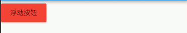
return RaisedButton(
onPressed: _log,
child: Text("浮动按钮"),
);

color
按钮的颜色

return RaisedButton(
      onPressed: _log,
      child: Text("浮动按钮"),
      color: Colors.red,
    );
textColor
按钮的文本颜色

 return RaisedButton(
      onPressed: _log,
      child: Text("浮动按钮"),
      color: Colors.red,
      textColor: Colors.white,
    );

splashColor
点击按钮时水波纹的颜色

   return RaisedButton(
      onPressed: _log,
      child: Text("浮动按钮"),
      color: Colors.red,
      textColor: Colors.white,
      splashColor: Colors.black,

    );

highlightColor
高亮颜色,点击(长按)按钮后的颜色

    return RaisedButton(
      onPressed: _log,
      child: Text("浮动按钮"),
      color: Colors.red,
      textColor: Colors.white,
      splashColor: Colors.black,
      highlightColor: Colors.green,
    );

elevation
阴影范围,一般不会设置太大

    return RaisedButton(
      onPressed: _log,
      child: Text("浮动按钮"),
      color: Colors.red,
      textColor: Colors.white,
      splashColor: Colors.black,
      highlightColor: Colors.green,
      elevation: 30,
    );

padding
内边距,其接收值的类型是EdgeInsetsGeometry类型的,EdgeInsetsGeometry是一个抽象类,我们来看看其实现类

我们一般都用EdgeInsets类中的方法来设置padding
常用方法如下

//单独设置左上右下的间距,四个参数都要填写
const EdgeInsets.fromLTRB(this.left, this.top, this.right, this.bottom);

//单独设置左上右下的间距,四个均为可选参数
  const EdgeInsets.only({
    this.left = 0.0,
    this.top = 0.0,
    this.right = 0.0,
    this.bottom = 0.0
  });

  //一次性设置上下左右的间距
  const EdgeInsets.all(double value)
      : left = value, top = value, right = value, bottom = value;


示例:

EdgeInsets.all()

      padding: EdgeInsets.all(20)

EdgeInsets.fromLTRB()

padding: EdgeInsets.fromLTRB(0,30,20,40)

EdgeInsets.only()

 padding: EdgeInsets.only(top: 30)

shape
shape用来设置按钮的形状,其接收值是ShapeBorder类型,ShapeBorder是一个抽象类,我们来看看有哪些实现类

可以看到,实现类还是很多的,我们主要来看看常用的即可。

    BeveledRectangleBorder 带斜角的长方形边框
    CircleBorder 圆形边框
    RoundedRectangleBorder 圆角矩形
    StadiumBorder 两端是半圆的边框

我们来简单用一用,在用之前我们先来看一下
常用的两个属性

    side 用来设置边线(颜色,宽度等)
    borderRadius 用来设置圆角

side接收一个BorderSide类型的值,比较简单,这里就不介绍了,看一下构造方法

  const BorderSide({
    this.color = const Color(0xFF000000),
    this.width = 1.0,
    this.style = BorderStyle.solid,
  })

borderRadius 接收一个BorderRadius类型的值,常用方法如下

我们可以把borderRadius分为上下左右四个方向,下面的方法都是对这四个方向进行设置,

    all 配置所有方向
    cricular 环形配置,跟all效果差不多,直接接收double类型的值
    horizontal 只配置左右方向
    only 可选左上,右上,左下,右下配置
    vertical 只配置上下方向

具体配置大家自行尝试

我们来简单用一下

BeveledRectangleBorder
带斜角的长方形边框

shape: BeveledRectangleBorder(
         side: BorderSide(
        color: Colors.white,
      ),
      borderRadius: BorderRadius.all(Radius.circular(10))
      ),

CircleBorder
圆形边框

     shape: CircleBorder(
        side: BorderSide(
          color: Colors.white,
        ),
      ),

RoundedRectangleBorder
圆角矩形

     shape: RoundedRectangleBorder(
        borderRadius: BorderRadius.all(Radius.circular(10)),
      ),

StadiumBorder
两端是半圆的边框

 shape: StadiumBorder(),

FlatButton

FlatButton跟RaisedButton用法基本一致,下面我们就直接用一下

/*扁平按钮*/
class FlatBtn extends StatelessWidget {
  _log() {
    print("点击了扁平按钮");
  }

  @override
  Widget build(BuildContext context) {
    return FlatButton(
      onPressed: _log,
      child: Text("扁平按钮"),
      color: Colors.blue,
      textColor: Colors.black,
      shape: RoundedRectangleBorder(
          side: BorderSide(
            color: Colors.white,
             1,
          ),
          borderRadius: BorderRadius.circular(8)),
    );
  }
}

OutlineButton

注意,OutlineButton是一个有默认边线且背景透明的按钮,也就是说我们设置其边线和颜色是无效的,其他属性跟MaterialButton中属性基本一致

下面我们直接来使用


/*带边线的按钮*/
class outlineBtn extends StatelessWidget {
  _log() {
    print("点击了边线按钮");
  }

  @override
  Widget build(BuildContext context) {
    // TODO: implement build
    return OutlineButton(
      onPressed: _log,
      child: Text("边线按钮"),
      textColor: Colors.red,
      splashColor: Colors.green,
      highlightColor: Colors.black,
      shape: BeveledRectangleBorder(
        side: BorderSide(
          color: Colors.red,
           1,
        ),
        borderRadius: BorderRadius.circular(10),
      ),
    );
  }
}

效果如下:

IconButton

IconButton是直接继承自StatelessWidget的,默认没有背景
我们来看一下他的构造方法

const IconButton({
    Key key,
    this.iconSize = 24.0,
    this.padding = const EdgeInsets.all(8.0),
    this.alignment = Alignment.center,
    @required this.icon,
    this.color,
    this.highlightColor,
    this.splashColor,
    this.disabledColor,
    @required this.onPressed,
    this.tooltip
  })


可以看到,icon是必填参数

icon接收一个Widget,但是一般我们都是传入一个Icon Widget

final Widget icon;


其他属性跟MaterialButton中的属性用法基本一致

我们来用一下

/*图标按钮*/
class IconBtn extends StatelessWidget {
  _log() {
    print("点击了图标按钮");
  }

  @override
  Widget build(BuildContext context) {
    return IconButton(
      icon: Icon(Icons.home),
      onPressed: _log,
      color: Colors.blueAccent,
      highlightColor: Colors.red,
    );
  }
}


效果如下

我们也可以传一个Text或其他Widget,这个大家自行尝试吧

Flutter中Button内容大概就是这些