用css3写3D立方体用到的属性不多,就那么几个:perspective,transform-style,以及transform。
目前来说能完美支持3D的浏览器有chrome、safari,火狐也支持。所以本文的css3代码都只加了webkit前缀,因为产生3D的关键属性perspective其他浏览器都不支持,所以其他浏览器是应该是看不了3D的,所以看本文的例子请用chrome或者safari来看哦。
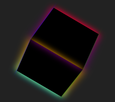
代码:
<!DOCTYPE html>
<html lang="en">
<head>
    <meta charset="UTF-8">
    <meta name="viewport" content="width=device-width, initial-scale=1.0">
    <meta http-equiv="X-UA-Compatible" content="ie=edge">
    <title>CSS鼠标移入效果</title>
    <style>
    *{margin: 0px;padding: 0px;}
    body{background: #222;}
    div.wrap{
        width: 200px;
        perspective: 1000px;/*景深*/
        position: absolute;
        top: 50%;
        left: 50%;
        transform: translateX(-50%) translateY(-50%);/*移动*/
    }
    .cube{
        width: 200px;
        height:200px;
        position: relative;
        transform-style: preserve-3d;/*所有子元素在3D空间中呈现*/
        transform: rotateX(-50deg) rotateY(50deg) rotateZ(0deg);
        animation: move 8s infinite linear;
    }
    .cube>div{
        width: 100%;
        height: 100%;
        background: #000;
        position: absolute;
        box-shadow: 0 0 30px currentColor;
    }
    .cube:hover div{
        background: currentColor;
        box-shadow: 0 0 60px currentColor;
    }
    .cube .out_front{
        color: red;
        transform: translateZ(100px);
    }
    .cube .out_back{
        color: orange;
        transform: translateZ(-100px);
    }
    .cube .out_left{
        color: blue;
        transform: translateX(-100px) rotateY(-90deg);
    }
    .cube .out_right{
        color: green;
        transform: translateX(100px) rotateY(90deg);
    }
    .cube .out_top{
        color: aqua;
        transform: translateY(-100px) rotateX(-90deg);
    }
    .cube .out_bottom{
        color: purple;
        transform: translateY(100px) rotateX(90deg);
    }

    /*帧动画*/
    @keyframes move{
    0%{
        transform:rotateX(0deg) rotateY(0deg) rotateZ(0deg) ;
    }
    100%{
        transform:rotateX(720deg) rotateY(360deg) rotateZ(360deg);
    }
}
    </style>
</head>
<body>
    <div class="wrap">
        <div class="cube">
            <div class="out_front"></div>
            <div class="out_back"></div>
            <div class="out_left"></div>
            <div class="out_right"></div>
            <div class="out_top"></div>
            <div class="out_bottom"></div>
        </div>
    </div>
</body>
</html>