1. 概述
1.1 说明
在项目过程中,有时候需要使用动画效果来展现某一效果,实现动画效果的方式有很多种,而css3提供的animation属性则可直接使用样式进行控制动画效果。
1.2 动画使用
注意:IE10以前版本不支持animation属性
1.2.1 animation 集合使用
示例:div横向移动效果
<!DOCTYPE html>
<html>
<head>
<meta charset="utf-8">
<title></title>
<style>
div
{
    width:100px;
    height:100px;
    background:red;
    position:relative;
    animation:divmove 5s infinite;
    -webkit-animation:mymove 5s infinite; /*Safari and Chrome*/
}

@keyframes divmove
{
    from {left:0px;}
    to {left:200px;}
}

@-webkit-keyframes mymove /*Safari and Chrome*/
{
    from {left:0px;}
    to {left:200px;}
}
</style>
</head>
<body>
<div></div>
</body>
</html>
-
- animation: name duration timing-funtion delay iteration-count direction fill-mode play-state;
- name 对应animation-name单独属性,作用是指定要绑定到选择器的关键帧(即为@keyframes 动画指定一个名称)的名称
- duration 对应animation-duration单独属性,定义动画完成一个周期需要多少秒(s)或毫秒(ms),即动画播放完成花费时间。
- timing-function 对应animation-timing-function单独属性,设置动画将如何完成一个周期(如从开始到结束以相同的速度播放动画)
- delay 对应animation-delay单独属性,设置动画在启动前的延迟时间。
- iteration-count 对应animation-iteration-count单独属性,定义动画的播放次数
- direction 对应animation-direction单独属性,定义是否循环交替反向播放动画
- fill-mode 对应animation-fill-mode单独属性,规定当动画不播放时(当动画完成或当动画有一个延迟未开始播放),要应用到元素的样式
- play-state 对应animation-play-state单独属性,指定动画是否正在运行或已暂停
- animation: name duration timing-funtion delay iteration-count direction fill-mode play-state;
1.2.2 animation 单独使用
示例:div横向移动效果
<!DOCTYPE html>
<html>
<head>
<meta charset="utf-8">
<title></title>
<style>
div
{
    width:100px;
    height:100px;
    background:red;
    position:relative;
    animation-name:divmove;
    animation-duration:5s;
    animation-iteration-count:infinite;
    -webkit-animation-name:mymove; /*Safari and Chrome*/
    -webkit-animation-duration:5s; /*Safari and Chrome*/
    -webkit-animation-iteration-count:infinite; /*Safari and Chrome*/
}

@keyframes divmove
{
    from {left:0px;}
    to {left:200px;}
}

@-webkit-keyframes mymove /*Safari and Chrome*/
{
    from {left:0px;}
    to {left:200px;}
}
</style>
</head>
<body>
<div></div>
</body>
</html>
-
- animation-name 为@keyframes动画指定名称;
- animation-name: keyframename | none ; keyframename要绑定到选择器的关键帧的名称,none指定有没有动画
- animation-duration 定义动画完成一个周期需要多少秒或毫秒
- animation-duration: time; time指定动画播放完成花费的时间,默认值为0,表示没有动画效果
- animation-timing-function 指定动画将如何完成一个周期
- animation-timing-function: linear; 动画从头到尾的速度时相同的
- animation-timing-function: ease; 默认,动画以低速开始,然后加快,在结束前变慢
- animation-timing-function: ease-in; 动画以低速开始
- animation-timing-function: ease-out; 动画以低速结束
- animation-timing-function: ease-in-out; 动画以低速开始和结束
- animation-timing-function: cubic-bezier(n,n,n,n); 在cubic-bezier(n,n,n,n)函数中的值的范围是从0到1的数值
- animation-delay 动画开始前等待多长时间,可以为负值(负值为进入立即开始,并且跳过设置的值进入动画)
- animation-delay: time;定义动画开始前等待的时间,以秒或者毫秒为单位。默认值0
- animation-iteration-count 定义动画应该播放多少次
- animation-iteration-count: n; n为数字,定义应该播放多少次动画
- animation-iteration-count: infinite; 播放此时无限次
- animation-name 为@keyframes动画指定名称;
2. 代码
2.1 代码示例
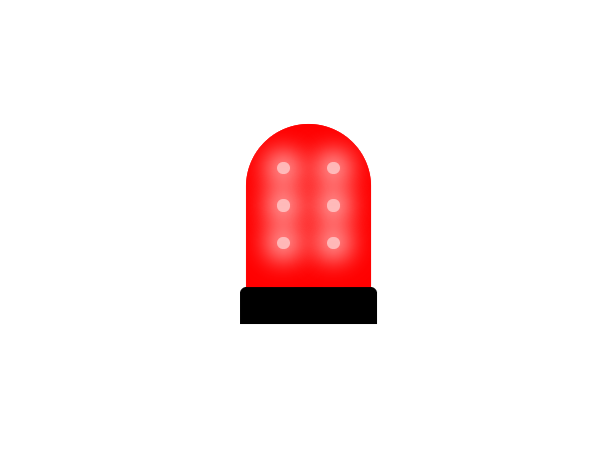
警报灯
<template>
  <div class="warning-warp">
    <div class="warning-item warning-content">
      <span class="bulb"></span>
      <span class="bulb"></span>
      <span class="bulb"></span>
      <span class="bulb"></span>
      <span class="bulb"></span>
      <span class="bulb"></span>
    </div>
    <div class="warning-bottom"></div>
  </div>
</template>

<script>
  export default {
    name: "warning"
  }
</script>

<style scoped>
  .warning-warp {
    margin: 100px auto;
    width: 900px;
    display: flex;
    flex-direction: column;
  }

  .warning-warp .warning-item {
    height: 130px;
    width: 100px;
    float: left;
    margin: 0 5px;
    position: relative;
    padding: 20px 10px;
  }

  .warning-warp .warning-item.warning-content {
    border-radius: 50px 50px 0 0;
  }

  .warning-warp .warning-item.warning-content {
    background: #f00;
    box-shadow: 0 0 50px 10px #f00, inset 0 0 10px #f99;
    animation-name: warningLight;
    animation-duration: 1s;
    animation-delay: 0.3s;
    animation-iteration-count: infinite;
  }

  .warning-warp .warning-item.warning-content .bulb {
    float: left;
    width: 10px;
    height: 10px;
    margin: 10px 15px;
    background: #ffe5e5;
    box-shadow: 0 0 20px 8px white;
    border-radius: 20px;
    opacity: 0.8;
    animation-name: bulb;
    animation-duration: 1s;
    animation-delay: 0.3s;
    animation-iteration-count: infinite;
  }

  @keyframes bulb {
    0% {
      background: #ffe5e5;
      box-shadow: 0 0 20px 8px white;
    }
    50% {
      background: #ffe5e5;
      box-shadow: 0 0 40px 20px white;
    }
    100% {
      background: #ffe5e5;
      box-shadow: 0 0 20px 8px white;
    }
  }

  @keyframes warningLight {
    0% {
      box-shadow: 0 0 0 0 #f00;
    }
    50% {
      box-shadow: 0 0 50px 10px #f00, 0 0 200px 20px #f00;
      z-index: 10;
    }
    100% {
      box-shadow: 0 0 0 0 #f00;
    }
  }
  .warning-bottom {
    width: 110px;
    height: 30px;
    background: #000;
    -webkit-border-radius: 5px 5px 0 0;
    -moz-border-radius: 5px 5px 0 0;
    border-radius: 5px 5px 0 0;
  }
</style>
2.2 结果示例
结果类似(自制gif)