浮动布局
浮动是CSS布局中经常使用的一种手段,其实说白了就是使元素进行漂浮脱离正常的文档流排列机制,实现一堆原本的block状态的标签可以并排显示,当然这也可以使用display:inline-block进行实现,但是通常情况我们不会那么做。
那么在使用浮动时我们应该注意下面的几点。
1.浮动应该发生在一个大盒子内部
2.浮动元素会影响后面文档流排列元素
3.浮动元素会自动转为
inline-block状态,这意味着原本的inline元素可设置宽高,而原本的block元素不会独占一行4.浮动元素会在父盒子的
content区域中,不会超出父盒子的padding区域5.当一个父盒子中所有元素都进行浮动,那么父盒子会丢失高度
对一个元素使用float就可以让该元素飘起来,它可以指定以下一些方向。
| 选项 | 说明 |
|---|---|
| left | 向左浮动 |
| right | 向右浮动 |
| none | 不浮动 |
文档流排列
文档流排列就是自上向下的一种排列方式,对于block元素来说,它应该是独占一行的。


<!DOCTYPE html> <html lang="en"> <head> <meta charset="UTF-8"> <meta name="viewport" content="width=device-width, initial-scale=1.0"> <title>Document</title> <style> article{ width: 220px; padding: 10px; border: solid 2px black; } article section:first-child{ border: solid 2px blue; box-sizing: border-box; width: 100px; height: 100px; } article section:last-child{ box-sizing: border-box; width: 100px; height: 100px; } </style> </head> <body> <article> <section></section> <section></section> </article> </body> </html>
空间占用
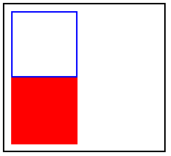
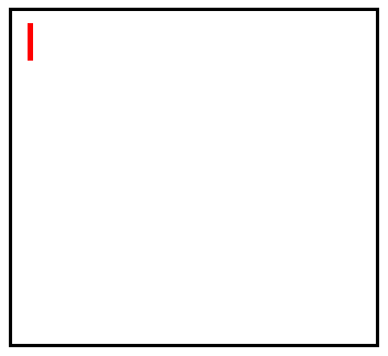
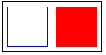
在同级情况下,排列在前的一个标签如果进行浮动设置从而脱离了文档流,那么排列在后的标签会占用之前标签的位置。
可以看到,当我们为排列在前的<section>标签进行了浮动设置漂浮到了右边,排列在后的<section>会自动向上顶,占用掉之前<section>的位置。

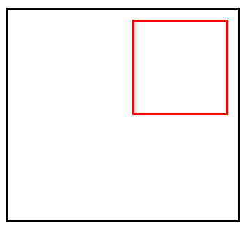
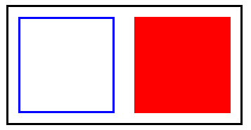
同理,我们将第排列在前的<section>标签进行了浮动设置漂浮到了左边,那么排列在后的<section>依旧会向上顶,占用掉之前的一个<section>的位置。
<!DOCTYPE html> <html lang="en"> <head> <meta charset="UTF-8"> <meta name="viewport" content="width=device-width, initial-scale=1.0"> <title>Document</title> <style> article{ width: 220px; padding: 10px; border: solid 2px black; } article section:first-child{ border: solid 2px blue; box-sizing: border-box; width: 100px; height: 100px; /* float: right; */ float: left; } article section:last-child{ box-sizing: border-box; width: 100px; height: 100px; } </style> </head> <body> <article> <section></section> <section></section> </article> </body> </html>
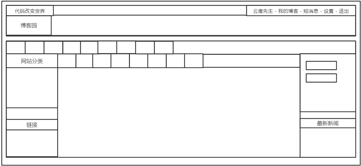
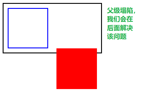
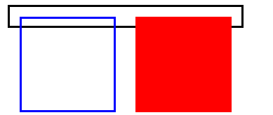
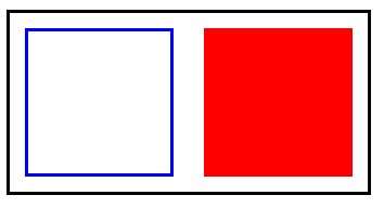
如果我们是对排列在后面的标签进行浮动设置,排列在前的标签不会受此影响,但是会出现父级盒子塌陷的问题,即父级盒子的高度会产生意料之外的情况。
<!DOCTYPE html> <html lang="en"> <head> <meta charset="UTF-8"> <meta name="viewport" content="width=device-width, initial-scale=1.0"> <title>Document</title> <style> article{ width: 220px; padding: 10px; border: solid 2px black; } article section:first-child{ border: solid 2px blue; box-sizing: border-box; width: 100px; height: 100px; /* float: right; */ /* float: left; */ } article section:last-child{ box-sizing: border-box; width: 100px; height: 100px; float: right; } </style> </head> <body> <article> <section></section> <section></section> </article> </body> </html>
状态转换
我们将一个inline状态的标签进行浮动,它会转为inline-block状态,这意味着原本的inline状态的标签经过浮动后可以设置宽高了,而block状态的标签不会独占一行了。
原本的inline状态的<span>标签,即使设置了宽度或高度也没用。
当成为浮动元素后,就可以为它设置宽度以及高度了。
<!DOCTYPE html> <html lang="en"> <head> <meta charset="UTF-8"> <meta name="viewport" content="width=device-width, initial-scale=1.0"> <title>Document</title> <style> div{ width: 220px; /* 为了防止父盒子塌陷,这里设置了高度 */ height: 200px; padding: 10px; border: solid 2px black; } div span{ border: solid 2px red; width: 100px; height: 100px; float:right; box-sizing: border-box; } </style> </head> <body> <div> <span></span> </div> </body> </html>
如果我们对一个block状态的标签进行浮动设置,它将不会独占一行。
未设置浮动,独占一行,宽度为父盒子宽度。
设置浮动后,宽度为内容撑开的宽度,如果没内容则没有宽度。
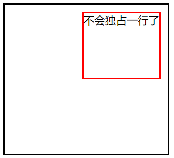
<!DOCTYPE html> <html lang="en"> <head> <meta charset="UTF-8"> <meta name="viewport" content="width=device-width, initial-scale=1.0"> <title>Document</title> <style> div{ width: 220px; /* 为了防止父盒子塌陷,这里设置了高度 */ height: 200px; padding: 10px; border: solid 2px black; } div section{ border: solid 2px red; height: 100px; float:right; box-sizing: border-box; } </style> </head> <body> <div> <section>不会独占一行了</section> </div> </body> </html>
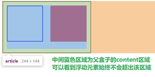
浮动边界
当父盒子中的两个子元素都进行了浮动,那么他们始终会在父盒子的content区域中,即不会超出padding区域。
<!DOCTYPE html> <html lang="en"> <head> <meta charset="UTF-8"> <meta name="viewport" content="width=device-width, initial-scale=1.0"> <title>Document</title> <style> article{ width: 220px; /* 为了防止父盒子坍塌,这里设置了高度 */ height: 120px; padding: 10px; border: solid 2px black; } article section:first-child{ border: solid 2px blue; box-sizing: border-box; width: 100px; height: 100px; float: left; } article section:last-child{ box-sizing: border-box; width: 100px; height: 100px; float: right; } </style> </head> <body> <article> <section></section> <section></section> </article> </body> </html>
清除浮动
首先我们要了解为什么要清除浮动,可以这么说,清除浮动是非常非常重要的!
上面看到了父盒子塌陷问题,我们不可能给父盒子一个固定的高度,这是为什么呢?看一下下面的示例:
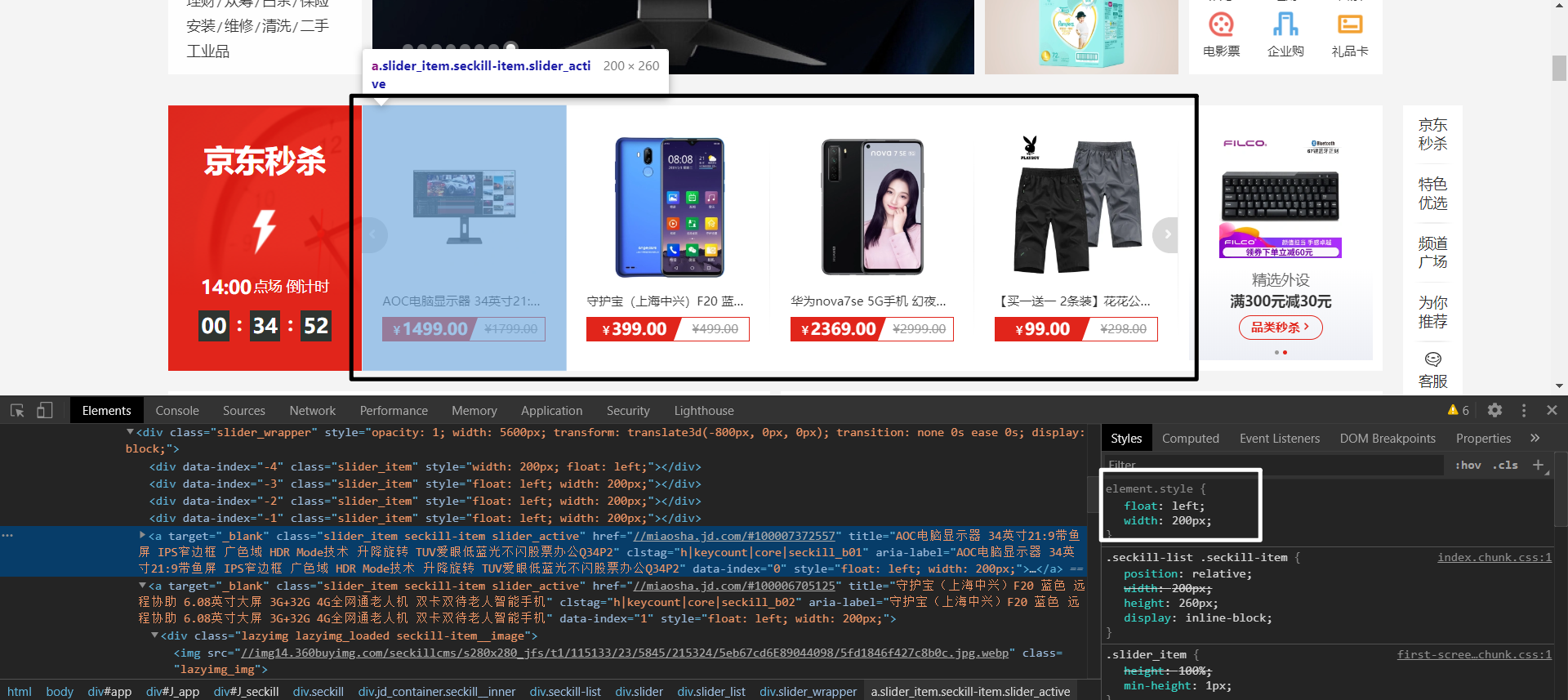
黑色部分圈住的是一块大的<div>标签,其中的每个<a>标签中都包裹着<img>标签。
可以看见<a>标签它本身设置了漂浮是可以定义宽高的,白色部分圈住的可以说明这点。
但是,我们通常不会给<a>设置高度,只会设置宽度,这就涉及到一个问题,如果我们对黑色框框住的<div>中每一个<a>标签都进行漂浮,那么<div>就会没有高度了,下面所有的排版都会乱掉,如下图
可能有人会说,那给他设置一个高度呀,当然这是可以的。但是,如果<a>标签中包裹的<img>标签在新的一轮方案中高度发生了变化,那么我们的<div>也要相应的调整高度,这无疑是非常麻烦的,这并不是一个明智的解决方案。
怎么解决这个问题呢?别着急,学会下面介绍的清除浮动的方式,该问题就可以迎刃而解了。
clear内墙法
clear可以给一个未浮动的元素使用,它的意思代表我不允许指定方位有浮动元素,有我就另起一行,而不是占用浮动元素的空间位置。
| 选项 | 说明 |
|---|---|
| left | 左边远离浮动元素 |
| right | 右连远离浮动元素 |
| both | 左右都远离浮动元素 |
<!DOCTYPE html> <html lang="en"> <head> <meta charset="UTF-8"> <meta name="viewport" content="width=device-width, initial-scale=1.0"> <title>Document</title> <style> article{ width: 220px; padding: 10px; border: solid 2px black; } article section:first-of-type{ border: solid 2px blue; box-sizing: border-box; width: 100px; height: 100px; float: left; } article section:last-of-type{ box-sizing: border-box; width: 100px; height: 100px; float: right; } .clearfix{ /* clear:both 代表如果两边有浮动,我就另起一行,不占据漂浮元素的空间位置 */ clear: both; height: 0; } </style> </head> <body> <article> <section></section> <section></section> <div class="clearfix"></div> </article> </body> </html>
伪元素内墙法
上面的解决办法任然有瑕疵,就是我们需要为每一个有浮动元素的父盒子都建立一个空标签,这样很累。
我们可以利用伪元素::after为有浮动元素的父盒子自动创建一个元素。
注意,一定要使用::after,因为它是插入到后面,如果使用::before的话是没有效果的,浮动元素不会影响之前的元素排列方式。
<!DOCTYPE html> <html lang="en"> <head> <meta charset="UTF-8"> <meta name="viewport" content="width=device-width, initial-scale=1.0"> <title>Document</title> <style> article{ width: 220px; padding: 10px; border: solid 2px black; } article section:first-of-type{ border: solid 2px blue; box-sizing: border-box; width: 100px; height: 100px; float: left; } article section:last-of-type{ box-sizing: border-box; width: 100px; height: 100px; float: right; } .clearfix::after{ content: ""; clear: both; display: block; } </style> </head> <body> <!-- 我们只需要对每一个具有浮动元素的盒子添加上clearfix类即可,非常方便 --> <article class="clearfix"> <section></section> <section></section> </article> </body> </html>
overflow
还有一种更方便的方式,就是为具有浮动元素的父盒子增加一个overflow属性,可以是hidden,也可以是auto,这会触发一个BFC机制解决浮动。
PS:如果想更详细了解BFC机制,可以看看相关的文章。
<!DOCTYPE html>
<html lang="en">
<head>
    <meta charset="UTF-8">
    <meta name="viewport" content="width=device-width, initial-scale=1.0">
    <title>Document</title>
    <style>
        article{
            width: 220px;
            padding: 10px;
            border: solid 2px black;
            /* overflow会触发BFC机制,缺点是可能会造成浮动元素部分内容缺失 */
            overflow: hidden;

        }
        article section:first-of-type{
            border: solid 2px blue;
            box-sizing: border-box;
            width: 100px;
            height: 100px;
            float: left;
        }
        article section:last-of-type{
            background-color: red;
            box-sizing: border-box;
            width: 100px;
            height: 100px;
            float: right;

        }

    </style>
</head>
<body>
    <article>
        <section></section>
        <section></section>
    </article>
</body>
</html>
浮动环绕
浮动环绕就是让文字内容对浮动元素进行环绕。类似于word中的环绕排版。
注意,要求必须是具有透明度的PNG格式图片。
那么我们怎么做到上图这种效果呢,别急,下面会介绍到。
距离控制
我们可以使用 shape-outside进行距离控制。
| 选项 | 说明 |
|---|---|
| margin-box | 外边距环绕 |
| padding-box | 内边距环绕 |
| border-box | 边线环绕 |
| content-box | 内容环绕 |
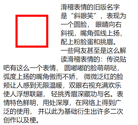
外边距环绕
可以看到,文字紧紧的跟随外边距进行环绕。
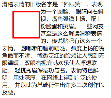
边框环绕
可以看到,文字紧紧的跟随边框进行环绕。
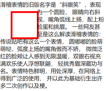
内边距环绕
可以看到,文字紧紧的跟随内边距进行环绕。
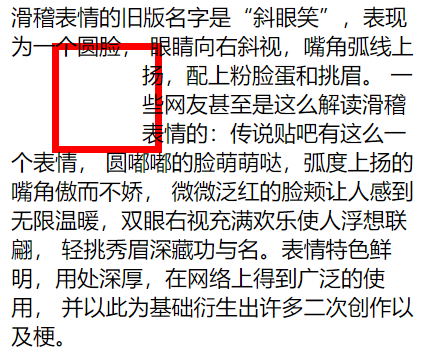
内容环绕
可以看到,文字紧紧的跟随内容区域进行环绕。
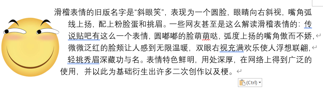
<!DOCTYPE html>
<html lang="en">
<head>
    <meta charset="UTF-8">
    <meta name="viewport" content="width=device-width, initial-scale=1.0">
    <title>Document</title>
    <style>
        article{
            width: 300px;
        }
        article div:first-of-type{
            float: left;
            width: 50px;
            height: 50px;
            padding: 10px;
            margin: 30px;
            border: solid 5px red;
            /* shape-outside: margin-box;
            shape-outside: border-box;
            shape-outside: padding-box;
            shape-outside: content-box; */
        }

    </style>
</head>
<body>
    <article>
        <div></div>
        <span>滑稽表情的旧版名字是“斜眼笑”,表现为一个圆脸,
            眼睛向右斜视,嘴角弧线上扬,配上粉脸蛋和挑眉。
            一些网友甚至是这么解读滑稽表情的:传说贴吧有这么一个表情,
            圆嘟嘟的脸萌萌哒,弧度上扬的嘴角傲而不娇,
            微微泛红的脸颊让人感到无限温暖,双眼右视充满欢乐使人浮想联翩,
            轻挑秀眉深藏功与名。表情特色鲜明,用处深厚,在网络上得到广泛的使用,
            并以此为基础衍生出许多二次创作以及梗。</span>
    </article>
</body>
</html>
显示区域
我们可以使用clip-path来对标签的显示区域形状进行控制,可以是我们想要的任意形状。
| 选项 | 说明 |
|---|---|
| circle | 圆形 |
| ellipse | 椭圆 |
| polygon | 多边形 |
圆形
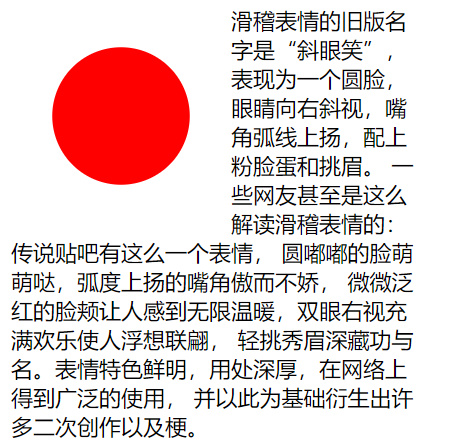
<!DOCTYPE html>
<html lang="en">
<head>
    <meta charset="UTF-8">
    <meta name="viewport" content="width=device-width, initial-scale=1.0">
    <title>Document</title>
    <style>
        article{
            width: 300px;
        }
        article div:first-of-type{
            float: left;
            width: 100px;
            height: 100px;
            padding: 10px;
            margin: 30px;
            box-sizing: border-box;
            background-color: red;
            /* 代表正圆,圆心在中间 */
            clip-path: circle(50% at center);
        }

    </style>
</head>
<body>
    <article>
        <div></div>
        <span>滑稽表情的旧版名字是“斜眼笑”,表现为一个圆脸,
            眼睛向右斜视,嘴角弧线上扬,配上粉脸蛋和挑眉。
            一些网友甚至是这么解读滑稽表情的:传说贴吧有这么一个表情,
            圆嘟嘟的脸萌萌哒,弧度上扬的嘴角傲而不娇,
            微微泛红的脸颊让人感到无限温暖,双眼右视充满欢乐使人浮想联翩,
            轻挑秀眉深藏功与名。表情特色鲜明,用处深厚,在网络上得到广泛的使用,
            并以此为基础衍生出许多二次创作以及梗。</span>
    </article>
</body>
</html>
椭圆
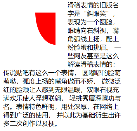
<!DOCTYPE html>
<html lang="en">
<head>
    <meta charset="UTF-8">
    <meta name="viewport" content="width=device-width, initial-scale=1.0">
    <title>Document</title>
    <style>
        article{
            width: 300px;
        }
        article div:first-of-type{
            float: left;
            width: 100px;
            height: 100px;
            padding: 10px;
            margin: 30px;
            box-sizing: border-box;
            background-color: red;
            /* 代表椭圆,圆心在右边 两个数,一个代表宽度,一个代表高度 */
            clip-path: ellipse(50% 80% at 100% 0);
        }

    </style>
</head>
<body>
    <article>
        <div></div>
        <span>滑稽表情的旧版名字是“斜眼笑”,表现为一个圆脸,
            眼睛向右斜视,嘴角弧线上扬,配上粉脸蛋和挑眉。
            一些网友甚至是这么解读滑稽表情的:传说贴吧有这么一个表情,
            圆嘟嘟的脸萌萌哒,弧度上扬的嘴角傲而不娇,
            微微泛红的脸颊让人感到无限温暖,双眼右视充满欢乐使人浮想联翩,
            轻挑秀眉深藏功与名。表情特色鲜明,用处深厚,在网络上得到广泛的使用,
            并以此为基础衍生出许多二次创作以及梗。</span>
    </article>
</body>
</html>
多边形
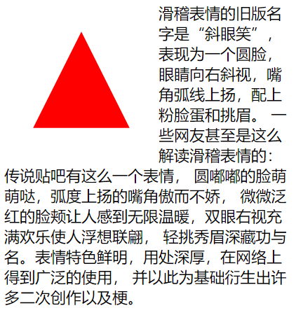
<!DOCTYPE html>
<html lang="en">
<head>
    <meta charset="UTF-8">
    <meta name="viewport" content="width=device-width, initial-scale=1.0">
    <title>Document</title>
    <style>
        article{
            width: 300px;
        }
        article div:first-of-type{
            float: left;
            width: 100px;
            height: 100px;
            padding: 10px;
            margin: 30px;
            box-sizing: border-box;
            background-color: red;
            /* clip-path: ellipse(50% 80% at 100% 0); */
            /* 代表三角形 */
            clip-path: polygon(50% 0, 100% 100%, 0 100%);
        }

    </style>
</head>
<body>
    <article>
        <div></div>
        <span>滑稽表情的旧版名字是“斜眼笑”,表现为一个圆脸,
            眼睛向右斜视,嘴角弧线上扬,配上粉脸蛋和挑眉。
            一些网友甚至是这么解读滑稽表情的:传说贴吧有这么一个表情,
            圆嘟嘟的脸萌萌哒,弧度上扬的嘴角傲而不娇,
            微微泛红的脸颊让人感到无限温暖,双眼右视充满欢乐使人浮想联翩,
            轻挑秀眉深藏功与名。表情特色鲜明,用处深厚,在网络上得到广泛的使用,
            并以此为基础衍生出许多二次创作以及梗。</span>
    </article>
</body>
</html>
内移距离
我们可以为shape-outside使用inset来进行自定义的控制环绕向内移动的距离,依旧是上右下左的顺序。
<!DOCTYPE html>
<html lang="en">
<head>
    <meta charset="UTF-8">
    <meta name="viewport" content="width=device-width, initial-scale=1.0">
    <title>Document</title>
    <style>
        article{
            width: 300px;
        }
        article div:first-of-type{
            float: left;
            width: 50px;
            height: 50px;
            padding: 10px;
            margin: 30px;
            border: solid 5px red;
            shape-outside: inset(0px -30px 0px 50px) padding-box;
        }

    </style>
</head>
<body>
    <article>
        <div></div>
        <span>滑稽表情的旧版名字是“斜眼笑”,表现为一个圆脸,
            眼睛向右斜视,嘴角弧线上扬,配上粉脸蛋和挑眉。
            一些网友甚至是这么解读滑稽表情的:传说贴吧有这么一个表情,
            圆嘟嘟的脸萌萌哒,弧度上扬的嘴角傲而不娇,
            微微泛红的脸颊让人感到无限温暖,双眼右视充满欢乐使人浮想联翩,
            轻挑秀眉深藏功与名。表情特色鲜明,用处深厚,在网络上得到广泛的使用,
            并以此为基础衍生出许多二次创作以及梗。</span>
    </article>
</body>
</html>
环绕模式
我们对shape-outside可以进行环绕模式的控制,如下:
| 选项 | 说明 |
|---|---|
| circle | 圆形环绕 |
| ellipse | 椭圆环绕 |
| url | 图片环绕 |
| polygan | 多边环绕 |
圆形环绕
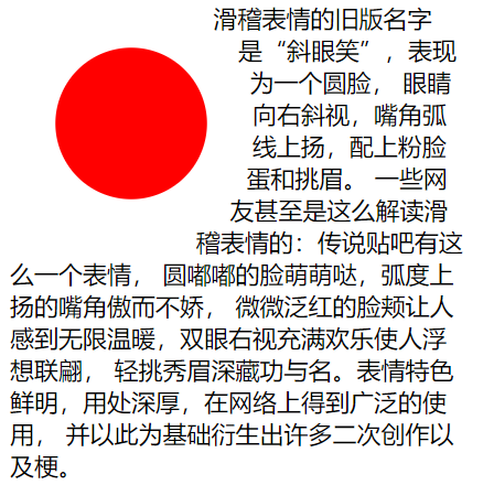
<!DOCTYPE html>
<html lang="en">
<head>
    <meta charset="UTF-8">
    <meta name="viewport" content="width=device-width, initial-scale=1.0">
    <title>Document</title>
    <style>
        article{
            width: 300px;
        }
        article div:first-of-type{
            float: left;
            width: 100px;
            height: 100px;
            padding: 10px;
            margin: 30px;
            box-sizing: border-box;
            background-color: red;
            /* 代表正圆,圆心在中间 */
            clip-path: circle(50% at center);
            /* 环绕的是正园,外边距环绕 */
            shape-outside: circle(50%) margin-box;
        }

    </style>
</head>
<body>
    <article>
        <div></div>
        <span>滑稽表情的旧版名字是“斜眼笑”,表现为一个圆脸,
            眼睛向右斜视,嘴角弧线上扬,配上粉脸蛋和挑眉。
            一些网友甚至是这么解读滑稽表情的:传说贴吧有这么一个表情,
            圆嘟嘟的脸萌萌哒,弧度上扬的嘴角傲而不娇,
            微微泛红的脸颊让人感到无限温暖,双眼右视充满欢乐使人浮想联翩,
            轻挑秀眉深藏功与名。表情特色鲜明,用处深厚,在网络上得到广泛的使用,
            并以此为基础衍生出许多二次创作以及梗。</span>
    </article>
</body>
</html>
椭圆环绕
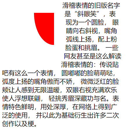
<!DOCTYPE html>
<html lang="en">
<head>
    <meta charset="UTF-8">
    <meta name="viewport" content="width=device-width, initial-scale=1.0">
    <title>Document</title>
    <style>
        article{
            width: 300px;
        }
        article div:first-of-type{
            float: left;
            width: 100px;
            height: 100px;
            padding: 10px;
            margin: 30px;
            box-sizing: border-box;
            background-color: red;
            /* 代表椭圆,圆心在右上 */
            clip-path: ellipse(50% 80% at 100% 0);
            /* 环绕的是椭圆,外边距环绕 */
            shape-outside: ellipse(50% 80%) margin-box;
        }

    </style>
</head>
<body>
    <article>
        <div></div>
        <span>滑稽表情的旧版名字是“斜眼笑”,表现为一个圆脸,
            眼睛向右斜视,嘴角弧线上扬,配上粉脸蛋和挑眉。
            一些网友甚至是这么解读滑稽表情的:传说贴吧有这么一个表情,
            圆嘟嘟的脸萌萌哒,弧度上扬的嘴角傲而不娇,
            微微泛红的脸颊让人感到无限温暖,双眼右视充满欢乐使人浮想联翩,
            轻挑秀眉深藏功与名。表情特色鲜明,用处深厚,在网络上得到广泛的使用,
            并以此为基础衍生出许多二次创作以及梗。</span>
    </article>
</body>
</html>
图片环绕
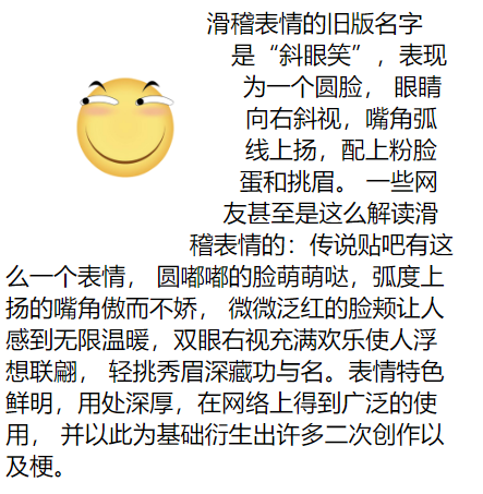
<!DOCTYPE html>
<html lang="en">
<head>
    <meta charset="UTF-8">
    <meta name="viewport" content="width=device-width, initial-scale=1.0">
    <title>Document</title>
    <style>
        article{
            width: 300px;
        }
        article img:first-of-type{
            float: left;
            width: 100px;
            height: 100px;
            padding: 10px;
            margin: 30px;
            box-sizing: border-box;
            /* 由于图形是个圆形,所以我们用圆形即可。外边距环绕 */
            shape-outside: circle(50%) margin-box;
        }

    </style>
</head>
<body>
    <article>
        <img src="./huaji.png" alt="">
        <span>滑稽表情的旧版名字是“斜眼笑”,表现为一个圆脸,
            眼睛向右斜视,嘴角弧线上扬,配上粉脸蛋和挑眉。
            一些网友甚至是这么解读滑稽表情的:传说贴吧有这么一个表情,
            圆嘟嘟的脸萌萌哒,弧度上扬的嘴角傲而不娇,
            微微泛红的脸颊让人感到无限温暖,双眼右视充满欢乐使人浮想联翩,
            轻挑秀眉深藏功与名。表情特色鲜明,用处深厚,在网络上得到广泛的使用,
            并以此为基础衍生出许多二次创作以及梗。</span>
    </article>
</body>
</html>
多边环绕
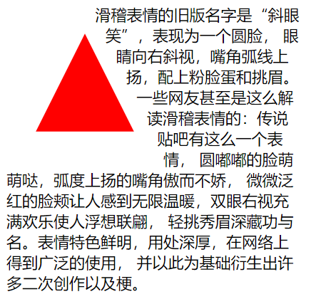
<!DOCTYPE html>
<html lang="en">
<head>
    <meta charset="UTF-8">
    <meta name="viewport" content="width=device-width, initial-scale=1.0">
    <title>Document</title>
    <style>
        article{
            width: 300px;
        }
        article div:first-of-type{
            float: left;
            width: 100px;
            height: 100px;
            padding: 10px;
            margin: 30px;
            box-sizing: border-box;
            background-color: red;
            /* 代表椭三角形 */
            clip-path: polygon(50% 0, 100% 100%, 0 100%);
            /* 环绕的是三角形,外边距环绕 */
            shape-outside: polygon(50% 0, 100% 100%, 0 100%) margin-box;
        }

    </style>
</head>
<body>
    <article>
        <div></div>
        <span>滑稽表情的旧版名字是“斜眼笑”,表现为一个圆脸,
            眼睛向右斜视,嘴角弧线上扬,配上粉脸蛋和挑眉。
            一些网友甚至是这么解读滑稽表情的:传说贴吧有这么一个表情,
            圆嘟嘟的脸萌萌哒,弧度上扬的嘴角傲而不娇,
            微微泛红的脸颊让人感到无限温暖,双眼右视充满欢乐使人浮想联翩,
            轻挑秀眉深藏功与名。表情特色鲜明,用处深厚,在网络上得到广泛的使用,
            并以此为基础衍生出许多二次创作以及梗。</span>
    </article>
</body>
</html>
页面布局
完成页面布局注意以下几点
1.首先根据设计稿确定页面大小(主要指宽度,移动端不需要考虑),如 1200px 宽度
2.水平分割页面主要区域
3.每个区域中按以上两步继续细分
其实页面布局就是不断的大盒子套着小盒子,小盒子根据情况进行浮动定位,或者其他的一些布局方式微调。