Similar to Storybook, react-styleguidist is used to show the custom UI elements.
It is easy to setup and use, it uses markdown file as example page:
install:
npm i react-styleguidist --save
Create styleguide.config.js file:
const path = require('path')
module.exports = {
  styleguideComponents: {
    Wrapper: path.join(__dirname, 'src/Provider.js'),
  },
}
Provider.js
You can put all Providers inside this file, for example mine is:
import React from 'react'
import { ThemeProvider } from 'styled-components'
import { Provider } from 'react-redux'
import { theme } from './theme'
import { configureStore } from './configureStore'

export default function Providers({ children }) {
  return (
    <Provider store={configureStore()}>
      <ThemeProvider theme={theme}>{children}</ThemeProvider>
    </Provider>
  )
}
---
Now for example we want to display a button component:
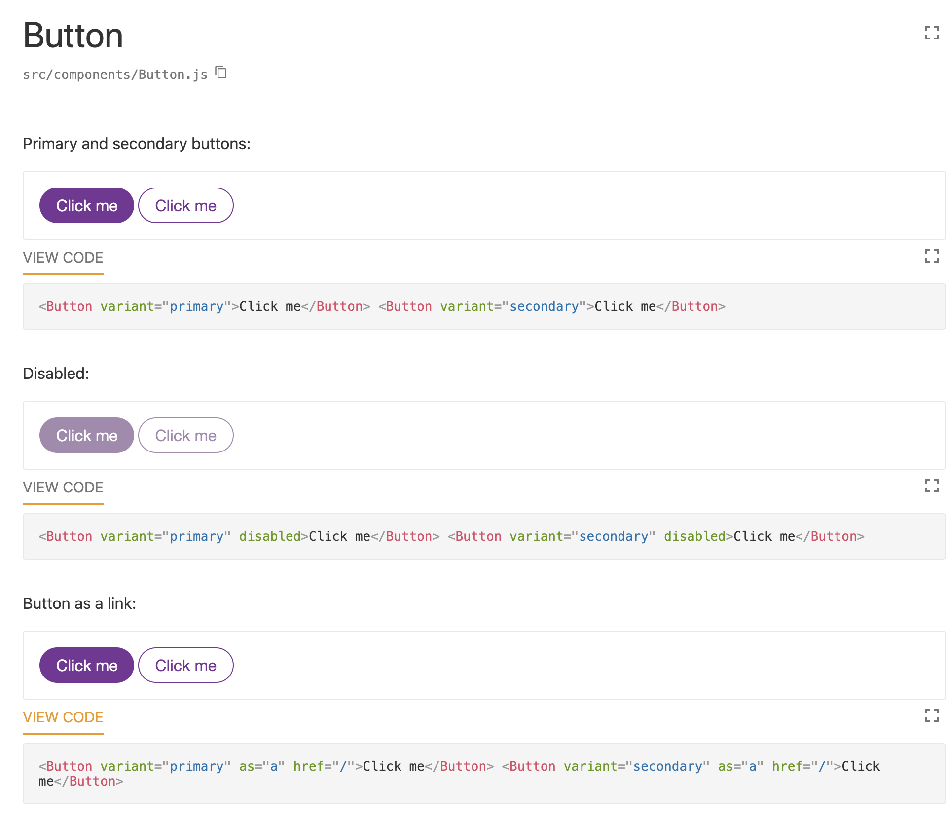
components/Button.md
Primary and secondary buttons:

```jsx
<Button variant="primary">Click me</Button> <Button variant="secondary">Click me</Button>
```

Disabled:

```jsx
<Button variant="primary" disabled>Click me</Button> <Button variant="secondary" disabled>Click me</Button>
```

Button as a link:

```jsx
<Button variant="primary" as="a" href="/">Click me</Button> <Button variant="secondary" as="a" href="/">Click me</Button>
```
components/Button.js:
import styled, { ThemeProvider } from 'styled-components'
import PropTypes from 'prop-types'
import css from '@styled-system/css'
import { variant } from 'styled-system'

const variants = {
  primary: {
    color: 'background',
    backgroundColor: 'primary',
  },
  secondary: {
    color: 'primary',
    backgroundColor: 'background',
  },
}

const Button = styled.button(
  css({
    boxSizing: 'border-box',
    display: 'inline-block',
    textAlign: 'center',
    px: 4,
    py: 3,
    color: (props) => (props.variant === 'primary' ? 'background' : 'primary'),
    backgroundColor: (props) =>
      props.variant === 'primary' ? 'primary' : 'background',
    border: '1px solid',
    borderColor: 'primary',
    borderRadius: 'round',
    fontFamily: 'body',
    fontSize: 'm',
    textDecoration: 'none',

    '&:hover:not(:disabled),&:active:not(:disabled),&:focus': {
      outline: 0,
      color: 'background',
      borderColor: 'accent',
      backgroundColor: 'accent',
      cursor: 'pointer',
    },

    '&:disabled': {
      opacity: 0.6,
      filter: 'saturate(60%)',
    },
  }),
  variant({ variants }),
)

export default Button
Run:
styleguidist server
open: localhost:6060
---
theme.js:
// https://theme-ui.com/theme-spec/
export const theme = {
  colors: {
    text: '#333',
    background: '#fff',
    primary: '#783396',
    secondary: '#767676',
    accent: '#d396c3',
    muted: '#efefef',
  },
  space: [
    0,
    '0.125rem', // 2px
    '0.25rem', // 4px
    '0.5rem', // 8px
    '1rem', // 16px
    '2rem', // 32px
    '4rem', // 64px
    '8rem', // 128px
    '16rem', // 256px
  ],
  fonts: {
    body: 'Helvetica Neue, Helvetica, Arial, sans-serif',
    heading: 'Helvetica Neue, Helvetica, Arial, sans-serif',
  },
  fontSizes: {
    xl: '4rem',
    l: '2rem',
    m: '1rem',
    s: '0.9rem',
    xs: '0.75rem',
  },
  fontWeights: {
    light: 200,
    normal: 400,
    bold: 700,
  },
  lineHeights: {
    body: 1.5,
    heading: 1.1,
  },
  borders: {
    none: 'none',
    thin: '1px solid',
  },
  radii: {
    none: 0,
    base: '0.25em',
    round: 99999,
  },
}