纯js实现原理:
通过函数表达式来完成对应的移动,函数表达式能够得到曲线图都能完成。
比如 y=sin(x)就是典型的曲线函数。
转换关系y:函数Y轴对应的就是我们的top Y==top
转换关系x:函数X轴对应的就是我们的left X==left
示例:(由于是js,顺带画了运动轨迹)
<!DOCTYPE html>
<html lang="en">
<head>
<meta charset="UTF-8">
<title>js元素弧线运动</title>
<style>
.box{
1000px;
height: 500px;
background-color:#369;
position:relative;
}
.box>span{
display: block;
10px;
height: 10px;
background-color:#963;
position:absolute;
top:230px
}
.box>.zz{
3px;
height: 3px;
background-color:red;
position:absolute;
}
</style>
</head>
<body>
<div class="box">
<span></span>
</div>
<script>
(function(){
var boxDom = document.querySelector('.box');
var spanDom = document.querySelector('.box>span');
setInterval(function(){//定时器
var nDom = document.createElement('span');
nDom.classList.add('zz');//运动轨迹
var left = spanDom.offsetLeft;
var top = spanDom.offsetTop;
left += 1;
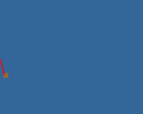
top = Math.sin(left/25)*100 + 230;//由于sinx是在正负1大小变化的我们这里放大了X和Y
spanDom.style.left = left+'px';
spanDom.style.top = top+'px';
nDom.style.left = left+'px';
nDom.style.top = top+'px';
boxDom.appendChild(nDom);//添加运动轨迹
},50)
})()
</script>
</body>
</html>
结果图:
纯css实现原理:
通过animation动画属性加上贝塞尔曲线来控制元素xy运动轨迹即可完成,具体运动轨迹通过贝塞尔曲线函数控制。
animation应该都用过,这里主要说一下贝塞尔曲线。
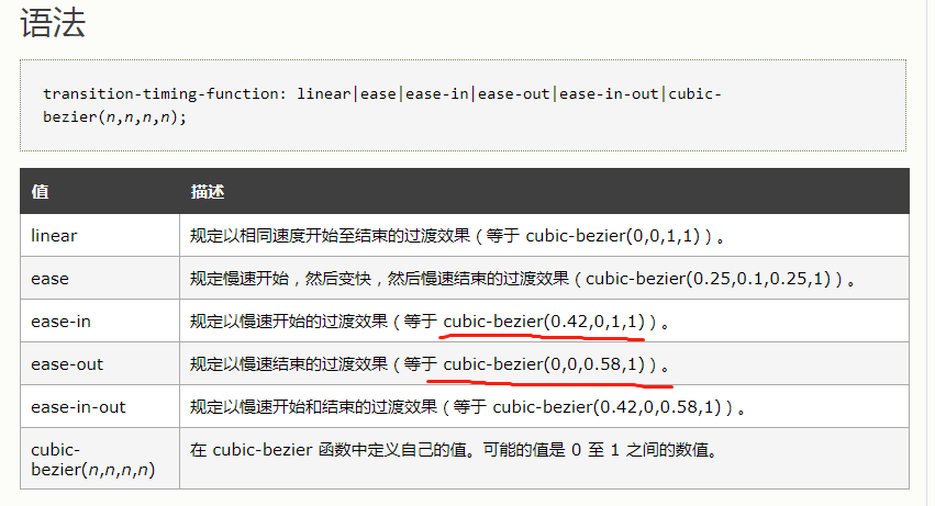
cubic-bezier称为三次贝塞尔曲线,主要是生成速度曲线的函数。
其实大家也用过,平时的ease-in,ease-out,linear等都是通过贝塞尔曲线分装好的函数。
示例:(示例通过控制父容器和子元素,赋予了子元素X和Y的运动速度,达到曲线移动效果)
<!DOCTYPE html>
<html lang="en">
<head>
    <meta charset="UTF-8">
    <title>js元素弧线运动</title>
    <style>
		.cont{
			 400px;
            height: 400px;
            border: 2px solid #ff8800;
		}
		/* 父容器轨迹 */
        .box{
             30px;
            height: 30px;
            background-color:#369;
			/* animation: aa 2s ease-in forwards;*/
			animation: aa 2s cubic-bezier(0.42,0,1,1) forwards;
        }
		/* 子元素轨迹 */
        .box>span{
            display: block;
             30px;
            height: 30px;
            background-color:#963;
			/* animation: bb 2s ease-out forwards;*/
			animation: bb 2s cubic-bezier(0,0,0.58,1) forwards;
        }
		@keyframes aa {
            to{transform: translateX(370px)}
        }
        @keyframes bb {
            to{transform: translateY(370px)}
        }
    </style>
</head>
<body>
<div class="cont">
	<div class="box">
		<span></span>
	</div>
</div>
<script>
</script>
</body>
</html>
效果图:图示蓝色块为父容器,只有一个运动状态,棕色块有两个方向运动状态。

js+css混合实现方法就多种多样了,暂不讨论了。