旋转rotate()函数:通过指定的角度参数使元素相对原点进行旋转。transform: rotate(45deg);
扭曲 skew()函数:让元素倾斜显示。它可以将一个对象以其中心位置围绕着X轴和Y轴按照一定的角度倾斜。transform:skew(45deg);
缩放 scale()函数: 让元素根据中心原点对对象进行缩放。
translate()函数可以将元素向指定的方向移动,类似于position中的relative。
transform-origin:改变元素原点位置;transform-origin: left top;
transition-property: 指定过渡或动态模拟的CSS属性; transition-property: background-color;
transition-duration: 指定完成过渡所需的时间 ; transition-delay: .2s;
transition-timing-function: 指定过渡函数; transition-timing-function: ease-in-out;
transition-delay: 指定开始出现的延迟时间; transition-delay:.5s;
自定义动画:
在CSS3中其主要以“@keyframes”开头,后面紧跟着是动画名称加上一对花括号“{…}”,括号中就是一些不同时间段样式规则。
@keyframes changecolor{
  0%{
   background: red;
  }
  100%{
    background: green;
  }
}
animation-name属性:上面定义的动画可以通过这个属性调用;
animation-name:changecolor;
animation-duration属性:设置动画播放所用的时间,就是可以调整快慢;
animation-duration: 0.5s;
animation-timing-function属性:设置动画播放的方式,CSS3定义了一下动画播放的函数,可以通过这个属性调用;
animation-timing-function: ease-out;
animation-iteration-count属性:主要用来定义动画的播放次数,参数为播放次数,如果取值为infinite,动画将会无限次的播放。
animation-iteration-count:infinite;
animation-direction属性:主要用来设置动画播放方向。
1、normal是默认值,如果设置为normal时,动画的每次循环都是向前播放;2、另一个值是alternate,他的作用是,动画播放在第偶数次向前播放,第奇数次向反方向播放。
animation-direction:alternate;
animation-play-state属性:主要用来控制元素动画的播放状态。其主要有两个值:running和paused。
animation-play-state:running;
animation-fill-mode属性:定义在动画开始之前和结束之后发生的操作。
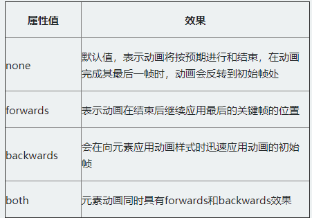
animation-fill-mode: both;