该总结只是为了记录自己学习过程中容易遗忘的问题,权当一个记事本使用。
1:散点图
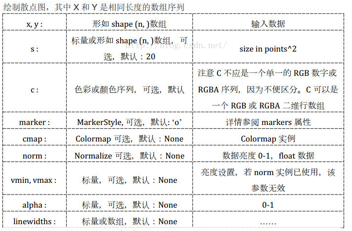
plt.scatter()函数的原型
scatter(x, y, s=s, c=c, marker=marker, cmap=cmap, norm=norm,vmin=vmin, vmax=vmax, alpha=alpha,
              linewidths=linewidths, verts=verts,edgecolors=edgecolors, data=data, **kwargs)
各个参数的含义:
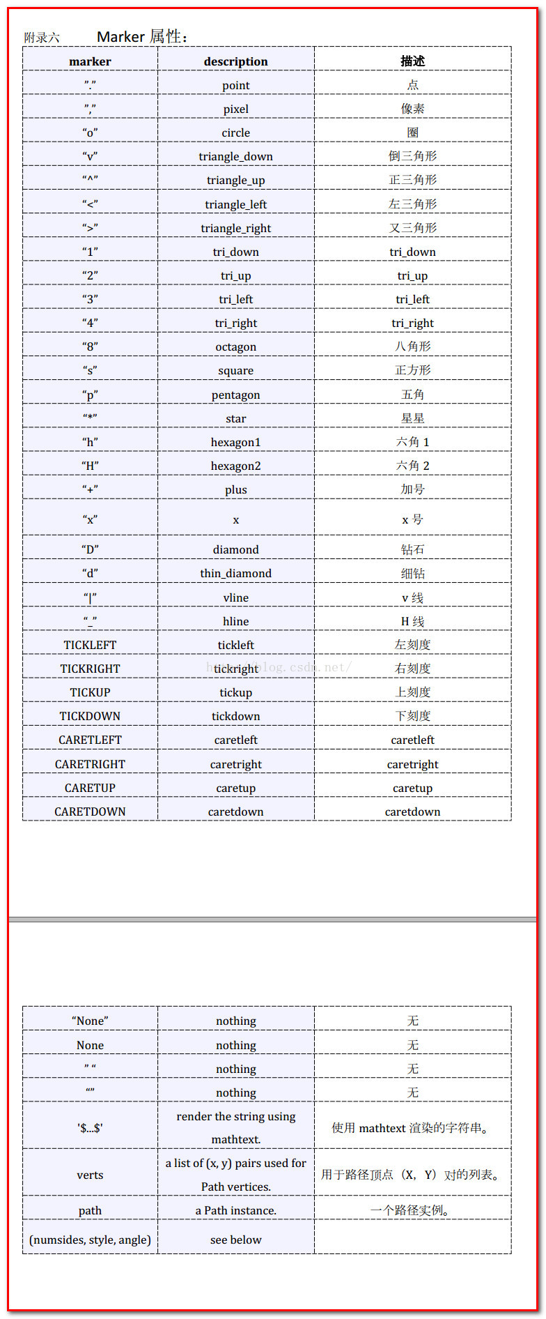
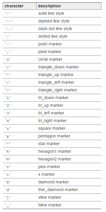
其中marker的含义
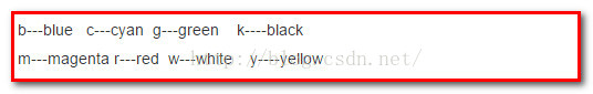
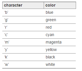
其中C的含义如下
下面进行简单的实例化演示:
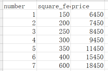
下面的例子是:房价的预测:
数据源:
 1 #利用模拟的模型进行画图
 2
 3 def show_linear_line(X_parameters,Y_parameters):
 4     reg = linear_model.LinearRegression()
 5     reg.fit(X_parameters,Y_parameters)
 6     plt.scatter(X_parameters,Y_parameters,c = 'blue',,marker = 'o')
 7     plt.plot(X_parameters,reg.predict(X_parameters),color = 'red',linewidth = 2 ,label = 'feet_price')      #其中label表示线条的含义
 8 #    设置图像的标题
 9     plt.title('house_price')
10     #为图像设置网格
11     plt.grid()
12     #设置横纵坐标的范围
13     plt.xlim((150,700))
14     plt.ylim(5000,20000)
15     #设置坐标轴的刻度
16     plt.xticks(np.linspace(150,700,5))
17     plt.yticks(np.linspace(5000,20000,5))
18     #设置横纵坐标轴标签
19     plt.xlabel('square_feet')
20     plt.ylabel('price')
21     plt.legend()
22     plt.show()
房价的预测结果:

plot()函数
用于绘制模拟的线
如上面代码中所示,plot()函数可以添加多个参数
其中形状的种类如下图:https://matplotlib.org/api/_as_gen/matplotlib.pyplot.plot.html
线条的颜色如下:
1 plot([1,2,3], [1,2,3], 'go-', label='line 1', linewidth=2)
2 plot([1,2,3], [1,4,9], 'rs',  label='line 2')
3 axis([0, 4, 0, 10])
4 legend()
savefig()函数
保存图片 https://matplotlib.org/api/pyplot_api.html 从api中查找各个参数的含义
savefig(fname, dpi=None, facecolor='w', edgecolor='w',
        orientation='portrait', papertype=None, format=None,
        transparent=False, bbox_inches=None, pad_inches=0.1,
        frameon=None)
如下图:如果加上标红线的代码,则会将图片输出到该路径中
 1 #利用模拟的模型进行画图
 2
 3 def show_linear_line(X_parameters,Y_parameters):
 4     reg = linear_model.LinearRegression()
 5     reg.fit(X_parameters,Y_parameters)
 6     plt.scatter(X_parameters,Y_parameters,c = 'blue',marker = '^')
 7     plt.plot(X_parameters,reg.predict(X_parameters),color = 'red',linewidth = 2 ,label = 'feet_price')
 8 #    设置图像的标题
 9     plt.title('house_price')
10     #为图像设置网格
11     plt.grid()
12     #设置横纵坐标的范围
13     plt.xlim((150,700))
14     plt.ylim(5000,20000)
15     #设置坐标轴的刻度
16     plt.xticks(np.linspace(150,700,5))
17     plt.yticks(np.linspace(5000,20000,5))
18     #设置横纵坐标轴标签
19     plt.xlabel('square_feet')
20     plt.ylabel('price')
21     #输出图片到改路径下面
22     plt.savefig('G:\python\20180108demo\01Lineargression\resultPic\housePredicted.png')
23     plt.legend()
24     plt.show()