下面代码可实现3D立方体,比较好理解,就是让每个面先平移到指定位置,然后旋转90度
<!DOCTYPE html>
<html lang="en">
<head>
    <meta charset="UTF-8">
    <title>3D转换模块-正方体</title>
    <style>
    *{
        margin: 0;
        padding: 0;
    }
    ul{
        width: 200px;
        height: 200px;
        border: 1px solid #000;
        box-sizing: border-box;
        margin: 100px auto;
        position: relative;
        transform: rotateY(0deg) rotateX(0deg);
        transform-style: preserve-3d;
    }
    ul li{
        list-style: none;
        width: 200px;
        height: 200px;
        font-size: 60px;
        text-align: center;
        line-height: 200px;
        position: absolute;
        left: 0;
        top: 0;
    }
    ul li:nth-child(1){
        background-color: red;
        transform: translateX(-100px) rotateY(90deg);
    }
    ul li:nth-child(2){
        background-color: green;
        transform: translateX(100px) rotateY(90deg);
    }
    ul li:nth-child(3){
        background-color: blue;
        transform: translateY(-100px) rotateX(90deg);
    }
    ul li:nth-child(4){
        background-color: yellow;
        transform: translateY(100px) rotateX(90deg);
    }
    ul li:nth-child(5){
        background-color: purple;
        transform: translateZ(-100px);
    }
    ul li:nth-child(6){
        background-color: pink;
        transform: translateZ(100px);
    }

</style>
</head>
<body>
<ul>
    <li>1</li>
    <li>2</li>
    <li>3</li>
    <li>4</li>
    <li>5</li>
    <li>6</li>
</ul>
</body>
</html>
但是缺点是 如果我们旋转每个面面对自己的时候,里面的数字可能并不是正序的,如图:
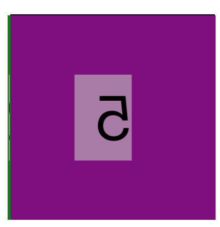
这里的5就是反的,为了解决这个问题,我们需要做的是 针对 上,后,下,前 四个面进行先旋转在平移的处理,就可以保证转向我们的面始终是正序的
代码如下:
<!DOCTYPE html>
<html lang="en">
<head>
    <meta charset="UTF-8">
    <title>3D转换模块-正方体终极</title>
    <style>
        *{
            margin: 0;
            padding: 0;
        }
        ul{
            width: 200px;
            height: 200px;
            border: 1px solid #000;
            box-sizing: border-box;
            margin: 100px auto;
            position: relative;
            transform: rotateY(0deg) rotateX(0deg);
            transform-style: preserve-3d;
        }
        ul li{
            list-style: none;
            width: 200px;
            height: 200px;
            font-size: 60px;
            text-align: center;
            line-height: 200px;
            position: absolute;
            left: 0;
            top: 0;
        }
        /*上面*/
        ul li:nth-child(1){
            background-color: red;
            transform: rotateX(90deg) translateZ(100px);
        }
        /*后面*/
        ul li:nth-child(2){
            background-color: green;
            transform: rotateX(180deg) translateZ(100px);
        }
        /*下面*/
        ul li:nth-child(3){
            background-color: blue;
            transform: rotateX(270deg) translateZ(100px);
        }
        /*
        前面*/
        ul li:nth-child(4){
            background-color: yellow;
            transform: rotateX(360deg) translateZ(100px);
        }
        /*
        左面
        */
        ul li:nth-child(5){
            background-color: purple;
            transform: translateX(-100px) rotateY(90deg);
        }
        /*
        右面
        */
        ul li:nth-child(6){
            background-color: pink;
            transform: translateX(100px) rotateY(90deg);
        }

    </style>
</head>
<body>
<ul>
    <li>1</li>
    <li>2</li>
    <li>3</li>
    <li>4</li>
    <li>5</li>
    <li>6</li>
</ul>
</body>
</html>
如果实现旋转效果,就需要加上CSS3中的animation属性,代码如下:
<!DOCTYPE html>
<html lang="en">
<head>
    <meta charset="UTF-8">
    <title>110-3D转换模块-练习</title>
    <style>
        *{
            margin: 0;
            padding: 0;
        }
        body{
            /*想看到整个立方的近大远小效果, 就给ul的父元素添加透视*/

            perspective: 500px;

        }
        ul{
            width: 200px;
            height: 200px;
            box-sizing: border-box;
            margin: 100px auto;
            position: relative;
            transform: rotateY(0deg) rotateX(0deg);
            transform-style: preserve-3d;
            animation: sport 5s linear 0s infinite normal;
        }
        ul li{
            list-style: none;
            width: 200px;
            height: 200px;
            font-size: 60px;
            text-align: center;
            line-height: 200px;
            position: absolute;
            left: 0;
            top: 0;
        }
        ul li:nth-child(1){
            background-color: red;
            transform: rotateX(90deg) translateZ(100px) scale(2, 1);
        }
        ul li:nth-child(2){
            background-color: green;
            transform: rotateX(180deg) translateZ(100px) scale(2, 1);
        }
        ul li:nth-child(3){
            background-color: blue;
            transform: rotateX(270deg) translateZ(100px) scale(2, 1);
        }
        ul li:nth-child(4){
            background-color: yellow;
            transform: rotateX(360deg) translateZ(100px) scale(2, 1);
        }
        ul li:nth-child(5){
            background-color: purple;
            transform: translateX(-200px) rotateY(90deg);
        }
        ul li:nth-child(6){
            background-color: pink;
            transform: translateX(200px) rotateY(90deg);
        }
        ul li img{
            /*
            注意点:
            只要父元素被拉伸了,子元素也会被拉伸
            */
            width: 200px;
            height: 200px;
        }
        @keyframes sport {
            from{
                transform: rotateX(0deg);
            }
            to{
                transform: rotateX(360deg);
            }
        }
    </style>
</head>
<body>
<ul>
    <li><img src="images/banner11.jpg" alt=""></li>
    <li><img src="images/banner21.jpg" alt=""></li>
    <li><img src="images/banner31.jpg" alt=""></li>
    <li><img src="images/banner41.jpg" alt=""></li>
    <li></li>
    <li></li>
</ul>
</body>
</html>