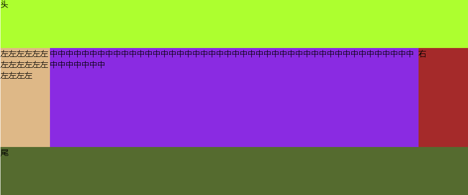
本例通过div+css实现HTML金典布局双飞翼布局,该布局结构为上中下结构,上:header头;下:footer尾;中:内容,将内容分为了三个结构,左中右
下图是效果图
我们来看下代码
<!DOCTYPE html>
<html lang="en">
<head>
    <meta charset="UTF-8">
    <title>index</title>
    <style type="text/css">
        *{
            margin: 0;
            padding: 0;
        }
     <!-- 整体div,设置整个页面占屏幕的比例,并居中 -->
        .container{
            width: 70%;
            margin: auto;
        }
     <!-- 中间内容,这里设置隐藏是配合该div中的其它元素(div)根据某div高度增长而增长 -->
        .content{
            overflow: hidden;
        }

     <!-- 设置如同种左中右三个布局左浮动;最小高度;其它两个div根据某一个div的高度而变化,这样舍得本例内容左中右三个div等高,如本例中,左中右,左div被内容撑高,那么中右两个div都将与左div等高 -->
        .content .middle,.content .left,.content .right{
            float: left;
            min-height: 200px;
            margin-bottom: -100000px;
            padding-bottom: 100000px;
        }

     <!-- 设置内容中间部分的宽 -->
        .content .middle{
            background: blueviolet;
            width: 100%;
        }

     <!-- 设置内容中间部分距middle容器左右的距离
      这里多嵌套一个名为inner的div,主要是因为如果不使用这种方式,直接在middle中使用padding或margin,会将容器撑大,这样将非常不好控制,多嵌套一个div,将规避这类问题
     -->
        .content .middle .inner{
            padding-left: 100px;
            padding-right: 100px;
        }

     <!-- 固定宽度,设置负边距,使得该布局移动到上一行,这里距左负百分之百,而且在总布局中使用了左浮动,会将该布局移动到上一行最左边 -->
        .content .left{
            background: burlywood;
            width: 100px;
            margin-left: -100%;
        }

     <!-- 固定宽度,设置负边距,使得该布局移动到上一行,这里距左负自身像素,而且在总布局中使用了左浮动,会将该布局移动到上一行最右边 -->
        .content .right{
            background: brown;
            width: 100px;
            margin-left: -100px;
        }
        header{
            height: 100px;
            background: greenyellow;
        }
        footer{
            height: 100px;
            background: darkolivegreen;
        }
    </style>
</head>
<body>
    <div class="container">
        <header>头</header>
        <div class="content">
            <div class="middle">
                <div class="inner">
                    中中中中中中中中中中中中中中中中中中中中中中中中中中中中中中中中中中中中中中中中中中中中中中中中中中中中中
                </div>
            </div>
            <div class="left">
                左左左左左左左左左左左左左左左左
            </div>
            <div class="right">右</div>
        </div>
        <footer>尾</footer>
    </div>
</body>
</html>