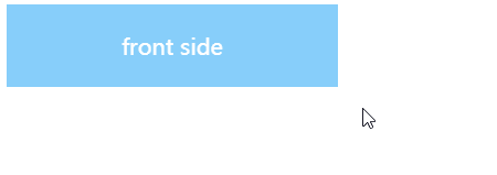
1、翻转
(1)效果演示
(2)完整代码
<!doctype html>
<html>

<head>
    <title>Flip</title>
    <style>
        .flip {
            /* 设置形状大小 */
            display: inline-block;
             240px;
            height: 60px;
        }

        .wrap {
            /* 设置形状大小 */
            display: inline-block;
             100%;
            height: 100%;
            /* 设置过渡效果 */
            transition: transform 0.8s;
            -webkit-transition: -webkit-transform 0.8s;
            /* 保留空间位置 */
            transform-style: preserve-3d;
            -webkit-transform-style: preserve-3d;
        }

        .flip:hover .wrap {
            /* 设置悬停效果 */
            /* 当鼠标悬停在元素上时,沿着 X 轴旋转 180° */
            transform: rotateX(180deg);
            -webkit-transform: rotateX(180deg);
        }

        .front-side {
            /* 设置定位方式 */
            position: absolute;
            /* 设置形状大小 */
            display: inline-block;
             100%;
            height: 100%;
            /* 设置布局方式 */
            display: flex;
            flex-direction: row;
            justify-content: center;
            align-items: center;
            /* 设置元素样式 */
            color: white;
            background-color: lightskyblue;
            /* 设置背面隐藏 */
            backface-visibility: hidden;
        }

        .back-side {
            /* 设置定位方式 */
            position: absolute;
            /* 设置形状大小 */
            display: inline-block;
             100%;
            height: 100%;
            transform: rotateX(180deg);
            -webkit-transform: rotateX(180deg);
            /* 设置布局方式 */
            display: flex;
            flex-direction: row;
            justify-content: center;
            align-items: center;
            /* 设置元素样式 */
            color: white;
            background-color: deepskyblue;
            /* 设置背面隐藏 */
            backface-visibility: hidden;
        }
    </style>
</head>

<body>
    <div class="flip">
        <div class="wrap">
            <div class="front-side">front side</div>
            <div class="back-side">back side</div>
        </div>
    </div>
</body>

</html>
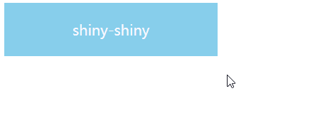
2、闪光
(1)效果演示
(2)完整代码
<!doctype html>
<html>

<head>
	<title>Shiny</title>
	<style>
		.shiny {
            /* 设置形状大小 */
            display: inline-block;
             240px;
			height: 60px;
			/* 设置元素样式 */
            color: ghostwhite;
			background-color: skyblue;
			/* 设置布局方式 */
			display: flex;
			flex-direction: row;
			justify-content: center;
			align-items: center;
			/* 溢出隐藏 */
			overflow: hidden;
			/* 定位相对 */
			position: relative;
		}

		.shiny:after {
            /* 设置样式 */
			content: "";
			background-color: rgba(255, 255, 255, 0.2);
			/* 设置大小 */
			 30px;
			height: 90px;
            /* 设置形状 */
			transform: rotate(30deg);
			-webkit-transform: rotate(30deg);
            /* 设置位置 */
			position: absolute;
			left: -50px;
			/* 设置过渡效果 */
			transition: left 0.4s;
			-webkit-transition: left 0.4s;
		}

		.shiny:hover:after {
            /* 设置悬停效果 */
            /* 当鼠标悬停在元素上时,向右移动 */
			left: 120%;
		}
	</style>
</head>

<body>
	<div class="shiny">shiny-shiny</div>
</body>

</html>
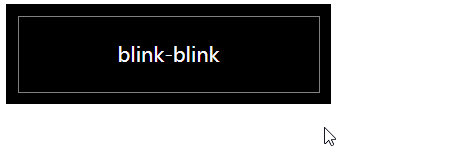
3、发光
(1)效果演示
(2)完整代码
<!doctype html>
<html>

<head>
	<title>Blink</title>
	<style>
		.wrap {
			/* 设置外观样式 */
            display: inline-block;
			 260px;
			height: 80px;
			background-color: black;
            /* 设置布局方式 */
			display: flex;
			flex-direction: row;
			justify-content: center;
			align-items: center;
		}

		.blink {
			/* 设置形状大小 */
            display: inline-block;
			 240px;
			height: 60px;
            /* 设置布局方式 */
			display: flex;
			flex-direction: row;
			justify-content: center;
			align-items: center;
			/* 设置文字颜色 */
			color: ghostwhite;
			/* 设置按钮边界 */
			outline: 1px solid rgba(255, 255, 255, 0.5);
		}

		.blink:hover {
			/* 改变文字颜色 */
			color: white;
			/* 设置字体阴影 */
			text-shadow: 1px 1px 2px ghostwhite;
			/* 改变按钮边界 */
			border: 1px solid rgba(255, 255, 255, 1);
			/* 设置按钮阴影 */
			box-shadow: 5px 5px 50px rgba(255, 255, 255, 0.4) inset;
		}
	</style>
</head>

<body>
	<div class="wrap">
		<div class="blink">blink-blink</div>
	</div>
</body>

</html>
【 阅读更多 CSS 系列文章,请看 CSS学习笔记 】