flex flex-grow flex-shrink flex-basis flex-flow flex-direction flex-wrap align-content align-items align-self justify-content order
(1) flex: none | <' flex-grow '> <' flex-shrink >' || <' flex-basis '>
(a) <' flex-grow '> : 当剩余空间 > 0 子项分配空间的比例
(b) <' flex-shrink >':当剩余空间 < 0 在收缩的时候收缩比率会以伸缩基准值加权
(c) <' flex-basis '>:「flex子项」长度的起始数值
例子:
<style>
    .flex{
        display:flex;
        width:800px;
        margin:0;
        padding:0;
        list-style:none;
    }
    .flex :nth-child(1){
        flex:1 1 300px;
    }
     .flex :nth-child(2){
        flex:1 2 200px;
    }
    .flex :nth-child(3){
        flex:3 3 400px;
    }
</style>
<ul class="flex">
    <li>a</li>
    <li>b</li>
    <li>c</li>
</ul>
剩余空间: 800-300-200-400 = -100<0
加权:300*1+200*2+400*3 = 1900;
a被移除的空间: (300*1/1900)*100 约等于 16
a的实际空间 : 300-16
b被移除的空间: (200*2/1900)*100
c被移除的空间: (400*3/1900)*100
用的是<' flex-shrink >'这列的比例
-----------------------------------------------------------------------------------------
如果上面例子中的flex的width为1500, 则会使用<' flex-grow '>,则计算如下:
1500-300-200-400 = 600>0
a的扩展量: 1/(1+1+3)*600=120
a的实际宽度:300+120
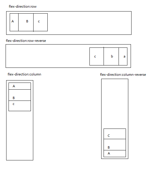
(2) flex-flow:<' flex-direction '> || <' flex-wrap '>
(a)flex-direction:row | row-reverse | column | column-reverse
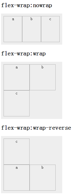
(b)flex-wrap:nowrap | wrap | wrap-reverse
nowrap:flex容器为单行。该情况下flex子项可能会溢出容器
wrap:flex容器为多行。该情况下flex子项溢出的部分会被放置到新行,子项内部会发生断行
wrap-reverse:反转 wrap 排列。
------align-content 和 justify-content 是针对整个flex container里的 content-----------------------------------------------------------------------------------------------------------------------------------------------------
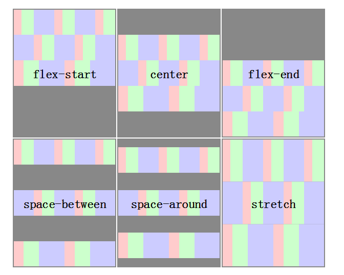
(3)align-content:flex-start | flex-end | center | space-between | space-around | stretch
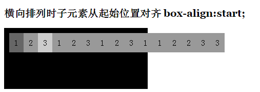
注意a: 当box-orient: 与 box-align相似,但是 box-align 属性不会自动换行,超出父级的部分仍会一行显示
b: 当伸缩容器的侧轴还有多余空间时,多行才起作用
(4) justify-content(当flex-direction为 column 或 column-reverse 不起作用):flex-start | flex-end | center | space-between | space-around
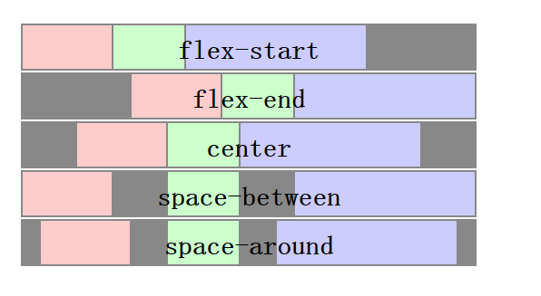
注意a: 与align-content相比,超出一行并不会换行,但仍起效果。
--------------------------------------------------------------------------------------------------------------------------------------------------------------------------
(5)align-items(作用于父节点):flex-start | flex-end | center | baseline | stretch 纵值
(6)align-self(作用于子节点):auto | flex-start | flex-end | center | baseline | stretch 作用于该样式的标签上
(7)order:<integer>
用整数值来定义排列顺序,数值小的排在前面。可以为负值。类似于box-ordinal-group