1、利用BFC:
<div id="root">
    <div class="left">左</div>
    <div class="right">右</div>
</div>
#root {
    height: 300px;
}
.left {
    float: left;
    width: 200px;
    height: 80%;
    background-color: rgba(255, 0, 0, 0.5);
}
.right {
    height: 100%;
    background-color: green;
}
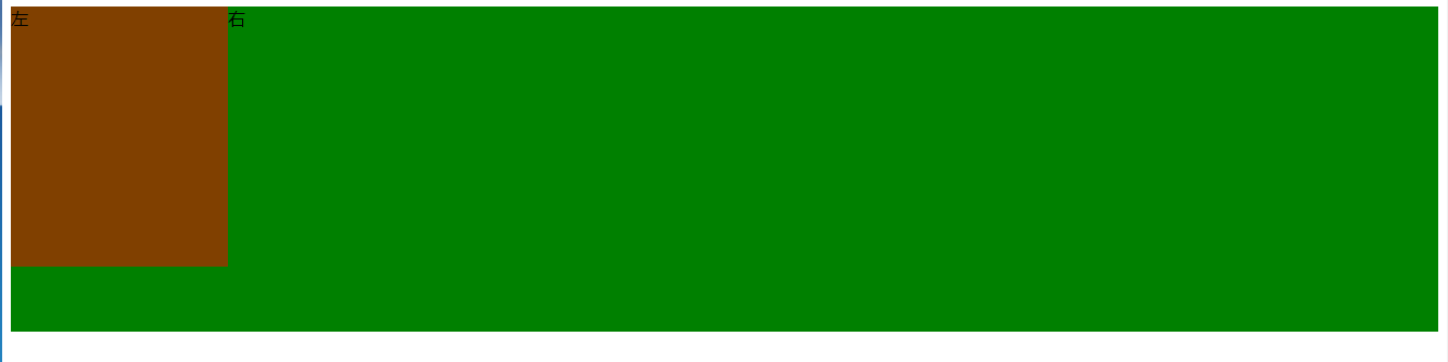
现在结果如上图的效果,为什么呈现这种效果?
每个元素的margin box(.left、.right)的左边, 与包含块border box(#root)的左边相接触(对于从左往右的格式化,否则相反)。即使存在浮动也是如此。所以.left盖在.right的上方。
怎么解决这种问题呢?-----BFC的区域不会与float box重叠。我们让.right成为一个BFC应该就可以了。
#root {
    height: 300px;
}
.left {
    float: left;
    width: 200px;
    height: 80%;
    background-color: rgba(255, 0, 0, 0.5);
}
.right {
    height: 100%;
    background-color: green;
    overflow: hidden; // 触发,成为BFC
}
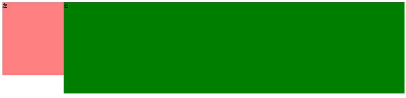
可以了,达到我们想要的效果。
2、css3有了flex属性,轻而易举就实现这种布局,第一种方法当做开阔眼界吧。
#root {
    height: 300px;
    display: flex;
}
.left {
    width: 200px;
    height: 80%;
    background-color: rgba(255, 0, 0, 0.5);
}
.right {
    flex: 1;
    background-color: green;
}