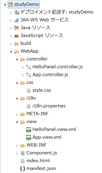
11 Step 11: Pages and Panels
修改App.view.xml
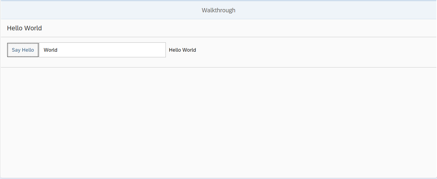
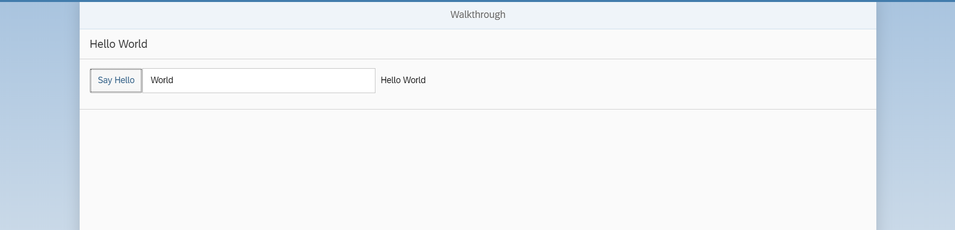
<mvc:View
   controllerName="sap.ui.demo.walkthrough.controller.App"
   xmlns="sap.m"
   xmlns:mvc="sap.ui.core.mvc"
  displayBlock="true">
   <App>
      <pages>
         <Page title="{i18n>homePageTitle}">
            <content>
               <Panel
                  headerText="{i18n>helloPanelTitle}">
                  <content>
                     <Button
                        text="{i18n>showHelloButtonText}"
                        press=".onShowHello"/>
                     <Input
                        value="{/recipient/name}"
                        description="Hello {/recipient/name}"
                        valueLiveUpdate="true"
                        width="60%"/>
                  </content>
               </Panel>
            </content>
         </Page>
      </pages>
   </App>
</mvc:View>
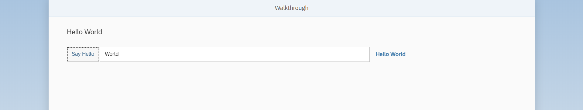
这里使用了新的控件sap.m.Page。
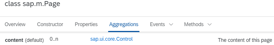
Page控件提供一个0到n的聚合,这个聚合是content。
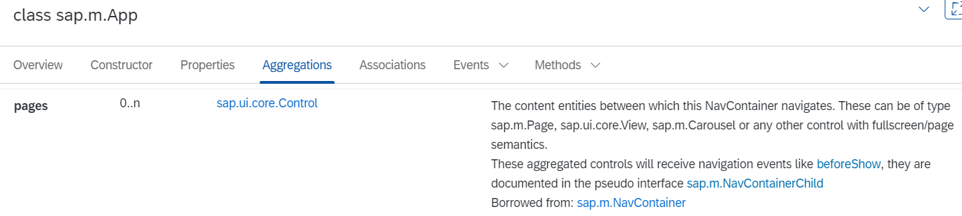
Page也被放在sap.m.App的聚合pages中,并且sap.m.App还提供了两个重要的功能。
1,它将一些属性写入index.html的头部,这些属性对于在移动设备上正确显示是必要的。
2,它提供了使用动画在页面之间导航的功能。
添加了displayBlock属性,为了使视图的全屏高度正常工作。
在Panel中也可以省略content,因为Panel控件将其声明为默认值,但是为了便于阅读,都会显示声明聚合内容。
修改ii18n.properties
# App Descriptor
appTitle=Hello World
appDescription=A simple walkthrough app that explains the most important concepts of SAPUI5

# Hello Panel
showHelloButtonText=Say Hello
helloMsg=Hello {0}
homePageTitle=Walkthrough
helloPanelTitle=Hello World
执行
XMLView控件书写的顺序
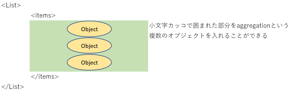
在XMLView中,有大写字母开头的控件,也有小写字母开头的非控件,比如有<List>,也有<items>。
<mvc:View
    controllerName="sap.m.sample.ObjectListItem.List"
    xmlns:mvc="sap.ui.core.mvc"
    xmlns="sap.m">
    <List
        items="{/ProductCollection}"
        headerText="Products">
        <items>
            <ObjectListItem
                title="{Name}"
                type="Active"
                press="onListItemPress"
                number="{
                    parts:[{path:'Price'},{path:'CurrencyCode'}],
                    type: 'sap.ui.model.type.Currency',
                    formatOptions: {showMeasure: false}
                }"
                numberUnit="{CurrencyCode}">
                <firstStatus>
                    <ObjectStatus
                        text="{Status}"
                        state="{
                            path: 'Status',
                            formatter: 'sap.m.sample.ObjectListItem.Formatter.status'
                        }" />
                </firstStatus>
                <attributes>
                    <ObjectAttribute text="{WeightMeasure} {WeightUnit}" />
                    <ObjectAttribute text="{Width} x {Depth} x {Height} {DimUnit}" />
                </attributes>
            </ObjectListItem>
        </items>
    </List>
</mvc:View>
大写字母开头的都是Control,小写字母开头的都是Aggregations。
Control里面可以放入很多Object,Aggregations就是为了将这些Object集合在一起。
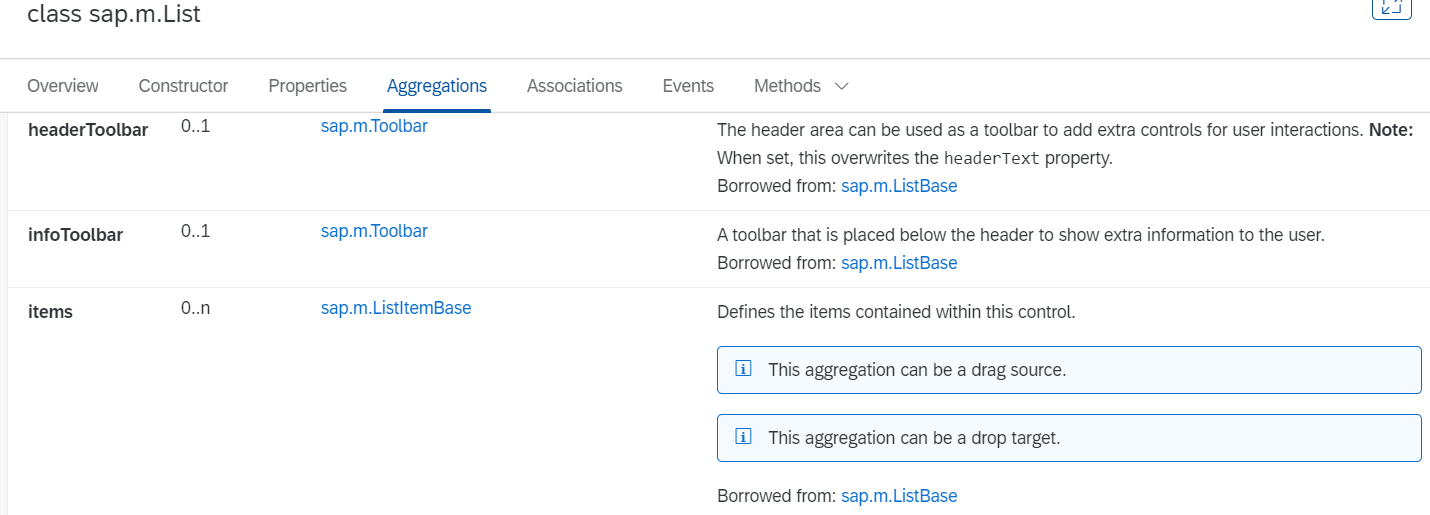
打开API,就可以看到LIst的Aggregations。在这里可以看到所有的Aggregations都是小写字母开头的,而且可以看到<items>。
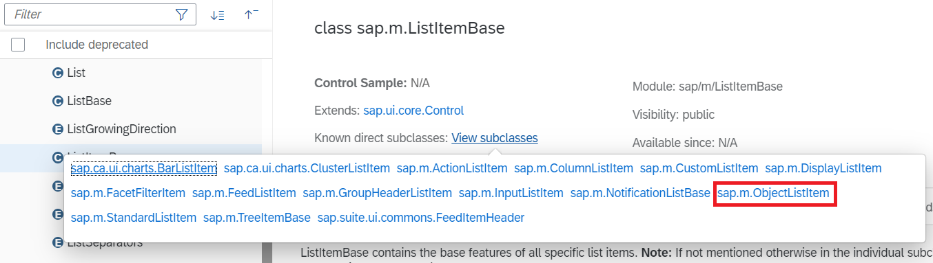
在上面代码的例子中,可以看到<items>中的对象是 ObjectListItem。点击上图的items的type sap.m.ListItemBase。可以看到ListItemBase中有子类ObjectListItem。
所以顺序就以这种方式来书写:
Control Aggregations Control Aggregations...
在上面的例子中<items>不写也不会报错,因为控件将其声明为默认值,但是为了便于阅读,都要加上Control对应的Aggregations。
12 Step 12: Shell Control as Container
<mvc:View
    controllerName="sap.ui.demo.walkthrough.controller.App"
    xmlns="sap.m"
    xmlns:mvc="sap.ui.core.mvc"
    displayBlock="true">
    <Shell>

        <App>
            <pages>
                <Page title="{i18n>homePageTitle}">
                    <content>
                        <Panel
                            headerText="{i18n>helloPanelTitle}">
                            <content>
                                <Button
                                    text="{i18n>showHelloButtonText}"
                                    press=".onShowHello"/>
                                <Input
                                    value="{/recipient/name}"
                                    description="Hello {/recipient/name}"
                                    valueLiveUpdate="true"
                                    width="60%"/>
                            </content>
                        </Panel>
                    </content>
                </Page>
            </pages>
        </App>
    </Shell>

</mvc:View>
13 Step 13: Margins and Paddings
修改App.view.xml<mvc:View controllerName="sap.ui.demo.walkthrough.controller.App" xmlns="sap.m" xmlns:mvc="sap.ui.core.mvc" displayBlock="true"> <Shell> <App> <pages> <Page title="{i18n>homePageTitle}"> <content> <Panel headerText="{i18n>helloPanelTitle}" class="sapUiResponsiveMargin" width="auto"> <content> <Button text="{i18n>showHelloButtonText}" press=".onShowHello" class="sapUiSmallMarginEnd"/> <Input value="{/recipient/name}" valueLiveUpdate="true" width="60%"/> <Text text="Hello {/recipient/name}" class="sapUiSmallMargin"/> </content> </Panel> </content> </Page> </pages> </App> </Shell> </mvc:View>
14 Step 14: Custom CSS and Theme Colors
有的时候我们需要自定义样式,这时我们就需要向控件中添加自定义的类,来对控件进行样式设置。
尽量避免这种操作,因为sapui5在升级后有可能会使你的样式不可用,所以如果当使用自定义样式的时候,需要在sapui5每次都升级后,确认你的样式可用。
新建style.css
html[dir="ltr"] .myAppDemoWT .myCustomButton.sapMBtn {
   margin-right: 0.125rem
}

html[dir="rtl"] .myAppDemoWT .myCustomButton.sapMBtn {
   margin-left: 0.125rem
}

.myAppDemoWT .myCustomText {
   display: inline-block;
   font-weight: bold;
}
修改manifest.json,将新建的style.css引入工程
...
  "sap.ui5": {
    ...
    "models": {
      ...
    },
    "resources": {
      "css": [
        {
          "uri": "css/style.css"
        }
      ]
    }
  }
命名空间sap.ui5的resources,可以加载应用程序的其他资源。通过定义相对于component的uri,来加载资源。
sapui5像使用link tag一样,将它添加到html页面的头部,这样浏览器就可以自动加载。
修改App.view.xml
<mvc:View
    controllerName="sap.ui.demo.walkthrough.controller.App"
    xmlns="sap.m"
    xmlns:mvc="sap.ui.core.mvc"
    displayBlock="true">
    <Shell>
        <App class="myAppDemoWT">
            <pages>
                <Page title="{i18n>homePageTitle}">
                    <content>
                        <Panel
                            headerText="{i18n>helloPanelTitle}"
                            class="sapUiResponsiveMargin"
                            width="auto">
                            <content>
                                <Button
                                    text="{i18n>showHelloButtonText}"
                                    press=".onShowHello"
                                    class="myCustomButton"/>
                                <Input
                                    value="{/recipient/name}"
                                    valueLiveUpdate="true"
                                    width="60%"/>
                                <FormattedText
                                    htmlText="Hello {/recipient/name}"
                                    class="sapUiSmallMargin sapThemeHighlight-asColor myCustomText"/>
                            </content>
                        </Panel>
                    </content>
                </Page>
            </pages>
        </App>
    </Shell>
</mvc:View>

15 Step 15: Nested Views
嵌套View,可以将panel的内容放入view中,嵌套到另外的一个view中。这样便于代码的理解,并且可以重用应用程序的各个部分。
修改App.view.xml
<mvc:View
    controllerName="sap.ui.demo.walkthrough.controller.App"
    xmlns="sap.m"
    xmlns:mvc="sap.ui.core.mvc"
    displayBlock="true">
    <Shell>
        <App class="myAppDemoWT">
            <pages>
                <Page title="{i18n>homePageTitle}">
                    <content>
                        <mvc:XMLView viewName="sap.ui.demo.walkthrough.view.HelloPanel"/>
                    </content>
                </Page>
            </pages>
        </App>
    </Shell>
</mvc:View>
新创建一个单独的HelloPanel view,并且使用了xmlview这个标签对他进行了引用。
新建HelloPanel.view.xml
<mvc:View
   controllerName="sap.ui.demo.walkthrough.controller.HelloPanel"
   xmlns="sap.m"
   xmlns:mvc="sap.ui.core.mvc">
   <Panel
      headerText="{i18n>helloPanelTitle}"
      class="sapUiResponsiveMargin"
      width="auto" >
      <content>
         <Button
            text="{i18n>showHelloButtonText}"
            press=".onShowHello"
            class="myAppDemoWT myCustomButton"/>
         <Input
            value="{/recipient/name}"
            valueLiveUpdate="true"
            width="60%"/>
         <FormattedText
            htmlText="Hello {/recipient/name}"
            class="sapUiSmallMargin sapThemeHighlight-asColor myCustomText"/>
      </content>
   </Panel>
</mvc:View>
新建HelloPanel.controller.js
sap.ui.define([
   "sap/ui/core/mvc/Controller",
   "sap/m/MessageToast"
], function (Controller, MessageToast) {
   "use strict";
   return Controller.extend("sap.ui.demo.walkthrough.controller.HelloPanel", {
      onShowHello : function () {
         // read msg from i18n model
         var oBundle = this.getView().getModel("i18n").getResourceBundle();
         var sRecipient = this.getView().getModel().getProperty("/recipient/name");
         var sMsg = oBundle.getText("helloMsg", [sRecipient]);
         // show message
         MessageToast.show(sMsg);
      }
   });
});
修改App.controller.js
sap.ui.define([
   "sap/ui/core/mvc/Controller"
], function (Controller) {
   "use strict";
   return Controller.extend("sap.ui.demo.walkthrough.controller.App", {
   });
});