好看的搜索框:

<!DOCTYPE html>
<html lang="zh">

<head>
  <meta charset="UTF-8" />
  <meta name="viewport" content="width=device-width, initial-scale=1.0" />
  <meta http-equiv="X-UA-Compatible" content="ie=edge" />
  <title>Awesome search Box</title>
  <link href="https://cdn.bootcss.com/font-awesome/5.8.0/css/all.css" rel="stylesheet" />
 <style>
   body{
  margin: 0;
  padding: 0;
  background: #e84118;
 }
.search-box{
  position: absolute;
  top:50%;
  left: 50%;
  transform: translate(-50%,-50%);
  background: #2f3640;
  border-radius: 40px;
  padding: 10px;
}
.search-btn{
  color: #e84118;
  float: right;
   40px;
  height: 40px;
  border-radius: 50%;
  background: #2f3640;
  display: flex;
  justify-content: center;
  align-items: center;
}
.search-txt{
  border: none;
  background: none;
  outline: none;
  float: left;
  padding: 0;
  color: white;
  font-size: 16px;
  transition: 0.4s;
  line-height: 40px;
   0;
}
.search-box:hover > .search-txt {
   240px;
	padding: 0 6px;
}
.search-box:hover > .search-btn {
	background: white;
}

 </style>

</head>

<body>
  <div class="search-box">
    <input class="search-txt" type="text" placeholder="Type to search" />
    <a class="search-btn" href="#">
      <i class="fas fa-search"></i>
    </a>
  </div>
</body>

</html>

<!DOCTYPE html>
<html lang="en">
	<head>
		<meta charset="UTF-8" />
		<meta name="viewport" content="width=device-width, initial-scale=1.0" />
		<meta http-equiv="X-UA-Compatible" content="ie=edge" />
		<title>Loading1</title>
		<style>
			body {
				margin: 0;
				padding: 0;
				background: #333;
			}
			.middle {
				position: absolute;
				top: 50%;
				left: 50%;
				transform: translate(-50%, -50%);
			}
			.bar {
				 6px;
				height: 2px;
				background: white;
				display: inline-block;
				transform-origin: bottom center;
				animation: loading 1.5s ease-in-out infinite;
			}
			.bar1 {
				animation-delay: 0.1s;
			}
			.bar2 {
				animation-delay: 0.2s;
			}
			.bar3 {
				animation-delay: 0.3s;
			}
			.bar4 {
				animation-delay: 0.4s;
			}
			.bar5 {
				animation-delay: 0.5s;
			}
			.bar6 {
				animation-delay: 0.6s;
			}
			.bar7 {
				animation-delay: 0.7s;
			}
			.bar8 {
				animation-delay: 0.8s;
			}
			@keyframes loading {
				0% {
					transform: scaleY(0.1);
					background: #fff;
				}
				50% {
					transform: scaleY(30);
					background: #2ecc71;
				}
				100% {
					transform: scaleY(0.1);
					background: transparent;
				}
			}
		</style>
	</head>
	<body>
		<div class="middle">
			<div class="bar bar1"></div>
			<div class="bar bar2"></div>
			<div class="bar bar3"></div>
			<div class="bar bar4"></div>
			<div class="bar bar5"></div>
			<div class="bar bar6"></div>
			<div class="bar bar7"></div>
			<div class="bar bar8"></div>
		</div>
	</body>
</html>

<!DOCTYPE html>
<html lang="en">
<head>
  <meta charset="UTF-8">
  <meta name="viewport" content="width=device-width, initial-scale=1.0">
  <link rel="stylesheet" href="css/style.css">
  <title>404 - 页面丢失啦</title>
</head>
<body>
  <div class="main-container">
    <div class="img-container container-item">
      <img src="./static/404.svg">
    </div>
    <div class="text-container container-item">
      <div class="code">404</div>
      <div class="msg">你查看的页面貌似丢失了呢...</div>
      <div class="action">返回首页,查看更多内容.</div>
    </div>
  </div>
</body>
</html>
* {
  padding: 0;
  margin: 0;
}

html,body {
  height: 100%;
}

body {
  background-color: rgba(223, 223, 255, 0.39);
  display: flex;
  justify-content: center;
  align-items: center;
}

.main-container {
   80%;
  max- 1000px;
  max-height: 500px;
  min- 600px;
  background-color: white;
  font-size: 0;
  border-radius: 20px;
  box-shadow: 0 0 50px 0 rgba(146, 146, 146, 0.63);
}

.main-container .container-item {
  display: inline-block;
  vertical-align: middle;
   50%;
}

.main-container .img-container {
  background-color: rgba(253, 216, 168, 0.692);
  border-top-left-radius: 20px;
  border-bottom-left-radius: 20px;
}

.main-container .text-container .code {
  font-size: clamp(150px,20vw,200px);
  font-family: 'Arial Narrow';
  color: rgb(86, 86, 253);
  font-weight: bolder;
  text-align: center;
}

.main-container .text-container .msg {
  font-size: 18px;
  text-align: center;
  font-weight: 200;
  margin-bottom: 20px;
}

.main-container .text-container .action {
  font-size: 15px;
  font-weight: 200;
  text-align: center;
  text-decoration-line: underline;
  cursor: pointer;
}
<!DOCTYPE html>
<html lang="en">
<head>
<meta charset="UTF-8">
<meta name="viewport" content="width=device-width, initial-scale=1.0">
<style>
*{
padding: 0;
margin: 0;
}
html{
height: 100%;
}
body{
background-color: rgb(55, 40, 65);
}
.main-container{
color: aliceblue;
padding-top: 100px;
}
.line-container{
910px;
height: 300px;
margin: 0 auto;
display: flex;
flex-direction: row;
}
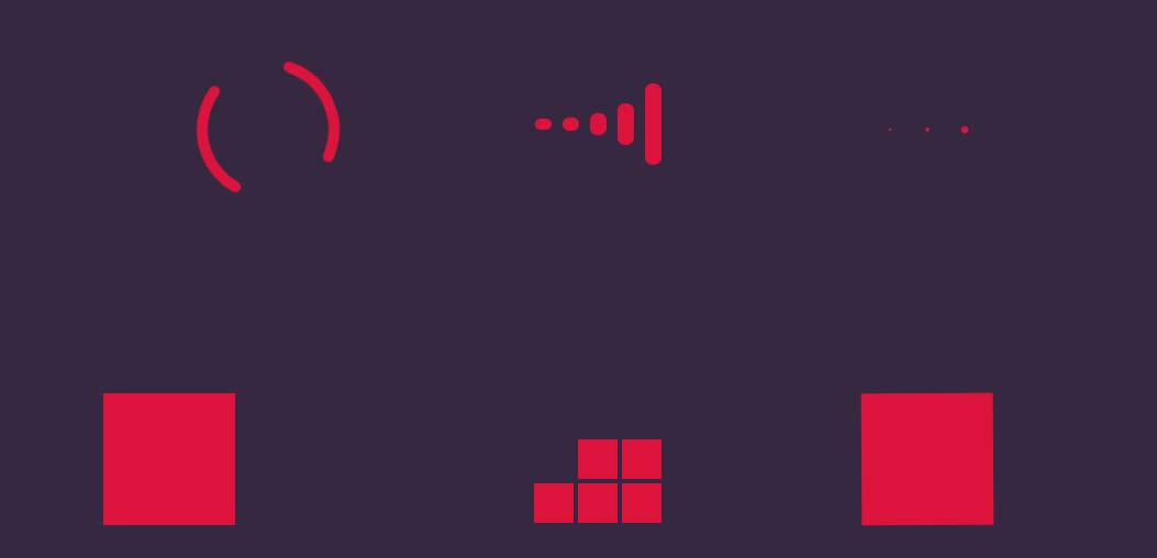
.line-container .loading{
300px;
text-align: center;
}
.line-container .loading.loading1{
animation: loading1-rotate 2s infinite 0s;
}
.line-container .loading.loading1 .item {
stroke: crimson;
stroke-dasharray:100;
stroke- 10;
stroke-linecap: round;
fill: none;
}
@keyframes loading1-rotate{
0%{
transform: rotate(0);
}
100% {
transform: rotate(360deg);
}
}
/* 第二个的样式 */
.loading2 .wrapper {
height: 100%;
margin: 0 auto;
font-size: 0;
}
.loading2 .wrapper .item {
background-color: crimson;
15px;
height: 0px;
display: inline-block;
font-size: 0;
margin: 0 5px;
position: relative;
transform: translateY(145px);
}
.loading2 .wrapper .item::before {
content: '';
height: 50px;
15px;
position: absolute;
bottom: 0;
left: 0;
border-top-left-radius: 8px;
border-top-right-radius: 8px;
background-color: crimson;
}
.loading2 .wrapper .item::after{
content: '';
position: absolute;
top: 0;
left: 0;
height: 50px;
15px;
border-bottom-left-radius: 8px;
border-bottom-right-radius: 8px;
background-color: crimson;
}
.loading2 .wrapper .item:nth-child(1)::before{
animation: loading2 2s infinite 0s;
}
.loading2 .wrapper .item:nth-child(2)::before {
animation: loading2 2s infinite .2s;
}
.loading2 .wrapper .item:nth-child(3)::before {
animation: loading2 2s infinite .4s;
}
.loading2 .wrapper .item:nth-child(4)::before {
animation: loading2 2s infinite .6s;
}
.loading2 .wrapper .item:nth-child(5)::before {
animation: loading2 2s infinite .8s;
}
.loading2 .wrapper .item:nth-child(1)::after {
animation: loading2 2s infinite 0s;
}
.loading2 .wrapper .item:nth-child(2)::after {
animation: loading2 2s infinite .2s;
}
.loading2 .wrapper .item:nth-child(3)::after {
animation: loading2 2s infinite .4s;
}
.loading2 .wrapper .item:nth-child(4)::after {
animation: loading2 2s infinite .6s;
}
.loading2 .wrapper .item:nth-child(5)::after {
animation: loading2 2s infinite .8s;
}
@keyframes loading2 {
0% {
height: 50px;
}
50% {
height: 5px;
}
100% {
height: 50px;
}
}
.loading3 .wrapper{
text-align: center;
}
.loading3 .wrapper .item{
display: inline-block;
height: 30px;
30px;
font-size: 0;
transform: translateY(135px);
}
.loading3 .wrapper .item::before {
content: '';
display: inline-block;
height: 30px;
30px;
background-color: crimson;
border-radius: 15px;
}
.loading3 .wrapper .item:nth-child(1)::before {
animation: loading3 2s infinite 0s;
}
.loading3 .wrapper .item:nth-child(2)::before {
animation: loading3 2s infinite 0.2s;
}
.loading3 .wrapper .item:nth-child(3)::before {
animation: loading3 2s infinite 0.4s;
}
@keyframes loading3 {
0% {
transform: scale(1);
}
50% {
transform: scale(0.1);
}
100% {
transform: scale(1);
}
}
.loading4 .item {
100px;
height: 100px;
border: 10px solid crimson;
margin-top: 90px;
animation: loading4-box 2s infinite 0s;
}
.loading4 .item::before {
content: '';
display: inline-block;
vertical-align: top;
100px;
height: 0px;
background-color: crimson;
animation: loading4 2s infinite 0s;
}
@keyframes loading4-box{
0% {
transform: rotate(0deg);
}
25% {
transform: rotate(0deg);
}
50% {
transform: rotate(180deg);
}
75% {
transform: rotate(180deg);
}
100% {
transform: rotate(360deg);
}
}
@keyframes loading4 {
0% {
height: 0px;
}
25% {
height: 100px;
}
50% {
height: 100px;
}
75% {
height: 0px;
}
100% {
height: 0px;
}
}
.loading5 .wrapper{
height: 120px;
120px;
display: flex;
flex-flow: row wrap;
transform: translateX(90px) translateY(90px);
}
.loading5 .wrapper .item {
36px;
height: 36px;
background-color: crimson;
font-size: 0;
margin: 2px;
}
.loading5 .wrapper .item:nth-child(1){
animation: loading5 4s infinite 0s;
}
.loading5 .wrapper .item:nth-child(2){
animation: loading5 4s infinite 0.25s;
}
.loading5 .wrapper .item:nth-child(3){
animation: loading5 4s infinite 0.5s;
}
.loading5 .wrapper .item:nth-child(4){
animation: loading5 4s infinite 0.75s;
}
.loading5 .wrapper .item:nth-child(5){
animation: loading5 4s infinite 1s;
}
.loading5 .wrapper .item:nth-child(6){
animation: loading5 4s infinite 1.25s;
}
.loading5 .wrapper .item:nth-child(7){
animation: loading5 4s infinite 1.5s;
}
.loading5 .wrapper .item:nth-child(8){
animation: loading5 4s infinite 1.75s;
}
.loading5 .wrapper .item:nth-child(9){
animation: loading5 4s infinite 2s;
}
@keyframes loading5{
0% {
transform: translateY(0px);
opacity: 1;
}
5% {
transform: translateY(20px);
opacity: 0;
}
45% {
transform: translateY(20px);
opacity: 0;
}
55% {
transform: translateY(0px);
opacity: 1;
}
100% {
transform: translateY(0px);
opacity: 1;
}
}
.loading6 {
animation:loading6 2s infinite linear 0s;
}
@keyframes loading6{
0% {
transform: rotate(0deg);
}
100% {
transform: rotate(360deg);
}
}
.loading6 .item{
120px;
height: 120px;
background-color: crimson;
transform: translateX(90px) translateY(90px);
animation: loading6-item 2s infinite linear 0s;
}
@keyframes loading6-item {
0% {
border-radius: 0;
}
12.5% {
border-bottom-right-radius: 60px;
}
25% {
border-radius: 0;
}
37.5% {
border-top-right-radius: 60px;
}
50% {
border-radius: 0;
}
62.5% {
border-top-left-radius: 60px;
}
75% {
border-radius: 0;
}
87.5% {
border-bottom-left-radius: 60px;
}
100% {
border-radius: 0;
}
}
</style>
<title>Loading...</title>
</head>
<body>
<div class="main-container">
<div class="line-container">
<div class="loading loading1">
<svg class="load" width="300" height="300">
<circle class="item" cx="150" cy="150" r=60></circle>
</svg>
</div>
<div class="loading loading2">
<div class="wrapper">
<div class="item"></div>
<div class="item"></div>
<div class="item"></div>
<div class="item"></div>
<div class="item"></div>
</div>
</div>
<div class="loading loading3">
<div class="wrapper">
<div class="item"></div>
<div class="item"></div>
<div class="item"></div>
</div>
</div>
</div>
<div class="line-container">
<div class="loading loading4">
<div class="item"></div>
</div>
<div class="loading loading5">
<div class="wrapper">
<div class="item"></div>
<div class="item"></div>
<div class="item"></div>
<div class="item"></div>
<div class="item"></div>
<div class="item"></div>
<div class="item"></div>
<div class="item"></div>
<div class="item"></div>
</div>
</div>
<div class="loading loading6">
<div class="item"></div>
</div>
</div>
</div>
</body>
</html>