在我之前的博客网页整体布局完全剖析—剖完你不进来看一下么?中总结单列、两列、三列固宽与变宽布局,我还以为已经囊括了所有经典的网页布局方法了呢,当然除了CSS3的弹性盒模型没有涉及到,现在看来确实是自己孤陋寡闻了,以前在看资料的时候无意中看过圣杯布局和双飞翼布局这样的名词,只不过当时基础是在太差直接忽略了(当然现在也是在打基础,但是好歹相对几个月前已经有了质的改变)。今天总结时再次看到这两个布局方法,当然再也不能错过了。
圣杯布局与双飞翼布局针对的都是三列左右栏固定中间栏边框自适应的网页布局(想象一下圣杯是主体是加上两个耳朵;鸟儿是身体加上一对翅膀),圣杯布局是Kevin Cornell在2006年提出的一个布局模型概念,在国内最早是由淘宝UED的工程师(传说是玉伯)改进并传播开来,在中国也有叫法是双飞翼布局,它的布局要求有几点:
三列布局,中间宽度自适应,两边定宽;
中间栏要在浏览器中优先展示渲染;
允许任意列的高度最高;
下面我们看看具体的实现方法。
一、圣杯布局
HTML结构
1 2 3 4 5 6 7 | <div class="header">header</div><div class="container"> <div class="main">main</div> <div class="left">left</div> <div class="right">right</div></div><div class="footer">footer</div> |
因为需要中间栏优先展示渲染,所以中间的main在HTML的结构中却是最靠前的。在实际的网站中这样做的好处就是用户能够先看到网页正文信息,一般网页两边的导航信息和说明信息我们认为优先级没有正文重要。
1.设置一下基本样式
1 2 3 4 5 6 7 8 9 10 11 12 13 14 15 16 17 18 19 20 21 22 23 24 | *{margin: 0;padding: 0;}body{min-width: 700px;}.header,.footer{ border: 1px solid #333; background: #aaa; text-align: center;}.left,.main,.right{ min-height: 130px;}.container{ border:2px solid yellow;}.left{ width:200px; background:red;}.right{ width:220px; background:green;}.main{ background:blue;} |
为了高度保持一致给left middle right都加上min-height:130px
2.将主体部分的三个子元素都设置左浮动
1 2 3 | .left,.main,.right{ float: left;} |
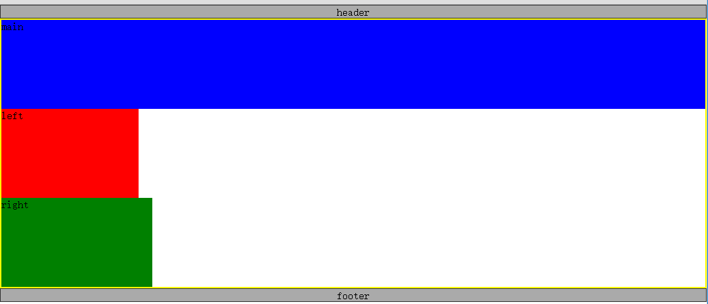
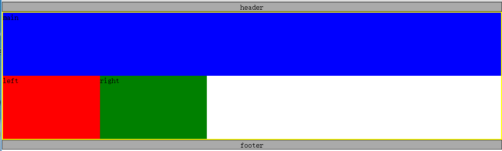
此时的页面显示如图所示,Shen Me Gui没关系,事情会变得好起来的
我们看一下上面的效果比较明显的两个问题,一是footer跑到上面去了,二是container容器高度塌陷了,这是典型的“清除浮动和闭合浮动”问题。
3.解决浮动问题
1 2 3 4 5 6 7 | .container{ border: 2px solid yellow; overflow: hidden;}.footer{ clear: both;} |
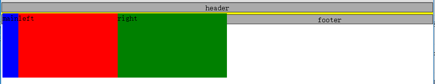
给container加上overflow:hidden触发BFC闭合浮动,给footer加上clear属性清除浮动。
我们发现footer移到了下面,并且container的高度塌陷也修复了。
4.设置main宽度为100%,让其单独占满一行
1 2 3 4 | .main{ width: 100%; background: blue;} |
5.设置left和right负的外边距
我们的目标是让left、main、right依次并排,但是上图中left和right都是位于下一行,这里的技巧就是使用负的margin-left:
1 2 3 4 5 6 7 8 9 10 | .left{ margin-left: -100%; width: 200px; background: red;}.right{ margin-left: -220px; width: 220px; background: green;} |
负的margin-left会让元素沿文档流向左移动,如果负的数值比较大就会一直移动到上一行。关于负的margin的应用也是博大精深,这里肯定是不能详细介绍了。
设置left部分的margin-left为-100%,就会使left向左移动一整个行的宽度,由于left左边是父元素的边框,所以left继续跳到上一行左移,一直移动到上一行的开头,并覆盖了main部分(仔细观察下图,你会发现main里面的字“main”不见了,因为被left遮住了),left上移过后,right就会处于上一行的开头位置,这是再设置right部分margin-left为负的宽度,right就会左移到上一行的末尾。
6.修复覆盖问题
第五步我们说过设置left和right负的外边距覆盖了main部分的内容,现在想办法修复这个问题,首先给container的左右加上一个内边距,分别为left和right的宽度。
1 2 3 4 5 | .container{ border: 2px solid yellow; padding:0 220px 0 200px; overflow: hidden;} |

由于left、main、right三个部分都被container包裹着,所以给其添加内边距,三个子元素会往中间挤。貌似还是没有修复问题,别着急,我们已经在container的左右两边留下了相应宽度的留白,只要把left和right分别移动到这两个留白就可以了。可以使用相对定位移动left和right部分,
1 2 3 4 5 6 7 8 9 10 11 12 13 14 15 16 17 | .left,.main,.right{ position: relative; float: left; min-height: 130px;}.left{ margin-left: -100%; left: -200px; width: 200px; background: red;}.right{ margin-left: -220px; right: -220px; width: 220px; background: green;} |
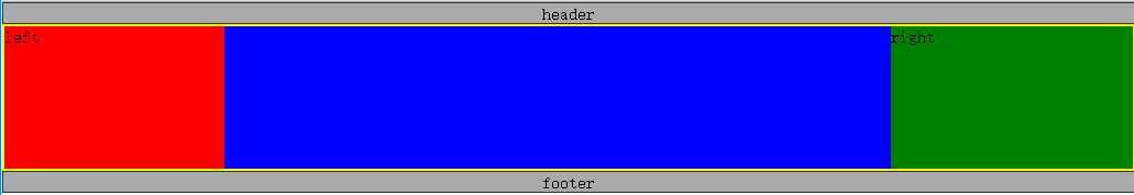
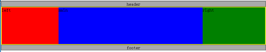
至此,我们完成了三列中间自适应的布局,也就是传说中的圣杯布局。完整的代码如下:
1 2 3 4 5 6 7 8 9 10 11 12 13 14 15 16 17 18 19 20 21 22 23 24 25 26 27 28 29 30 31 32 33 34 35 36 37 38 39 40 41 42 43 44 45 46 47 48 49 50 51 52 53 54 55 56 57 | <!DOCTYPE html><html><head> <meta charset="utf-8"> <title>圣杯布局</title> <style type="text/css"> *{margin: 0;padding: 0;} body{min- 700px;} .header, .footer{ border: 1px solid #333; background: #aaa; text-align: center; } .left, .main, .right{ position: relative; float: left; min-height: 130px; } .container{ border: 2px solid yellow; padding:0 220px 0 200px; overflow: hidden; } .left{ margin-left: -100%; left: -200px; 200px; background: red; } .right{ margin-left: -220px; right: -220px; 220px; background: green; } .main{ 100%; background: blue; } .footer{ clear: both; } </style></head><body> <div class="header">header</div> <div class="container"> <div class="main">main</div> <div class="left">left</div> <div class="right">right</div> </div> <div class="footer">footer</div></body></html> |
二、双飞翼布局
圣杯布局和双飞翼布局解决问题的方案在前一半是相同的,也就是三栏全部float浮动,但左右两栏加上负margin让其跟中间栏div并排,以形成三栏布局。不同在于解决”中间栏div内容不被遮挡“问题的思路不一样。
HTML 结构
1 2 3 4 5 6 7 8 9 | <div class="header">header</div><div class="container"> <div class="main"> <div class="content">main</div> </div> <div class="left">left</div> <div class="right">right</div></div><div class="footer">footer</div> |
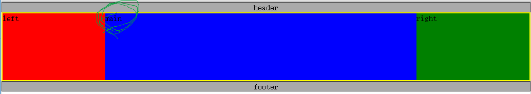
双飞翼布局的前五步和圣杯布局完全相同,我们只需要修改第六步,前面是设置container的内边距以及相对定位来解决这个覆盖问题的,双飞翼布局中,为了main内容不被遮挡,在main里面添加一个子元素content来显示内容,然后设置content的margin-left和margin-right为左右两栏div留出位置。
直接贴出代码,读者可以自行参透他们的异同:
1 2 3 4 5 6 7 8 9 10 11 12 13 14 15 16 17 18 19 20 21 22 23 24 25 26 27 28 29 30 31 32 33 34 35 36 37 38 39 40 41 42 43 44 45 46 47 48 49 50 51 52 53 54 55 56 57 58 | <!DOCTYPE html><html><head> <meta charset="utf-8"> <title>圣杯布局</title> <style type="text/css"> *{margin: 0;padding: 0;} body{min- 700px;} .header, .footer{ border: 1px solid #333; background: #aaa; text-align: center; } .left, .main, .right{ float: left; min-height: 130px; } .container{ border: 2px solid yellow; overflow: hidden; } .left{ margin-left: -100%; 200px; background: red; } .right{ margin-left: -220px; 220px; background: green; } .main{ 100%; background: blue; } .content{ margin: 0 220px 0 200px; } .footer{ clear: both; } </style></head><body> <div class="header">header</div> <div class="container"> <div class="main"> <div class="content">main</div> </div> <div class="left">left</div> <div class="right">right</div> </div> <div class="footer">footer</div></body></html> |
双飞翼布局比圣杯布局多使用了1个div,少用大致4个css属性(圣杯布局container的 padding-left和padding-right这2个属性,加上左右两个div用相对布局position: relative及对应的right和left共4个属性,;而双飞翼布局子div里用margin-left和margin-right共2个属性,比圣杯布局思路更直接和简洁一点。简单说起来就是”双飞翼布局比圣杯布局多创建了一个div,但不用相对布局了。
参考