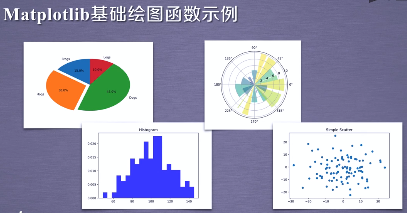
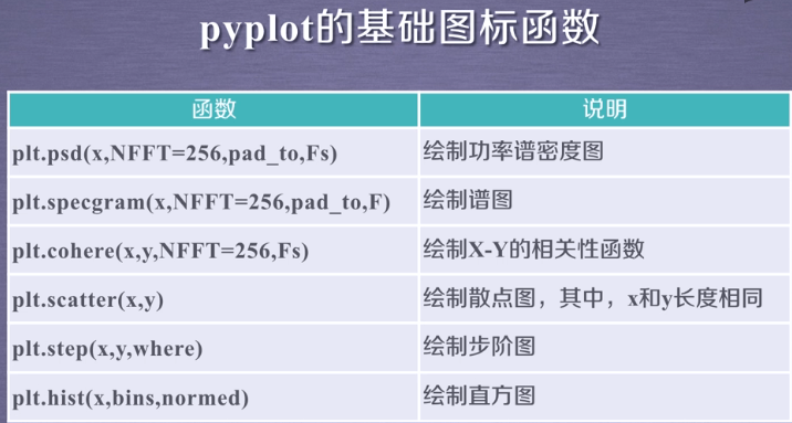
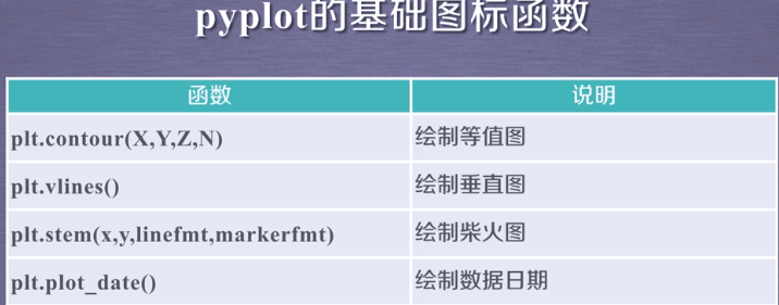
一:基本绘图函数(这里介绍16个,还有许多其他的)
二:pyplot饼图plt.pie的绘制
三:pyplot直方图plt.hist的绘制
(一)修改第二个参数bins:代表直方图的个数,均分为多段,取其中的每段均值
(二)normed为1代表我们要使用归一化数据(所占比例)在y轴,为0表示每个期间所占个数
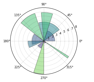
四:pyplot极坐标图bar的绘制(角度空间内展示效果不错,在生活中不常用)
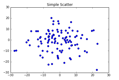
五:pyplot散点图的绘制(面向对象绘制:各种绘制函数变为当前图表区域对象的方法,这是推荐的方法)
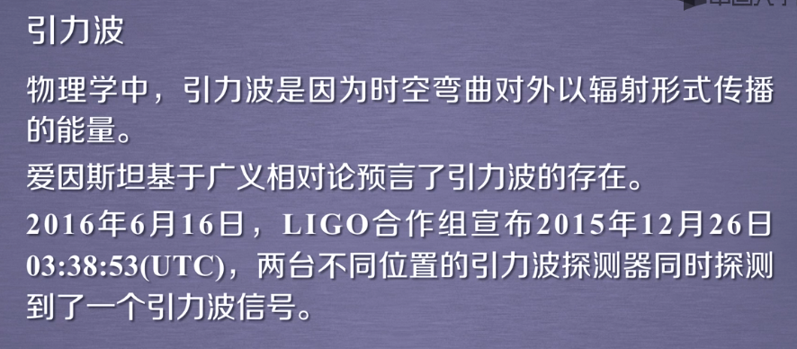
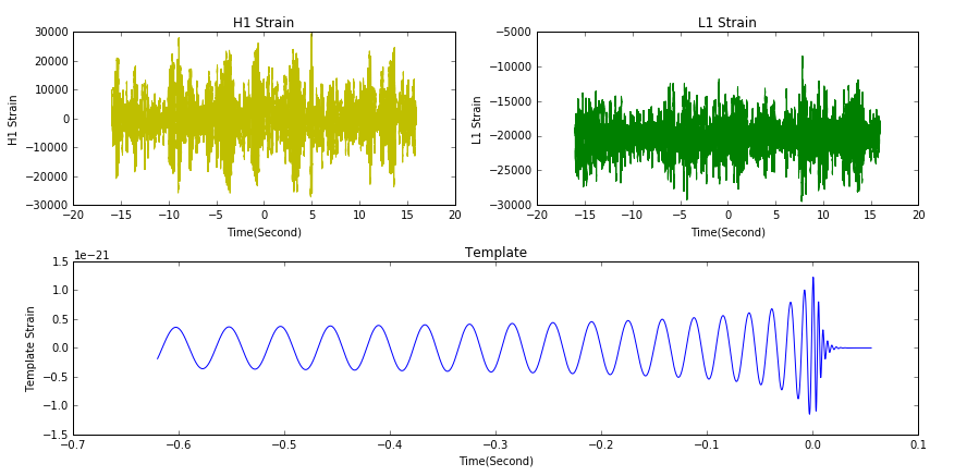
六:引力波的绘制
一:基本绘图函数(这里介绍16个,还有许多其他的)

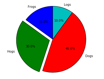
二:pyplot饼图plt.pie的绘制
import matplotlib
import matplotlib.pyplot as plt

labels = 'Frogs','Hogs','Dogs','Logs'
sizes = [15,30,45,10]  #这是各个区域所占的大小,不一定是100,会自动换算为百分比
explode = (0,0.1,0,0)  #0.1是表示这个区域突出的程度

plt.pie(sizes,explode=explode,labels=labels,autopct="%1.1f%%",shadow=False,startangle=90)  #explode是突出比例,startangle起始角度
plt.show()
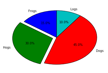
plt.axis("equal") #将饼图变水平
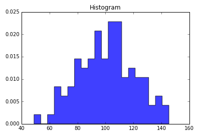
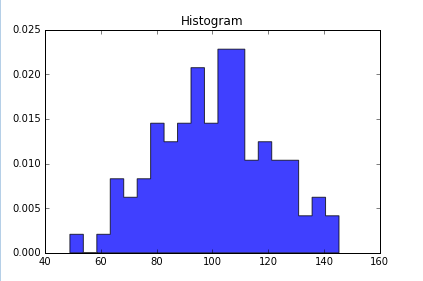
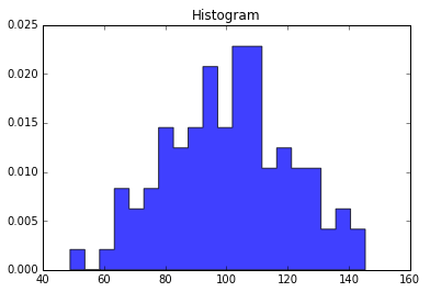
三:pyplot直方图plt.hist的绘制
import numpy as np
import matplotlib.pyplot as plt

np.random.seed(0)
mu,sigma = 100,20 #均值和标准差
a = np.random.normal(mu,sigma,size=100)  #正态分布,size=100,表示一维数组,长度100

plt.hist(a,20,normed=1,histtype="stepfilled",facecolor="b",alpha=0.75)
plt.title("Histogram")

plt.show()
def hist(x, bins=10, range=None, normed=False, weights=None, cumulative=False,
         bottom=None, histtype='bar', align='mid', orientation='vertical',
         rwidth=None, log=False, color=None, label=None, stacked=False,
         hold=None, data=None, **kwargs):
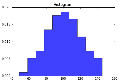
(一)修改第二个参数bins:代表直方图的个数,均分为多段,取其中的每段均值
plt.hist(a,10,normed=1,histtype="stepfilled",facecolor="b",alpha=0.75)
plt.hist(a,20,normed=1,histtype="stepfilled",facecolor="b",alpha=0.75)
plt.hist(a,40,normed=1,histtype="stepfilled",facecolor="b",alpha=0.75)
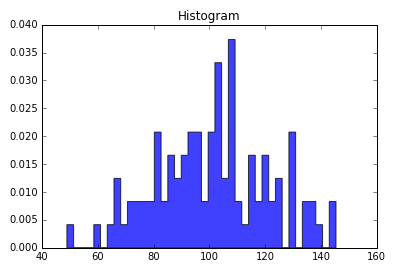
(二)normed为1代表我们要使用归一化数据(所占比例)在y轴,为0表示每个期间所占个数
plt.hist(a,20,normed=1,histtype="stepfilled",facecolor="b",alpha=0.75)
plt.hist(a,20,normed=0,histtype="stepfilled",facecolor="b",alpha=0.75)

四:pyplot极坐标图的绘制(角度空间内展示效果不错,在生活中不常用)
import numpy as np
import matplotlib.pyplot as plt

N = 20  #表示极坐标图中数据的个数
theta = np.linspace(0.0,2*np.pi,N,endpoint=False)  #起始值0,结束值2∏,元素个数(等分角度),是否将最后结束值放入数据
radii = 10*np.random.rand(N)  #生成每个元素对应的值,一维数组含20列
width = np.pi/4*np.random.rand(N)  #∏/4*np.random..rand(N)  生成宽度值

ax = plt.subplot(111,projection="polar")  #111绘制一个绘图区域,projection给出了polar绘制极坐标图的指示
bars = ax.bar(theta,radii,width=width,bottom=0.0)  #left(绘制极坐标区域中那些颜色区域的时候是从哪开始的<角度>),height(中心点到边缘的长度),width(每个绘图区域在角度范围内辐射的面积)

for r,bar in zip(radii,bars):
    bar.set_facecolor(plt.cm.viridis(r/10.))  #使用for循环对每一个绘图区域进行颜色和透明度的设置,若是没有这个那么全是蓝色
    bar.set_alpha(0.5)

plt.show()
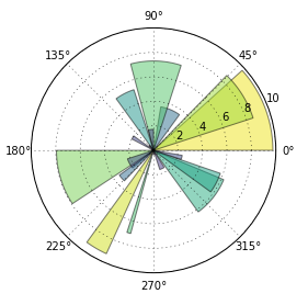
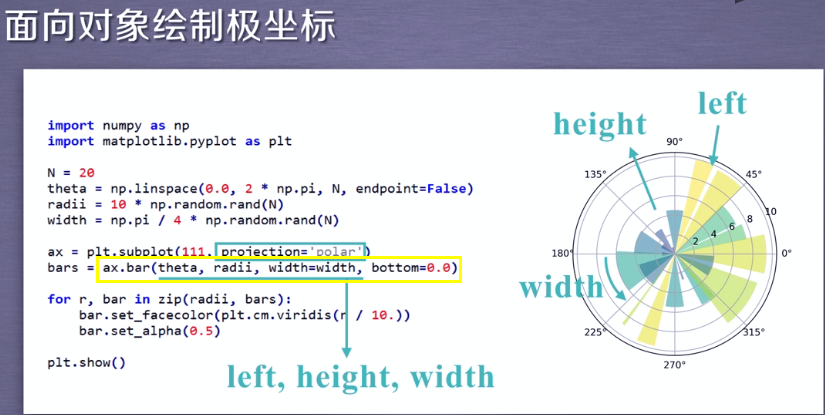
修改N和width
N = 10
width = np.pi/2*np.random.rand(N)
五:pyplot散点图的绘制(面向对象绘制:各种绘制函数变为当前图表区域对象的方法,这是推荐的方法)
import numpy as np
import matplotlib.pyplot as plt

fig, ax = plt.subplots()  #返回图表以及图表相关的区域,为空代表绘制区域为111
ax.plot(10*np.random.randn(100),10*np.random.randn(100),'o')  #randn标准正态分布,有100个元素在一维数组中,乘以10,使值分布大些,plot参数x,y‘o’是实心圆标记
ax.set_title("Simple Scatter")

plt.show()
补充:
subplots和subplot方法作用相似:
subplots会返回一个图表和图表相关的区域
subplot只会返回区域
六:引力波的绘制
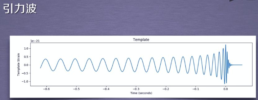
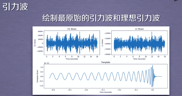

import numpy as np
import matplotlib.pyplot as plt
from scipy.io import wavfile   #读取波形文件的库

rate_h, hstrain = wavfile.read(r"H1_Strain.wav")    #读取下载好的音频文件,当文件符里面出现反斜杠时等转义特殊字符时,在字符前面添加2,表示原始的字符串
rate_l, hstrain = wavfile.read(r"L1_Strain.wav")    #将结果赋给速率rate和数据strain
reftime,ref_H1 = np.genfromtxt("wf_template.txt").transpose()   #获取提供的理论模型,时间序列和信号的数据

htime_interval = 1/rate_h #求倒数,获取波形的时间间隔
ltime_interval = 1/rate_l

htime_len = hstrain.shape[0]/rate_h #hstrain是一个矩阵,shape[0]代表当前第一维度数据,数据点的个数,初一相应的rate,就可以获取在坐标轴上的总长度
htime = np.arange(-htime_len/2,htime_len/2,htime_interval) #绘制以原点为中心对称图形
ltime_len = lstrain.shape[0]/rate_h
ltime = np.arange(-ltime_len/2,ltime_len/2,ltime_interval)


fig = plt.figure(figsize=(12,6)) #创建一个大小为12*6的绘图区域

plth = fig.add_subplot(221) #将窗口绘制为2*2区域选取第1个区域
plth.plot(htime,hstrain,'y')
plth.set_xlabel("Time(Second)")
plth.set_ylabel("H1 Strain")
plth.set_title("H1 Strain")

plth = fig.add_subplot(222) #将窗口绘制为2*2区域选取第2个区域
plth.plot(ltime,lstrain,'g')
plth.set_xlabel("Time(Second)")
plth.set_ylabel("L1 Strain")
plth.set_title("L1 Strain")

plth = fig.add_subplot(212) #在这个图表分为两行一列取第二行
plth.plot(reftime,ref_H1)
plth.set_xlabel("Time(Second)")
plth.set_ylabel("Template Strain")
plth.set_title("Template")
fig.tight_layout()

fig.tight_layout()  #自动调整图像外部边缘

plt.savefig("./Gravitational_Waves_Original.png")
plt.show()
plt.close(fig)
#genfromtxt主要执行两个运算循环,第一个是将文件每一行都转换为字符串序列,第二个循环是将每个字符串序列转换为相应的数据类型,
#使用genfromtxt获取的是一个两行的矩阵
#使用transpose进行转置,赋给两个数组
'''
[1,2]
[2,3]
[2,4]
.....
[5,6]
------------>转置
[1,2,2,...,5]
[2,3,4,...,6]
'''
总结