01 与图片的交互方式设置
这一小节简要介绍一下Matplotlib的交互方式
import pandas as pd
import numpy as np
import matplotlib.pyplot as plt
np.random.seed(111)
X = np.random.rand(1000)
y = np.random.rand(1000)
# 图表窗口1 → plt.show()

plt.plot(X)
plt.show()
# 直接生成图表
# 图表窗口2 → 魔法函数,嵌入图表

% matplotlib inline
plt.scatter(X, y)
# 直接嵌入图表,不用plt.show()
# <matplotlib.collections.PathCollection at ...> 代表该图表对象
# 图表窗口3 → 魔法函数,弹出可交互的matplotlib窗口,缺点是特别占内存

% matplotlib notebook
s = pd.Series(X)
s.plot(style = 'k--o',figsize=(10,5))
# 可交互的matplotlib窗口,不用plt.show()
# 可做一定调整
# 图表窗口4 → 魔法函数,弹出matplotlib控制台,这种情况下就不是嵌入在网页中了,而是有单独的GUI

% matplotlib qt5
df = pd.DataFrame(np.random.rand(50,2),columns=['A','B'])
df.hist(figsize=(12,5),color='g',alpha=0.8)
# 可交互性控制台
# 如果已经设置了显示方式(比如notebook),需要重启然后再运行魔法函数
# 网页嵌入的交互性窗口 和 控制台,只能显示一个

#plt.close()
# 关闭窗口

#plt.gcf().clear()
# 每次清空图表内内容
02 坐标轴的刻度、图中的网格设置
import numpy as np
import pandas as pd
import matplotlib.pyplot as plt
%matplotlib inline
np.random.seed(11)
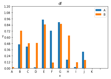
df = pd.DataFrame(np.random.rand(10, 2), columns=['A', 'B'])
df
| A | B | |
|---|---|---|
| 0 | 0.180270 | 0.019475 |
| 1 | 0.463219 | 0.724934 |
| 2 | 0.420204 | 0.485427 |
| 3 | 0.012781 | 0.487372 |
| 4 | 0.941807 | 0.850795 |
| 5 | 0.729964 | 0.108736 |
| 6 | 0.893904 | 0.857154 |
| 7 | 0.165087 | 0.632334 |
| 8 | 0.020484 | 0.116737 |
| 9 | 0.316367 | 0.157912 |
fig = plt.figure(figsize=(10, 2))
print(fig, type(fig))
Figure(720x144) <class 'matplotlib.figure.Figure'>
<Figure size 720x144 with 0 Axes>
fig = df.plot(kind='bar')
plt.title('df')   # 设置表的标题
plt.xlabel('x')   # 设置x轴
plt.ylabel('y', rotation=360)   # 设置y轴,rotation可以将label转到合适的角度
plt.legend(loc='best')  # 设置图例显示在图的哪一边

# 可选值如下
# best
# upper right
# upper left
# lower left
# lower right
# right
# center left
# center right
# lower center
# upper center
# center

plt.xlim(0, 12)  # 设置x轴的长度,输入两个数a,b,表示x从a到b
plt.ylim(0, 1.2)  # 设置y轴的长度,输入两个数a,b,表示x从a到b

plt.xticks(range(12), rotation=360)  # 设置x轴的刻度,输入是列表或者range数据结构;设置rotation
plt.yticks(np.linspace(0, 1.2, 11))

# 为原本的坐标刻度设置‘label’,同理y轴也可以这么设置
fig.set_xticklabels(['A', 'B', 'C', 'D', 'E', 'F', 'G', 'H', 'I', 'J', 'K']);

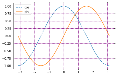
x = np.linspace(-np.pi, np.pi, 256, endpoint=True)
a, b = np.cos(x), np.sin(x)
plt.plot(x, a, '--', label='cos')
plt.plot(x, b, label='sin')   # 要想显示图例需要设置label属性,然后再利用legend方法显示
plt.legend(loc='best')

# x和y坐标轴刻度显示的方式,'inout'正好插入坐标轴,'in'朝内,'out'朝外
plt.rcParams['xtick.direction'] = 'out'
plt.rcParams['ytick.direction'] = 'inout'

#坐标轴的刻度是否显示,如果显示则是True,若是不显示,则是False
plt.tick_params(bottom=True, left=False, right=True, top=True)
plt.grid(True, linestyle='--', color='purple', axis='both')

frame = plt.gca()
# plt.axis('off')  # 整个关闭坐标轴
# 关闭坐标轴
frame.axes.get_xaxis().set_visible(True)   # 设置坐标轴是否可见
frame.axes.get_yaxis().set_visible(True)   # True可见,False不可见