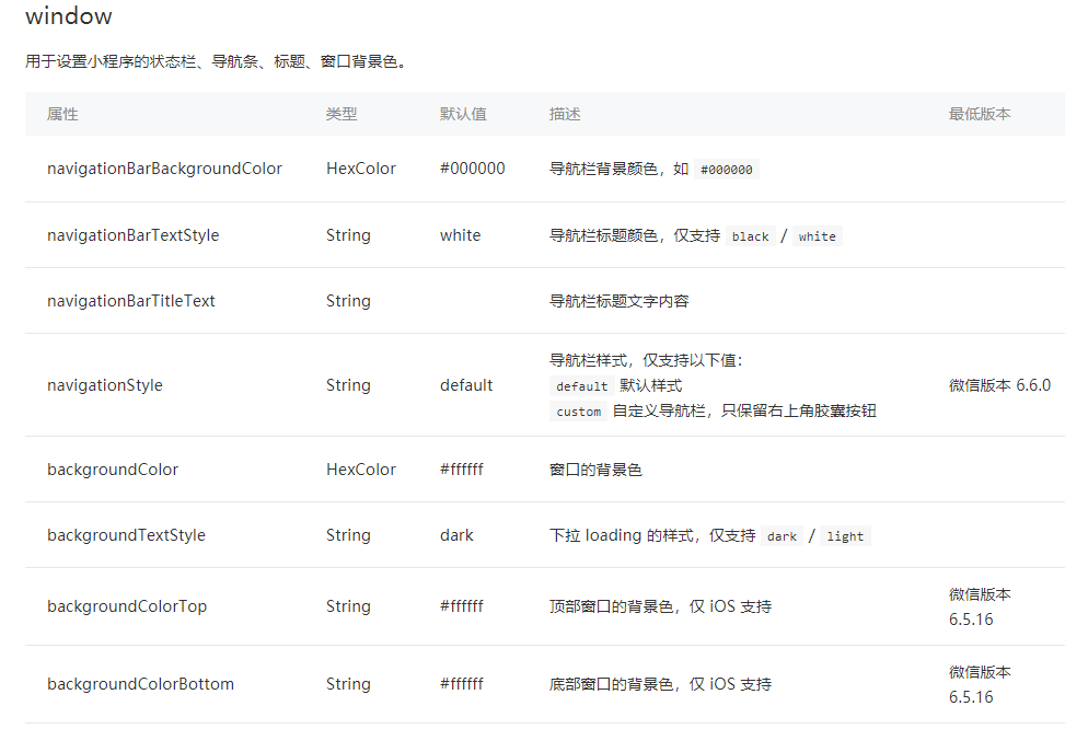
微信头部导航栏可能通过json配置:
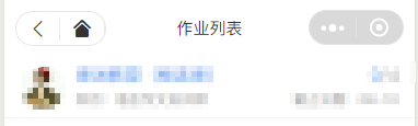
但是有时候我们项目需求可能需要自定义头部导航栏,如下图所示:
现在具体说一下实现步骤及使用方法:
步骤:
1.在 app.json 里面把 "navigationStyle" 设置为 "custom"
这样子之后就只会保留右上角胶囊按钮了。

2.计算相关值
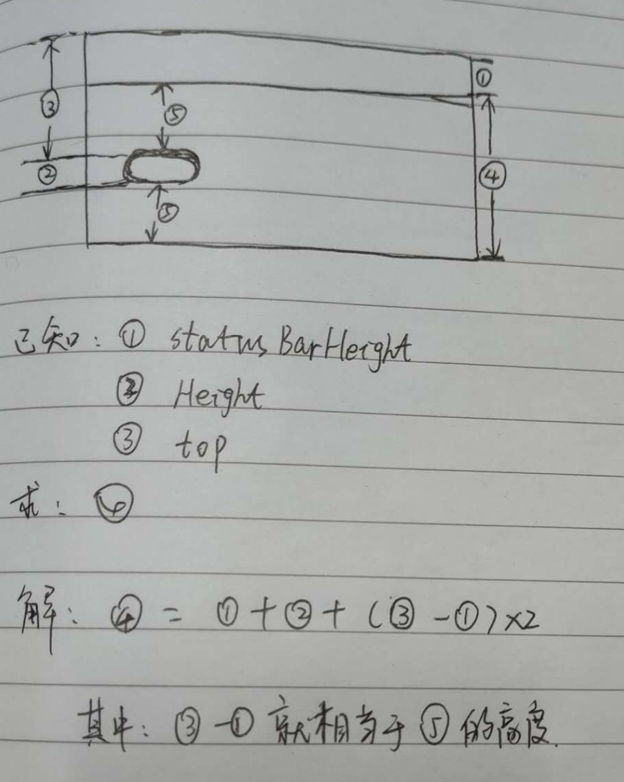
因为在不同的手机型号头部那条栏目高度可能不一致,所以为了我们适配更多型号,我们需要计算3个值:
如下图:

1. 整个导航栏的高度;
2. 胶囊按钮与顶部的距离;
3. 胶囊按钮与右侧的距离。
小程序可以通过 wx.getMenuButtonBoundingClientRect() 获取胶囊按钮的信息 和 wx.getSystemInfo() 获取设备信息。
如下图:

通过这些信息我们可以计算出上面说的3个值:
1. 整个导航栏高度 = statausBarHeight + height + (top-statausBarHeight )*2;
2. 胶囊按钮与顶部的距离 = top;
3.胶囊按钮与右侧的距离 = windowWidth - right。
关于第1步中,为啥要乘以2的原因,请看灵魂画手般的我画的图纸:
App.js 代码如下:
App({
  globalData: {

  },
  onLaunch: function () {
    let menuButtonObject = wx.getMenuButtonBoundingClientRect();
    wx.getSystemInfo({
      success: res => {
        let statusBarHeight = res.statusBarHeight,
          navTop = menuButtonObject.top,//胶囊按钮与顶部的距离
          navHeight = statusBarHeight + menuButtonObject.height + (menuButtonObject.top - statusBarHeight)*2;//导航高度
        this.globalData.navHeight = navHeight;
        this.globalData.navTop = navTop;
        this.globalData.windowHeight = res.windowHeight;
      },
      fail(err) {
        console.log(err);
      }
    })
  }
})
3.因为这个头部导航是公共的,所以我们最好把它设置成一个组件,命名为navbar

index.wxml:
<view class="navbar custom-class" style='height:{{navHeight}}px;background-color:{{bgColor}}'>
  <view wx:if="{{showNav}}" class="navbar-action-wrap navbar-action-group row item-center" style='top:{{navTop}}px;background-color:rgba(255,255,255,.6)'>
      <ss-icon name="back" color="{{iconColor}}" size="15px" block="{{true}}" class="navbar-action_item" bind:click="_navBack"></ss-icon>
      <ss-icon name="index" color="{{iconColor}}" size="15px" block="{{true}}" class="navbar-action_item last" bind:click="_toIndex"></ss-icon>
  </view>
  <view class='navbar-title' style='top:{{navTop}}px'>
    {{pageName}}
  </view>
</view>
index.js:
// components/navbar/index.js
const App = getApp();

Component({
  options: {
    addGlobalClass: true,
  },
  /**
   * 组件的属性列表
   */
  properties: {
    pageName:String,
    showNav:{
      type:Boolean,
      value:true
    },
    showHome: {
      type: Boolean,
      value: true
    }
  },

  /**
   * 组件的初始数据
   */
  data: {

  },
  lifetimes: {
    attached: function () {
      this.setData({
        navH: App.globalData.navHeight
      })
     }
  },
  /**
   * 组件的方法列表
   */
  methods: {
    //回退
    navBack: function () {
        wx.navigateBack({
          delta: 1
        })
    },
    //回主页
    toIndex: function () {
      wx.navigateTo({
        url: '/pages/admin/home/index/index'
      })
    },
  }
})
index.wxss:
/* components/navbar/index.wxss */

.navbar {
  width: 100%;
  overflow: hidden;
  position: relative;
  top: 0;
  left: 0;
  z-index: 10;
  flex-shrink: 0;
}

.navbar-title {
  width: 100%;
  box-sizing: border-box;
  padding-left: 115px;
  padding-right: 115px;
  height: 32px;
  line-height: 32px;
  text-align: center;
  position: absolute;
  left: 0;
  z-index: 10;
  color: #333;
  font-size: 16px;
  font-weight: bold;
  text-overflow: ellipsis;
  overflow: hidden;
  white-space: nowrap;
}

.navbar-action-wrap {
  display: -webkit-flex;
  display: flex;
  -webkit-box-align: center;
  -ms-flex-align: center;
  -webkit-align-items: center;
  align-items: center;
  position: absolute;
  left: 10px;
  z-index: 11;
  line-height: 1;
  padding-top: 4px;
  padding-bottom: 4px;
}

.navbar-action-group {
  border: 1px solid #f0f0f0;
  border-radius: 20px;
  overflow: hidden;
}

.navbar-action_item {
  padding: 3px 0;
  color: #333;
}

.navbar-action-group .navbar-action_item {
  border-right: 1px solid #f0f0f0;
  padding: 3px 14px;
}

.navbar-action-group .last {
  border-right: none;
}
index.json:
{
  "component": true,
  "usingComponents": {
    "ss-icon": "../icon/index"
  }
}
ss-icon 是我自定义的一个 icon 组件,点击查看。 如果你没有这个组件,可以在我使用<ss-icon></ss-icon>的地方换成<view></view>组件,然后里面放入你的图标就可以了。
对于组件不太明白的,可以看下微信小程序组件相关组件的介绍。
组件已创建完毕,现在说下该组件的使用方法:
假设我们需要在index.wxml中需要调用这个组件,
1.在index.json中引用该组件:
{
  "usingComponents": {
    "navbar": "/components/navbar/index"
  }
}
2.在index.wxml中使用该组件:
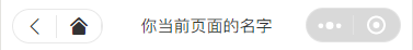
<view class='view-page'>
  <navbar page-name="你当前页面的名字"></navbar>
  <view class='page-content'>
    <!--这里放你的内容-->
  </view>
</view>
最后的结果如下图所示:
3.参数说明
| 参数 | 说明 | 类型 | 默认值 |
| page-name | 当前页面名称 | String | -- |
| show-nav | 是否显示左侧图标按钮 | Boolean | true |
| bg-color | 导航背景颜色 | String | #fff |
| icon-color | 左侧图标颜色 | String | #000 |
| custom-class | 导航样式 |
完整代码git地址:微信小程序自定义导航栏