今天整理一下前端的几种经典布局:
一、上中下一栏式布局
此类布局是最简单的布局方式,直接排下来就可以了。代码如下:
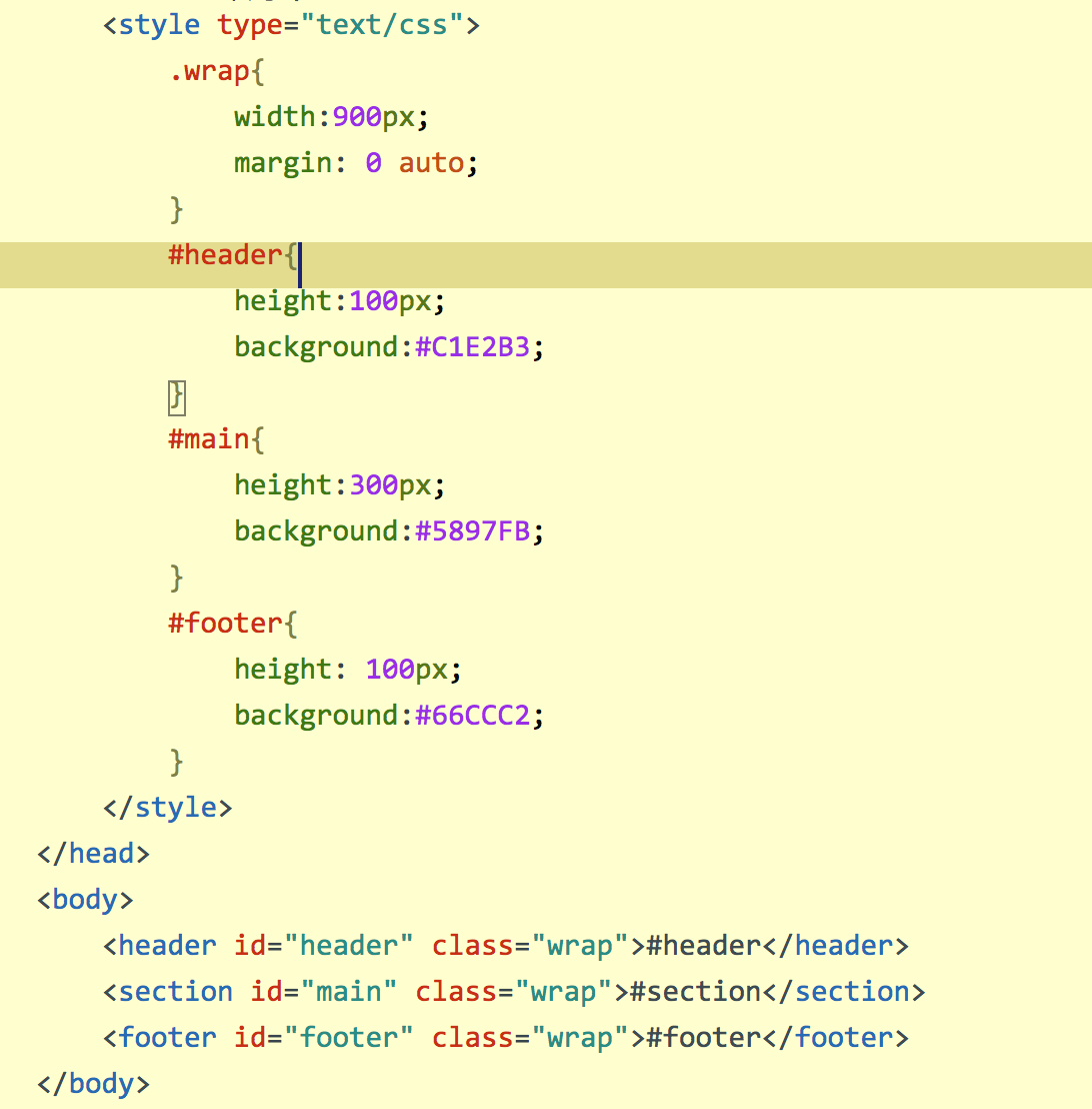
实现效果:
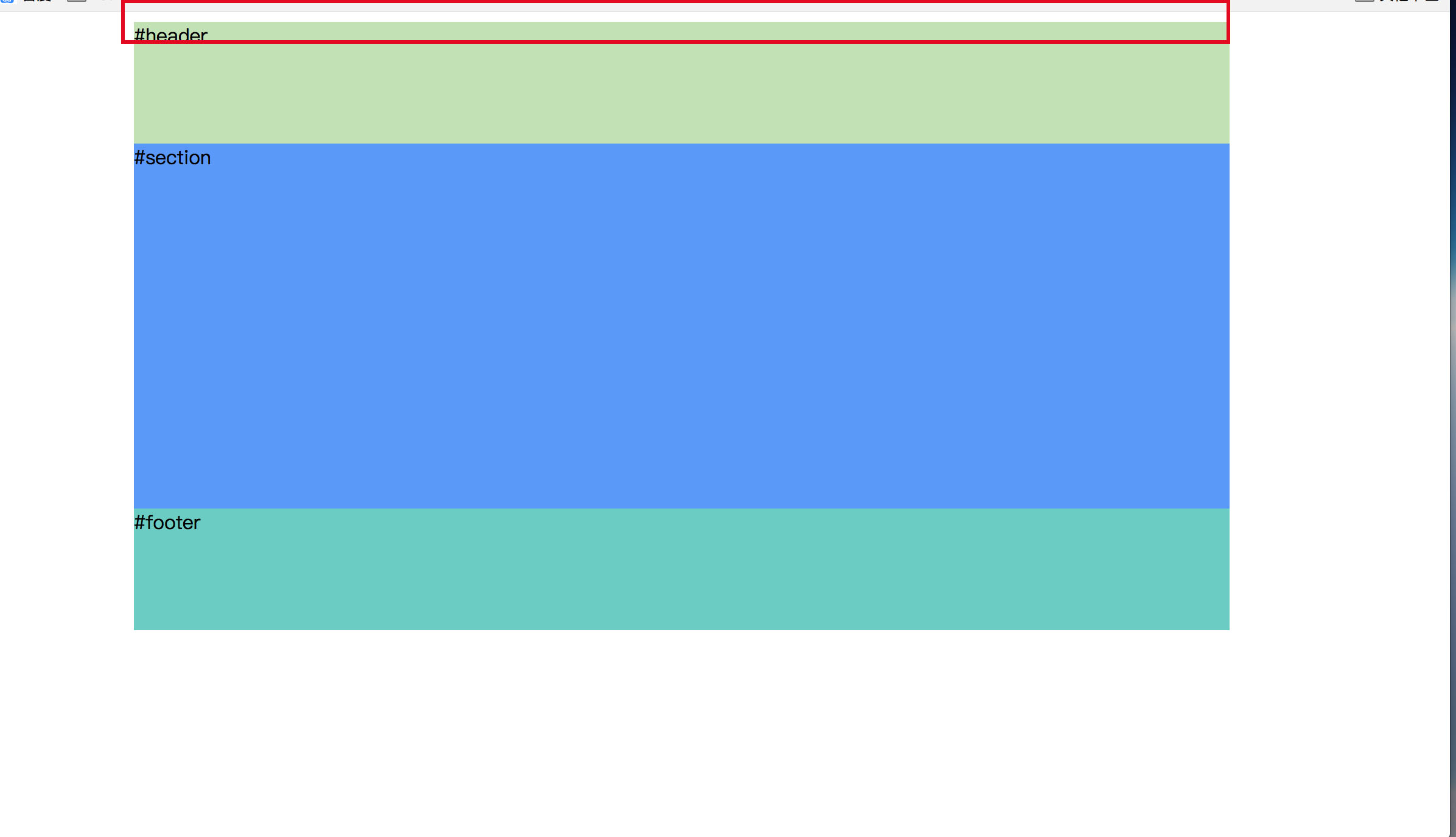
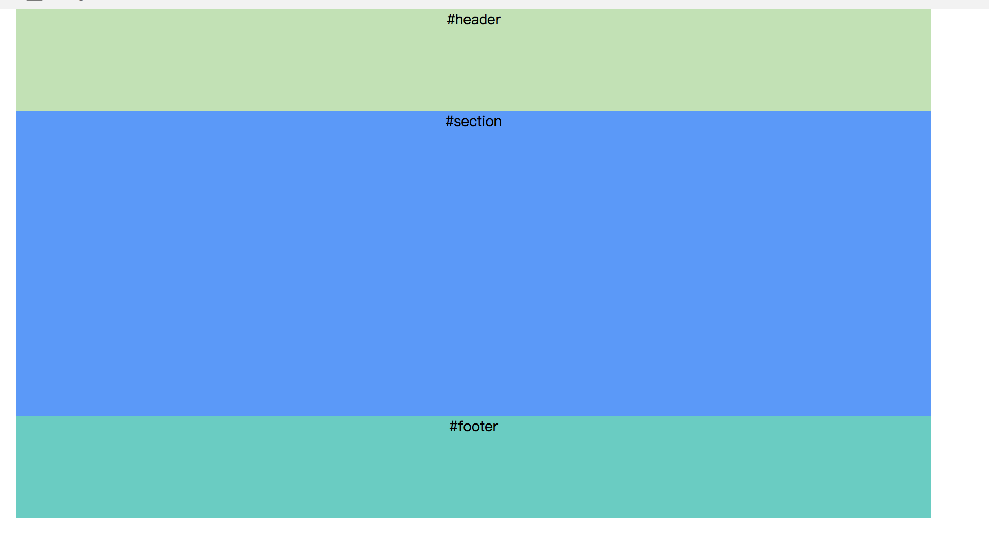
上面红框里面看到body与页面之间有 一个小缝隙,那是浏览器自带的默认值导致的,直接加一个body{margin:0;} 就可以了。
效果如下:
二、左右两栏式布局
1、浮动+普通流混合模式
原理:left向左浮动后,right无需给宽,自动占全部宽度,需加一个margin-left来腾出left的空间。如果父元素宽度不是固定的,那么right可以随着窗口大小的变化而变化。
html如下:
<div class="wrap">
<aside class="left">left</aside>
<section class="right">right</section>
</div>
css如下:
.wrap{width: 80%;margin:0 auto;}
.left{width:200px;height:100px;float: left; background: #94D3A4;}
.right{height:100px;background: #8EB6D6;margin-left:200px;}
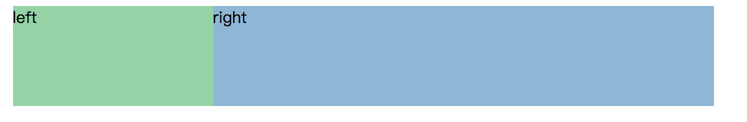
效果:
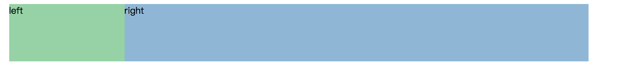
注意:制作过程中right的宽度会占100%的宽,所以需要给right一个margin值,让出位置给left。
2、纯浮动式
原理:left和right都浮动,然后给父元素清除浮动即可。
代码:
<div class="wrap">
<aside class="left">left</aside>
<section class="right">right</section>
</div>
.wrap{width: 80%;margin:0 auto;overflow: hidden;}
.left{width:200px;height:100px;float: left; background: #94D3A4;}
.right{width:500px;height:100px;float:left;background: #8EB6D6;}
效果:

3、绝对定位
代码:
<div class="wrap">
<aside class="left">left</aside>
<section class="right">right</section>
</div>
.wrap{width:700px;margin:0 auto; position:relative;}
.left{width:200px;height:100px; background: #94D3A4;position: absolute;top:0;left:0;}
.right{width:500px;height:100px;background: #8EB6D6;position: absolute;top:0;right:0;}
效果:
三、左右两栏加页眉页脚
四、左中右三栏
五、左中右三栏加页眉页脚