- css3的盒模型,
css3中添加弹性盒模型,最新弹性盒模型是flex,之前为box
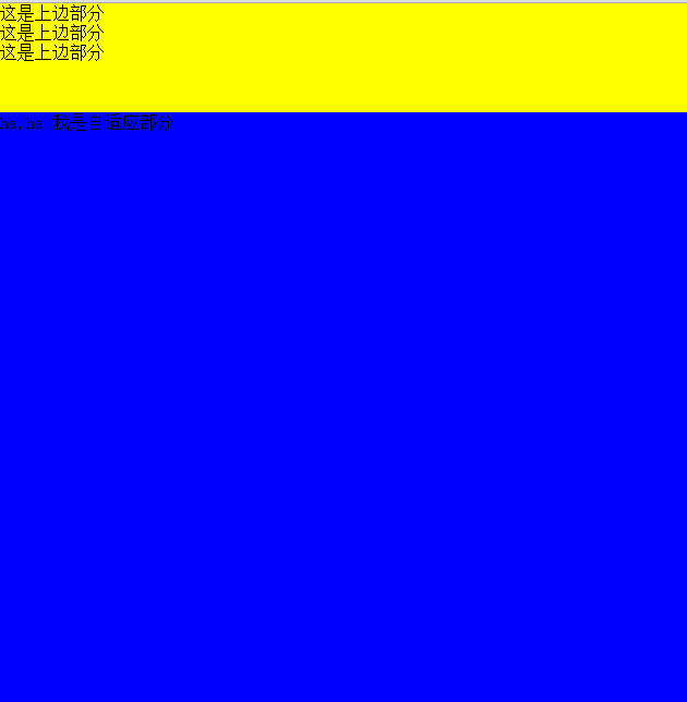
<!DOCTYPE html>
<html >
<head>
    <title>div + css宽度自适应(液态布局)</title>
    <meta http-equiv="Content-Type" content="text/html; charset=utf-8" />
    <style type="text/css">
        /*左边栏,设定宽度*/
      html,body{
         width: 100%;
         height: 100%;
        margin: 0;
      }
      #wrap{
            display: flex;
            width: 100%;
            height: 100%;
            /*css3 的盒模型设置垂直排序 新老方法 box-orient老方法  flex-direction新方法*/
            box-orient:vertical;
            flex-direction:column;
        }
        .wrap_l
        {
            height: 150px;
            width: 150px;
            background: yellow;
        }
        /*中间栏,宽度auto,*/
        .wrap_m
        {
          flex:1;
          background: blue;
        }
        </style>
</head>
<body>
    <div id="wrap">
         <div class="wrap_l">
            这是上边部分<br />
            这是上边部分<br />
            这是上边部分
        </div>
        <div class="wrap_m">
            这是下部分
        </div>
</div>
</body>
</html>
2.position: absolute;绝对布局解决方案
绝对布局主要相对它的父dom做的操作,一般父dom要有足够的空间,如果涉及嵌套太多,父dom可以设置为postion:relative
<!DOCTYPE html>
<html >
<head>
    <title>div + css宽度自适应(液态布局)</title>
    <meta http-equiv="Content-Type" content="text/html; charset=utf-8" />
    <style type="text/css">
        /*左边栏,设定宽度*/
      html,body{
         width: 100%;
         height: 100%;
         margin: 0;
      }
      #wrap{
            width: 100%;
            height: 100%;
        }
        .wrap_l
        {
            height: 150px;
            width: 150px;
            background: yellow;
        }
        /*中间栏,宽度auto,*/
        .wrap_m
        {
          position: absolute;
          top:150px;
          width: 100%;
          background: blue;
          bottom: 0px;
        }
        </style>
</head>
<body>
    <div id="wrap">
         <div class="wrap_l">
            这是上边部分<br />
            这是上边部分<br />
            这是上边部分
        </div>
        <div class="wrap_m">
            这是下部分
        </div>
</div>
</body>
</html>
3.table布局
也可以用display:table仿table布局
display:table只支持IE8+以上
<!DOCTYPE html>
<html >
<head>
    <title>div + css宽度自适应(液态布局)</title>
    <meta http-equiv="Content-Type" content="text/html; charset=utf-8" />
    <style type="text/css">
        /*左边栏,设定宽度*/
      html,body{
         width: 100%;
         height: 100%;
         margin: 0;
      }
      #wrap{
            width: 100%;
            height: 50%;
            display: table;
        }
        .wrap_l
        {
            height: 100px;
            display: table-row;
            background: yellow;
        }
        /*中间栏,宽度auto,*/
        .wrap_m
        {
          display: table-row;
          background: blue;
        }
        </style>
</head>
<body>
    <div id="wrap">
         <div class="wrap_l">
            这是上边部分<br />
            这是上边部分<br />
            这是上边部分
        </div>
        <div class="wrap_m">
            这是下部分
        </div>
         </div>
        <table style="height:50%;100%">
            <tr style="background: red;height:100px"><td > 上部分</td></tr>
            <tr style="background: yellow;"><td > 下部分</td></tr>
        </table>
</div>
</body>
</html>
这就最终的结果