第一种方法:单行文字或者单个图片在div里垂直居中,直接设置line-height与div高度相同
 <style>
        .container{
            width:200px;
            height:100px;
            background-color:#8ec63f;
            line-height:100px;
        }
    </style>
</head>
<body>
<div class="container">
    <span>肚子好饿!</span>
</div>
效果如第二种方法:
CSS中的确是有vertical-align属性,但是它只对HTML元素中拥有valign特性的元素才生效,
例如表格元素中的<td>、<th>、<caption>等,而像<div>,<span>这样的 元素是没有valign特性的,使用vertical-align对这些元素并不起作用。
可以使得div模拟table属性。因此我们可以设置父级div的display属性:display: table;;然后再添加一个div包含文本内容,设置其display:table-cell;和vertical-align:middle;。
a,图片在div中垂直居中:
对父div设置:display:table-cell 和 vertical-align:middle;img 上也要加上vertical-align:middle的属性。
<style>
        *{
            margin:0;
            padding:0;
        }
        .box{
            background: #8ec63f;
            height: 200px;
            width: 200px;
            display:table-cell;
            vertical-align:middle;
        }
        img{
            height:30px; /**这种方法img的宽高是任意的,它都会在div中垂直居中**/
            width:50px;
            vertical-align:middle;
        }
    </style>
</head>
<body>
<div class="box">
    <img src="3.jpg"/>
</div>
</body>
b,多行文字在固定高度的父元素中,垂直居中
   <style>
        #outer{
            width: 400px;
            height: 200px;
            margin: 50px auto;
            border: 1px solid red;
            display: table;
        }
        #middle{
            display:table-cell;
            vertical-align:middle;
            text-align: center; /*设置文本水平居中*/
            width:100%;
        }
    </style>
</head>
<body>
<!--html代码-->
<div id="outer">
    <div id="middle">
        这是固定高度多行文本垂直居中,
        这是固定高度多行文本垂直居中,
        这是固定高度多行文本垂直居中,
        这是固定高度多行文本垂直居中。
    </div>
</div>
</body>
c,多行文字在不固定高度的父元素中,垂直居中
父级高度不固定的时,高度只能通过内部文本来撑开。
这样,我们可以通过设置内填充(padding)的值来使文本看起来垂直居中,只需设置padding-top和padding-bottom的值相等。

第三种:利用position定位
<style>
        *{
            margin:0;
            padding:0;
        }
        .box{
            background: #8ec63f;
            height: 200px;
            width: 200px;
            position:relative;
        }
        img{
            height:30px;
            width:50px;
            position:absolute;
            left:50%;
            top:50%;
            margin-left:-25px;/*宽度的一半*/
            margin-top:-15px;/*高度的一半*/
        }
    </style>
</head>
<body>
    <div class="box">
       <img src="3.jpg"/>
    </div>
</body>
效果如图所示:

方法四:还有一种方法·也能实现图片的水平居中,在网上看到的,实现的方式有点奇怪,且不太明白....
 <style>
        *{
            margin:0;
            padding:0;
        }
        .box{
            background: #8ec63f;
            height: 200px;
            width: 200px;
            text-align:center;
        }
        .box span{
            height:100%;
            width:0;
            overflow:hidden;
            display:inline-block;
            vertical-align:middle;
        }

    </style>
</head>
<body>
    <div class="box">
       <img src="a.png"/><span></span>
    </div>
</body>
方法5:也是看一个大神的博客,顺便总结起来:这种居中办法对block ,inline-block,inline元素都起作用
 <style>
        .Center-Container {
            position: relative;
            background-color: #8ec63f;
            width:500px;
            height:500px;
        }

        .Absolute-Center {
            width: 50px;
            height: 50px;
            overflow: auto;
            margin: auto;
            position: absolute;
            top: 0; left: 0; bottom: 0; right: 0;
        }

    </style>
</head>
<body>
<div class="Center-Container"><!---这里的 父容器 container是一定要设置宽高的。图片大小可以随意-->
    <img src="3.jpg" class="Absolute-Center"/>
</div>
</body>
效果如下图:

方法6,利用flex属性来实现
 <style>
        *{
            margin:0;
            padding:0;
        }
        .box{
            display: flex;
            width: 600px;
            height: 300px;
            background: #0099cc
        }
        .main{
            width:100px;
            height:100px;
            margin:auto;
        }
    </style>
</head>
<body>
    <div class="box">
      <img src="a.png" class="main"/>
    </div>
</body>
flex实现垂直居中方法二:
 <style>
        .main-wrap{
            display:flex;
            justify-content: center;
            align-items: center;
            width:300px;
            height:300px;
            background-color: #8ec63f;
        }
        .main{
            width:100px;
            height:100px;
            background-color: #ffed53;
        }

    </style>
</head>
<body>
<div class="main-wrap">
    <div class="main">#main</div>
</div>
效果如下图:

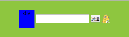
补充一个div,图片,表单,按钮四个同时垂直居中的例子
 <style>
        *{
            margin:0;
            padding:0;
        }
        .container{
            margin:20px;
            width:400px;
            padding:10px;
            height:100px;
            background-color:#8ec63f;
            display:table-cell;
            text-align:center;
            vertical-align: middle;

        }
        .input-text{
            height:25px;
        }
        .btn{
            height:25px;
            vertical-align: middle;
        }
        .div1{
            width:50px;
            height:60px;
            background-color: blue;
            display:inline-block;
            vertical-align: middle;
        }
        img{
            vertical-align: middle;
        }

    </style>
</head>
<body>
<div class="container">
    <div class="div1">div</div>
    <input type="text" class="input-text"/>
    <button type="button" class="btn">发送</button>
    <img src="a.png"/>
</div>
效果如图:
总之实现垂直居中的办法应该还有很多吧,关键是要理解,为什么这样做可以实现,暂时总结这么多吧,友情附上一篇大神的博客:http://blog.csdn.net/freshlover/article/details/11579669
这个总结貌似更靠谱:
用css让一个容器水平垂直
https://juejin.im/entry/59f4867d5188252940599206