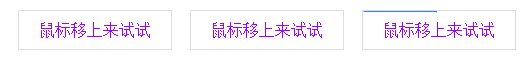
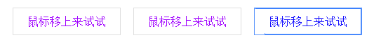
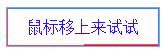
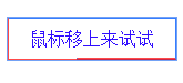
屏幕录制gif的软件不好用,就用三张截图说明动画效果吧:

我比较喜欢的是他那个边框描边的动画,于是做了整理,提取关键代码如下
结构
 1     <ul class="animate">
 2         <li>
 3             <a href="javascript:;">鼠标移上来试试</a>
 4         </li>
 5         <li>
 6             <a href="javascript:;">鼠标移上来试试</a>
 7         </li>
 8         <li>
 9             <a href="javascript:;">鼠标移上来试试</a>
10         </li>
11     </ul>
样式
 1 .animate li{
 2     margin-right: 10px;
 3     display: inline-block;
 4 }
 5 .animate li a{
 6     position: relative;
 7     color: #9f00ff;
 8     text-decoration: none;
 9     display: block;
10     padding: 10px 20px;
11     border: 1px solid #dedede;
12     -webkit-transition: all 0.6s ease-in;
13   -moz-transition: all 0.6s ease-in;
14   -ms-transition: all 0.6s ease-in;
15   -o-transition: all 0.6s ease-in;
16   transition: all 0.6s ease-in;
17 }
18 .animate li a:hover{
19     color: #0012ff;
20     border: 1px solid #4488ff;
21 }
22 .animate li a:before,.animate li a:after{
23     content: '';
24   display: block;
25   position: absolute;
26     box-sizing: border-box;
27   border: 1px solid transparent;
28   width: 0;
29   height: 0;
30 }
31 .animate li a:before {
32   bottom: 0;
33   right: 0;
34   -webkit-transition: border-color 0s ease-in 0.4s,width 0.2s ease-in 0.2s,height 0.2s ease-in;
35   transition: border-color 0s ease-in 0.4s,width 0.2s ease-in 0.2s,height 0.2s ease-in;
36 }
37 .animate li a:after{
38   top: 0;
39   left: 0;
40   -webkit-transition: border-color 0s ease-in 0.8s,width 0.2s ease-in 0.6s,height 0.2s ease-in 0.4s;
41   transition: border-color 0s ease-in 0.8s,width 0.2s ease-in 0.6s,height 0.2s ease-in 0.4s;
42 }
43 .animate li a:hover:after,.animate li a:hover:before {
44   width: 100%;
45   height: 100%;
46 }
47 .animate li a:hover:before {
48   border-bottom-color: #367dff;
49   border-left-color: #367dff;
50   -webkit-transition: border-color 0s ease-out 0.4s,width 0.2s ease-out 0.4s,height 0.2s ease-out 0.6s;
51   transition: border-color 0s ease-out 0.4s,width 0.2s ease-out 0.4s,height 0.2s ease-out 0.6s;
52 }
53 .animate li a:hover:after {
54   border-top-color: #367dff;
55   border-right-color: #367dff;
56   -webkit-transition: width 0.2s ease-out,height 0.2s ease-out 0.2s;
57   transition: width 0.2s ease-out,height 0.2s ease-out 0.2s;
58 }
从css中看,除了普通的动画以外,本效果利用动画的延迟属性,让after和befor的宽高边框颜色依次按序开始执行,就有了我们看到的动画
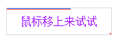
并且,after和before的起始位置不同,after在左上角,before在右下角
after先变化,宽度在0.2s内无延迟的从0-100%,0.2s过后,after的高度开始变化,同样在0.2s以后变化完毕,至此,after的整个已经覆盖完边框了,
只不过after:hover时候,只有border-top和border-right的color被设置了,所以效果上看上去只有从上边框到右边框的描边效果。
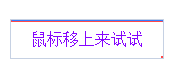

after运动完毕,before开始按照同样的套路先变宽后变高,只不过before的起始位置在右下角,且border的颜色只有bottom和left的,所以他的变化在视觉上看上去就是从有向左描边下边框,再从下到上描边左边框。
至于border-color 0s ease-out 0.4s这段,是在after的宽高刚好变完后,before的border瞬间变成彩色,然后同时起步的是宽度也开始变化。。。剩下的套路都是上一句的了
于是就看到before的border变了色,也就是边框的右边快速变成了蓝色。

鼠标移除后的套路就是这个顺序再反过来回去,也就是延迟反过来,按照退出的顺序,一个比一个长点。