这种布局方式除了是很常见的面试题,更重要的,他还是很常见的一种页面布局。因此必须要掌握几种制作情况。
这里我先列出几种我总结的,可能有些不足,希望大家也可以留言补充,我再整理成更完善的。
在分条展示实现方案前,我先把通用的css贴一下:
*{
  margin: 0;
  padding: 0;
}
html{
  font-family: "微软雅黑";
}
ul li{
  list-style: none;
}
a:link,a:hover{
  text-decoration: none;
}
.clearfix{
  *zoom:1;
}
.clearfix:after{
  height: 0;
  clear: both;
  content: "";
  visibility: hidden;
  display: block;
}
.fl{
  float: left;
}
.fr{
  float: right;
}
h3,.tips-info{
  margin: 8px 0;
  font-size: 14px;
}
li{
  margin-bottom: 10px
}
.tips,ol{
  background: #fffbfb;
  padding: 10px 20px;
}
.tips-ex{
  font-size: 12px;
  color: #99c1c1;
}
.block{
  padding: 10px 20px;
  border-top: 5px solid #99c1c1;
  margin: 30px 0 0px;
  background: #f5f5f5;
}
.browser,.container{
  padding: 20px;

}
.container{
  font-size: 14px;
}
.container,.img-box{
  background: #eee;
  border: 1px solid #999;
}
.box{
  background: #fff;
  padding: 20px;
  border: 1px solid #999;
}
.team-box{
   158px;
}
.info-box{

}
.person-box{
   78px;
}
.person-box .img-box{
  margin-bottom: 20px;
}
.person-box .img-box:last-child{
  margin: 0;
}
.img-box{
   78px;
}
.img-txt{
  line-height: 20px;
  margin: 20px 0;
  text-align: center;
  padding: 0 5px;
}
.team-name{
   78px;
  height: 80px;
  text-align: center;
}
主要是以下几种方案基础代码、无关痛痒的样式代码和左中右三栏各自需要提前固定的尺寸代码。
以下分几种情况实现:
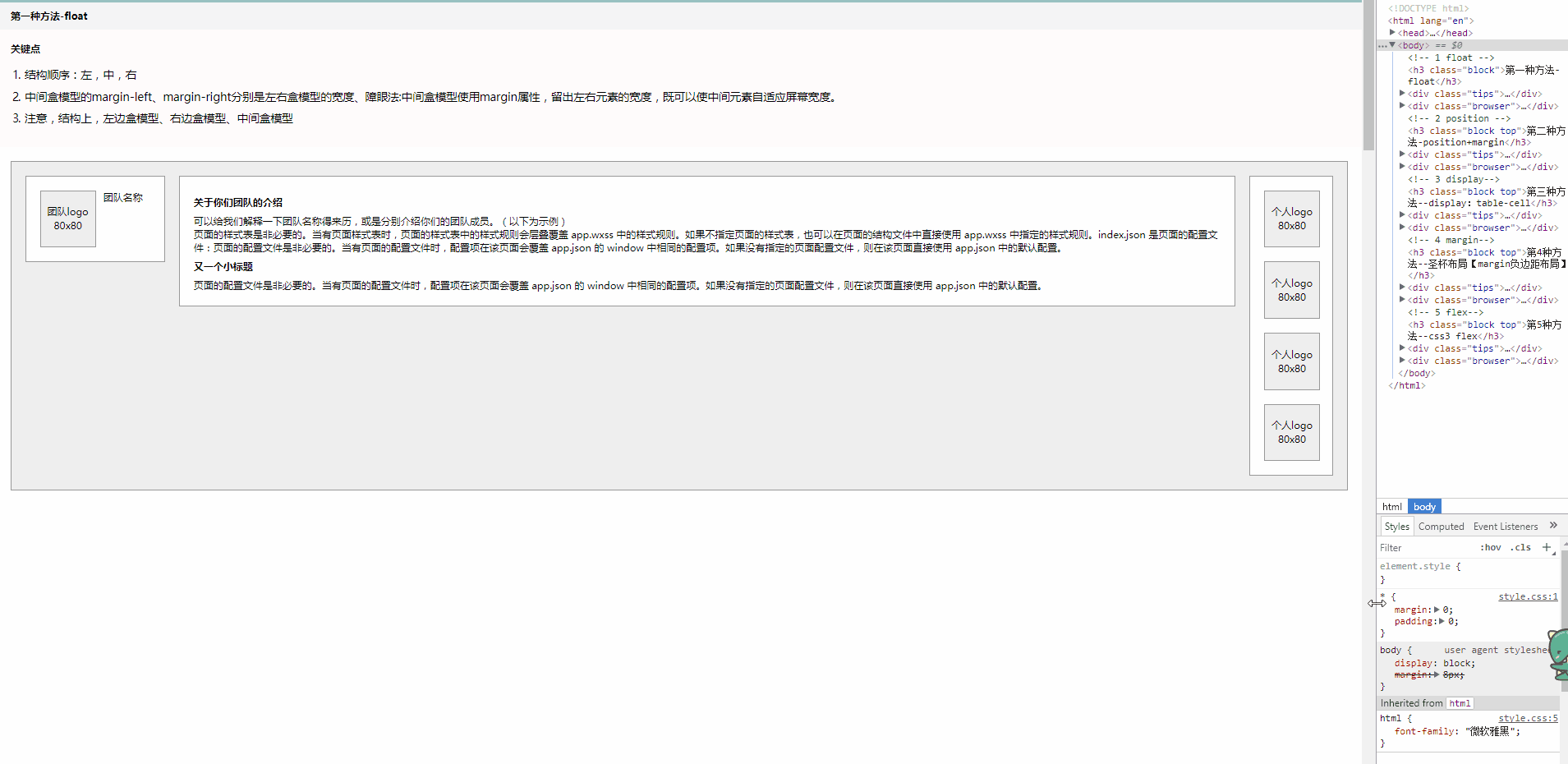
第一种,float布局实现
这绝对是我大脑能第一下想到的!

左右两栏分别左浮动、右浮动。
中间栏使用margin/padding撑开左右两栏需要占据的位置即可。
代码:
html:
 1 <div class="browser">
 2     <div class="container f-cont clearfix">
 3         <div class="box team-box clearfix">
 4             <div class="img-box">
 5                 <div class="img-txt">团队logo 80x80</div>
 6             </div>
 7             <div class="team-name">团队名称</div>
 8         </div>
 9         <div class="box person-box clearfix">
10             <div class="img-box">
11                 <div class="img-txt">个人logo 80x80</div>
12             </div>
13             <div class="img-box">
14                 <div class="img-txt">个人logo 80x80</div>
15             </div>
16             <div class="img-box">
17                 <div class="img-txt">个人logo 80x80</div>
18             </div>
19             <div class="img-box">
20                 <div class="img-txt">个人logo 80x80</div>
21             </div>
22         </div>
23         <div class="box info-box">
24             <div>
25                 <h3>关于你们团队的介绍</h3>
26                 <span>可以给我们解释一下团队名称得来历,或是分别介绍你们的团队成员。(以下为示例)</span>
27                 <p>页面的样式表是非必要的。当有页面样式表时,页面的样式表中的样式规则会层叠覆盖 app.wxss 中的样式规则。如果不指定页面的样式表,也可以在页面的结构文件中直接使用 app.wxss 中指定的样式规则。index.json 是页面的配置文件:页面的配置文件是非必要的。当有页面的配置文件时,配置项在该页面会覆盖 app.json 的 window 中相同的配置项。如果没有指定的页面配置文件,则在该页面直接使用 app.json 中的默认配置。</p>
28                 <h3>又一个小标题</h3>
29                 <p>
30                     页面的配置文件是非必要的。当有页面的配置文件时,配置项在该页面会覆盖 app.json 的 window 中相同的配置项。如果没有指定的页面配置文件,则在该页面直接使用 app.json 中的默认配置。
31                 </p>
32             </div>
33         </div>
34     </div>
35 </div>
css关键点:
.f-cont .team-box,.img-box,.team-name{
  float: left;
}
.f-cont .person-box{
  float: right;
}
.f-cont .info-box,.p-cont .info-box{
  margin: 0 140px 0 220px;
}
看下动态效果:
第二种,定位布局+margin
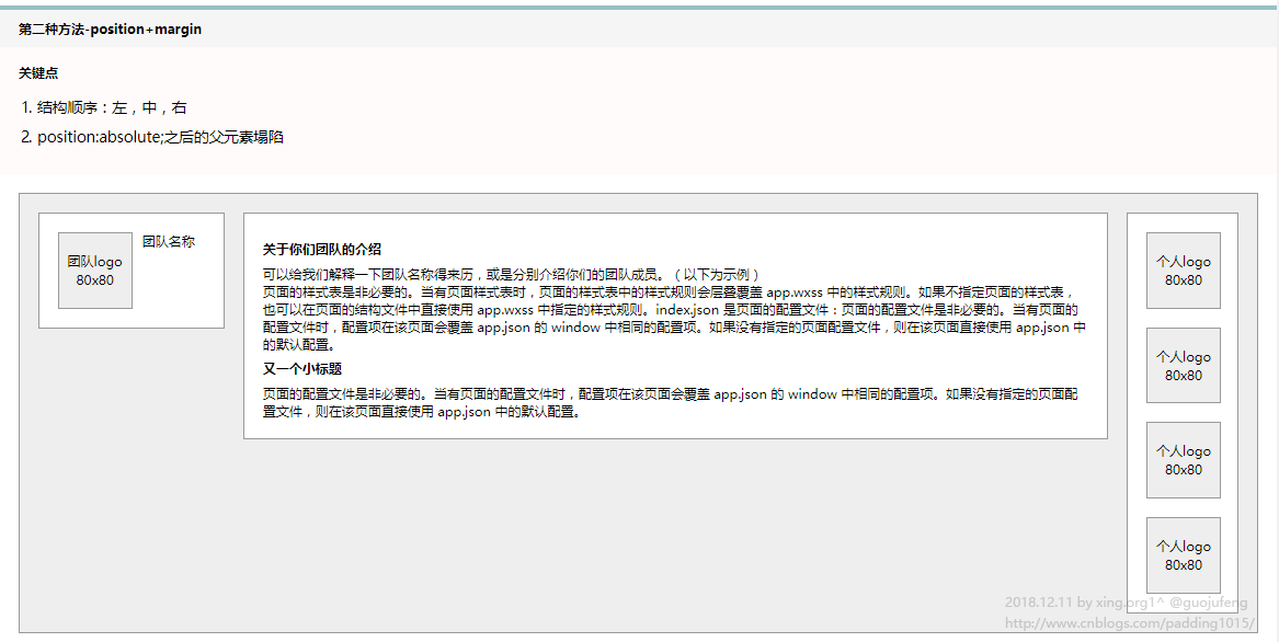
左右栏分别使用absolute定位,同float一样,左边的定位left 0,右边的定位right 0;
中间还是用margin或padding撑开左右栏需要占据的位置即可。(利用了浮动或定位时,结构飘起来不占据文档空间的特点)
代码:
html:
 1 <div class="browser">
 2     <div class="container p-cont">
 3         <div class="box team-box clearfix">
 4             <div class="img-box">
 5                 <div class="img-txt">团队logo 80x80</div>
 6             </div>
 7             <div class="team-name">团队名称</div>
 8         </div>
 9         <div class="box info-box">
10             <div>
11                 <h3>关于你们团队的介绍</h3>
12                 <span>可以给我们解释一下团队名称得来历,或是分别介绍你们的团队成员。(以下为示例)</span>
13                 <p>页面的样式表是非必要的。当有页面样式表时,页面的样式表中的样式规则会层叠覆盖 app.wxss 中的样式规则。如果不指定页面的样式表,也可以在页面的结构文件中直接使用 app.wxss 中指定的样式规则。index.json 是页面的配置文件:页面的配置文件是非必要的。当有页面的配置文件时,配置项在该页面会覆盖 app.json 的 window 中相同的配置项。如果没有指定的页面配置文件,则在该页面直接使用 app.json 中的默认配置。</p>
14                 <h3>又一个小标题</h3>
15                 <p>
16                     页面的配置文件是非必要的。当有页面的配置文件时,配置项在该页面会覆盖 app.json 的 window 中相同的配置项。如果没有指定的页面配置文件,则在该页面直接使用 app.json 中的默认配置。
17                 </p>
18             </div>
19         </div>
20         <div class="box person-box clearfix">
21             <div class="img-box">
22                 <div class="img-txt">个人logo 80x80</div>
23             </div>
24             <div class="img-box">
25                 <div class="img-txt">个人logo 80x80</div>
26             </div>
27             <div class="img-box">
28                 <div class="img-txt">个人logo 80x80</div>
29             </div>
30             <div class="img-box">
31                 <div class="img-txt">个人logo 80x80</div>
32             </div>
33         </div>
34     </div>
35 </div>
css:
.p-cont{
  position: relative;
  height: 430px;
}
.p-cont .team-box,.p-cont .person-box{
  position: absolute;
  top: 20px;
  z-index: 9;
}
.p-cont .team-box{
  left: 20px;
}
.p-cont .person-box{
  right: 20px;
}
不足:
不过这种布局有点缺点就是,父元素需要设置固定高度,中间自适应时,如果内容过多而宽度又过窄,会导致高度被迫增加,严重时冲破父元素高度,产生溢出的现象:
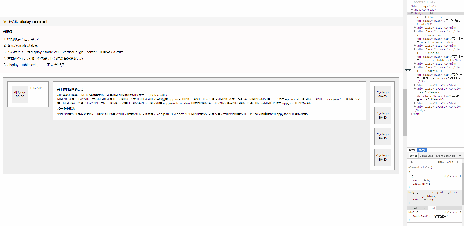
第三种,display-table 实现
父元素display:table;
左右子元素使用display:table-cell;
中间正常文档流,margin撑开间距即可
代码:
html:
<div class="browser">
    <div class="container d-cont">
        <div class="cell">
            <div class="box team-box clearfix">
            <div class="img-box">
                <div class="img-txt">团队logo 80x80</div>
            </div>
            <div class="team-name">团队名称</div>
        </div>
        </div>
        <div class="box info-box">
            <div>
                <h3>关于你们团队的介绍</h3>
                <span>可以给我们解释一下团队名称得来历,或是分别介绍你们的团队成员。(以下为示例)</span>
                <p>页面的样式表是非必要的。当有页面样式表时,页面的样式表中的样式规则会层叠覆盖 app.wxss 中的样式规则。如果不指定页面的样式表,也可以在页面的结构文件中直接使用 app.wxss 中指定的样式规则。index.json 是页面的配置文件:页面的配置文件是非必要的。当有页面的配置文件时,配置项在该页面会覆盖 app.json 的 window 中相同的配置项。如果没有指定的页面配置文件,则在该页面直接使用 app.json 中的默认配置。</p>
                <h3>又一个小标题</h3>
                <p>
                    页面的配置文件是非必要的。当有页面的配置文件时,配置项在该页面会覆盖 app.json 的 window 中相同的配置项。如果没有指定的页面配置文件,则在该页面直接使用 app.json 中的默认配置。
                </p>
            </div>
        </div>
        <div class="cell">
            <div class="box person-box clearfix">
            <div class="img-box">
                <div class="img-txt">个人logo 80x80</div>
            </div>
            <div class="img-box">
                <div class="img-txt">个人logo 80x80</div>
            </div>
            <div class="img-box">
                <div class="img-txt">个人logo 80x80</div>
            </div>
            <div class="img-box">
                <div class="img-txt">个人logo 80x80</div>
            </div>
        </div>
        </div>
    </div>
</div>
css:
.d-cont{
  display: table;
}
.d-cont .cell{
  display: table-cell;
  vertical-align: top;
}
.d-cont .info-box{
  margin: 0 20px;
}
看下效果:
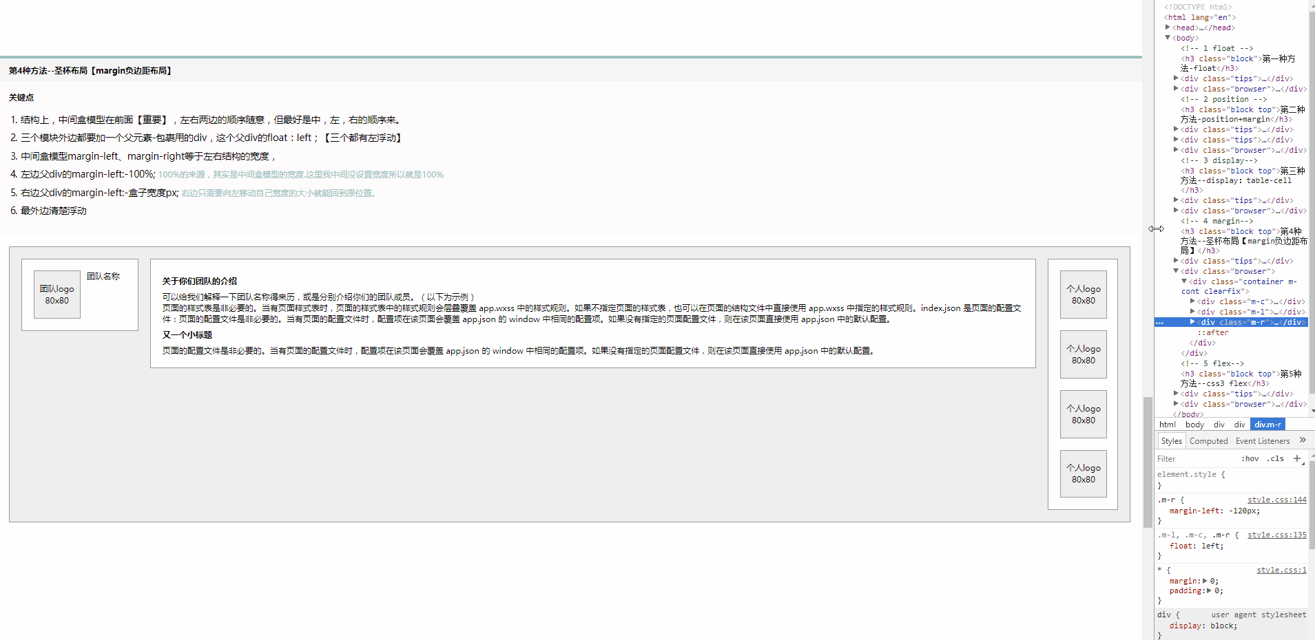
第四种,浮动 + margin负边距
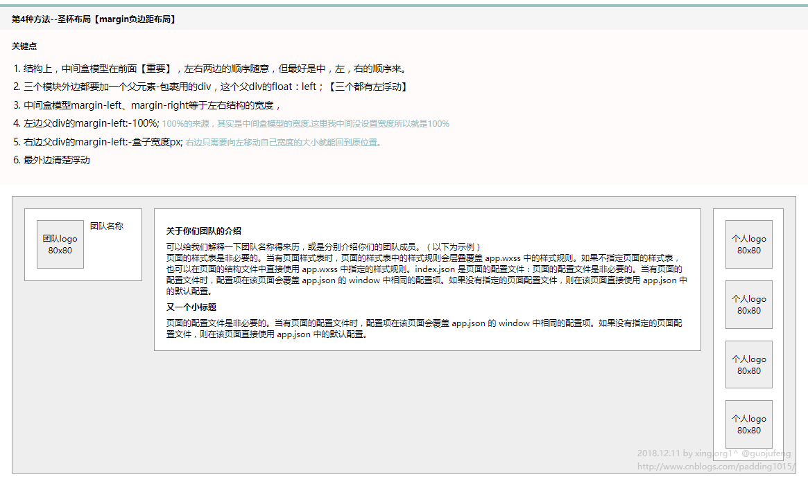
代码:
html:
 1 <div class="browser">
 2     <div class="container m-cont clearfix">
 3         <div class="m-c">
 4             <div class="box info-box">
 5                 <div>
 6                     <h3>关于你们团队的介绍</h3>
 7                     <span>可以给我们解释一下团队名称得来历,或是分别介绍你们的团队成员。(以下为示例)</span>
 8                     <p>页面的样式表是非必要的。当有页面样式表时,页面的样式表中的样式规则会层叠覆盖 app.wxss 中的样式规则。如果不指定页面的样式表,也可以在页面的结构文件中直接使用 app.wxss 中指定的样式规则。index.json 是页面的配置文件:页面的配置文件是非必要的。当有页面的配置文件时,配置项在该页面会覆盖 app.json 的 window 中相同的配置项。如果没有指定的页面配置文件,则在该页面直接使用 app.json 中的默认配置。</p>
 9                     <h3>又一个小标题</h3>
10                     <p>
11                         页面的配置文件是非必要的。当有页面的配置文件时,配置项在该页面会覆盖 app.json 的 window 中相同的配置项。如果没有指定的页面配置文件,则在该页面直接使用 app.json 中的默认配置。
12                     </p>
13                 </div>
14             </div>
15         </div>
16         <div class="m-l">
17             <div class="box team-box clearfix">
18                 <div class="img-box">
19                     <div class="img-txt">团队logo 80x80</div>
20                 </div>
21                 <div class="team-name">团队名称</div>
22             </div>
23         </div>
24         <div class="m-r">
25             <div class="box person-box clearfix">
26                 <div class="img-box">
27                     <div class="img-txt">个人logo 80x80</div>
28                 </div>
29                 <div class="img-box">
30                     <div class="img-txt">个人logo 80x80</div>
31                 </div>
32                 <div class="img-box">
33                     <div class="img-txt">个人logo 80x80</div>
34                 </div>
35                 <div class="img-box">
36                     <div class="img-txt">个人logo 80x80</div>
37                 </div>
38             </div>
39         </div>
40     </div>
41 </div>
css:
.m-l,.m-c,.m-r{
  float: left;
}
.m-l{
  margin-left: -100%;
}
.m-c{
  margin: 0 140px 0 220px;
}
.m-r{
  margin-left: -120px;
}
效果:
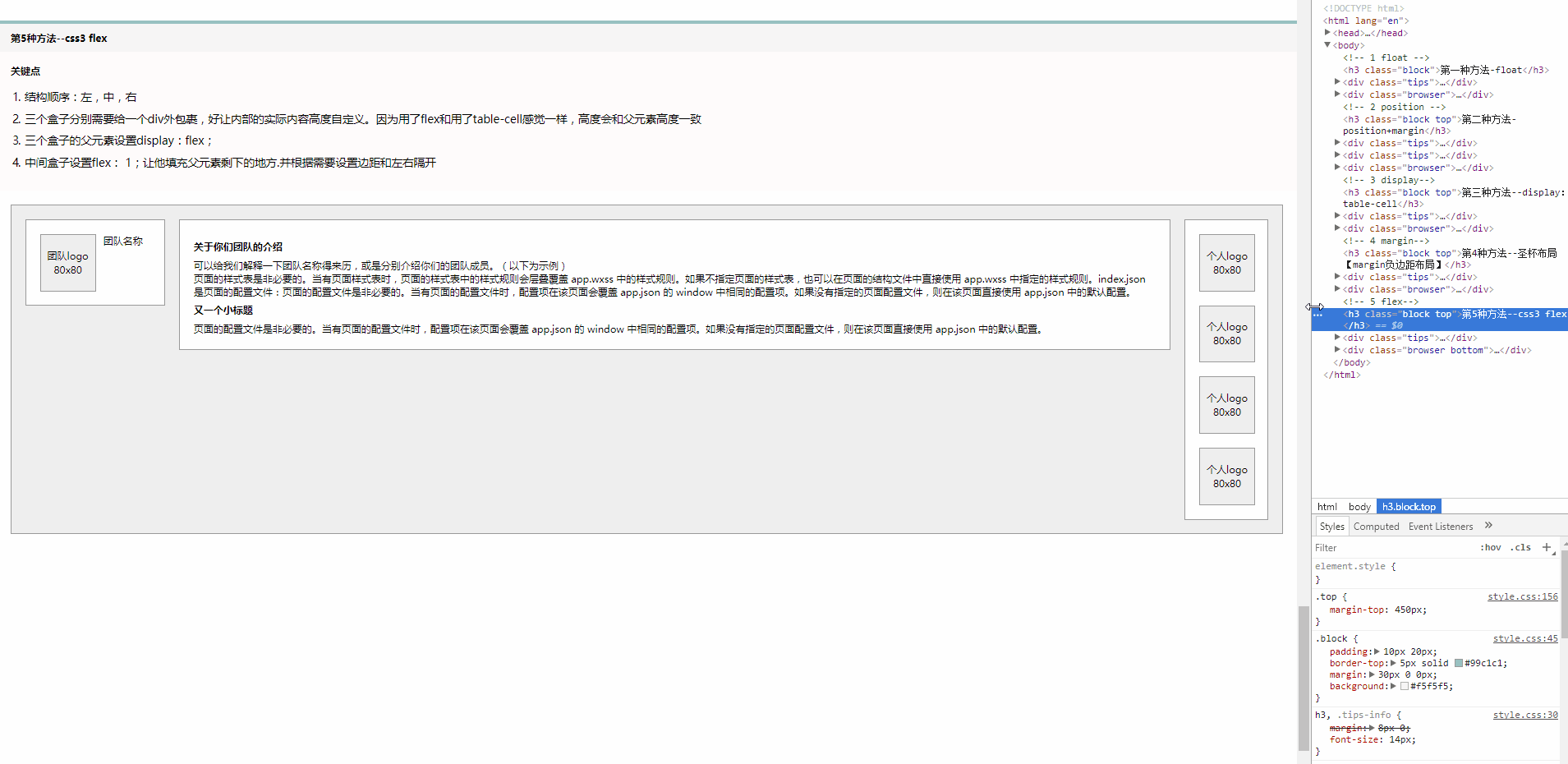
第五种,css3 - flex
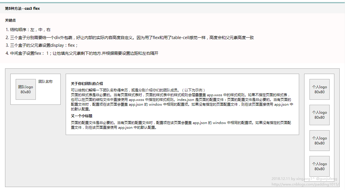
代码:
html:
 1 <div class="browser">
 2     <div class="container fx-cont">
 3         <div class="cell">
 4             <div class="box team-box clearfix">
 5                 <div class="img-box">
 6                     <div class="img-txt">团队logo 80x80</div>
 7                 </div>
 8                 <div class="team-name">团队名称</div>
 9             </div>
10         </div>
11         <div class="cell">
12             <div class="box info-box">
13                 <div>
14                     <h3>关于你们团队的介绍</h3>
15                     <span>可以给我们解释一下团队名称得来历,或是分别介绍你们的团队成员。(以下为示例)</span>
16                     <p>页面的样式表是非必要的。当有页面样式表时,页面的样式表中的样式规则会层叠覆盖 app.wxss 中的样式规则。如果不指定页面的样式表,也可以在页面的结构文件中直接使用 app.wxss 中指定的样式规则。index.json 是页面的配置文件:页面的配置文件是非必要的。当有页面的配置文件时,配置项在该页面会覆盖 app.json 的 window 中相同的配置项。如果没有指定的页面配置文件,则在该页面直接使用 app.json 中的默认配置。</p>
17                     <h3>又一个小标题</h3>
18                     <p>
19                         页面的配置文件是非必要的。当有页面的配置文件时,配置项在该页面会覆盖 app.json 的 window 中相同的配置项。如果没有指定的页面配置文件,则在该页面直接使用 app.json 中的默认配置。
20                     </p>
21                 </div>
22             </div>
23         </div>
24         <div class="cell">
25             <div class="box person-box clearfix">
26                 <div class="img-box">
27                     <div class="img-txt">个人logo 80x80</div>
28                 </div>
29                 <div class="img-box">
30                     <div class="img-txt">个人logo 80x80</div>
31                 </div>
32                 <div class="img-box">
33                     <div class="img-txt">个人logo 80x80</div>
34                 </div>
35                 <div class="img-box">
36                     <div class="img-txt">个人logo 80x80</div>
37                 </div>
38             </div>
39         </div>
40     </div>
41 </div>
css:
.fx-cont{
  display: -webkit-flex;
  display: flex;
}
.fx-cont .info-box{
  flex: 1;
  margin: 0 20px;
}
整篇源代码:


  1 <!DOCTYPE html>
  2 <html lang="en">
  3
  4 <head>
  5   <meta charset="UTF-8">
  6   <meta name="viewport" content="width=device-width, initial-scale=1.0">
  7   <meta http-equiv="X-UA-Compatible" content="ie=edge">
  8   <meta name="author" content="xing.org1^ guojufeng">
  9   <title>三栏布局-中间自适应的写法总结</title>
 10   <link rel="stylesheet" href="style.css">
 11 </head>
 12
 13 <body>
 14   <!-- 1 float -->
 15   <h3 class="block">第一种方法-float</h3>
 16   <div class="tips">
 17     <h4 class="tips-info">关键点</h4>
 18     <ol>
 19       <li>结构顺序:左,中,右</li>
 20       <li>中间盒模型的margin-left、margin-right分别是左右盒模型的宽度、障眼法:中间盒模型使用margin属性,留出左右元素的宽度,既可以使中间元素自适应屏幕宽度。</li>
 21       <li>注意,结构上,左边盒模型、右边盒模型、中间盒模型</li>
 22     </ol>
 23   </div>
 24   <div class="browser">
 25     <div class="container f-cont clearfix">
 26       <div class="box team-box clearfix">
 27         <div class="img-box">
 28           <div class="img-txt">团队logo 80x80</div>
 29         </div>
 30         <div class="team-name">团队名称</div>
 31       </div>
 32       <div class="box person-box clearfix">
 33         <div class="img-box">
 34           <div class="img-txt">个人logo 80x80</div>
 35         </div>
 36         <div class="img-box">
 37           <div class="img-txt">个人logo 80x80</div>
 38         </div>
 39         <div class="img-box">
 40           <div class="img-txt">个人logo 80x80</div>
 41         </div>
 42         <div class="img-box">
 43           <div class="img-txt">个人logo 80x80</div>
 44         </div>
 45       </div>
 46       <div class="box info-box">
 47         <div>
 48           <h3>关于你们团队的介绍</h3>
 49           <span>可以给我们解释一下团队名称得来历,或是分别介绍你们的团队成员。(以下为示例)</span>
 50           <p>页面的样式表是非必要的。当有页面样式表时,页面的样式表中的样式规则会层叠覆盖 app.wxss 中的样式规则。如果不指定页面的样式表,也可以在页面的结构文件中直接使用 app.wxss
 51             中指定的样式规则。index.json 是页面的配置文件:页面的配置文件是非必要的。当有页面的配置文件时,配置项在该页面会覆盖 app.json 的 window
 52             中相同的配置项。如果没有指定的页面配置文件,则在该页面直接使用 app.json 中的默认配置。</p>
 53           <h3>又一个小标题</h3>
 54           <p>
 55             页面的配置文件是非必要的。当有页面的配置文件时,配置项在该页面会覆盖 app.json 的 window 中相同的配置项。如果没有指定的页面配置文件,则在该页面直接使用 app.json 中的默认配置。
 56           </p>
 57         </div>
 58       </div>
 59     </div>
 60   </div>
 61
 62   <!-- 2 position -->
 63   <h3 class="block top">第二种方法-position+margin</h3>
 64   <div class="tips">
 65     <h4 class="tips-info">关键点</h4>
 66     <ol>
 67       <li>结构顺序:左,中,右</li>
 68       <li>position:absolute;之后的父元素塌陷</li>
 69     </ol>
 70   </div>
 71   <div class="tips">
 72     <h4 class="tips-info">缺点</h4>
 73     <ol>
 74       <li>父元素设置固定高度,中间结构超出高度会溢出</li>
 75     </ol>
 76   </div>
 77   <div class="browser">
 78     <div class="container p-cont">
 79       <div class="box team-box clearfix">
 80         <div class="img-box">
 81           <div class="img-txt">团队logo 80x80</div>
 82         </div>
 83         <div class="team-name">团队名称</div>
 84       </div>
 85       <div class="box info-box">
 86         <div>
 87           <h3>关于你们团队的介绍</h3>
 88           <span>可以给我们解释一下团队名称得来历,或是分别介绍你们的团队成员。(以下为示例)</span>
 89           <p>页面的样式表是非必要的。当有页面样式表时,页面的样式表中的样式规则会层叠覆盖 app.wxss 中的样式规则。如果不指定页面的样式表,也可以在页面的结构文件中直接使用 app.wxss
 90             中指定的样式规则。index.json 是页面的配置文件:页面的配置文件是非必要的。当有页面的配置文件时,配置项在该页面会覆盖 app.json 的 window
 91             中相同的配置项。如果没有指定的页面配置文件,则在该页面直接使用 app.json 中的默认配置。</p>
 92           <h3>又一个小标题</h3>
 93           <p>
 94             页面的配置文件是非必要的。当有页面的配置文件时,配置项在该页面会覆盖 app.json 的 window 中相同的配置项。如果没有指定的页面配置文件,则在该页面直接使用 app.json 中的默认配置。
 95           </p>
 96         </div>
 97       </div>
 98       <div class="box person-box clearfix">
 99         <div class="img-box">
100           <div class="img-txt">个人logo 80x80</div>
101         </div>
102         <div class="img-box">
103           <div class="img-txt">个人logo 80x80</div>
104         </div>
105         <div class="img-box">
106           <div class="img-txt">个人logo 80x80</div>
107         </div>
108         <div class="img-box">
109           <div class="img-txt">个人logo 80x80</div>
110         </div>
111       </div>
112     </div>
113   </div>
114
115   <!-- 3 display-->
116   <h3 class="block top">第三种方法--display:table-cell</h3>
117   <div class="tips">
118     <h4 class="tips-info">关键点</h4>
119     <ol>
120       <li>结构顺序:左,中,右</li>
121       <li>父元素display:table;</li>
122       <li>左右两个子元素display:table-cell;vertical-align:center,中间盒子不用管。</li>
123       <li>左右两个子元素加一个包裹,因为高度会盛满父元素</li>
124
125       <li>display:table-cell;——不支持ie6,7</li>
126     </ol>
127   </div>
128   <div class="browser">
129     <div class="container d-cont">
130       <div class="cell">
131         <div class="box team-box clearfix">
132           <div class="img-box">
133             <div class="img-txt">团队logo 80x80</div>
134           </div>
135           <div class="team-name">团队名称</div>
136         </div>
137       </div>
138       <div class="box info-box">
139         <div>
140           <h3>关于你们团队的介绍</h3>
141           <span>可以给我们解释一下团队名称得来历,或是分别介绍你们的团队成员。(以下为示例)</span>
142           <p>页面的样式表是非必要的。当有页面样式表时,页面的样式表中的样式规则会层叠覆盖 app.wxss 中的样式规则。如果不指定页面的样式表,也可以在页面的结构文件中直接使用 app.wxss
143             中指定的样式规则。index.json 是页面的配置文件:页面的配置文件是非必要的。当有页面的配置文件时,配置项在该页面会覆盖 app.json 的 window
144             中相同的配置项。如果没有指定的页面配置文件,则在该页面直接使用 app.json 中的默认配置。</p>
145           <h3>又一个小标题</h3>
146           <p>
147             页面的配置文件是非必要的。当有页面的配置文件时,配置项在该页面会覆盖 app.json 的 window 中相同的配置项。如果没有指定的页面配置文件,则在该页面直接使用 app.json 中的默认配置。
148           </p>
149         </div>
150       </div>
151       <div class="cell">
152         <div class="box person-box clearfix">
153           <div class="img-box">
154             <div class="img-txt">个人logo 80x80</div>
155           </div>
156           <div class="img-box">
157             <div class="img-txt">个人logo 80x80</div>
158           </div>
159           <div class="img-box">
160             <div class="img-txt">个人logo 80x80</div>
161           </div>
162           <div class="img-box">
163             <div class="img-txt">个人logo 80x80</div>
164           </div>
165         </div>
166       </div>
167     </div>
168   </div>
169   <!-- 4 margin-->
170   <h3 class="block top">第4种方法--圣杯布局【margin负边距布局】</h3>
171   <div class="tips">
172     <h4 class="tips-info">关键点</h4>
173     <ol>
174       <li>结构上,中间盒模型在前面【重要】,左右两边的顺序随意,但最好是中,左,右的顺序来。</li>
175       <li>三个模块外边都要加一个父元素-包裹用的div,这个父div的float:left;【三个都有左浮动】</li>
176       <li>中间盒模型margin-left、margin-right等于左右结构的宽度,</li>
177       <li>左边父div的margin-left:-100%;
178         <span class="tips-ex">100%的来源,其实是中间盒模型的宽度.这里我中间没设置宽度所以就是100%</span>
179       </li>
180       <li>右边父div的margin-left:-盒子宽度px;
181         <span class="tips-ex">右边只需要向左移动自己宽度的大小就能回到原位置。</span>
182       </li>
183       <li>最外边清楚浮动</li>
184     </ol>
185   </div>
186   <div class="browser">
187     <div class="container m-cont clearfix">
188       <div class="m-c">
189         <div class="box info-box">
190           <div>
191             <h3>关于你们团队的介绍</h3>
192             <span>可以给我们解释一下团队名称得来历,或是分别介绍你们的团队成员。(以下为示例)</span>
193             <p>页面的样式表是非必要的。当有页面样式表时,页面的样式表中的样式规则会层叠覆盖 app.wxss 中的样式规则。如果不指定页面的样式表,也可以在页面的结构文件中直接使用 app.wxss
194               中指定的样式规则。index.json 是页面的配置文件:页面的配置文件是非必要的。当有页面的配置文件时,配置项在该页面会覆盖 app.json 的 window
195               中相同的配置项。如果没有指定的页面配置文件,则在该页面直接使用 app.json 中的默认配置。</p>
196             <h3>又一个小标题</h3>
197             <p>
198               页面的配置文件是非必要的。当有页面的配置文件时,配置项在该页面会覆盖 app.json 的 window 中相同的配置项。如果没有指定的页面配置文件,则在该页面直接使用 app.json 中的默认配置。
199             </p>
200           </div>
201         </div>
202       </div>
203       <div class="m-l">
204         <div class="box team-box clearfix">
205           <div class="img-box">
206             <div class="img-txt">团队logo 80x80</div>
207           </div>
208           <div class="team-name">团队名称</div>
209         </div>
210       </div>
211       <div class="m-r">
212         <div class="box person-box clearfix">
213           <div class="img-box">
214             <div class="img-txt">个人logo 80x80</div>
215           </div>
216           <div class="img-box">
217             <div class="img-txt">个人logo 80x80</div>
218           </div>
219           <div class="img-box">
220             <div class="img-txt">个人logo 80x80</div>
221           </div>
222           <div class="img-box">
223             <div class="img-txt">个人logo 80x80</div>
224           </div>
225         </div>
226       </div>
227     </div>
228   </div>
229   <!-- 5 flex-->
230   <h3 class="block top">第5种方法--css3 flex</h3>
231   <div class="tips">
232     <h4 class="tips-info">关键点</h4>
233     <ol>
234       <li>结构顺序:左,中,右</li>
235       <li>三个盒子分别需要给一个div外包裹,好让内部的实际内容高度自定义。因为用了flex和用了table-cell感觉一样,高度会和父元素高度一致</li>
236       <li>三个盒子的父元素设置display:flex;</li>
237       <li>中间盒子设置flex: 1;让他填充父元素剩下的地方.并根据需要设置边距和左右隔开</li>
238     </ol>
239   </div>
240   <div class="browser bottom">
241     <div class="container fx-cont">
242       <div class="cell">
243         <div class="box team-box clearfix">
244           <div class="img-box">
245             <div class="img-txt">团队logo 80x80</div>
246           </div>
247           <div class="team-name">团队名称</div>
248         </div>
249       </div>
250       <div class="cell">
251         <div class="box info-box">
252           <div>
253             <h3>关于你们团队的介绍</h3>
254             <span>可以给我们解释一下团队名称得来历,或是分别介绍你们的团队成员。(以下为示例)</span>
255             <p>页面的样式表是非必要的。当有页面样式表时,页面的样式表中的样式规则会层叠覆盖 app.wxss 中的样式规则。如果不指定页面的样式表,也可以在页面的结构文件中直接使用 app.wxss
256               中指定的样式规则。index.json 是页面的配置文件:页面的配置文件是非必要的。当有页面的配置文件时,配置项在该页面会覆盖 app.json 的 window
257               中相同的配置项。如果没有指定的页面配置文件,则在该页面直接使用 app.json 中的默认配置。</p>
258             <h3>又一个小标题</h3>
259             <p>
260               页面的配置文件是非必要的。当有页面的配置文件时,配置项在该页面会覆盖 app.json 的 window 中相同的配置项。如果没有指定的页面配置文件,则在该页面直接使用 app.json 中的默认配置。
261             </p>
262           </div>
263         </div>
264       </div>
265       <div class="cell">
266         <div class="box person-box clearfix">
267           <div class="img-box">
268             <div class="img-txt">个人logo 80x80</div>
269           </div>
270           <div class="img-box">
271             <div class="img-txt">个人logo 80x80</div>
272           </div>
273           <div class="img-box">
274             <div class="img-txt">个人logo 80x80</div>
275           </div>
276           <div class="img-box">
277             <div class="img-txt">个人logo 80x80</div>
278           </div>
279         </div>
280       </div>
281     </div>
282   </div>
283 </body>
284
285 </html>
  1 /*
  2  * @Author: @Guojufeng
  3  * @Date: 2017-09-05 12:58:07
  4  * @Last Modified by: @Guojufeng
  5  * @Last Modified time: 2018-12-11 11:51:48
  6  */
  7 *{
  8   margin: 0;
  9   padding: 0;
 10 }
 11 html{
 12   font-family: "微软雅黑";
 13 }
 14 ul li{
 15   list-style: none;
 16 }
 17 a:link,a:hover{
 18   text-decoration: none;
 19 }
 20 .clearfix{
 21   *zoom:1;
 22 }
 23 .clearfix:after{
 24   height: 0;
 25   clear: both;
 26   content: "";
 27   visibility: hidden;
 28   display: block;
 29 }
 30 .fl{
 31   float: left;
 32 }
 33 .fr{
 34   float: right;
 35 }
 36 h3,.tips-info{
 37   margin: 8px 0;
 38   font-size: 14px;
 39 }
 40 li{
 41   margin-bottom: 10px
 42 }
 43 .tips,ol{
 44   background: #fffbfb;
 45   padding: 10px 20px;
 46 }
 47 .tips-ex{
 48   font-size: 12px;
 49   color: #99c1c1;
 50 }
 51 .block{
 52   padding: 10px 20px;
 53   border-top: 5px solid #99c1c1;
 54   margin: 30px 0 0px;
 55   background: #f5f5f5;
 56 }
 57 .browser,.container{
 58   padding: 20px;
 59
 60 }
 61 .container{
 62   font-size: 14px;
 63 }
 64 .container,.img-box{
 65   background: #eee;
 66   border: 1px solid #999;
 67 }
 68 .box{
 69   background: #fff;
 70   padding: 20px;
 71   border: 1px solid #999;
 72 }
 73 .team-box{
 74   width: 158px;
 75 }
 76 .info-box{
 77
 78 }
 79 .person-box{
 80   width: 78px;
 81 }
 82 .person-box .img-box{
 83   margin-bottom: 20px;
 84 }
 85 .person-box .img-box:last-child{
 86   margin: 0;
 87 }
 88 .img-box{
 89   width: 78px;
 90 }
 91 .img-txt{
 92   line-height: 20px;
 93   margin: 20px 0;
 94   text-align: center;
 95   padding: 0 5px;
 96 }
 97 .team-name{
 98   width: 78px;
 99   height: 80px;
100   text-align: center;
101 }
102 /* others */
103 .top{
104   margin-top: 150px;
105 }
106 .bottom{
107   margin-bottom: 150px;
108 }
109
110 /*不同*/
111 .f-cont .team-box,.img-box,.team-name{
112   float: left;
113 }
114 .f-cont .person-box{
115   float: right;
116 }
117 .f-cont .info-box,.p-cont .info-box{
118   margin: 0 140px 0 220px;
119 }
120 /*2*/
121 .p-cont{
122   position: relative;
123   height: 430px;
124 }
125 .p-cont .team-box,.p-cont .person-box{
126   position: absolute;
127   top: 20px;
128   z-index: 9;
129 }
130 .p-cont .team-box{
131   left: 20px;
132 }
133 .p-cont .person-box{
134   right: 20px;
135 }
136 /*3*/
137 .d-cont{
138   display: table;
139 }
140 .d-cont .cell{
141   display: table-cell;
142   vertical-align: top;
143 }
144 .d-cont .info-box{
145   margin: 0 20px;
146 }
147 /*4*/
148 .m-l,.m-c,.m-r{
149   float: left;
150 }
151 .m-l{
152   margin-left: -100%;
153 }
154 .m-c{
155   margin: 0 140px 0 220px;
156 }
157 .m-r{
158   margin-left: -120px;
159 }
160 /*5*/
161 .fx-cont{
162   display: -webkit-flex;
163   display: flex;
164 }
165 .fx-cont .info-box{
166   flex: 1;
167   margin: 0 20px;
168 }
声明:
请尊重博客园原创精神,转载或使用图片请注明:
博主:xing.org1^
出处:http://www.cnblogs.com/padding1015/