5.4 绘制数据图
参考视频: 5 - 4 - Plotting Data (10 min)
5.4.1 绘制曲线
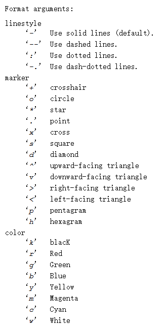
1、画一个sin曲线
1 >> t = [0:0.01:0.98];
2 >> y1 = sin(2 * pi * 4 * t);
3 >> plot(t,y1);
2、画一个cos曲线
1 >> y2 = cos(2 * pi * 4 * t);
2 >> plot(t,y2);

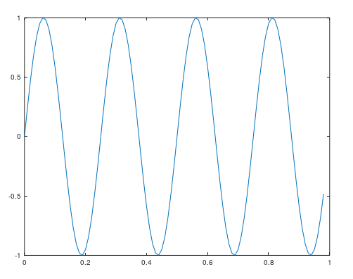
3、将两个曲线合并在一起
1 >> plot(t,y1);
2 >> hold on
3 >> plot(t,y2,'r');

4、给图像添加信息
1 > xlabel('time')    % X轴标签
2 >> ylabel('value')   % Y轴标签
3 >> legend('sin','cos')  % 添加曲线名称
4 >> title('my plot')  % 添加标题
5、保存到文件
1 >> print -dpng 'myPlot.png'
2 >> ls
3  Directory of D:myc_learnmachine_learningcodeweek2
5 [.]             5.m             hello.dat       myPlot.png
6 [..]            featuresX.dat   hello.txt       priceY.dat
9 >> close
6、绘制多张图
绘制多张图,需要指定将哪个曲线放在哪个图中。否则会一直绘制在当前窗口,覆盖之前的图形
1 >> figure(1); plot(t,y1);  % 在figure1中绘制
2 >> figure(2); plot(t,y2);  % 在figure2中绘制
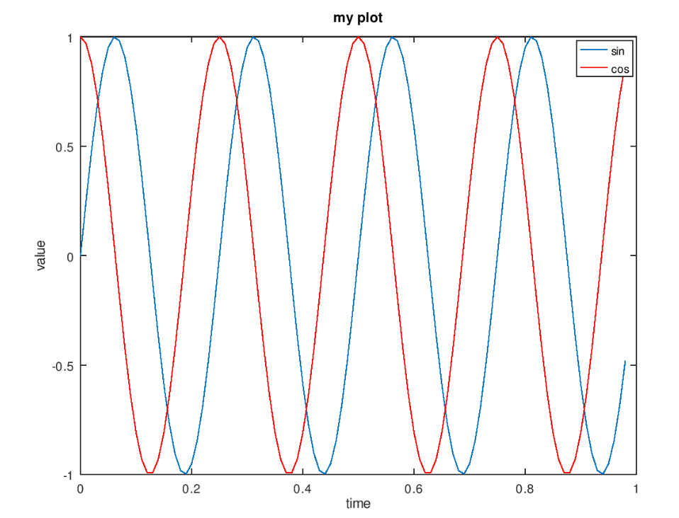
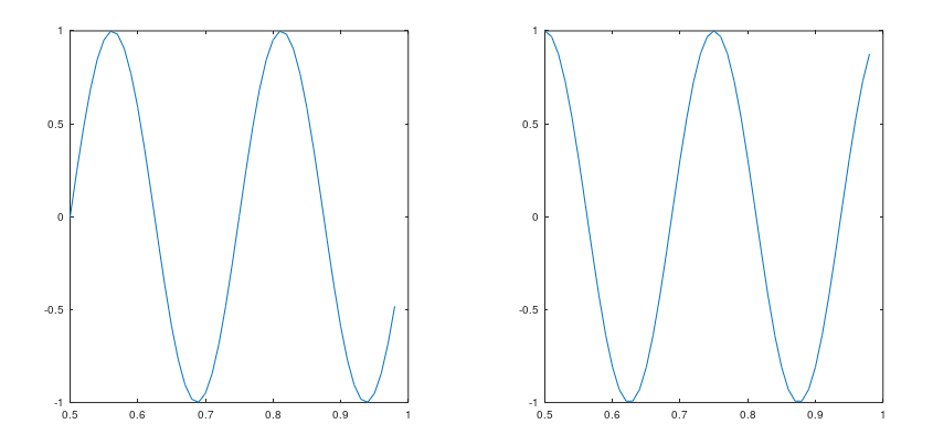
7、将两个图显示在一张图片中
1 >> subplot(1,2,1);  % 将图片划分为两个格子,访问第一个格子
2 >> plot(t,y1)    % 画第一个图像
3 >> subplot(1,2,2);  % 访问第二个格子
4 >> plot(t,y2)    % 画第二个图像
8、改变坐标轴范围
1 >> axis([0.5 1 -1 1])
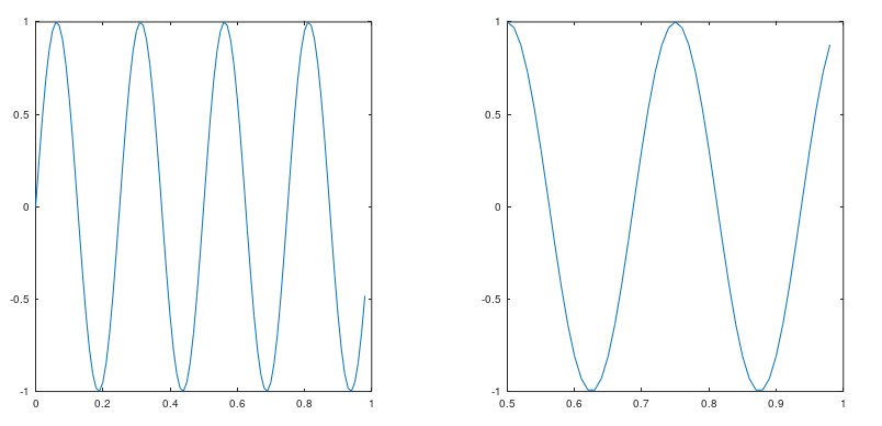
点击一下第一张图片,再运行一下上面那行代码,图变为:
9、清空和关闭图片
1 >> clf    % 清空
2 >> close   % 关闭
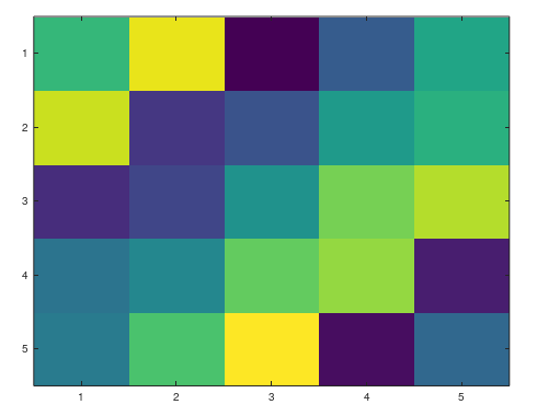
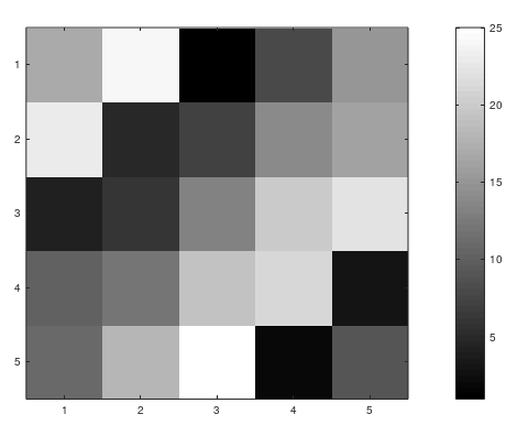
5.4.2 绘制可视化矩阵
1、生成矩阵图
根据矩阵的值生成图像,不同的颜色对应矩阵中不同的值
1 >> A = magic(5)
2 A =
3    17   24    1    8   15
4    23    5    7   14   16
5     4    6   13   20   22
6    10   12   19   21    3
7    11   18   25    2    9
8 >> imagesc(A)
2、显示颜色条
1 >> colorbar
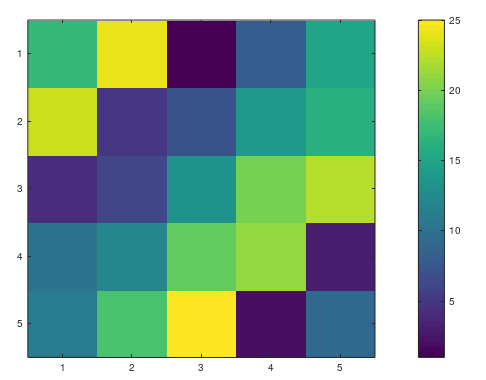
或者直接使用下面的一行代码:
1 >> imagesc(magic(5)), colorbar;
3、生成灰度图
1 >> imagesc(A), colorbar, colormap gray;
生成一个15行15列灰度图
1 >> imagesc(magic(15)),colorbar,colormap gray;
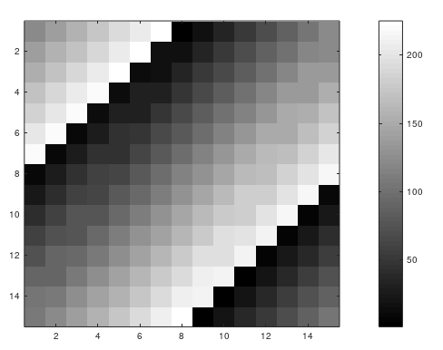
以 imagesc(magic(15)),colorbar,colormap gray; 为例。
这种几个逗号隔开的命令一起运行的方式,叫做逗号连接函数调用 comma chaining of function calls 或 comma chaining commands 。
比如赋值操作可以写成:a=1, b=2, c=3;
5.4.3 散点图
1   plot(x,y,'rx', 'MarkerSize', 10);
2   xlabel('Population of City in 10,000s');
3   ylabel('Profit in $10,000s');
4   title('POPULATION AND PROFIT');
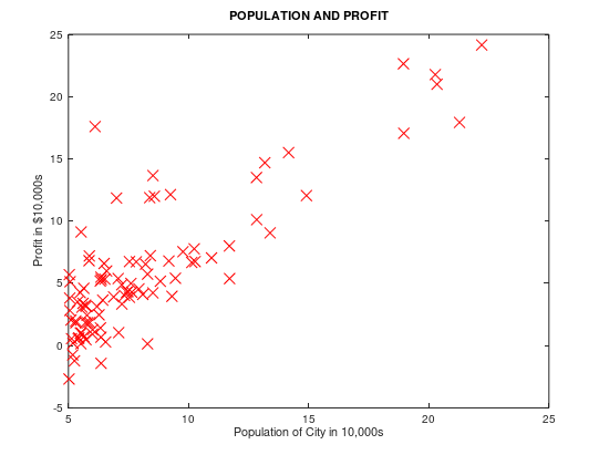
图像绘制在Octave官方文档的 15.2.1 Two-Dimensional Plots ,图形属性设置在15.3.3.4 Line Properties。
如果想设置某个属性,直接写属性名,后面跟一个值。plot (x, y, property, value, …)
例如 plot (x, y, 'linewidth', 2, …);