1. div高度自适应的情况
div在不设置高度的时候,会被里面的内容撑开,内容自动填充在div中,无论是一行内容还是多行内容,此时不需要设置垂直居中,内容自动在中间的,
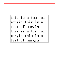
想要看的更直观些,只需要加上padding元素,内容四周便会留下空白,实现水平垂直居中的效果
css代码如下:
.demo{
    width: 200px;
    border: 1px solid red;
    padding: 20px;
 }
HTML代码如下:
<div class="demo">
        this is a test of margin
        this is a test of margin
        this is a test of margin
        this is a test of margin
        this is a test of margin
 </div>
效果如下所示:

2.div设置具体高度
(1)内容只有一行
设置div的line-height和div的高度一样即可,这个大家都知道哒
(2)内容不确定有几行
这时候需要在div中再加一层结构,用p标签或者div都可以
方法一:
css代码如下:
.demo{
    position: absolute;
    width: 200px;
    height: 200px;
    border: 1px solid red;
}
 p{
    position: absolute;
    width: 150px;
    top: 50%;
    left:50%;
    transform: translate(-50%,-50%);
    border: 1px solid black;
 }
HTML代码如下:
<div class="demo">
     <p>
        this is a test of margin
        this is a test of margin
        this is a test of margin
        this is a test of margin
     </p>
</div>
效果如下:
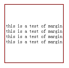
方法二:若是不想用position:absolute这样的脱离文档流的样式,那就可以尝试模拟表格的方法
设置父元素display:table,设置子元素display:table-cell,并设置vertical-align:middle即可
css代码如下:
.demo{
    width: 200px;
    height: 200px;
    display: table;
    border: 1px solid red;
}
 p{
    display: table-cell;
    vertical-align: middle;
    text-align: center;
    border: 1px solid black;
 }
HTML代码如下:
<div class="demo">
     <p>
        this is a test of margin
        this is a test of margin
        this is a test of margin
        this is a test of margin
    </p>
 </div>
效果如下所示:
此时子元素设置宽度是没用的,宽度始终和父元素一致;
但是如果子元素设置高度的话,若是高度小于父元素则无效果,若是高度大于父元素则父元素的高度也相应增加到和子元素一样的高度
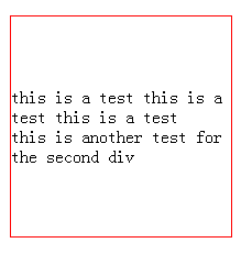
方法三:
使用css3新增的flex布局完成。
设置父元素display:box; box-pack:center; box-orient:vertical;即可,记得要在前面加上浏览器前缀哦
css代码如下:
.box{
    width: 200px;
    height: 200px;
    border: 1px solid red;
    display: box;
    box-pack:center;
    box-orient:vertical;
    display: -webkit-box;
    -webkit-box-pack:center;
    -webkit-box-orient:vertical;
}
HTML代码如下:
<div class="box">
        <div>
            this is a test
            this is a test
            this is a test
        </div>
        <div>
            this is another test for the second div
        </div>
</div>
效果显示如下:
(by新手小白的记录)