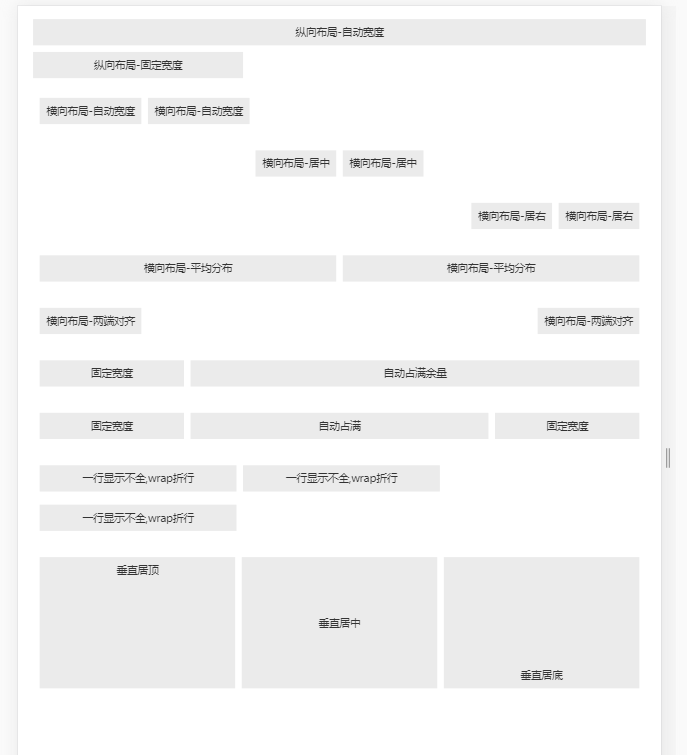
<!DOCTYPE html>
<html lang="en">

<head>
    <meta charset="UTF-8">
    <meta name="divport" content="width=device-width, initial-scale=1.0">
    <meta http-equiv="X-UA-Compatible" content="ie=edge">
    <title>flex布局</title>
    <style>
            div {
                padding: 0;
                font-size: 20px;
                margin:20px 10px;
                color: #333;
            }

            .text {
                margin: 10px 5px;
                padding: 0 10px;
                background-color: #ebebeb;
                height: 40px;
                line-height: 40px;
                text-align: center;
                color: #333;
                font-size: 16px;
            }

            .flex {
                display: flex;
                flex-direction: row;
            }

            .row {
                flex-direction: row;
            }
        </style>
</head>

<body>

    <div>
        <div class="text">纵向布局-自动宽度</div>
        <div class="text" style=" 300px;">纵向布局-固定宽度</div>
        <div class="flex row">
            <div class="text">横向布局-自动宽度</div>
            <div class="text">横向布局-自动宽度</div>
        </div>
        <div class="flex row" style="-webkit-justify-content: center;justify-content: center;">
            <div class="text">横向布局-居中</div>
            <div class="text">横向布局-居中</div>
        </div>
        <div class="flex row" style="-webkit-justify-content: flex-end;justify-content: flex-end;">
            <div class="text">横向布局-居右</div>
            <div class="text">横向布局-居右</div>
        </div>
        <div class="flex row">
            <div class="text" style="-webkit-flex: 1;flex: 1;">横向布局-平均分布</div>
            <div class="text" style="-webkit-flex: 1;flex: 1;">横向布局-平均分布</div>
        </div>
        <div class="flex row" style="-webkit-justify-content: space-between;justify-content: space-between;">
            <div class="text">横向布局-两端对齐</div>
            <div class="text">横向布局-两端对齐</div>
        </div>
        <div class="flex row">
            <div class="text" style=" 200px;">固定宽度</div>
            <div class="text" style="-webkit-flex: 1;flex: 1;">自动占满余量</div>
        </div>
        <div class="flex row">
            <div class="text" style=" 200px;">固定宽度</div>
            <div class="text" style="-webkit-flex: 1;flex: 1;">自动占满</div>
            <div class="text" style=" 200px;">固定宽度</div>
        </div>
        <div class="flex row" style="-webkit-flex-wrap: wrap;flex-wrap: wrap;">
            <div class="text" style=" 280px;">一行显示不全,wrap折行</div>
            <div class="text" style=" 280px;">一行显示不全,wrap折行</div>
            <div class="text" style=" 280px;">一行显示不全,wrap折行</div>
        </div>
        <div class="flex row">
            <div class="text flex"
                style="-webkit-flex: 1;flex: 1;height: 200px;-webkit-justify-content: center;justify-content: center;-webkit-align-items: flex-start;align-items: flex-start;">
                <span>垂直居顶</span>
            </div>
            <div class="text flex"
                style="-webkit-flex: 1;flex: 1;height: 200px;-webkit-justify-content: center;justify-content: center;-webkit-align-items: center;align-items: center;">
                <span>垂直居中</span>
            </div>
            <div class="text flex"
                style="-webkit-flex: 1;flex: 1;height: 200px;-webkit-justify-content: center;justify-content: center;-webkit-align-items: flex-end;align-items: flex-end;">
                <span>垂直居底</span>
            </div>
        </div>
</body>

</html>
效果: