目的:
1.将变量的分布进行可视化展示
2.通过结果进行跨组比较
内容:
1.条形图,箱线图,点图
2.饼图和扇形图
3.直方图与核密度图
1.条形图
条形图通过垂直和水平的条形展示了类别型变量的分布
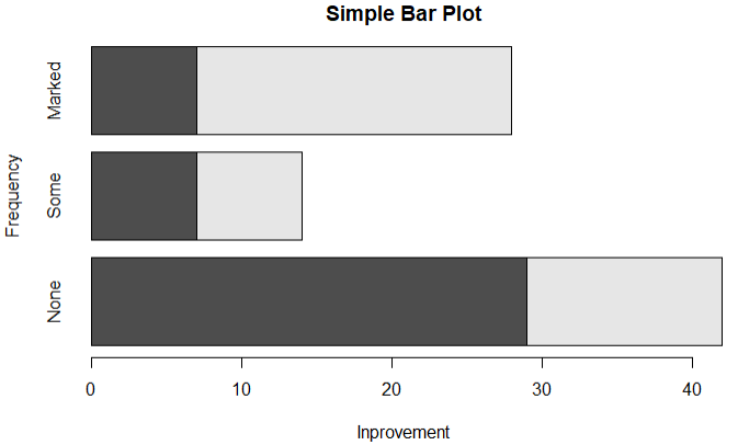
1.1普通条形图
1 library(vcd)
2 counts <- table(Arthritis$Improved)
3 barplot(counts,main='Simple Bar Plot',xlab = 'Inprovement',ylab = 'Frequency')
4 barplot(counts,main='Simple Bar Plot',xlab = 'Inprovement',ylab = 'Frequency',horiz = T)

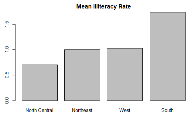
1.2均值条形图
# 1.构建数据集
# 2.整合数据集,根据region分组来计算每个地区的平均犯罪率
# 3.对结果进行排序
# 4.画图,并给出每个bar的名称
1 states <- data.frame(state.region,state.x77)
2 means <- aggregate(states$Illiteracy,by=list(state.region),FUN=mean)
3 means <- means[order(means$x),]
4 barplot(means$x,names.arg = means$Group.1)
5 title('Mean Illiteracy Rate')
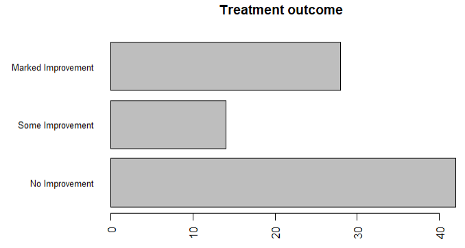
1.3条形图微调
1 library(vcd)
2 par(mar=c(5,8,4,2))
3 par(las=2)
4 counts <- table(Arthritis$Improved)
5 # cex.name缩小字号,names.arg使用字符向量作为标签名
6 barplot(counts,main = 'Treatment outcome',horiz = T,cex.names = 0.8,
7         names.arg = c('No Improvement','Some Improvement','Marked Improvement'))
1.4 棘状图(一种特殊的堆叠条形图,对其进行重缩放,每个条形的高度都是1,每一段的高度都表示比例)
1 attach(Arthritis)
2 counts <- table(Treatment,Improved)
3 spine(counts,main='Spinogram Example')
4 detach(Arthritis)

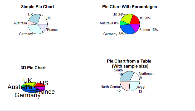
2. 饼图
library(plotrix)
# 把四幅图合并为1幅图
par(mfrow=c(2,2))
# 1,简单饼图
slices <- c(10,12,4,16,8)
lbls <- c('US','UK','Australia','Germany','France')
pie(slices,labels = lbls,main = 'Simple Pie Chart')
# 2.带有比例的饼图
pct <- round(slices/sum(slices)*100)
lbls2 <- paste(lbls,' ',pct,'%',sep = '' )
pie(slices,labels = lbls2,col=rainbow(length(lbls2)),main = 'Pie Chart With Percentages')
# 3.3D饼图
pie3D(slices,labels = lbls,explode = 0.1,main='3D Pie Chart')
# 4.从表格中创建饼图
mytable <- table(state.region)
lbls3 <- paste(names(mytable),'
',mytable,seq='')
pie(mytable,labels = lbls3,main = 'Pie Chart from a Table
 (With sample size)')
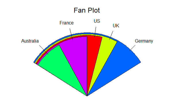
3.扇形图(更直观的展示各个数值的比例)
fan.plot(slices,labels = lbls,main = 'Fan Plot')
4.直方图
直方图可以直观的反映连续型变量的分布
 1 par(mfrow=c(2,2))
 2 # 1.简单直方图
 3 hist(mtcars$mpg)
 4 # 2.指定直方图的组数和颜色
 5 hist(mtcars$mpg,breaks = 12,col = 'red',xlab = 'Mile Per Gallon',main = 'Colored histogram with 12 bins')
 6 # 3.添加轴须
 7 hist(mtcars$mpg,freq = F,breaks = 12,col = 'red',xlab = 'Mile Per Gallon',main = 'Histogram,rug plot,density curve')
 8 rug(jitter(mtcars$mpg))
 9 lines(density(mtcars$mpg),col='blue',lwd=2)
10 #添加正态分布和外边框
11 x <- mtcars$mpg
12 h <- hist(x,breaks = 12,col = 'red',xlab = 'Mile Per Gallon',main = 'Histogram with normal curve and box')
13 xfit <- seq(min(x),max(x),length=40)
14 yfit <- dnorm(xfit,mean = mean(x),sd = sd(x))
15 yfit <- yfit * diff(h$mids[1:2])*length(x)
16 lines(xfit,yfit,col='blue',lwd=2)
17 box()

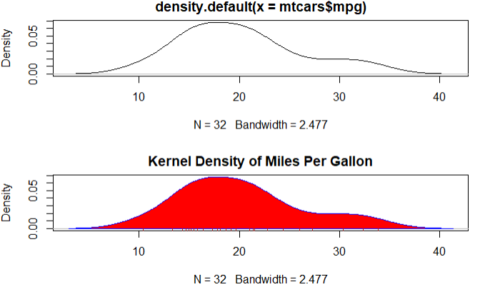
5.核密度图
核密度图用于估计随机变量的概率分布
par(mfrow=c(2,1))
# 1.使用默认设置,创建最简单图形
d <- density(mtcars$mpg)
plot(d)
# 2/曲线修改为蓝色,使用红色填充图形
plot(d,main = 'Kernel Density of Miles Per Gallon')
polygon(d,col = 'red',border = 'blue')
rug(mtcars$mpg,col = 'brown')
6.箱线图
箱线图通过最小值,下四分位数,中位数,上四分位数,最大值描述了连续型变量的分布
结论:4缸车的油耗更少
1 # 描述了四缸,六缸,八缸发动机对每加仑汽油行驶的英理数的统计
2 boxplot(mpg ~ cyl,data=mtcars,main='Car Mile Data',xlab='Number of Cylinders',ylab='Mile Pre Gas')

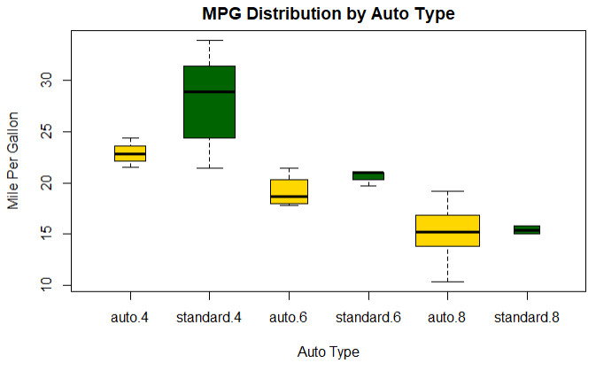
具有交叉因子的箱线图
结论:说明油耗随着缸数的下降而减少,对于4,6缸数的车,标准变速箱的油耗更低.对于8缸车变速箱类型没有区别
1 # 1.创建气缸数量因子
2 mtcars$cyl.f <- factor(mtcars$cyl,levels = c(4,6,8),labels = c('4','6','8'))
3 # 2.创建变速箱类型因子
4 mtcars$am.f <- factor(mtcars$am,levels = c(0,1),labels = c('auto','standard'))
5 #生成图形
6 boxplot(mpg ~ am.f * cyl.f,data=mtcars,varwidth=T,col=c('gold','darkgreen'),main='MPG Distribution by Auto Type',
7         xlab = 'Auto Type',ylab = 'Mile Per Gallon')
7.点图
点图提供了一种在简单水平刻度上的绘制大量有标签值的做法
1 dotchart(mtcars$mpg,labels = row.names(mtcars),cex = .7,
2          main = 'Gas Mileage for Car Models',
3          xlab = 'Miles Per Gallon')

分组,排序,着色后的点图
结论:从图中可以很直观的得出信息:最省油的车是丰田卡罗拉,最费油的车是林肯
# 1.根据每加仑行驶的公里数进行排序
x <- mtcars[order(mtcars$mpg),]
# 2.将气缸数转换成因子
x$cyl <- factor(x$cyl)
# 3.给不同的气缸添加颜色
x$color[x$cyl == 4] <- 'red'
x$color[x$cyl == 6] <- 'blue'
x$color[x$cyl == 8] <- 'darkgreen'
# 4.作图,根据气缸数进行分组,根据数据点标签取数据框的行名
dotchart(x$mpg,labels = row.names(x),cex = .7,groups = x$cyl,gcolor = 'black',color = x$color,pch=19,
         main = 'Gas Mileage for Car Model
 group by cylinder',xlab = 'Mile per Gallon')
