简介
Bootstrap是Twitter开源的基于HTML、CSS、JavaScript的前端框架。
它是为实现快速开发Web应用程序而设计的一套前端工具包。
它支持响应式布局,并且在V3版本之后坚持移动设备优先。
就是复制黏贴一把梭,htmlcssjs代码的封装组合
#**************************
在Bootstrap出现之前:
  命名:重复、复杂、无意义(想个名字费劲)
  样式:重复、冗余、不规范、不和谐
  页面:错乱、不规范、不和谐
  在使用Bootstrap之后: 各种命名都统一并且规范化。 页面风格统一,画面和谐。
下载地址:
	https://www.bootcss.com/
目录结构
bootstrap-3.3.7-dist/
├── css  // CSS文件
│   ├── bootstrap-theme.css  // Bootstrap主题样式文件,官方提供的,一般不用
│   ├── bootstrap-theme.css.map
│   ├── bootstrap-theme.min.css  // 主题相关样式压缩文件
│   ├── bootstrap-theme.min.css.map
│   ├── bootstrap.css  //引用的时候,引用这一个或者下面那个bootstrap.min.css文件就可以了
│   ├── bootstrap.css.map
│   ├── bootstrap.min.css  // 核心CSS样式压缩文件,其他的文件都是在这个核心文件的基础上加了一些其他的样式
│   └── bootstrap.min.css.map
├── fonts  // 字体文件
│   ├── glyphicons-halflings-regular.eot
│   ├── glyphicons-halflings-regular.svg
│   ├── glyphicons-halflings-regular.ttf
│   ├── glyphicons-halflings-regular.woff
│   └── glyphicons-halflings-regular.woff2
└── js  // JS文件
    ├── bootstrap.js
    ├── bootstrap.min.js  // 核心JS压缩文件
    └── npm.js

#由于Bootstrap的某些组件依赖于jQuery,所以请确保下载对应版本的jQuery文件,来保证Bootstrap相关组件运行正常。
BookStrap引入
//在head标签中引入CSS样式文件
	<link rel="stylesheet" href="bootstrap-3.3.7-dist/css/bootstrap.min.css">
    <script src="bootstrap-3.3.7-dist/js/bootstrap.min.js"></script>
table标签导入
<table class="table table-bordered table-striped table-hover">
class='table'  //导入CSS样式,
table-bordered //加上表格
table-striped  //给表格加上斑马线效果
table-hover    //鼠标悬浮效果
Bookstrap基础模版
<!DOCTYPE html>
<html lang="zh-CN">
  <head>
    <meta charset="utf-8">
    <meta http-equiv="X-UA-Compatible" content="IE=edge">
    <meta name="viewport" content="width=device-width, initial-scale=1">//屏幕适配
    <!-- 上述3个meta标签*必须*放在最前面,任何其他内容都*必须*跟随其后! -->
    <title>Bootstrap 101 Template</title>
    <link href="https://cdn.jsdelivr.net/npm/bootstrap@3.3.7/dist/css/bootstrap.min.css" rel="stylesheet">
    <!-- HTML5 shim 和 Respond.js 是为了让 IE8 支持 HTML5 元素和媒体查询(media queries)功能 -->
    <!-- 警告:通过 file:// 协议(就是直接将 html 页面拖拽到浏览器中)访问页面时 Respond.js 不起作用 -->
  </head>
  <body>
    <!-- jQuery (Bootstrap 的所有 JavaScript 插件都依赖 jQuery,所以必须放在前边) -->
    <script src="jquery.js"></script>
    <!-- 加载 Bootstrap 的所有 JavaScript 插件。你也可以根据需要只加载单个插件。 -->
    <script src="https://cdn.jsdelivr.net/npm/bootstrap@3.3.7/dist/js/bootstrap.min.js"></script>
  </body>
布局容器
//.container 类用于固定宽度并支持响应式布局的容器
	<div class="container">//标签位于屏幕正中间
 		 ...
	</div>
//.container-fluid 类用于 100% 宽度,占据全部视口(viewport)的容器。
	<div class="container-fluid">
 		 ...
	</div>
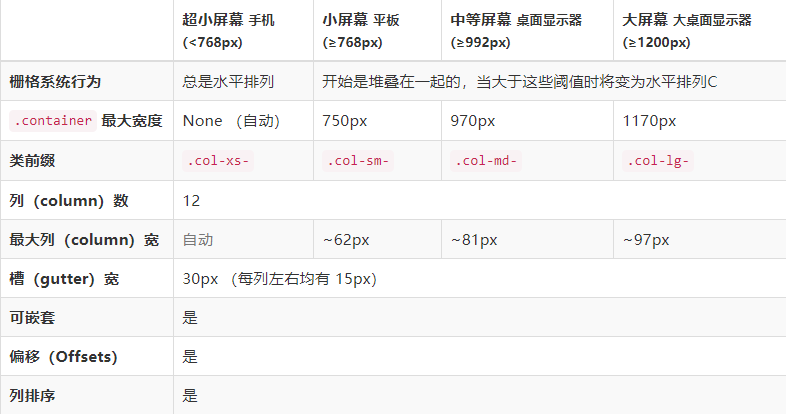
栅格系统
Bootstrap 提供了一套响应式、移动设备优先的流式栅格系统,随着屏幕或视口(viewport)尺寸的增加,系统会自动分为最多12列。它包含了易于使用的预定义类,还有强大的mixin 用于生成更具语义的布局。//自动捕获屏幕宽度,栅格系统可以进行嵌套
class = 'row'; //导入栅格系统,这一行会分成12列
class = 'col-md-6'//说明占的栅格的个数
如果这一行的栅格系统超过12列,那么就换行
md指的是中性屏幕
sm指的是小型屏幕,格式可以一起写,
    针对不同屏幕进行适配
列偏移
//使用 .col-md-offset-* 类可以将列向右侧偏移。这些类实际是通过使用 * 选择器为当前元素增加了左侧的边距(margin)。例如,.col-md-offset-4 类将 .col-md-4 元素向右侧偏移了4个列(column)的宽度。
标题排版
//HTML 中的所有标题标签,<h1> 到 <h6> 均可使用。另外,还提供了 .h1 到 .h6 类,为的是给内联(inline)属性的文本赋予标题的样式。
<h1>h1. Bootstrap heading</h1>
<h2>h2. Bootstrap heading</h2>
<h3>h3. Bootstrap heading</h3>
<h4>h4. Bootstrap heading</h4>
<h5>h5. Bootstrap heading</h5>
<h6>h6. Bootstrap heading</h6>
//在标题内还可以包含 <small> 标签或赋予 .small 类的元素,可以用来标记副标题。
<h1>h1. Bootstrap heading <small>Secondary text</small></h1>
<h2>h2. Bootstrap heading <small>Secondary text</small></h2>
<h3>h3. Bootstrap heading <small>Secondary text</small></h3>
<h4>h4. Bootstrap heading <small>Secondary text</small></h4>
<h5>h5. Bootstrap heading <small>Secondary text</small></h5>
<h6>h6. Bootstrap heading <small>Secondary text</small></h6>
    //<small>标签的文字会变小