前言
曾经屏幕适配一直是个头疼的问题,各种坑,各种浏览器&设备兼容问题,好在的是,随着技术&标准的不断发展,这个问题得到了极大程度的解决,这篇文章主要对之前开发过程中的屏幕适配问题做个的简单总结,包括两个部分。
长屏适配
得益于CSS样式中vh&vw单位的支持普及,终于可以放心大胆的使用了,避免使用相对繁琐的scale、em、rem。
如图所示:

vh:将window.innerHeight分成100份,即1vh等于window.innerHeight的1%
vw:将window.innerWidth分成100份,即1vw等于window.innerWidth的1%
注意:长度包括滚动条
注意:长度包括滚动条
注意:长度包括滚动条
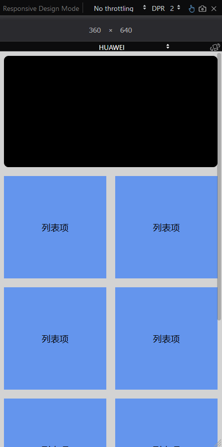
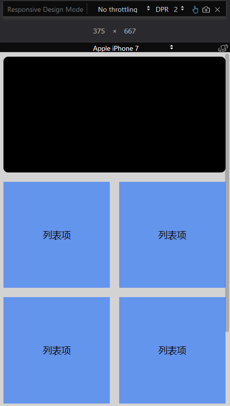
然后,我们就可以放心的使用vw当做长度单位来进行排版啦,因为在长屏的情况下,高度我们不在意(因为高度随页面内容变化),而元素会随着宽度的变化而变化。
以750x1334的设计稿为例,750/100=7.5px,那么1vw=7.5px,在排版的时候,根据这个单位换算即可。
简单示例如下:传送门
<!doctype html>
<html lang="zh-CN">

<head>
    <meta charset="utf-8">
    <meta http-equiv="x-ua-compatible" content="ie=edge">
    <title></title>
    <meta name="description" content="">
    <meta name="viewport" content="width=device-width, initial-scale=1">
    <link href="https://cdn.bootcss.com/normalize/7.0.0/normalize.min.css" rel="stylesheet">
    <style>
    html,
    body {
        height: 100%;
        background-color: lightgray;
    }

    .container {
         100vw margin: 0 auto;
        overflow: auto;
    }

    .banner {
        background-color: black;
        height: 50vw;
        margin: 2vw;
        border-radius: 2vw;
    }

    .row {
        display: flex;
    }

    .item {
      flex: 1;
        height: 46vw;
        background-color: cornflowerblue;
        margin: 2vw;
        font-size: 4vw;
        display: flex;
        align-items: center;
        justify-content: center;
    }
    </style>
</head>

<body>
    <div class="container">
        <div class="banner">
        </div>
        <div class="row">
            <div class="item">
                列表项
            </div>
            <div class="item">
                列表项
            </div>
        </div>
        <div class="row">
            <div class="item">
                列表项
            </div>
            <div class="item">
                列表项
            </div>
        </div>
        <div class="row">
            <div class="item">
                列表项
            </div>
            <div class="item">
                列表项
            </div>
        </div>
        <div class="row">
            <div class="item">
                列表项
            </div>
            <div class="item">
                列表项
            </div>
        </div>
    </div>
</body>

</html>那么有同学可能有疑问了,vw和%百分比有啥区别?在我看来,主要有2个。
1、百分比是定义基于包含块(父元素)宽度的百分比宽度,受到position属性的影响。而vw永远以浏览器可视区为基准。
2、百分比只能用于width和height,而vw可以用于任何以大小为单位的属性,例如font-size,这样就非常方便了。
单页适配
与长屏不同的是,类似单页H5小游戏,H5单页滚屏展示等,我们需要在屏幕内将页面完整的展现出来,这就没法使用vw了,因为我们需要根据设计图比例,保证单页完整动态计算和限制页面的展示大小展示,而vw无法做单一限制,这时js+百分比就派上用场了。
以微信中的单页活动展示为例,去掉64px的顶部导航,设计图定为750*1206。
有2种情况:
1、当屏幕宽度大于设计稿时
为了保证单页完整显示,需要以高度为基准,动态计算出宽度,居中显示
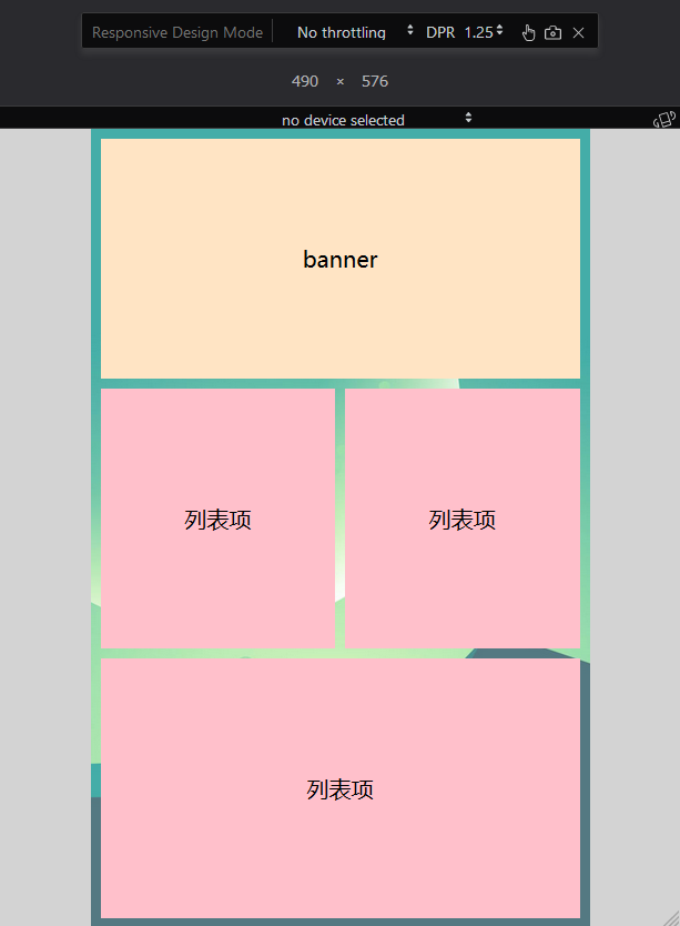
2、当屏幕宽度小于设计稿时
为了保证单页完整显示,需要以宽度为基准,动态计算出高度,居中显示
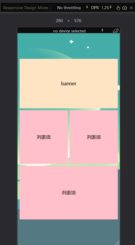
字体大小,也可根据缩放比例,动态计算px
示例代码如下:传送门
<!doctype html>
<html lang="zh-CN">

<head>
    <meta charset="utf-8">
    <meta http-equiv="x-ua-compatible" content="ie=edge">
    <title></title>
    <meta name="description" content="">
    <meta name="viewport" content="width=device-width, initial-scale=1">
    <link href="https://cdn.bootcss.com/normalize/7.0.0/normalize.min.css" rel="stylesheet">
    <style>
    html,
    body {
         100%;
        height: 100%;
        background-color: lightgray;
    }

    .wrapper {
        background: url('./img/timg.jpg') no-repeat center;
        background-size: cover;
        height: 100%;
        display: flex;
        align-items: center;
        justify-content: center;
        margin: 0 auto;
    }

    .container {
        position: relative;
        height: 100%;
    }

    .banner {
        height: 30%;
        background-color: bisque;
        flex: 1;
        display: flex;
        align-items: center;
        justify-content: center;
        margin: 2%;
    }

    .row {
        display: flex;
        justify-content: center;
        align-items: center;
        margin: 2%;
        height: 32.5%;
    }

    .item {
        flex: 1;
        display: flex;
        align-items: center;
        justify-content: center;
        background-color: pink;
        height: 100%;
    }
    </style>
</head>

<body>
    <div class="wrapper">
        <div class="container">
            <div class="banner">
                banner
            </div>
            <div class="row">
                <div class="item" style="margin-right: 1%">
                    列表项
                </div>
                <div class="item" style="margin-left: 1%">
                    列表项
                </div>
            </div>
            <div class="row">
                <div class="item">
                    列表项
                </div>
            </div>
        </div>
    </div>
    <script src="https://cdn.bootcss.com/jquery/3.2.1/jquery.min.js"></script>
    <script>
    var fontSize = $('html').css('font-size').slice(0, -2);

    function measureArea() {
        var height = $(window).height();
        var width = $(window).width();

        var temp_width = height * 10 / 16;
        if (temp_width < width) {
            $('.container').css('width', temp_width + 'px');
            $('.wrapper').css('max-width', temp_width + 'px');
        } else {
            $('.container').css('width', width + 'px');
            $('.container').css('height', width * 16 / 10 + 'px');
            $('html').css('font-size', fontSize * (width / temp_width) + 'px');
        }
    }
    window.onresize = measureArea;
    measureArea();
    </script>
</body>

</html>
参考
https://developer.mozilla.org/en-US/docs/Web/CSS/length#vw
https://github.com/amfe/lib-flexible
https://www.w3cplus.com/css/vw-for-layout.html