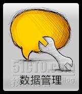
现在移动设备的按钮设计讲究大图标小文字,希望用户只要一看到图标便能知道这个按钮是干嘛的,但又要有必要的文字提示,最常见的就数搜索按钮了,上面一个大大的放大镜图标,下面两个字——搜索。
Bill最近也在做具有这种效果的按钮,过程总是曲折的,不过结果总是美好滴~现在Bill把其做法分享给大家,希望对还不会的朋友有所帮助。
先看看bill曲折的过程吧,也许里面就有你的影子:
最开始以为直接利用Android控件ImageButton即可完事,谁知事不如人料,ImageButton只能显示图片,并不能对其添加文字,此想法不攻自破。
于是我想到了直接用Button,但是Button的文字却是显示在图片内部,并不能达到我的需求。放弃。
懒人总有懒人的办法,我可以直接在图片下方PS需要的文字嘛,然后把P好的图片放进ImageButton就好了。此法十分简单好用。但是,一旦我们需要改变文字,或者我要把文字显示在图片顶部而不是底部怎么办?此法虽简单,却缺乏可变性。放弃。
这就是所谓的“一钮三折”了~
那么,有没有一种方法既能够拥有Button的效果,又能够实现Button显示的自定义呢?
答案是肯定的,接下来,bill将一步一步详细解释这个按钮的制作过程。
思路
首先,我们来看一下这个按钮的实现思路。有一种思维方式叫做“out of box”,也就是鼓励大家跳出固定思维模式以寻求新的突破。但是在“跳出箱子”之前,我们必须首先知道困住我们思维的“箱子”是什么。
在这里,这个箱子就是“按钮”。我们一直在想,如何去实现这个“按钮”,怎么才能让“按钮”显示出图片,然后在图片下面还显示一行字。我们就在“按钮”这个箱子里纠结。
但实际上,当我们发现所谓的“按钮”其实就是一个View的时候,一切就变得简单了。
它只不过是一个可点击、可设置监听、可显示文字或者图片的View而已。那么我们就跳出Android给我们设置的这个箱子,自己重新造一个具有我们需要的功能和外观的View不就OK了?
经过分析,上述按钮效果实际上就是一个布局,一个最简单不过的垂直线性布局,上部分是一个ImageView,下部分是一个TextView,这个布局可点击、可设置监听。
我们首先要编写自己的ImageButton类,然后在主布局文件中为我们自定义的Button编写布局,最后在Activity中调用我们自定义ImageButton即可。
那么接下来我们就一起来实现这个简单的LinearLayout。
编码实现自己的ImageButton
在编写我们自己的ImageButton之前,如果读者并不清楚如何在一个静态的xml布局文件中动态地加载子布局,请先阅读下面的博文(此文言简意赅,已经写得很清楚了,bill就不再赘述)
http://blog.csdn.net/lzx_bupt/article/details/5600187
首先,我们编写一个MyImageButton类,继承自LinearLayout
- package com.billhoo.study;
- import android.content.Context;
- import android.widget.ImageView;
- import android.widget.LinearLayout;
- import android.widget.TextView;
- //自定义ImageButton,模拟ImageButton,并在其下方显示文字
- //提供Button的部分接口
- public class MyImageButton extends LinearLayout {
- public MyImageButton(Context context, int imageResId, int textResId) {
- super(context);
- mButtonImage = new ImageView(context);
- mButtonText = new TextView(context);
- setImageResource(imageResId);
- mButtonImage.setPadding(0, 0, 0, 0);
- setText(textResId);
- setTextColor(0xFF000000);
- mButtonText.setPadding(0, 0, 0, 0);
- //设置本布局的属性
- setClickable(true); //可点击
- setFocusable(true); //可聚焦
- setBackgroundResource(android.R.drawable.btn_default); //布局才用普通按钮的背景
- setOrientation(LinearLayout.VERTICAL); //垂直布局
- //首先添加Image,然后才添加Text
- //添加顺序将会影响布局效果
- addView(mButtonImage);
- addView(mButtonText);
- }
- // ----------------public method-----------------------------
- /*
- * setImageResource方法
- */
- public void setImageResource(int resId) {
- mButtonImage.setImageResource(resId);
- }
- /*
- * setText方法
- */
- public void setText(int resId) {
- mButtonText.setText(resId);
- }
- public void setText(CharSequence buttonText) {
- mButtonText.setText(buttonText);
- }
- /*
- * setTextColor方法
- */
- public void setTextColor(int color) {
- mButtonText.setTextColor(color);
- }
- // ----------------private attribute-----------------------------
- private ImageView mButtonImage = null;
- private TextView mButtonText = null;
- }
然后在main布局中为我们自定义的Button写xml布局,注意,我们的“按钮”实际上是一个线性布局,因此xml中应该写LinearLayout而不是Button或者ImageButton
- <?xml version="1.0" encoding="utf-8"?>
- <LinearLayout xmlns:android="http://schemas.android.com/apk/res/android"
- android:orientation="vertical" android:layout_width="fill_parent"
- android:layout_height="fill_parent">
- <!-- 这就是我们的“数据管理按钮” -->
- <LinearLayout android:id="@+id/ll_bt_data_config"
- android:layout_width="wrap_content" android:layout_height="wrap_content" />
- </LinearLayout>
最后,在Activity中为我们自定义的按钮设置监听
- package com.billhoo.study;
- import android.app.Activity;
- import android.os.Bundle;
- import android.view.View;
- import android.widget.Button;
- import android.widget.LinearLayout;
- public class TestActivity extends Activity {
- /** Called when the activity is first created. */
- @Override
- public void onCreate(Bundle savedInstanceState) {
- super.onCreate(savedInstanceState);
- setContentView(R.layout.main);
- btDataConfig = new MyImageButton(this, R.drawable.option, R.string.text);
- //获取包裹本按钮的容器
- llbtDataConfig = (LinearLayout) findViewById(R.id.ll_bt_data_config);
- //将我们自定义的Button添加进这个容器
- llbtDataConfig.addView(btDataConfig);
- //设置按钮的监听
- btDataConfig.setOnClickListener(new Button.OnClickListener() {
- @Override
- public void onClick(View v) {
- btDataConfig.setText("按钮被点击过了");
- }
- });
- }
- private LinearLayout llbtDataConfig = null; //main布局中包裹本按钮的容器
- private MyImageButton btDataConfig = null;
- }
效果


扩展
大家还可以自己扩展这个类的功能,比如可以设置文字的环绕位置,大小控制等等

本文出自 “Bill_Hoo专栏” 博客,请务必保留此出处http://billhoo.blog.51cto.com/2337751/772442