在 CSS 中第个标签都可以认为是个盒子,盒子就有以下几层
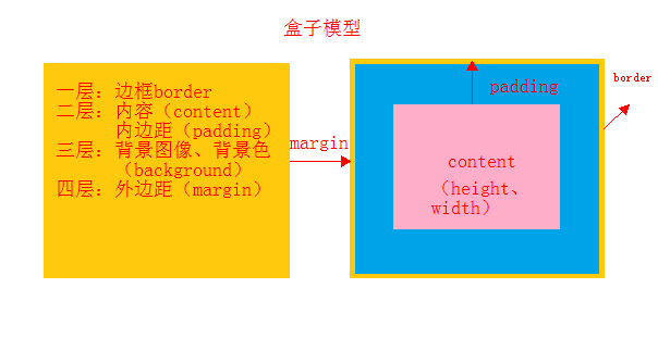
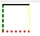
边框 border
            border-top: 5px solid black;            /*上边框 实线*/
            border-right: 3px double yellow;        /*右边框 双线*/
            border-bottom: 8px dotted red;          /*下边框 点点*/
            border-left: 7px dashed green;          /*左边框 虚线*/
内边距 padding
内容和框音响的距离
在实际操作使用中,一般不对内边距调,这样会影响整个盒子的大小,从而影响整个页面布局
    <style>
        div{
            height: 200px;
             100px;
            border:  3px solid red;
            padding-top: 20px;          /*上内边距*/
            padding-right: 10px;        /*右内边距*/
            padding-bottom: 10px;        /*下内边距*/
            padding-left: 10px;        /*左内边距*/
        }
    </style>
</head>
<body>
    <div>
        博客园是面向开发者的知识分享社区,
    </div>
padding: 10px 20px 30px 40px; /*复合样式 ,上右下左,按顺序,哪个值缺少,就取对面的值,*/
外边距 margin
盒子间的距离
            background: #525d68;
            margin-top: 30px;           /*上边距*/
            margin-right: 100px;        /*右边距*/
            margin-bottom: 100px;       /*下边距*/
            margin-left: 100px;         /*左边距*/
margin10px 20px 30px 40px; /*复合样式 ,上右下左,按顺序,哪个值缺少,就取对面的值,*/
css 重置
    <style>
        *{
            margin: 0;
            padding: 0;
        }
    </style>
浮动
列变行用 float: left;
<!DOCTYPE html>
<html lang="en">
<head>
    <meta charset="UTF-8">
    <title>Title</title>
    <style>
        li{
            height: 20px;
             20px;
            background: green;
            float: left;                /*列变行*/
            margin-left: 20px;
            border-radius: 50px;        /*圆角*/
        }
        ul{
            list-style: none;           /*把点去掉*/
        }
    </style>
</head>
<body>
    <ul>
        <li></li>
        <li></li>
        <li></li>
    </ul>
</body>
</html>
浮动问题:
高度塌陷
<!DOCTYPE html>
<html lang="en">
<head>
    <meta charset="UTF-8">
    <title>Title</title>
    <style>
        .box{
            border: 20px solid red;
            /*overflow: hidden;           !*防高度塌陷 方法1*!*/
        }
        .box div{
            height: 100px;
             100px;
        }
        .left{
            float: left;
            background: green;
        }
        .ri{
            float: right;
            background: skyblue;
        }


        .clearfix::after{                /**防高度塌陷 方法3/
            display: block;             /*保证为块级元素*/
            clear: both;
            content: '';
        }
    </style>
</head>
<body>
    <div class="box clearfix" >             <!--/*防高度塌陷 方法3 加共同样式 clearfix-->
        <div class="left"></div>
        <div class="ri"></div>
        <!--<div></div>                             /*防高度塌陷 方法2*/-->
    </div>
</body>
</html>
清除浮动带来的影响
设置共同样式,
        .clearfix::after{
            display: block;
            clear: both;
            content: '';
}
在父级 div 中添加共同样式 clearfix 之后进行相关设置
固定定位
<!DOCTYPE html>
<html lang="en">
<head>
    <meta charset="UTF-8">
    <title>Title</title>
    <style>
        div{
             100px;
            height: 100px;
            background: #525d68;
            position: fixed;                /*指明固定定位*/
            right: 20px;                    /*指定偏移*/
            bottom: 100px;
        }
    </style>
</head>
<body>
    <div></div>
</body>
</html>
不论浏览器怎么动,该 box 始终在这个偏移位置中
相对定位
相对自身而言,的位置偏移 ,不脱离文档流
在这个例子中,其父元素是浏览器,所以他的偏移是以浏览器为参照物,
<!DOCTYPE html>
<html lang="en">
<head>
    <meta charset="UTF-8">
    <title>Title</title>
    <style>
        div{
             200px;
            height: 200px;
        }
        .text{
            background: #e7dede;
            position: relative;             /*相对定位*/
            left: 200px;
        }
        .box{
            background: blue;
        }
    </style>
</head>
<body>
    <div class="text"></div>
    <div class="box">参照</div>
</body>
</html>
绝对定位 position: absolute; /*绝对定位*/
脱离文档流,偏移反,位置将让出来,
<!DOCTYPE html>
<html lang="en">
<head>
    <meta charset="UTF-8">
    <title>Title</title>
    <style>
        div{
             200px;
            height: 200px;
        }
        .text{
            background: #e7dede;
            position: absolute;             /*绝对定位*/
            left: 200px;
        }
        .box{
            background: blue;
        }
    </style>
</head>
<body>
    <div class="text"></div>
    <div class="box">参照</div>
</body>
</html>
父相子绝,(在绝对定位的 box 上设个父元素)
这个应用比较我,保证其不脱离文档流,不影响整个页面布局,子 box 实现随心所欲的放置,
<!DOCTYPE html>
<html lang="en">
<head>
    <meta charset="UTF-8">
    <title>Title</title>
    <style>
        .par{                               /*父元素*/
            height: 300px;
             500px;
            background: #3e3d32;
            position: relative;         /*相对定位*/
        }
        .chi{                              /*子元素*/
            height: 100px;
             100px;
            background: maroon;
            position: absolute;         /*绝对 定位*/
            /*居中操作*/
            left: 50%;
            margin-left:-50px;
            top: 50%;
            margin-top: -50px;
        }
    </style>
</head>
<body>
    <div class="par">父 box
        <div class="chi">子 box </div>
    </div>
</body>
</html>
z index
style="z-index: -1" 里边的数值越大戛越在上层,
<!DOCTYPE html>
<html lang="en">
<head>
    <meta charset="UTF-8">
    <title>Title</title>
    <style>
        *{
            margin-left: 0;
            padding: 0;
        }
        ul{
            list-style: none;       /*去掉列表的带的小点*/
        }
        div{
            height: 200px;
             800px;
            background:black;
            margin: 20px auto;
            position: relative;                         /*相对定位*/
        }
        img{
            height: 200px;
             800px;
            position: absolute;                         /*绝对定位*/
        }
    </style>
</head>
<body>
    <div>
        <ul class="pic">
            <li><img style="z-index: 0" src="https://res.shiguangkey.com//file/201806/19/20180619142252602590185.jpg"></li>
            <li><img style="z-index: 1" src="https://res.shiguangkey.com//file/201806/19/20180619141337485823895.jpg"></li>
            <li><img style="z-index: -2" src="https://res.shiguangkey.com//file/201806/21/20180621150342030454625.jpg"></li>
            <li><img style="z-index: -1" src="https://res.shiguangkey.com//file/201805/17/20180517113424433990524.jpg"></li>

        </ul>
    </div>
</body>
</html>
作业
<!DOCTYPE html>
<html lang="en">
<head>
    <meta charset="UTF-8">
    <title>Title</title>
    <style>
        *{
            margin:0;
            padding:0;
        }
        ul{
            list-style: none;       /*去掉列表的带的小点*/
        }
        img{
            height: 200px;
             800px;
            position: absolute;                         /*绝对定位*/
        }
        div{
            height: 200px;
             800px;
            background:yellow;
            margin: 40px auto;
            position: relative;                         /*相对定位*/
        }
        .btn{
            height: 200px;                          /*高度=行高,..*/
            line-height: 200px;                    /*行高,便于居中*/
            font-size: 50px;                      /*字体大小*/
            color: white;                       /*字体颜色*/
            font-weight: bold;
            display: none;                      /*不显示 */
        }
        .btn .left{
            position: absolute;
            left: 20px;
        }
        .btn .right{
            position: absolute;
            right: 20px;
        }
        div:hover .btn{
            display: block;
        }
        .dian{
            position: absolute;
            left: 50%;
            margin-left: -30px;
            top: 150px;
        }
        .dian li{
             10px;
            height: 10px;
            border: 2px solid red;
            border-radius: 50%;
            float: left;
            margin-left: 20px;
        }
        .dian li:hover{
            background: #ffffff;
        }
    </style>
</head>
<body>
    <div>
        <ul class="pic">
            <li><img  src="https://res.shiguangkey.com//file/201806/19/20180619142252602590185.jpg"></li>
            <li><img  src="https://res.shiguangkey.com//file/201806/19/20180619141337485823895.jpg"></li>
            <li><img  src="https://res.shiguangkey.com//file/201806/21/20180621150342030454625.jpg"></li>
            <li><img  src="https://res.shiguangkey.com//file/201805/17/20180517113424433990524.jpg"></li>
        </ul>

         <ul class="btn" >
            <li class="left"><</li>
            <li class="right">></li>
        </ul>

        <ul class="dian">
            <li ></li>
            <li ></li>
            <li ></li>
            <li ></li>
        </ul>
    </div>
</body>
</html>