(1)视图容器
| 名称 | 功能说明 |
|---|---|
| movable-view | 可移动的视图容器,在页面中可以拖拽滑动 |
| cover-image | 覆盖在原生组件之上的图片视图 |
| cover-view | 覆盖在原生组件之上的文本视图 |
| movable-area | movable-view的可移动区域 |
| scroll-view | 可滚动视图区域 |
| swiper | 滑块视图容器 |
| swiper-item | 仅可放置在swiper组件中,宽高自动设置为100% |
| view | 视图容器 |
可移动的视图容器,在页面中可以拖拽滑动。movable-view必须在 movable-area 组件中,并且必须是直接子节点,否则不能移动。
| 属性 | 类型 | 默认值 | 必填 | 说明 | 最低版本 |
|---|---|---|---|---|---|
| direction | string | none | 否 | movable-view的移动方向,属性值有all、vertical、horizontal、none | 1.2.0 |
| inertia | boolean | false | 否 | movable-view是否带有惯性 | 1.2.0 |
| out-of-bounds | boolean | false | 否 | 超过可移动区域后,movable-view是否还可以移动 | 1.2.0 |
| x | number | 否 | 定义x轴方向的偏移,如果x的值不在可移动范围内,会自动移动到可移动范围;改变x的值会触发动画 | 1.2.0 | |
| y | number | 否 | 定义y轴方向的偏移,如果y的值不在可移动范围内,会自动移动到可移动范围;改变y的值会触发动画 | 1.2.0 | |
| damping | number | 20 | 否 | 阻尼系数,用于控制x或y改变时的动画和过界回弹的动画,值越大移动越快 | 1.2.0 |
| friction | number | 2 | 否 | 摩擦系数,用于控制惯性滑动的动画,值越大摩擦力越大,滑动越快停止;必须大于0,否则会被设置成默认值 | 1.2.0 |
| disabled | boolean | false | 否 | 是否禁用 | 1.9.90 |
| scale | boolean | false | 否 | 是否支持双指缩放,默认缩放手势生效区域是在movable-view内 | 1.9.90 |
| scale-min | number | 0.5 | 否 | 定义缩放倍数最小值 | 1.9.90 |
| scale-max | number | 10 | 否 | 定义缩放倍数最大值 | 1.9.90 |
| scale-value | number | 1 | 否 | 定义缩放倍数,取值范围为 0.5 - 10 | 1.9.90 |
| animation | boolean | true | 否 | 是否使用动画 | 2.1.0 |
| bindchange | eventhandle | 否 | 拖动过程中触发的事件,event.detail = {x, y, source} | 1.9.90 | |
| bindscale | eventhandle | 否 | 缩放过程中触发的事件,event.detail = {x, y, scale},x和y字段在2.1.0之后支持 | 1.9.90 | |
| htouchmove | eventhandle | 否 | 初次手指触摸后移动为横向的移动时触发,如果catch此事件,则意味着touchmove事件也被catch | 1.9.90 | |
| vtouchmove | eventhandle | 否 | 初次手指触摸后移动为纵向的移动时触发,如果catch此事件,则意味着touchmove事件也被catch | 1.9.90 |
bindchange 返回的 source 表示产生移动的原因
| 值 | 说明 |
|---|---|
| touch | 拖动 |
| touch-out-of-bounds | 超出移动范围 |
| out-of-bounds | 超出移动范围后的回弹 |
| friction | 惯性 |
| 空字符串 | setData |
Bug & Tip
tip: movable-view 必须设置width和height属性,不设置默认为10pxtip: movable-view 默认为绝对定位,top和left属性为0px
②movable-area
movable-view的可移动区域。
| 属性 | 类型 | 默认值 | 必填 | 说明 | 最低版本 |
|---|---|---|---|---|---|
| scale-area | Boolean | false | 否 | 当里面的movable-view设置为支持双指缩放时,设置此值可将缩放手势生效区域修改为整个movable-area | 1.9.90 |
Bug & Tip
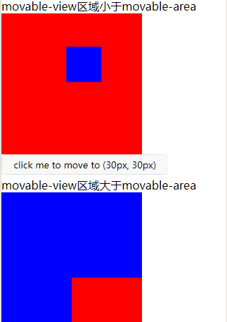
tip: movable-area 必须设置width和height属性,不设置默认为10px**tip: 当movable-view小于movable-area时,movable-view的移动范围是在movable-area内;tip: 当movable-view大于movable-area时,movable-view的移动范围必须包含movable-area(x轴方向和y轴方向分开考虑)
示例代码
<view class="section">
  <view class="section__title">movable-view区域小于movable-area</view>
  <movable-area style="height: 200px;  200px; background: red;">
    <movable-view style="height: 50px;  50px; background: blue;" x="{{x}}" y="{{y}}" direction="all">
    </movable-view>
  </movable-area>
  <view class="btn-area">
    <button size="mini" bindtap="tap">click me to move to (30px, 30px)</button>
  </view>
  <view class="section__title">movable-view区域大于movable-area</view>
  <movable-area style="height: 100px;  100px; background: red;">
    <movable-view style="height: 200px;  200px; background: blue;" direction="all">
    </movable-view>
  </movable-area>
  <view class="section__title">可放缩</view>
  <movable-area style="height: 200px;  200px; background: red;" scale-area>
    <movable-view style="height: 50px;  50px; background: blue;" direction="all" bindchange="onChange" bindscale="onScale" scale scale-min="0.5" scale-max="4" scale-value="2">
    </movable-view>
  </movable-area>
</view>
Page({
  data: {
    x: 0,
    y: 0
  },
  tap: function(e) {
    this.setData({
      x: 30,
      y: 30
    });
  },
  onChange: function(e) {
    console.log(e.detail)
  },
  onScale: function(e) {
    console.log(e.detail)
  }
})
③cover-image
覆盖在原生组件之上的图片视图
覆盖在原生组件之上的图片视图。可覆盖的原生组件同cover-view,支持嵌套在cover-view里。
| 属性 | 类型 | 默认值 | 必填 | 说明 | 最低版本 |
|---|---|---|---|---|---|
| src | string | 否 | 图标路径,支持临时路径、网络地址(1.6.0起支持)、云文件ID(2.2.3起支持)。暂不支持base64格式。 | 1.4.0 | |
| bindload | eventhandle | 否 | 图片加载成功时触发 | 2.1.0 | |
| binderror | eventhandle | 否 | 图片加载失败时触发 | 2.1.0 |
④cover-view
覆盖在原生组件之上的文本视图
可覆盖的原生组件包括 map、video、canvas、camera、live-player、live-pusher
只支持嵌套 cover-view、cover-image,可在 cover-view 中使用 button。组件属性的长度单位默认为px,2.4.0起支持传入单位(rpx/px)。
| 属性 | 类型 | 默认值 | 必填 | 说明 | 最低版本 |
|---|---|---|---|---|---|
| scroll-top | number/string | 否 | 设置顶部滚动偏移量,仅在设置了 overflow-y: scroll 成为滚动元素后生效 | 2.1.0 |
Bug & Tip
tip: cover-view和cover-image的aria-role仅可设置为button,读屏模式下才可以点击,并朗读出“按钮”;为空时可以聚焦,但不可点击tip: 基础库 2.2.4 起支持 touch 相关事件,也可使用 hover-class 设置点击态tip: 基础库 2.1.0 起支持设置scalerotate的 css 样式,包括 transition 动画tip: 基础库 1.9.90 起cover-view支持overflow: scroll,但不支持动态更新overflowtip: 基础库 1.9.90 起最外层cover-view支持position: fixedtip: 基础库 1.9.0 起支持插在view等标签下。在此之前只可嵌套在原生组件map、video、canvas、camera内,避免嵌套在其他组件内。tip: 基础库 1.6.0 起支持css transition动画,transition-property只支持transform (translateX, translateY)与opacity。tip: 基础库 1.6.0 起支持css opacity。tip: 事件模型遵循冒泡模型,但不会冒泡到原生组件。tip: 文本建议都套上cover-view标签,避免排版错误。tip: 只支持基本的定位、布局、文本样式。不支持设置单边的border、background-image、shadow、overflow: visible等。tip: 建议子节点不要溢出父节点tip: 支持使用 z-index 控制层级tip: 默认设置的样式有:white-space: nowrap;line-height: 1.2;display: block;bug: 自定义组件嵌套cover-view时,自定义组件的 slot 及其父节点暂不支持通过 wx:if 控制显隐,否则会导致cover-view不显示
示例代码
<video id="myVideo" src="http://wxsnsdy.tc.qq.com/105/20210/snsdyvideodownload?filekey=30280201010421301f0201690402534804102ca905ce620b1241b726bc41dcff44e00204012882540400&bizid=1023&hy=SH&fileparam=302c020101042530230204136ffd93020457e3c4ff02024ef202031e8d7f02030f42400204045a320a0201000400" controls="{{false}}" event-model="bubble">
  <cover-view class="controls">
    <cover-view class="play" bindtap="play">
      <cover-image class="img" src="/path/to/icon_play" />
    </cover-view>
    <cover-view class="pause" bindtap="pause">
      <cover-image class="img" src="/path/to/icon_pause" />
    </cover-view>
    <cover-view class="time">00:00</cover-view>
  </cover-view>
</video>
.controls {
  position: relative;
  top: 50%;
  height: 50px;
  margin-top: -25px;
  display: flex;
}
.play,.pause,.time {
  flex: 1;
  height: 100%;
}
.time {
  text-align: center;
  background-color: rgba(0, 0, 0, .5);
  color: white;
  line-height: 50px;
}
.img {
   40px;
  height: 40px;
  margin: 5px auto;
}
Page({
  onReady() {
    this.videoCtx = wx.createVideoContext('myVideo')
  },
  play() {
    this.videoCtx.play()
  },
  pause() {
    this.videoCtx.pause()
  }
})
⑤scroll-view
可滚动视图区域。使用竖向滚动时,需要给scroll-view一个固定高度,通过 WXSS 设置 height。组件属性的长度单位默认为px,2.4.0起支持传入单位(rpx/px)。
| 属性 | 类型 | 默认值 | 必填 | 说明 | 最低版本 |
|---|---|---|---|---|---|
| scroll-x | boolean | false | 否 | 允许横向滚动 | 1.0.0 |
| scroll-y | boolean | false | 否 | 允许纵向滚动 | 1.0.0 |
| upper-threshold | number/string | 50 | 否 | 距顶部/左边多远时,触发 scrolltoupper 事件 | 1.0.0 |
| lower-threshold | number/string | 50 | 否 | 距底部/右边多远时,触发 scrolltolower 事件 | 1.0.0 |
| scroll-top | number/string | 否 | 设置竖向滚动条位置 | 1.0.0 | |
| scroll-left | number/string | 否 | 设置横向滚动条位置 | 1.0.0 | |
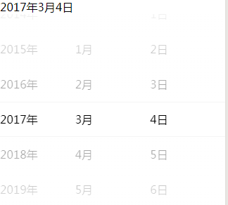
| scroll-into-view | string | 否 | 值应为某子元素id(id不能以数字开头)。设置哪个方向可滚动,则在哪个方向滚动到该元素 | 1.0.0 | |
| scroll-with-animation | boolean | false | 否 | 在设置滚动条位置时使用动画过渡 | 1.0.0 |
| enable-back-to-top | boolean | false | 否 | iOS点击顶部状态栏、安卓双击标题栏时,滚动条返回顶部,只支持竖向 | 1.0.0 |
| bindscrolltoupper | eventhandle | 否 | 滚动到顶部/左边时触发 | 1.0.0 | |
| bindscrolltolower | eventhandle | 否 | 滚动到底部/右边时触发 | 1.0.0 | |
| bindscroll | eventhandle | 否 | 滚动时触发,event.detail = {scrollLeft, scrollTop, scrollHeight, scrollWidth, deltaX, deltaY} | 1.0.0 |
Bug & Tip
tip: 基础库 2.4.0以下不支持嵌套textarea、map、canvas、video组件tip:scroll-into-view的优先级高于scroll-toptip: 在滚动scroll-view时会阻止页面回弹,所以在scroll-view中滚动,是无法触发onPullDownRefreshtip: 若要使用下拉刷新,请使用页面的滚动,而不是scroll-view,这样也能通过点击顶部状态栏回到页面顶部
<!--垂直滚动,这里必须设置高度-->
<scroll-view scroll-y="true" style="height: 200px">
    <view style="background: red;  100px; height: 100px" ></view>
    <view style="background: green;  100px; height: 100px"></view>
    <view style="background: blue;  100px; height: 100px"></view>
    <view style="background: yellow;  100px; height: 100px"></view>
</scroll-view>

<!--  white-space
  normal: 正常无变化(默认处理方式.文本自动处理换行.假如抵达容器边界内容会转到下一行)
  pre: 保持HTML源代码的空格与换行,等同与pre标签
  nowrap: 强制文本在一行,除非遇到br换行标签
  pre-wrap: 同pre属性,但是遇到超出容器范围的时候会自动换行
  pre-line: 同pre属性,但是遇到连续空格会被看作一个空格
  inherit: 继承
-->
<!--水平滚动-->
<scroll-view scroll-x="true" style=" white-space: nowrap; display: flex" >
<!--  display: inline-block-->
  <view style="background: red;  200px; height: 100px; display: inline-block" ></view>
  <view style="background: green;  200px; height: 100px; display: inline-block"></view>
  <view style="background: blue;  200px; height: 100px; display: inline-block"></view>
  <view style="background: yellow;  200px; height: 100px; display: inline-block"></view>
</scroll-view>
⑥swiper
滑块视图容器。其中只可放置swiper-item组件,否则会导致未定义的行为。
| 属性 | 类型 | 默认值 | 必填 | 说明 | 最低版本 |
|---|---|---|---|---|---|
| indicator-dots | boolean | false | 否 | 是否显示面板指示点 | 1.0.0 |
| indicator-color | color | rgba(0, 0, 0, .3) | 否 | 指示点颜色 | 1.1.0 |
| indicator-active-color | color | #000000 | 否 | 当前选中的指示点颜色 | 1.1.0 |
| autoplay | boolean | false | 否 | 是否自动切换 | 1.0.0 |
| current | number | 0 | 否 | 当前所在滑块的 index | 1.0.0 |
| interval | number | 5000 | 否 | 自动切换时间间隔 | 1.0.0 |
| duration | number | 500 | 否 | 滑动动画时长 | 1.0.0 |
| circular | boolean | false | 否 | 是否采用衔接滑动 | 1.0.0 |
| vertical | boolean | false | 否 | 滑动方向是否为纵向 | 1.0.0 |
| previous-margin | string | "0px" | 否 | 前边距,可用于露出前一项的一小部分,接受 px 和 rpx 值 | 1.9.0 |
| next-margin | string | "0px" | 否 | 后边距,可用于露出后一项的一小部分,接受 px 和 rpx 值 | 1.9.0 |
| display-multiple-items | number | 1 | 否 | 同时显示的滑块数量 | 1.9.0 |
| skip-hidden-item-layout | boolean | false | 否 | 是否跳过未显示的滑块布局,设为 true 可优化复杂情况下的滑动性能,但会丢失隐藏状态滑块的布局信息 | 1.9.0 |
| easing-function | string | "default" | 否 | 指定 swiper 切换缓动动画类型 | 2.6.5 |
| bindchange | eventhandle | 否 | current 改变时会触发 change 事件,event.detail = {current, source} | 1.0.0 | |
| bindtransition | eventhandle | 否 | swiper-item 的位置发生改变时会触发 transition 事件,event.detail = {dx: dx, dy: dy} | 2.4.3 | |
| bindanimationfinish | eventhandle | 否 | 动画结束时会触发 animationfinish 事件,event.detail 同上 | 1.9.0 |
easing-function 的合法值
| 值 | 说明 | 最低版本 |
|---|---|---|
| default | 默认缓动函数 | |
| linear | 线性动画 | |
| easeInCubic | 缓入动画 | |
| easeOutCubic | 缓出动画 | |
| easeInOutCubic | 缓入缓出动画 |
change事件 source 返回值
从 1.4.0 开始,change事件增加 source字段,表示导致变更的原因,可能值如下:
autoplay自动播放导致swiper变化;touch用户划动引起swiper变化;- 其它原因将用空字符串表示。
Bug & Tip
tip: 如果在bindchange的事件回调函数中使用setData改变current值,则有可能导致setData被不停地调用,因而通常情况下请在改变current值前检测source字段来判断是否是由于用户触摸引起。
示例代码
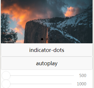
<swiper indicator-dots="{{indicatorDots}}"
  autoplay="{{autoplay}}" interval="{{interval}}" duration="{{duration}}">
  <block wx:for="{{imgUrls}}">
    <swiper-item>
      <image src="{{item}}" class="slide-image" width="355" height="150"/>
    </swiper-item>
  </block>
</swiper>
<button bindtap="changeIndicatorDots"> indicator-dots </button>
<button bindtap="changeAutoplay"> autoplay </button>
<slider bindchange="intervalChange" show-value min="500" max="2000"/>
<slider bindchange="durationChange" show-value min="1000" max="10000"/>
Page({
  data: {
    imgUrls: [
      'https://images.unsplash.com/photo-1551334787-21e6bd3ab135?w=640',
      'https://images.unsplash.com/photo-1551214012-84f95e060dee?w=640',
      'https://images.unsplash.com/photo-1551446591-142875a901a1?w=640'
    ],
    indicatorDots: false,
    autoplay: false,
    interval: 5000,
    duration: 1000
  },
  changeIndicatorDots: function(e) {
    this.setData({
      indicatorDots: !this.data.indicatorDots
    })
  },
  changeAutoplay: function(e) {
    this.setData({
      autoplay: !this.data.autoplay
    })
  },
  intervalChange: function(e) {
    this.setData({
      interval: e.detail.value
    })
  },
  durationChange: function(e) {
    this.setData({
      duration: e.detail.value
    })
  }
})
⑦swiper-item 仅可放置在swiper组件中,宽高自动设置为100%
| 属性 | 类型 | 默认值 | 必填 | 说明 | 最低版本 |
|---|---|---|---|---|---|
| item-id | string | 否 | 该 swiper-item 的标识符 | 1.9.0 |
⑧view视图容器
| 属性 | 类型 | 默认值 | 必填 | 说明 | 最低版本 |
|---|---|---|---|---|---|
| hover-class | string | none | 否 | 指定按下去的样式类。当 hover-class="none" 时,没有点击态效果 |
1.0.0 |
| hover-stop-propagation | boolean | false | 否 | 指定是否阻止本节点的祖先节点出现点击态 | 1.5.0 |
| hover-start-time | number | 50 | 否 | 按住后多久出现点击态,单位毫秒 | 1.0.0 |
| hover-stay-time | number | 400 | 否 | 手指松开后点击态保留时间,单位毫秒 | 1.0.0 |
Bug & Tip
tip: 如果需要使用滚动视图,请使用 scroll-view
示例代码
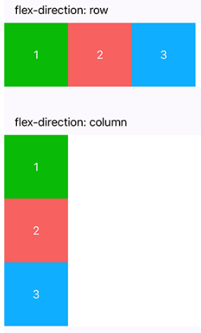
<view class="section">
  <view class="section__title">flex-direction: row</view>
  <view class="flex-wrp" style="flex-direction:row;">
    <view class="flex-item bc_green">1</view>
    <view class="flex-item bc_red">2</view>
    <view class="flex-item bc_blue">3</view>
  </view>
</view>
<view class="section">
  <view class="section__title">flex-direction: column</view>
  <view class="flex-wrp" style="height: 300px;flex-direction:column;">
    <view class="flex-item bc_green">1</view>
    <view class="flex-item bc_red">2</view>
    <view class="flex-item bc_blue">3</view>
  </view>
</view>
(2)基础内容
①icon图标
图标。组件属性的长度单位默认为px,2.4.0起支持传入单位(rpx/px)。
| 属性 | 类型 | 默认值 | 必填 | 说明 | 最低版本 |
|---|---|---|---|---|---|
| type | string | 是 | icon的类型,有效值:success, success_no_circle, info, warn, waiting, cancel, download, search, clear | 1.0.0 | |
| size | number/string | 23 | 否 | icon的大小 | 1.0.0 |
| color | string | 否 | icon的颜色,同css的color | 1.0.0 |
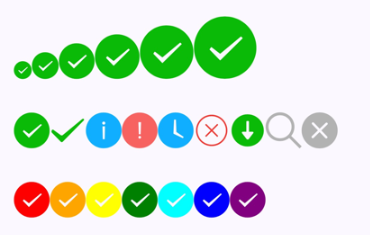
<view class="group">
  <block wx:for="{{iconSize}}">
    <icon type="success" size="{{item}}"/>
  </block>
</view>

<view class="group">
  <block wx:for="{{iconType}}">
    <icon type="{{item}}" size="40"/>
  </block>
</view>

<view class="group">
  <block wx:for="{{iconColor}}">
    <icon type="success" size="40" color="{{item}}"/>
  </block>
</view>

Page({
  data: {
    iconSize: [20, 30, 40, 50, 60, 70],
    iconColor: [
      'red', 'orange', 'yellow', 'green', 'rgb(0,255,255)', 'blue', 'purple'
    ],
    iconType: [
      'success', 'success_no_circle', 'info', 'warn', 'waiting', 'cancel', 'download', 'search', 'clear'
    ]
  }
})
②progress进度条
| 属性 | 类型 | 默认值 | 必填 | 说明 | 最低版本 |
|---|---|---|---|---|---|
| percent | number | 否 | 百分比0~100 | 1.0.0 | |
| show-info | boolean | false | 否 | 在进度条右侧显示百分比 | 1.0.0 |
| border-radius | number/string | 0 | 否 | 圆角大小 | 2.3.1 |
| font-size | number/string | 16 | 否 | 右侧百分比字体大小 | 2.3.1 |
| stroke-width | number/string | 6 | 否 | 进度条线的宽度 | 1.0.0 |
| color | string | #09BB07 | 否 | 进度条颜色(请使用activeColor) | 1.0.0 |
| activeColor | string | #09BB07 | 否 | 已选择的进度条的颜色 | 1.0.0 |
| backgroundColor | string | #EBEBEB | 否 | 未选择的进度条的颜色 | 1.0.0 |
| active | boolean | false | 否 | 进度条从左往右的动画 | 1.0.0 |
| active-mode | string | backwards | 否 | backwards: 动画从头播;forwards:动画从上次结束点接着播 | 1.7.0 |
| bindactiveend | eventhandle | 否 | 动画完成事件 | 2.4.1 |
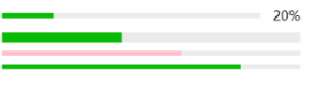
<progress percent="20" show-info />
<progress percent="40" stroke-width="12" />
<progress percent="60" color="pink" />
<progress percent="80" active show-info/>
③rich-text富文本
space 的合法值
| 值 | 说明 | 最低版本 |
|---|---|---|
| ensp | 中文字符空格一半大小 | |
| emsp | 中文字符空格大小 | |
| nbsp | 根据字体设置的空格大小 |
nodes
现支持两种节点,通过type来区分,分别是元素节点和文本节点,默认是元素节点,在富文本区域里显示的HTML节点 元素节点:type = node*
| 属性 | 说明 | 类型 | 必填 | 备注 |
|---|---|---|---|---|
| name | 标签名 | string | 是 | 支持部分受信任的 HTML 节点 |
| attrs | 属性 | object | 否 | 支持部分受信任的属性,遵循 Pascal 命名法 |
| children | 子节点列表 | array | 否 | 结构和 nodes 一致 |
文本节点:type = text*
| 属性 | 说明 | 类型 | 必填 | 备注 |
|---|---|---|---|---|
| text | 文本 | string | 是 | 支持entities |
受信任的HTML节点及属性
全局支持class和style属性,不支持id属性。
| 节点 | 属性 |
|---|---|
| a | |
| abbr | |
| address | |
| article | |
| aside | |
| b | |
| bdi | |
| bdo | dir |
| big | |
| blockquote | |
| br | |
| caption | |
| center | |
| cite | |
| code | |
| col | span,width |
| colgroup | span,width |
| dd | |
| del | |
| div | |
| dl | |
| dt | |
| em | |
| fieldset | |
| font | |
| footer | |
| h1 | |
| h2 | |
| h3 | |
| h4 | |
| h5 | |
| h6 | |
| header | |
| hr | |
| i | |
| img | alt,src,height,width |
| ins | |
| label | |
| legend | |
| li | |
| mark | |
| nav | |
| ol | start,type |
| p | |
| pre | |
| q | |
| rt | |
| ruby | |
| s | |
| section | |
| small | |
| span | |
| strong | |
| sub | |
| sup | |
| table | width |
| tbody | |
| td | colspan,height,rowspan,width |
| tfoot | |
| th | colspan,height,rowspan,width |
| thead | |
| tr | colspan,height,rowspan,width |
| tt | |
| u | |
| ul |
Bug & Tip
tip: nodes 不推荐使用 String 类型,性能会有所下降。tip:rich-text组件内屏蔽所有节点的事件。tip: attrs 属性不支持 id ,支持 class 。tip: name 属性大小写不敏感。tip: 如果使用了不受信任的HTML节点,该节点及其所有子节点将会被移除。tip: img 标签仅支持网络图片。tip: 如果在自定义组件中使用rich-text组件,那么仅自定义组件的 wxss 样式对rich-text中的 class 生效。
示例代码
<rich-text nodes="{{nodes}}" bindtap="tap"></rich-text> Page({ data: { nodes: [{ name: 'div', attrs: { class: 'div_class', style: 'line-height: 60px; color: red;' }, children: [{ type: 'text', text: 'Hello World!' }] }] }, tap() { console.log('tap') } })
④text文本
| 属性 | 类型 | 默认值 | 必填 | 说明 | 最低版本 |
|---|---|---|---|---|---|
| selectable | boolean | false | 否 | 文本是否可选 | 1.1.0 |
| space | string | 否 | 显示连续空格 | 1.4.0 | |
| decode | boolean | false | 否 | 是否解码 | 1.4.0 |
space 的合法值
| 值 | 说明 | 最低版本 |
|---|---|---|
| ensp | 中文字符空格一半大小 | |
| emsp | 中文字符空格大小 | |
| nbsp | 根据字体设置的空格大小 |
Bug & Tip
tip: decode可以解析的有 <>&'  tip: 各个操作系统的空格标准并不一致。tip:text 组件内只支持 text 嵌套。tip: 除了文本节点以外的其他节点都无法长按选中。bug: 基础库版本低于2.1.0时, text 组件内嵌的 text style 设置可能不会生效。
示例代码
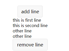
<view class="btn-area">
  <view class="body-view">
    <text>{{text}}</text>
    <button bindtap="add">add line</button>
    <button bindtap="remove">remove line</button>
  </view>
</view>
var initData = 'this is first line
this is second line'
var extraLine = [];
Page({
  data: {
    text: initData
  },
  add: function(e) {
    extraLine.push('other line')
    this.setData({
      text: initData + '
' + extraLine.join('
')
    })
  },
  remove: function(e) {
    if (extraLine.length > 0) {
      extraLine.pop()
      this.setData({
        text: initData + '
' + extraLine.join('
')
      })
    }
  }
})
(3)表单组件
| 名称 | 功能说明 |
|---|---|
| button | 按钮 |
| checkbox | 多选项目 |
| checkbox-group | 多项选择器,内部由多个checkbox组成 |
| editor | 富文本编辑器,可以对图片、文字进行编辑 |
| form | 表单 |
| input | 输入框 |
| label | 用来改进表单组件的可用性 |
| picker | 从底部弹起的滚动选择器 |
| picker-view | 嵌入页面的滚动选择器 |
| picker-view-column | 滚动选择器子项 |
| radio | 单选项目 |
| radio-group | 单项选择器,内部由多个 radio 组成 |
| slider | 滑动选择器 |
| switch | 开关选择器 |
| textarea | 多行输入框 |
①按钮
| 属性 | 类型 | 默认值 | 必填 | 说明 | 最低版本 |
|---|---|---|---|---|---|
| size | string | default | 否 | 按钮的大小 | 1.0.0 |
| type | string | default | 否 | 按钮的样式类型 | 1.0.0 |
| plain | boolean | false | 否 | 按钮是否镂空,背景色透明 | 1.0.0 |
| disabled | boolean | false | 否 | 是否禁用 | 1.0.0 |
| loading | boolean | false | 否 | 名称前是否带 loading 图标 | 1.0.0 |
| form-type | string | 否 | 用于 form 组件,点击分别会触发 form 组件的 submit/reset 事件 | 1.0.0 | |
| open-type | string | 否 | 微信开放能力 | 1.1.0 | |
| hover-class | string | button-hover | 否 | 指定按钮按下去的样式类。当 hover-class="none"时,没有点击态效果 |
1.0.0 |
| hover-stop-propagation | boolean | false | 否 | 指定是否阻止本节点的祖先节点出现点击态 | 1.5.0 |
| hover-start-time | number | 20 | 否 | 按住后多久出现点击态,单位毫秒 | 1.0.0 |
| hover-stay-time | number | 70 | 否 | 手指松开后点击态保留时间,单位毫秒 | 1.0.0 |
| lang | string | en | 否 | 指定返回用户信息的语言,zh_CN 简体中文,zh_TW 繁体中文,en 英文。 | 1.3.0 |
| session-from | string | 否 | 会话来源,open-type="contact"时有效 | 1.4.0 | |
| send-message-title | string | 当前标题 | 否 | 会话内消息卡片标题,open-type="contact"时有效 | 1.5.0 |
| send-message-path | string | 当前分享路径 | 否 | 会话内消息卡片点击跳转小程序路径,open-type="contact"时有效 | 1.5.0 |
| send-message-img | string | 截图 | 否 | 会话内消息卡片图片,open-type="contact"时有效 | 1.5.0 |
| app-parameter | string | 否 | 打开 APP 时,向 APP 传递的参数,open-type=launchApp时有效 | 1.9.5 | |
| show-message-card | boolean | false | 否 | 是否显示会话内消息卡片,设置此参数为 true,用户进入客服会话会在右下角显示"可能要发送的小程序"提示,用户点击后可以快速发送小程序消息,open-type="contact"时有效 | 1.5.0 |
| bindgetuserinfo | eventhandle | 否 | 用户点击该按钮时,会返回获取到的用户信息,回调的detail数据与wx.getUserInfo返回的一致,open-type="getUserInfo"时有效 | 1.3.0 | |
| bindcontact | eventhandle | 否 | 客服消息回调,open-type="contact"时有效 | 1.5.0 | |
| bindgetphonenumber | eventhandle | 否 | 获取用户手机号回调,open-type=getPhoneNumber时有效 | 1.2.0 | |
| binderror | eventhandle | 否 | 当使用开放能力时,发生错误的回调,open-type=launchApp时有效 | 1.9.5 | |
| bindopensetting | eventhandle | 否 | 在打开授权设置页后回调,open-type=openSetting时有效 | 2.0.7 | |
| bindlaunchapp | eventhandle | 否 | 打开 APP 成功的回调,open-type=launchApp时有效 |
size 的合法值
| 值 | 说明 | 最低版本 |
|---|---|---|
| default | 默认大小 | |
| mini | 小尺寸 |
type 的合法值
| 值 | 说明 | 最低版本 |
|---|---|---|
| primary | 绿色 | |
| default | 白色 | |
| warn | 红色 |
form-type 的合法值
| 值 | 说明 | 最低版本 |
|---|---|---|
| submit | 提交表单 | |
| reset | 重置表单 |
open-type 的合法值
| 值 | 说明 | 最低版本 |
|---|---|---|
| contact | 打开客服会话,如果用户在会话中点击消息卡片后返回小程序,可以从 bindcontact 回调中获得具体信息,具体说明 | 1.1.0 |
| share | 触发用户转发,使用前建议先阅读使用指引 | 1.2.0 |
| getPhoneNumber | 获取用户手机号,可以从bindgetphonenumber回调中获取到用户信息,具体说明 | 1.2.0 |
| getUserInfo | 获取用户信息,可以从bindgetuserinfo回调中获取到用户信息 | 1.3.0 |
| launchApp | 打开APP,可以通过app-parameter属性设定向APP传的参数具体说明 | 1.9.5 |
| openSetting | 打开授权设置页 | 2.0.7 |
| feedback | 打开“意见反馈”页面,用户可提交反馈内容并上传日志,开发者可以登录小程序管理后台后进入左侧菜单“客服反馈”页面获取到反馈内容 | 2.1.0 |
lang 的合法值
| 值 | 说明 | 最低版本 |
|---|---|---|
| en | 英文 | |
| zh_CN | 简体中文 | |
| zh_TW | 繁体中文 |
Bug & Tip
tip:button-hover默认为{background-color: rgba(0, 0, 0, 0.1); opacity: 0.7;}tip:bindgetphonenumber从1.2.0 开始支持,但是在1.5.3以下版本中无法使用wx.canIUse进行检测,建议使用基础库版本进行判断。tip: 在bindgetphonenumber等返回加密信息的回调中调用 wx.login 登录,可能会刷新登录态。此时服务器使用 code 换取的 sessionKey 不是加密时使用的 sessionKey,导致解密失败。建议开发者提前进行login;或者在回调中先使用checkSession进行登录态检查,避免login刷新登录态。tip: 从 2.1.0 起,button 可作为原生组件的子节点嵌入,以便在原生组件上使用open-type的能力。tip: 目前设置了form-type的button只会对当前组件中的form有效。因而,将button封装在自定义组件中,而from在自定义组件外,将会使这个button的form-type失效。
②checkbox多选按钮
| 属性 | 类型 | 默认值 | 必填 | 说明 | 最低版本 |
|---|---|---|---|---|---|
| value | string | 否 | checkbox标识,选中时触发checkbox-group的 change 事件,并携带 checkbox 的 value | 1.0.0 | |
| disabled | boolean | false | 否 | 是否禁用 | 1.0.0 |
| checked | boolean | false | 否 | 当前是否选中,可用来设置默认选中 | 1.0.0 |
| color | string | #09BB07 | 否 | checkbox的颜色,同css的color | 1.0.0 |
示例代码
<checkbox-group bindchange="checkboxChange">
  <label class="checkbox" wx:for="{{items}}">
    <checkbox value="{{item.name}}" checked="{{item.checked}}"/>{{item.value}}
  </label>
</checkbox-group>
Page({
  data: {
    items: [
      {name: 'USA', value: '美国'},
      {name: 'CHN', value: '中国', checked: 'true'},
      {name: 'BRA', value: '巴西'},
      {name: 'JPN', value: '日本'},
      {name: 'ENG', value: '英国'},
      {name: 'TUR', value: '法国'},
    ]
  },
  checkboxChange: function(e) {
    console.log('checkbox发生change事件,携带value值为:', e.detail.value)
  }
})

③checkbox-group 多项选择器,内部由多个checkbox组成
④editor 富文本编辑器,可以对图片、文字进行编辑
富文本编辑器,可以对图片、文字进行编辑。
编辑器导出内容支持带标签的 html和纯文本的 text,编辑器内部采用 delta 格式进行存储。
通过setContents接口设置内容时,解析插入的 html 可能会由于一些非法标签导致解析错误,建议开发者在小程序内使用时通过 delta 进行插入。
富文本组件内部引入了一些基本的样式使得内容可以正确的展示,开发时可以进行覆盖。需要注意的是,在其它组件或环境中使用富文本组件导出的html时,需要额外引入这段样式,并维护<ql-container><ql-editor></ql-editor></ql-container>的结构。
图片控件仅初始化时设置有效。(待定)
⑤表单form
表单。将组件内的用户输入的switch input checkbox slider radio picker 提交。
当点击 form 表单中 form-type 为 submit 的 button 组件时,会将表单组件中的 value 值进行提交,需要在表单组件中加上 name 来作为 key。
| 属性 | 类型 | 默认值 | 必填 | 说明 | 最低版本 |
|---|---|---|---|---|---|
| report-submit | boolean | false | 否 | 是否返回 formId 用于发送模板消息 | 1.0.0 |
| report-submit-timeout | number | 0 | 否 | 等待一段时间(毫秒数)以确认 formId 是否生效。如果未指定这个参数,formId 有很小的概率是无效的(如遇到网络失败的情况)。指定这个参数将可以检测 formId 是否有效,以这个参数的时间作为这项检测的超时时间。如果失败,将返回 requestFormId:fail 开头的 formId | 2.6.2 |
| bindsubmit | eventhandle | 否 | 携带 form 中的数据触发 submit 事件,event.detail = {value : {'name': 'value'} , formId: ''} | 1.0.0 | |
| bindreset | eventhandle | 否 | 表单重置时会触发 reset 事件 | 1.0.0 |
示例代码
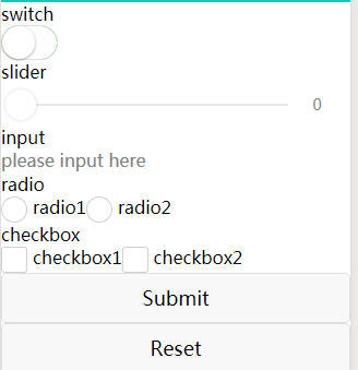
<form bindsubmit="formSubmit" bindreset="formReset">
  <view class="section section_gap">
    <view class="section__title">switch</view>
    <switch name="switch"/>
  </view>
  <view class="section section_gap">
    <view class="section__title">slider</view>
    <slider name="slider" show-value ></slider>
  </view>

  <view class="section">
    <view class="section__title">input</view>
    <input name="input" placeholder="please input here" />
  </view>
  <view class="section section_gap">
    <view class="section__title">radio</view>
    <radio-group name="radio-group">
      <label><radio value="radio1"/>radio1</label>
      <label><radio value="radio2"/>radio2</label>
    </radio-group>
  </view>
  <view class="section section_gap">
    <view class="section__title">checkbox</view>
    <checkbox-group name="checkbox">
      <label><checkbox value="checkbox1"/>checkbox1</label>
      <label><checkbox value="checkbox2"/>checkbox2</label>
    </checkbox-group>
  </view>
  <view class="btn-area">
    <button form-type="submit">Submit</button>
    <button form-type="reset">Reset</button>
  </view>
</form>
Page({
  formSubmit: function(e) {
    console.log('form发生了submit事件,携带数据为:', e.detail.value)
  },
  formReset: function() {
    console.log('form发生了reset事件')
  }
})
⑥input输入框
⑦label用来改进表单组件的可用性
⑧picker从底部弹起的滚动选择器
从底部弹起的滚动选择器。
| 属性 | 类型 | 默认值 | 必填 | 说明 | 最低版本 |
|---|---|---|---|---|---|
| mode | string | selector | 否 | 选择器类型 | 1.0.0 |
| disabled | boolean | false | 否 | 是否禁用 | 1.0.0 |
| bindcancel | eventhandle | 否 | 取消选择时触发 | 1.9.90 |
mode 的合法值
| 值 | 说明 | 最低版本 |
|---|---|---|
| selector | 普通选择器 | |
| multiSelector | 多列选择器 | |
| time | 时间选择器 | |
| date | 日期选择器 | |
| region | 省市区选择器 |
除了上述通用的属性,对于不同的mode,picker拥有不同的属性。
⑨picker-view
嵌入页面的滚动选择器。其中只可放置 picker-view-column组件,其它节点不会显示。
10、picker-view-column 滚动选择器子项
11、radio 单选项目
| 属性 | 类型 | 默认值 | 必填 | 说明 | 最低版本 |
|---|---|---|---|---|---|
| value | string | 否 | radio 标识。当该radio 选中时,radio-group 的 change 事件会携带radio的value | 1.0.0 | |
| checked | boolean | false | 否 | 当前是否选中 | 1.0.0 |
| disabled | boolean | false | 否 | 是否禁用 | 1.0.0 |
| color | string | #09BB07 | 否 | radio的颜色,同css的color | 1.0.0 |
12、radio-group 单项选择器,内部由多个 radio 组成
13、slider 滑动选择器
14、switch 开关选择器
Bug & Tip
tip: switch类型切换时在iOS自带振动反馈,可在系统设置 -> 声音与触感 -> 系统触感反馈中关闭
示例代码
<view class="body-view">
    <switch checked bindchange="switch1Change"/>
    <switch bindchange="switch2Change"/>
</view>
Page({
  switch1Change: function (e){
    console.log('switch1 发生 change 事件,携带值为', e.detail.value)
  },
  switch2Change: function (e){
    console.log('switch2 发生 change 事件,携带值为', e.detail.value)
  }
})
15、textarea 多行输入框
(4)导航
| 名称 | 功能说明 |
|---|---|
| functional-page-navigator | 仅在插件中有效,用于跳转到插件功能页 |
| navigator | 页面链接 |
①functional-page-navigator 仅在插件中有效,用于跳转到插件功能页(待定)
②navigator 页面链接
<view class="btn-area">
  <navigator url="/pages/navigator/navigator" hover-class="navigator-hover">跳转到新页面</navigator>
  <navigator url="/pages/redirect/redirect" open-type="redirect" hover-class="other-navigator-hover">在当前页打开</navigator>
  <navigator url="/pages/index/index" open-type="switchTab" hover-class="other-navigator-hover">切换 Tab</navigator>
  <navigator target="miniProgram" open-type="navigate" app-id="" path="" extra-data="" version="release">打开绑定的小程序</navigator>
</view>

Page({
  onLoad: function(options) {
    this.setData({
      title: options.title
    })
  }
})
(5)媒体组件
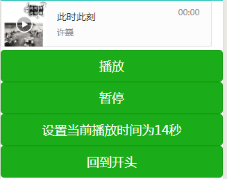
①audio音频
<!-- audio.wxml -->
<audio poster="{{poster}}" name="{{name}}" author="{{author}}" src="{{src}}" id="myAudio" controls loop></audio>
<button type="primary" bindtap="audioPlay">播放</button>
<button type="primary" bindtap="audioPause">暂停</button>
<button type="primary" bindtap="audio14">设置当前播放时间为14秒</button>
<button type="primary" bindtap="audioStart">回到开头</button>

// audio.js
Page({
  onReady: function (e) {
    // 使用 wx.createAudioContext 获取 audio 上下文 context
    this.audioCtx = wx.createAudioContext('myAudio')
  },
  data: {
    poster: 'http://y.gtimg.cn/music/photo_new/T002R300x300M000003rsKF44GyaSk.jpg?max_age=2592000',
    name: '此时此刻',
    author: '许巍',
    src: 'http://ws.stream.qqmusic.qq.com/M500001VfvsJ21xFqb.mp3?guid=ffffffff82def4af4b12b3cd9337d5e7&uin=346897220&vkey=6292F51E1E384E06DCBDC9AB7C49FD713D632D313AC4858BACB8DDD29067D3C601481D36E62053BF8DFEAF74C0A5CCFADD6471160CAF3E6A&fromtag=46',
  },
  audioPlay: function () {
    this.audioCtx.play()
  },
  audioPause: function () {
    this.audioCtx.pause()
  },
  audio14: function () {
    this.audioCtx.seek(14)
  },
  audioStart: function () {
    this.audioCtx.seek(0)
  }
})
②camera系统相机
<!-- camera.wxml -->
<camera device-position="back" flash="off" binderror="error" style=" 100%; height: 300px;"></camera>
<button type="primary" bindtap="takePhoto">拍照</button>
<view>预览</view>
<image mode="widthFix" src="{{src}}"></image>

// camera.js
Page({
  takePhoto() {
    const ctx = wx.createCameraContext()
    ctx.takePhoto({
      quality: 'high',
      success: (res) => {
        this.setData({
          src: res.tempImagePath
        })
      }
    })
  },
  error(e) {
    console.log(e.detail)
  }
})

③image图片
图片。支持JPG、PNG、SVG格式,2.3.0 起支持云文件ID。
<view class="page">
  <view class="page__hd">
    <text class="page__title">image</text>
    <text class="page__desc">图片</text>
  </view>
  <view class="page__bd">
    <view class="section section_gap" wx:for="{{array}}" wx:for-item="item">
      <view class="section__title">{{item.text}}</view>
      <view class="section__ctn">
        <image style=" 200px; height: 200px; background-color: #eeeeee;" mode="{{item.mode}}" src="{{src}}"></image>
      </view>
    </view>
  </view>
</view>

Page({
  data: {
    array: [{
      mode: 'scaleToFill',
      text: 'scaleToFill:不保持纵横比缩放图片,使图片完全适应'
    }, {
      mode: 'aspectFit',
      text: 'aspectFit:保持纵横比缩放图片,使图片的长边能完全显示出来'
    }, {
      mode: 'aspectFill',
      text: 'aspectFill:保持纵横比缩放图片,只保证图片的短边能完全显示出来'
    }, {
      mode: 'top',
      text: 'top:不缩放图片,只显示图片的顶部区域'
    }, {
      mode: 'bottom',
      text: 'bottom:不缩放图片,只显示图片的底部区域'
    }, {
      mode: 'center',
      text: 'center:不缩放图片,只显示图片的中间区域'
    }, {
      mode: 'left',
      text: 'left:不缩放图片,只显示图片的左边区域'
    }, {
      mode: 'right',
      text: 'right:不缩放图片,只显示图片的右边边区域'
    }, {
      mode: 'top left',
      text: 'top left:不缩放图片,只显示图片的左上边区域'
    }, {
      mode: 'top right',
      text: 'top right:不缩放图片,只显示图片的右上边区域'
    }, {
      mode: 'bottom left',
      text: 'bottom left:不缩放图片,只显示图片的左下边区域'
    }, {
      mode: 'bottom right',
      text: 'bottom right:不缩放图片,只显示图片的右下边区域'
    }],
    src: '../resources/cat.jpg'
  },
  imageError: function(e) {
    console.log('image3发生error事件,携带值为', e.detail.errMsg)
  }
})
④live-player 实时音视频播放
⑤live-pusher 实时音视频录制
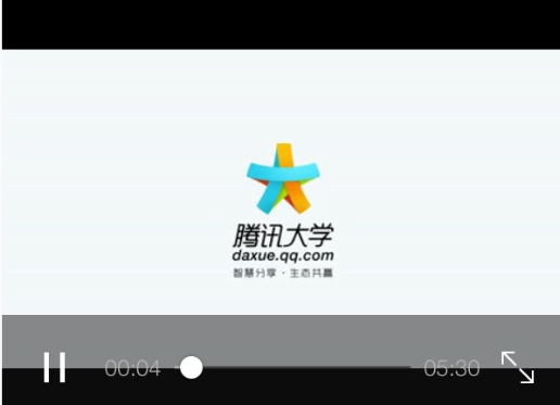
⑥video视频
<view class="section tc">
  <video src="{{src}}"   controls ></video>
  <view class="btn-area">
    <button bindtap="bindButtonTap">获取视频</button>
  </view>
</view>

<view class="section tc">
  <video id="myVideo" src="http://wxsnsdy.tc.qq.com/105/20210/snsdyvideodownload?filekey=30280201010421301f0201690402534804102ca905ce620b1241b726bc41dcff44e00204012882540400&bizid=1023&hy=SH&fileparam=302c020101042530230204136ffd93020457e3c4ff02024ef202031e8d7f02030f42400204045a320a0201000400" danmu-list="{{danmuList}}" enable-danmu danmu-btn controls></video>
  <view class="btn-area">
    <button bindtap="bindButtonTap">获取视频</button>
    <input bindblur="bindInputBlur"/>
    <button bindtap="bindSendDanmu">发送弹幕</button>
  </view>
</view>

function getRandomColor () {
  let rgb = []
  for (let i = 0 ; i < 3; ++i){
    let color = Math.floor(Math.random() * 256).toString(16)
    color = color.length == 1 ? '0' + color : color
    rgb.push(color)
  }
  return '#' + rgb.join('')
}

Page({
  onReady: function (res) {
    this.videoContext = wx.createVideoContext('myVideo')
  },
  inputValue: '',
  data: {
    src: '',
    danmuList: [
      {
        text: '第 1s 出现的弹幕',
        color: '#ff0000',
        time: 1
      },
      {
        text: '第 3s 出现的弹幕',
        color: '#ff00ff',
        time: 3
    }]
  },
  bindInputBlur: function(e) {
    this.inputValue = e.detail.value
  },
  bindButtonTap: function() {
    var that = this
    wx.chooseVideo({
      sourceType: ['album', 'camera'],
      maxDuration: 60,
      camera: ['front','back'],
      success: function(res) {
        that.setData({
          src: res.tempFilePath
        })
      }
    })
  },
  bindSendDanmu: function () {
    this.videoContext.sendDanmu({
      text: this.inputValue,
      color: getRandomColor()
    })
  }
})
(6)map地图
(7)canvas画布
(8) 开放能力(待定)
| 名称 | 功能说明 |
|---|---|
| web-view | 承载网页的容器 |
| ad | Banner 广告 |
| official-account | 公众号关注组件 |
| open-data | 用于展示微信开放的数据 |
(9)原生组件
native-component
小程序中的部分组件是由客户端创建的原生组件,这些组件有:
cameracanvasinput(仅在focus时表现为原生组件)live-playerlive-pushermaptextareavideo
原生组件的使用限制
由于原生组件脱离在 WebView 渲染流程外,因此在使用时有以下限制:
- 原生组件的层级是最高的,所以页面中的其他组件无论设置
z-index为多少,都无法盖在原生组件上。- 后插入的原生组件可以覆盖之前的原生组件。
- 原生组件还无法在 picker-view 中使用。
- 基础库 2.4.4 以下版本,原生组件不支持在 scroll-view、swiper、movable-view 中使用。
- 部分CSS样式无法应用于原生组件,例如:
- 无法对原生组件设置 CSS 动画
- 无法定义原生组件为
position: fixed - 不能在父级节点使用
overflow: hidden来裁剪原生组件的显示区域
- 原生组件的事件监听不能使用
bind:eventname的写法,只支持bindeventname。原生组件也不支持 catch 和 capture 的事件绑定方式。 - 原生组件会遮挡 vConsole 弹出的调试面板。 在工具上,原生组件是用web组件模拟的,因此很多情况并不能很好的还原真机的表现,建议开发者在使用到原生组件时尽量在真机上进行调试。*
cover-view 与 cover-image
为了解决原生组件层级最高的限制。小程序专门提供了 cover-view 和 cover-image 组件,可以覆盖在部分原生组件上面。这两个组件也是原生组件,但是使用限制与其他原生组件有所不同。
原生组件同层渲染
同层渲染是为了解决原生组件的层级问题,在支持同层渲染后,原生组件与其它组件可以随意叠加,有关层级的限制将不再存在。但需要注意的是,组件内部仍由原生渲染,样式一般还是对原生组件内部无效。小程序在 2.4.0 起已支持 video 组件的同层渲染。
原生组件相对层级
为了可以调整原生组件之间的相对层级位置,小程序在 v2.7.0 及以上版本支持在样式中声明 z-index 来指定原生组件的层级。该 z-index 仅调整原生组件之间的层级顺序,其层级仍高于其他非原生组件。
原生组件的使用限制
由于原生组件脱离在 WebView 渲染流程外,因此在使用时有以下限制:
- 原生组件的层级是最高的,所以页面中的其他组件无论设置
z-index为多少,都无法盖在原生组件上 |
(10)无障碍访问
| 名称 | 功能说明 |
|---|---|
| aria-component | ## 无障碍访问 |
| 为了更好地满足视障人士对于小程序的访问需求,基础库自2.7.1起,支持部分ARIA标签 |
Tips
- 安卓和iOS读屏模式下设置
aria-role后朗读的内容不同系统之间会有差异 - 可设置的
aria-role可参看 Using Aria中的Widget Roles,部分role的设置在移动端可能无效。
.